Thomas Trimingham
4 Reasons Distressed Designs Go Wrong
Differentiating between two of today’s popular designs.

Let’s Talk About It
Creating a More Diverse and Inclusive Screen Printing Industry
LET’S TALK About It: Part 3 discusses how four screen printers have employed people with disabilities, why you should consider doing the same, the resources that are available, and more. Watch the live webinar, held August 16, moderated by Adrienne Palmer, editor-in-chief, Screen Printing magazine, with panelists Ali Banholzer, Amber Massey, Ryan Moor, and Jed Seifert. The multi-part series is hosted exclusively by ROQ.US and U.N.I.T.E Together. Let’s Talk About It: Part 1 focused on Black, female screen printers and can be watched here; Part 2 focused on the LGBTQ+ community and can be watched here.
-

 Case Studies2 months ago
High-Density Inks Help Specialty Printing Take Center Stage
-

 Art, Ad, or Alchemy2 months ago
F&I Printing Is Everywhere!
-

 Andy MacDougall2 months ago
Functional and Industrial Printing is EVERYWHERE!
-

 Columns3 weeks ago
8 Marketing Mistakes Not to Make When Promoting Your Screen Printing Services Online
-

 Editor's Note2 weeks ago
Livin’ the High Life
-

 Thomas Trimingham2 months ago
“Magic” Marketing for Screen Printing Shops
-

 Marshall Atkinson2 weeks ago
How to Create a Winning Culture in Your Screen-Printing Business
-

 News & Trends1 month ago
What Are ZALPHAS and How Can You Serve Them in Your Print Business?

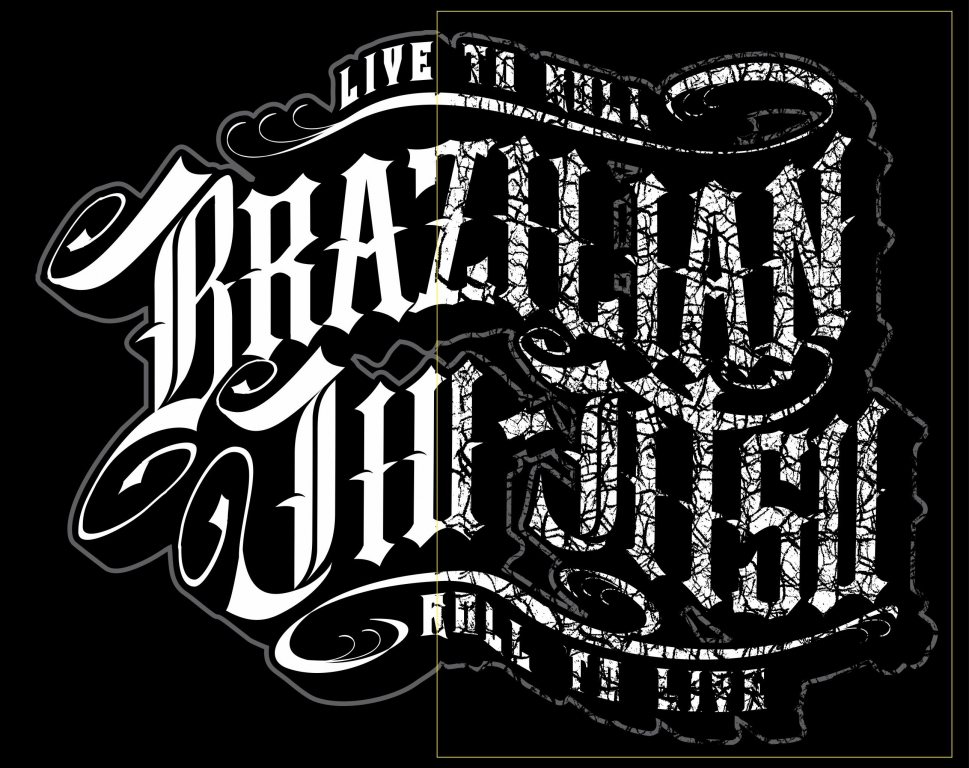
 The most common mistake when using distressed effects on screen printed apparel involves the “slap it on” approach where an overlay is applied to a design without adequate review of how it may affect the look of the final image. If the distress layer is too dense or knocks out too much of the positive elements in the graphic, the result may appear bad or damaged rather than worn.
 Another common error is caused by using distressed images too heavily in the type, giving the logo and other text a damaged look that may make the graphic confusing or illegible. It may even look as though the logo was misspelled. Small type elements that are needed to achieve clarity may be lost.
 When photographic distress patterns are used, there will often be areas in the source file that are grainy or shades of gray. These areas can become small dots that you’ll have trouble replicating with your mesh and inks. They’ll sometimes produce a light halftone with dots that will be too small for your mesh and stencil; they can also damage solid areas of the design to the extent that they don’t expose properly.
 When textures from low-resolution web photos or graphics are used, the resulting distress filter can become pixelated and appear blocky or distorted. This can make the distress effect unrealistic and amateurish, so the overall design will be less appealing.


