Here’s a statement that many in the graphic-arts community will disagree with: Using a proofing system to simulate the appearance of a press’s output has caused the loss of millions of dollars in labor and materials in our industry and has made potentially very profitable printers—the ones who really know how to print—unprofitable. Print-device simulation eats up man-hours and press time like Pac-Man gobbling his way through those little dots. A press should be used to produce sellable product and not be tied up by printers who are trying to simulate color appearance. Large- format presses, regardless of imaging technology, are simply not financially feasible proofing devices. You have other options.
Common sense will tell you that an 85-line/in. print and a 150-line/in. print won’t match unless you adjust the tonal values to match. That’s why the graphic-arts industry has international standards for color appearance. If a print facility were to conform to international standards, it would need two proofs to simulate the two different line counts. But why? Color management in prepress allows for the adjustment of tonal values, which ultimately leads to color matching. So why work with two proofs when you can just move the tonal values to a specific target? This simple approach to color matching makes it possible for many printers to match their many different print configurations to one standard.
Tonal-value adjustment allows colors produced by offset, screen printing, digital imaging, and other print technologies to match one another. All print devices can be standardized to one color target. A standardized color target can turn print shops into money- making machines. Such companies have a free, unrestricted workflow where litho, screen printing, and digital output all match the same color appearance at the correct viewing distance.
Advertisement
Simulated appearance
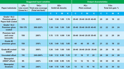
When people tell you their work matches an international standard, you have to ask which one. The reason you have to ask is because there are different standards for different line counts and different substrates. These standards are referred to as appearances. Table 1
illustrates examples of international print-appearance standards. Its numbers serve as proof that international-standard appearances create workflow environments that accept multiple color standards based on line count, substrate, and even the type of printing device—all of which lead to confusion about what a file should look like when it’s printed.
International standards groups that want to equalize different appearances typically subscribe to the thinking that a 150-line/in. graphic won’t match a 175-line/in. graphic in color, or that an 85-line/in. image won’t match the color in work printed at 65 lines/in. It’s true that colors won’t match in these cases when the file output is linearized for use with different line counts and on a variety of substrates. The higher line counts are susceptible to dot gain. The more gain, the darker the image appears. Low-quality paper also contributes to gain, as well as a reduction in solid density, and thus a different color.
Advertisement
I believe this is outdated thinking that recalls the days before color management began to correct these tonal values and solid overprints. Today, line count—and even the substrate—can be corrected to match very closely to a specific target. We don’t have to accept linear appearance. If the color of the solids are close, then they’ll match almost exactly. If the solids are different, they can still match in the 25%, 50%, 75% areas—the bulk of most images. So why do most of the standards organizations stay on the path of designating different appearances for different line counts and paper qualities?
The dark hole into which printers are pouring money is the ignorance of having different proofs for different presses and neglecting the fact that very close matches are possible when they use one target and one appearance for all print devices. The press can be calibrated to match the color target. This allows the output of different presses and different printing technologies to match.
GRACoL 7 success
GRACoL (Graphic Requirements for Applications of Commercial Offset Lithography) has worked diligently for several years now to create specifications for the sheet-fed offset industry. At the time of this writing there is a GRACoL 7 standard. But the multiple-appearance trap—believing different line counts and paper qualities required different appearance specifications—remains a challenge. Ignoring the fact that innovations in color management takes the focus away from line count has hindered the value of this new and better specification.
Advertisement
IDEAlliance, an organization that validates best practices in publishing and information technology, recently realized that it could abandon the specification of different appearances for different line counts in favor of an NPDC (neutral print-density curve) that would allow different line counts, papers, and print devices calibrated to it to appear very close in color. G7 was born. I believe it’s a huge step forward (Figure 1).
G7, which should not be confused with GRACoL 7, is an innovative calibration methodology developed to modernize and improve the latest versions of GRACoL and SWOP (Specifications for Web Offset Publications). IDEAlliance promotes the G7 method as a constant component of all future print specifications, and the group offers it openly for adoption by all standards associations for all types of imaging or media, worldwide. The main purpose of G7 is to simplify the calibration of any printing device, such as a prepress proofing system or a commercial press, to the IS0 12647-2 printing standard. The -2 at the end of the specification designates litho, but G7 can be applied to any type of printing technology that uses a CMYK color space, regardless of which inks are used or how the ink is put on paper. It even applies to digital output. Digital output desperately needs help with standards.
A common misunderstanding is that G7 is an official standard. G7 is not a standard. It’s a specification of a calibration methodology designed to attain the grayscale appearance implied in the ISO 12647-2 standard while bypassing the ambiguous and visually inconsistent TVI (dot gain) definitions in the current standard document that relates to different line counts and paper grades. G7 adjusts the device via typical CMYK RIP curves, or other device-calibration utilities, to match a pre-defined NPDC and gray balance. G7 assumes the use of ISO-standard inks, for which precise L*a*b* values are defined in ISO 12647-2, but even if a device were to use non-ISO inks (different hues), G7 calibration would give it the same natural grayscale appearance as all other G7 devices (Figure 2).
The secret sauce in the G7 method is that it delivers a constant appearance in terms of gray balance and neutral density— regardless of which colorants you use or how you apply them to the substrate—without the need for additional color management. When the dot gain is too high or too low, the calibration method just lowers or raises the gain to achieve a specific neutral tonal value, meaning the color of a file is accurately represented with no color cast. Solids that are too high are adjusted at the midtone. Solids that are too low are adjusted at the midtone. That way the appearance is neutralized in most of the image.
G7 is therefore the first calibration methodology to offer cross-media grayscale consistency, which means files are more easily and safely re-purposed from litho to flexo, litho to screen, digital to screen, etc. Even though G7 alone does not attempt to control color accuracy, the fact that it does control neutral gray tones without ICC profiles is a major step toward a universal standardized definition of printed appearance that can be applied to all imaging methods.
Hybrid curves
Hybrid curves offer another approach to matching color device to device by targeting midtone neutral absolute density values. Hybrid curves are very similar to what color-management software does in a relative rendering intent, except for chasing ink hues. The curves are created using absolute density values, as well as dot-gain values, to closely match an intended color target. Absolute density is used in the middle of the curve, and dot percentage is targeted in the highlights and shadows of the curve. Printers are using this technique in litho, flexo, screen, and digital. The closer the numbers are to matching the intended target, the closer the match.
But just like relative rendering intent in color management, when the substrate is dramatically different, we allow the tonal percentages below 25% to deviate from the target. We risk losing image detail when we try to completely correct this problem (Figure 3).
Dot-gain curves in highlights and extreme shadows and density curves in the quarter-tones, midtones, and shadows correct the color but won’t sacrifice detail of the image. G7 does the same thing, and it also creates a visual appearance of ISO 12647-2. Should the solid colors and substrate differ from the intended target appearance, the NPDC of G7 will ignore the highlights and solids and correct the balance of the image to produce a consistent color appearance. If your target’s solid densities and substrate are the same as your print, then dot-gain curves and hybrid curves will yield almost identical numbers. However, if the color of the ink and/or the substrate are dramatically different from the color target—possibly an international color standard—then there’s a big advantage in using both density and dot-percentage data combined to create a hybrid curve for the printing device. Doing so corrects the effects of colored substrates like styrene, corrugated plastic, gray cast vinyl, and foam boards. When we apply both sets of data, we adjust the color in the highlights and shadows for better detail with a dot-gain curve and adjust the quarter tones, mid-tones, and three-quarter tones for more accurate color with an absolute-density curve. Therefore, when we mix the two different methods of curving our tonal range, we can have great de-tail and more accurate color. We create a hybrid curve.
The concept of hybrid curves came as a result of testing I conducted a few years ago. I wanted to find a method that would deliver a higher level of color control for screen and digital printers who are challenged by the diverse, colored substrates that they use for producing large-format graphics. Among my discoveries was that changing ink density to hit specific color targets really drains productive press time in a major way. I also noticed that many of these press delays were caused by differences in substrate color. Therefore, there was a real need to move colors closer by using better compensation curves rather than just deal with solid density and dot-gain data. I acknowledged the need to combine dot-gain data with absolute-density data. The results were very successful. Combining the two distinctly different sets of data to formulate a better and more accurate curve for color matching works beautifully. This combination significantly improves color matching without the need to halt production and change ink densities on the printing device. Hybrid curves can help move color closer the first time and eliminate many color adjustments at press.
What's next?
I believe the progressive and closely color-calibrated companies in the litho industry will quickly accept the G7 specifications that simplify matches to the most common color appearance in the world: ISO 12647-2. Many companies in the screen-printing industry have already been using hybrid curves and, as a result, have been accomplishing the same goal, but without specifically targeting ISO 12647-2. Now is the time to seriously consider the value in bringing screen printers and digital printers to this same standard. To that end, SGIA recently formed a G7 Evaluation Task Force for this project at its annual Congress of Committees meeting. By moving on from the appearance trap of the outdated international standards that specify different dot gains and accept different color appearances for different line counts and paper grades, we can open up a new world of device-to-device matching.
You will soon see how G7, hybrid curves, and other methods improve the productivity and profitability of those who invest in this progressive thinking. Your ability to remain competitive may very well depend on your willingness to adopt these new practices in your own business.
Mike Ruff is chief technology officer of Nazdar Consulting Service, Shawnee, KS. During his more than 35 years in the graphic-arts industry, he has worked in the signmaking and screen-printing fields as both a manager and business owner. Ruff frequently lectures at trade shows, conducts training classes for the Screen Printing Technical Foundation, and authors articles for industry journals. He is a member of the Academy of Screen Printing Technology and is a Certified G7 Color Expert.


 Art, Ad, or Alchemy1 month ago
 Case Studies1 month ago
 Andy MacDougall1 month ago
 Columns2 weeks ago

 Marshall Atkinson2 weeks ago
 Thomas Trimingham2 months ago
 News & Trends1 month ago