Articles
Published
18 years agoon
Customers and retail buyers are always on the lookout for that something extra in a printed garment that will set it apart from the average shirt. Creative use of an underbase print is a great way to make your garment graphics stand out from the competition without a lot of extra work on your part. The underbase print typically serves to block the garment color from affecting the ink colors that will be printed on top of it, but experimenting with the underbase can uncover additional uses.
Customers and retail buyers are always on the lookout for that something extra in a printed garment that will set it apart from the average shirt. Creative use of an underbase print is a great way to make your garment graphics stand out from the competition without a lot of extra work on your part. The underbase print typically serves to block the garment color from affecting the ink colors that will be printed on top of it, but experimenting with the underbase can uncover additional uses. The goal with this process is to keep the underbase a simple embellishment that creates added value to a screen print without destroying the integrity of the original artwork.
This month, I’ll discuss an underbase modification that gives an extra boost to the art that is printed on top of it. In particular, I’ll talk about using an expanding underbase. You’ll be able to use the same artwork you might print in a conventional garment job, but, after curing, the modified underbase will expand upward in certain areas of the print to create an exciting, dimensional look.
Finding the right artwork
The first step in creating any special-effects print is designing or picking your art around the specific qualities that a particular special effect has. It’s essential to consider the effect’s limitations and advantages before you select the art; otherwise, you may have to completely redo the artwork to ensure that it’ll work properly and not look cheaply executed.
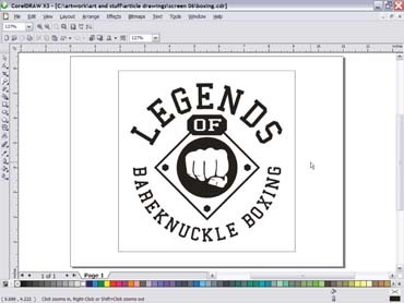
For instance, I received a boxing logo (Figure 1) that needed design adjustments to give it a higher perceived value. This artwork fit the mold for a design that would work with both an expanding and a distressed underbase. The artwork’s large, distinct areas of specific geometric shapes made it ideal for these processes.
If I had picked a design that was created with a lot of smaller pieces, or was less bold with its graphics, the special effects wouldn’t be as clear to the viewer. From a profit standpoint, it’s a good idea for a special effect to justify itself with added value through a visible increase in interest. Artwork should complement and highlight the special effect.
The expanding underbase
The concept of this special effect is to create an image with real dimension that invites the viewer to feel the surface of the garment and see the image pop off of the shirt in the right areas. This effect is achieved through the skillful use of modified ink that has a blowing agent added to the mix. A blowing agent is a compound that releases gas upon being heated. The gas that forms inside the heating ink causes the ink to expand upward in a domelike shape. Inks of this type are commonly referred to as puff inks, but I don’t recommend using standard puff ink out of the can for this process. You’ll achieve the best results when you mix a small amount of puff additive into an ink. Doing so allows you to control the amount of puff reaction.
I normally look at the manufacturer’s specs on the puff additive and add between 5-10% so the ink won’t puff too much. Another way to improve this process is to mix a stretch additive into the ink. The stretch additive gives the ink a smoother surface than regular puff ink will and maintains more detail of the halftones or line work that you print on top of the expanding underbase. I usually add 10-15% stretch to my ink for this method to help prevent loss of detail.
White is the most common color for an expanding underbase ink. In some cases, you may want to use a colored expanding ink to prevent the overprint from lightening too much. All puff-ink underbases will generally lighten overprinted colors to some degree. You can control the amount by managing the ink’s expansion and keeping the ink film’s surface smoother. The change you’ll see won’t necessarily a bad one. It’ll often give the print a really cool, slightly worn look that is very popular.
The downside comes when you print a bright red and don’t want it to turn pinkor when you try to match a Pantone color. When the puff underbase expands, it spreads out the pigments in the top layer of ink and tends to lighten that ink noticeably. In our red example, it’d be beneficial to use a red puff underneath for just the red areas, in addition to a white puff, to maintain the color purity of the top red hue (as long as you have enough flashes to do it).
Resist the temptation to just throw a puff ink under your print and start the press running. Wait until you’ve tested the ink and the process and have determined what the final results will be with the style of ink and art that you’re using. A good test file (Figure 2) consists of a variety of shapes in different sizes and distances from each other. Just print the file onto a scrap shirt to see how much it puffs up and how smooth the surface is. A rule of thumb when using puff inks as underbases is to not have large, solid areas and to break up the underprint as much as possible to prevent it from becoming too heavy, which could buckle the shirt fabric. A large, puffed area on a shirt also will often crack after several washes.
Redesigning the art for the process
I reviewed the test file and determined the best ink mix for the underbase and then proceeded to redesign the file to utilize this process in the best manner. The object of redesigning the file in Photoshop was to create a metallic look in the print that included lettering, bolts, fist, and borders that looked dimensional (Figure 3).
One of the things I discovered after using this process several times is that any large areas that you underbase with puff should have significant color variation to them. A large, flat area of color that has a puff underbase will show all of the imperfections of the puff underbase loud and clear. The best result comes from using a couple of graduated fills or overlapping colors that will help hide imperfections in the halftone dots. The little bubble holes and bumps blend into the halftone patterns and don’t show nearly as much.
You can experiment with a variety of specialty inks as well. Some metallic colors will work, while others won’t because of the expansion of the suspended particles in the inks. The ink may appear dull or mottled. I had particularly good results using gold and silver gel inks, probably because of the flexible gels in which the particles were suspended. For the boxing print example, I wanted the dimensional qualities of the final printed image to give the appearance that the graphic had been welded to the shirt.
Separating the artwork for the expanding underbase
I started to separate the file for printing by creating a normal underbase and then duplicating it. The next step was to look at the design carefully and decide where I wanted the special effect to puff up under the print to create the maximum visual and textural impact. I found a good way through trial and error to achieve a great look by using a two-color underbase.
I printed the first underbase with normal ink, printed the puffed areas using the special mix kiss-registered with the first print, and then flashed the whole thing. In some cases, when the first underprint (the non-puff ink) had a lot of halftones and graduations in it, I flashed before and after the puff inkas long as I had enough flash cycles available to finish the job.
The two underbase plates I created produced a controlled puff under parts of the print and left other areas to appear flat (Figure 4). The rest of the colors were separated conventionally as if for use in a conventional print. I used a 180-thread/in. mesh for the regular underbase and an 86-thread/in. mesh for the puff inks. I used a 230-thread/in. mesh for all of the top colors, except for the metallic silver, which I printed through a 110-thread/in. mesh.
Printing the image
The final printing order was light gray, puff white, flash, dark gray, metallic silver gel, flash, black, and highlight white. Flash dwell time is a crucial consideration that you must address at the printing stage. This effect would have failed on press and looked horrible had the flash cure caused the puff ink to expand on the press. Such a reaction would not have produced a smooth surface on which the following colors would sit. I set the flash cure to just gel the puff ink enough for other colors to be printed on top of it. The puffing process had to wait to occur until the shirt was running through the dryer.
You should include experiments with flash temperatures during the testing process. Make sure the flash isn’t too hot. I found it better to flash slower and print less per hour than wreck shirts. You won’t know the shirts are ruined until they exit the dryer. You’ll know something is wrong when the prints look rough and distorted. In this case, the ink puffed under the flash unit, which led to crooked and misregistered overprints with subsequent colors on the raised ink.
Curing time is the final issue to address. Puff underbases can take significantly longer in a dryer tunnel to fully activate because the top colors tend to block some of the heat and gas that the puff ink releases as it builds height. I found 45-60 sec in the dryer to be enough for a maximum puff effect on the print pictured in this article. Overcuring a print like this one would make it brittle, compromise its washfastness, or melt it back down and reduce some of its height.
Some other ideas for puff underbases
You can use this effect in any number of ways. Some examples I’ve seen include simulated welds (as in the example here), simulated beads, feathers, belt buckles (printed to look like they were on the shirt), snakeskin patterns, fish scales, topographical maps, portraits, cartoons, sports ball textures, and many more.
The best way to approach this printing method in your shop is to first test it with some ideas that you can confidently show people. Then you can sell it as an extra-cost option to recoup the added time you’ll spend setting up and to compensate for slower printing speeds that can otherwise eat into your profit margin. This effect usually enjoys a great customer response and can really be a best seller when someone runs a hand across the graphic, feels the image, and sees it jumping off of the shirt.


Subscribe

Magazine
Get the most important news
and business ideas from Screenprinting Magazine.
Most Popular
-

 Case Studies2 months ago
High-Density Inks Help Specialty Printing Take Center Stage
-

 Art, Ad, or Alchemy2 months ago
F&I Printing Is Everywhere!
-

 Andy MacDougall2 months ago
Functional and Industrial Printing is EVERYWHERE!
-

 Columns3 weeks ago
8 Marketing Mistakes Not to Make When Promoting Your Screen Printing Services Online
-

 Editor's Note3 weeks ago
Livin’ the High Life
-

 Marshall Atkinson3 weeks ago
How to Create a Winning Culture in Your Screen-Printing Business
-

 Thomas Trimingham2 months ago
“Magic” Marketing for Screen Printing Shops
-

 News & Trends2 months ago
What Are ZALPHAS and How Can You Serve Them in Your Print Business?