Articles
Published
24 years agoon
In any discussion of halftone screen printing, the subject of dot shape is bound to come up. And the conversation usually concerns the way halftone dot selection influences two unwanted side effects of printing: dot gain and moiré generation. The effect of dot shape on screen-printed halftones is frequently misunderstood, and many printers make downright incorrect assumptions about dot selection. This month, we’ll look at some of the misconceptions and provide guidelines for producing superior screen-printed halftones from digital artwork.
Conventional halftones (as opposed to FM or stochastic) are known collectively as “dot centered ordered array cluster patterns.” This means the dots are arranged in regular rows and that the dot in each halftone cell grows from the center outward. The line count or ruling of the halftone determines how large an individual cell will be. In the case of a 100 line/in. halftone, for example, one cell would be 1/100 x 1/100 in.
On digital imagesetters, a halftone cell is typically divided into a grid of 16 x 16 individual pixels. These individual pixels are “turned on” in a specific order to form a dot at a particular tonal percentage. The maximum number of tonal steps we can achieve with a 16 x 16 pixel cell is 162- 1, or 255. This equates to a tonal increase of approximately 0.38% for each step.
The impact of dot shape is most apparent in the midtone area. In the midtones, dot area grows to the point where the corners of adjacent dots join. This creates huge problems for our printing process. When the corners of the joining dots connect, they immediately bleed together, creating a condition we know as dot gain. The associated simultaneous corner growth is referred to as midtone jump. The geometry of the joining corners, combined with the high film thickness of screen-printing inks, contribute to how much midtone jump we experience.
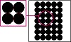
Round dots maintain their circular geometry throughout the tonal range. In midtone areas, all adjacent dots connect at tangents as shown in Figure 1. The angles formed between connecting dots at the tangent point are always acute (less than 90°). And because the angles are so tight, it is very easy to fill in the area between dots with ink. The round dot is the absolute worst choice for screen printing and can result in midtone jump that exceeds 15%.
Printers select round dots for two reasons. First, this dot is more resistant to moiré formation; its uniformity helps to minimize the effect of thread eclipsing. The second reason relates to the printing process used. On high-speed web- and sheet-fed offset presses, the dot distorts as the paper passes between the blanket and impression roller. Consequently, the round dot automatically tends toward an ellipse. And as we’ll soon discuss, this helps to minimize midtone jump. But in screen printing, a round dot remains round and provides no benefits to the printer.
To address the problems of the round dot, the square dot (Figure 2) was developed. In this type of halftone, the dot starts out round. But as the image darkens toward the midtones, the dot shape transitions from round to square with rounded corners, finally becoming a perfect square at the 50% tone. The four corners of the square now connect simultaneously at an improved 90° angle. But the possibility still exists that corners may fill in and lead to midtone jumps.
Square dots will spontaneously increase midtone values by 10-12% under ideal conditions. The jump will be greater if printing conditions are poor. Past the 50% value, the dot shape reverses itself, eventually becoming a negative round dot before finally becoming a solid tone.
Although square dots carry extremely sharp detail in the midtone region, they tend to be less moiré tolerant (mesh threads easily eclipse the narrow corners of the dot). Because all four corners connect simultaneously, any disruption of the connecting pattern is readily apparent to the human eye.
Still looking for a better solution for even tonal transition, two alternative dot shapes were designed. They are diamond (Figure 3) and elliptical and seek to address the geometry of the midtone join as well as shift the values at which dot corners connect. In these two de-signs, the halftone dot starts off round, transitions to diamond or ellipse, and then transitions back to round before becoming a solid value.changing the shape of the dot, it becomes possible to connect two ends of the dot at a lower tonal value (usually in the 40% range). The dot would continue to grow until corners on the opposing axis join in the 60% region. By controlling the aspect ratio of the dot, the corners can be joined at almost any percentage value.
Besides the huge advantage of connecting dot corners at different tonal values, these dots shapes also produce obtuse angles (greater than 90°) in the joined corners. This greater open angle is less prone to filling in as the printed ink spreads. The result is a reduction of the midtone jump to nearly zero.
However, as a dot narrows to a diamond or ellipse in the midtones, the chance of thread eclipsing increases. As a result, these two shapes are particularly susceptible to moiré. The narrow dot also creates a more visually objectionable delineation of the regular halftone pattern. This can be particularly distressing in large areas of uniform tonal values (e.g., an image depicting a blue sky) or slowly changing tonal value (e.g., fleshtones). Careful selection of the halftone angle set can help to minimize these visual disturbances.
Resolution vs. line count
The formation of regular halftone dot shapes is controlled by the resolution of the output device. To take advantage of all 255 tonal values possible, the minimum output resolution of the imagesetter must be 16 times the desired halftone line count. So, for a 50-line/in. halftone, the minimum required output resolution would be 800 dpi.
If imagesetter resolution isn’t ideal, the number of discrete tones it can produce is reduced. To determine how many tonal steps an output device can achieve, we divide its output resolution by the halftone line count, round down to the nearest whole number, square it. and subtract 1.
For example, if we’re using a 400-dpi imagesetter to produce 50 line/in. halftones, we can achieve 63 tonal steps between no coverage and solid coverage (400 ÷ 50 = 8, 82 – 1 = 63). Even though this represents only about 1/4 of the ideal range of 255 steps, the viewer may not notice. The minimum acceptable number of tonal values is determined based on ink, substrate, and viewing distance. The smoother the substrate and closer the viewing distance, the more tonal steps required.
While fewer tonal steps may still suffice, lower-resolution imagesetters can create other problems when they attempt to render complex angles and transition shapes between tonal steps. In many cases, the system will form a misshapen and irregular dot (Figure 4). Under magnification, the dots appear to have “nibs,” which can easily be blocked by mesh threads and create highly irregular and unpredictable moiré patterns. About the only solution is to use the finest possible screen-mesh thread diameter to minimize the interference.
Halftone dot design is a highly technical undertaking, requiring extensive knowledge of mathematics. The ability to engineer a specific dot shape or transition sequence involves knowing the imaging process and the method by which the halftone will be printed. It is possible that the ideal halftone dots for screen printing will be invented in the future. But until that day, we are limited to working with diamond or elliptical dots to minimize the tonal jump issues that have been with us since halftones were first used in screen printing.


Subscribe

Magazine
Get the most important news
and business ideas from Screenprinting Magazine.
Most Popular
-

 Art, Ad, or Alchemy1 month ago
F&I Printing Is Everywhere!
-

 Case Studies1 month ago
High-Density Inks Help Specialty Printing Take Center Stage
-

 Andy MacDougall1 month ago
Functional and Industrial Printing is EVERYWHERE!
-

 Columns2 weeks ago
8 Marketing Mistakes Not to Make When Promoting Your Screen Printing Services Online
-

 Editor's Note2 weeks ago
Livin’ the High Life
-

 Thomas Trimingham2 months ago
“Magic” Marketing for Screen Printing Shops
-

 Marshall Atkinson2 weeks ago
How to Create a Winning Culture in Your Screen-Printing Business
-

 News & Trends1 month ago
What Are ZALPHAS and How Can You Serve Them in Your Print Business?