The duotone image is a very popular look in movies and graphics. Blending a grayscale image with a second color creates a duotone—and a dramatic mood. A common example of this is the Old West photos that are sold at many vacation spots. The photos are shot in black and white and then filtered with a sepia color to appear brownish, like an old wanted poster. Duotone images are a real snap to create using Photoshop, and they can really give a classy appearance to a design when a full-color photo would look too distracting.
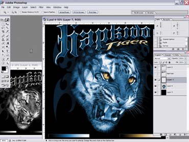
The duotone image is a very popular look in movies and graphics. Blending a grayscale image with a second color creates a duotone—and a dramatic mood. A common example of this is the Old West photos that are sold at many vacation spots. The photos are shot in black and white and then filtered with a sepia color to appear brownish, like an old wanted poster. Duotone images are a real snap to create using Photoshop, and they can really give a classy appearance to a design when a full-color photo would look too distracting. The real difficulty is in separating duotones for screen printing. The computer may only use a couple of colors to create duotone separations, so you may be tempted to think that you can use just one or two colors to do the same on press. In reality, you’ll likely have to use at least three colors to achieve a quality reproduction that will be printer-friendly. Four to six colors may be necessary on dark garments. The fundamentals of working with duotones include creating a simple duotone from a grayscale image, prepping the image, and separating the duotone into Photoshop channels. You can devise some reliable shortcuts for duotone separations, and if you do a lot of this style of artwork in certain color palettes, you can entirely streamline the creation and separation process if you are willing to spend the time to practice with it. Creating a simple duotone Creating a duotone look is easier than other methods of coloring and rendering images. If you have an image that is in grayscale mode or just desaturated in RGB mode, you can use several different techniques to quickly create a duotone image. The obvious way is to change the color mode from grayscale into duotone using the >Image>Mode>Duotone command. Another method is to use the Hue/Saturation menu and the Colorize button at the bottom of the dialog box. I prefer this option because it allows me to adjust the color hue and appearance (brightness and saturation) of just a selection without changing the color mode of the whole image. This is especially useful if you want to adjust only parts of an image and leave other areas unadjusted or combine several different duotones in one design. I created the tiger in Figure 1 by using selections that were converted into duotones by selecting those areas and then adjusting the color hue using the Colorize option in the Hue/Saturation dialog box. I took the grayscale image and created some tonal-range bars at the bottom (this will aid in separation). I then selected the word “hapkido” and the larger portion of the tiger with the Lasso tool and used the Colorize command on these areas with a hue of 210 and a saturation of 30. Next, I inverted the selection and colorized the eyes of the tiger and the word tiger using a hue of 43 and a saturation of 35. I made sure to include my tonal-range bars on the bottom of the design with each selection so I’d have a reference tool for the separation of the design. Prepping the image Preparing a duotone image for quick separation isn’t really different than readying an ordinary image; however, you want to make careful note of areas in the image that are really subtle and may require editing later. Examples include deep shadows and delicate highlight details. I prepared the tiger image by making sure that all active design elements were on their own layers and that the tonal bars were included in the layers that had the corresponding color hue. The image was set to actual printing size, 14 x 14 in., with 300 dpi as the resolution. Separating the design for screen printing A printer-friendly duotone image is one that uses opaque colors on press. While, in theory, you could produce a print with a transparent ink on an underbase, this approach would likely give you only a couple of good prints before the dot gain would flood out all of the highlight and shadow details. For this reason, it is best to use three opaque colors on top of the underbase to achieve a duotone simulation on press. The underbase for this graphic was fairly simple to create because it was made for black garments. I used a duplicate of the original image, inverted it, and then adjusted the image slightly with a curve to make the black areas solid and choke the highlight areas so they wouldn’t show around the colors (Figure 2). The best way that I have found to pull colors effectively from an image that is adjusted into a duotone is to duplicate the file and create the separations using grayscale files that are adjusted to trap sections of the information into separate channels. I start the process by focusing in on the bottom tonal-range bars that were created with the image. These bars are a good example of the tonal range and color saturation of the duotone. They come in handy now that I want to separate because I can pick the 50% color (by selecting the center of the tonal-range bar with the eyedropper), which is typically the strongest saturated color in a duotone. I can also pick the 75% and 15% colors, which should give me a good spread on how the colors will properly overlap on top of the underbase. I saved these colors by creating blank alpha channels that hold the same colors that I selected from the tonal bars. I just double clicked on the channel and then input the color values into the Channel Color box. Creating these Channel Color separations from a grayscale version of the image is the tricky part. The easiest way I have found to do this is to convert the image to grayscale and then use the Color Range tool on the grayscale image in the 50, 75, and 20% areas. I know that a lot of high-end separators frown on the Color Range tool but it does work surprisingly well on grayscale images—probably because there’s just a lot less information from which to pick. The goal is to get a good range of color above and below the selection that really looks smooth. If the selection that is created from the Color Range tool is too choppy or has fuzzy edges, it may be better to use a different method. I used a color-range selection from the 50% area on the tonal bar at 120 fuzziness to create a channel for my saturated blue color (Figure 3). The light blue and the navy blue colors were extracted using the same method and saved in their own corresponding channels. The smaller size of the tonal ranges in the yellow/gold colors allowed me to use just two selections when I separated those colors from the image and saved them into alpha channels. The final step when I set up these separations was to place a black channel in front of the other channels (to emulate the shirt’s color) and then place the rest of the channels in order so that I could apply any final curves to adjust clunky color transitions once I viewed them in the proper print sequence (Figure 4). The approach to creating duo-tone separations is quick and effective. And the results it provides are dramatic enough that even beginners will be wowed when they see the finished prints on garments.


 Expert Perspectives2 months ago
 Women in Screen Printing1 month ago
 Shop Management2 months ago
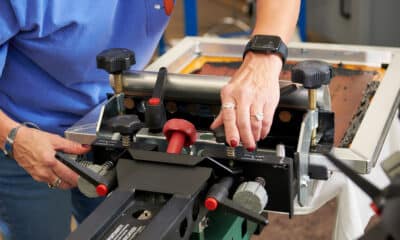
 Case Studies2 weeks ago
 Women in Screen Printing1 month ago
 Kevin Baumgart2 months ago
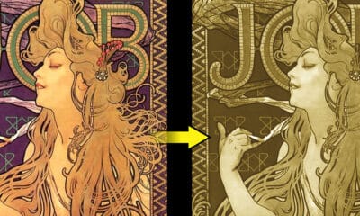
 Thomas Trimingham4 weeks ago
 Marshall Atkinson1 month ago