Articles
Published
19 years agoon
The more separation issues you can deal with on the computer, the less you will have to address when it’s time to print T-shirts. For most screen-printing shops, artwork changes with almost every job. And if you produce a lot of custom artwork, you will find yourself in a constant fight with dot gain. Dot gain is the amount that a halftone dot will increase in size during a printing run. All printing of halftone dots creates this spread to some degree; the challenge is to control and manage it to reduce the amount of unpredictable shifts in the finished imprints.
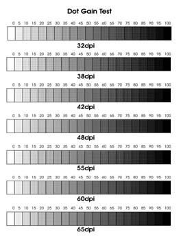
The more separation issues you can deal with on the computer, the less you will have to address when it’s time to print T-shirts. For most screen-printing shops, artwork changes with almost every job. And if you produce a lot of custom artwork, you will find yourself in a constant fight with dot gain. Dot gain is the amount that a halftone dot will increase in size during a printing run. All printing of halftone dots creates this spread to some degree; the challenge is to control and manage it to reduce the amount of unpredictable shifts in the finished imprints. Garment screen printing tends to produce more dot gain than graphics screen printing. The primary cause is the garment’s uneven printing surface. When a halftone pattern is printed onto a woven surface, some of the dots may not make good contact with the fabric, and the ink will remain in the screen. When the next several prints are made, these dots will stack up with new ones and begin to spread out as more ink is pushed through the screen. In addition to the printing variables that contribute to dot gain, numerous artistic issues can affect the process as well. Within a set of separations, it’s very common for some colors to show more dot gain than others. This is often blamed on ink variables, but you can deal with the situation when you create the separations. If your artwork changes with almost every job, you will need to have flexible methods for estimating and controlling dot gain, with checks and balances in several departments. The best way I have found to manage dot gain in a screen-printing environment is to first isolate and control the production variables, then run some print tests to determine when and where dot gain occurs so that your artists can compensate for the gain in the artwork itself. I am not a big fan of having a standard percentage for dot gain that is applied to all custom graphics. You will find this option in the print dialog of many software applications. This is where you will select the “print” menu, and under the separations tab you have a “dot gain” selection that will allow you to choose a percentage by which dot sizes will automatically be reduced when the separations are RIPed for output. This automatic compensation, however, doesn’t often work well with custom designs for garments. Such a standardized approach is only useful if the printing surface, the graphics, and separation method are all very similar from one job to the next. With simulated-process separations in Photoshop, the amount that you adjust for dot gain should change depending on the image and what it is being printed onto. There is an added benefit to estimating the dot gain on a color-to-color basis inside of Photoshop before you print out the separations–it allows you to extract only the necessary amount of value from the separations in specific areas. If you use an output RIP or software to uniformly extract a set percentage from the image, the image will be affected on all colors in all areas. By putting in the time to experiment and test, you can get to the point where you will be able to standardize and predict your dot gain on most designs (although there may still be occasions when you want to manually identify compensation values, such as when you print simulated process). Mastering production variables The variable that impacts dot gain in production the most is off-contact. If you can control and standardize your off-contact distance to the minimal level necessary for proper ink release, then you will be able to master dot gain. So what does it take to achieve standardized control over off-contact? You must have consistent screen tension, screen leveling, press alignment, press leveling, print pressure (minimum required), flood pressure, and enough experience to adjust for different garment types and printing speeds. Mastering these principles will give you the ability to properly estimate dot gain, and you can then isolate the artistic variables from the print variables. Once you have the production elements under control, you’re ready to start testing so that you can build a profile of gain characteristics for the art department. Begin by creating a series of 20-step grayscale patterns in several halftone line counts. Generate a film positive of this test sheet (Figure 1), then use it to create a screen stencil following the same screenmaking techniques you plan to use in production. When the screen is complete, use it to produce sample prints of the grayscale pattern. To achieve the broadest understanding of dot-gain tendencies, you should run test prints with inks in several different colors (white, black, and a few primary colors) and viscosity ranges. When you print the grayscale test, don’t forget to use proper printing speed, and aim for the best quality possible. You’ll then be able to use the test results as a reliable standard for all your prints. Keep in mind that this test will only give you results as good as your best efforts in screen creation, press setup, squeegee selection (pick a good one with a good edge on it), and careful printing. Whenever you test anything for production, you should treat it like you are running a crucial job for your most demanding customer. On several occasions, I’ve watched printers use sloppy methods and their worst screens because it was only a test. The quickest way to a higher standard in printing is to raise the quality on all of the little tasks that combine to form the final process. So use your best equipment and methods! Now it’s time to evaluate the test results. Compare the original film positive used to produce the test screen or a computer printout of the test pattern with your test print (or with your first and last test prints if you did a volume run of the test). When comparing these items under identical lighting, you should be able to see where the gray values match up and where they don’t (Figure 2). Look at the 10-90% tonal areas, compare them with the same areas on the computer printout, and determine what shift in tonal value you’re seeing. For example, do the 10% dots look more like a 20% or 30%? You can also look for tendencies in dot gain where there may be more apparent dot gain in the midtones and shadows than in the highlights. This can be an indication of other factors influencing your final print, such as too much ink flow (the need for a higher mesh count), poor screen tension, and so on. The ideal situation is to have even dot gain in most areas. When you do, the final print in your test run is likely to appear more stabilized than some of the earlier prints you generated. This is a good indicator that your printing variables are correctly balanced. Dialing in the art side of dot gain The results of the test will serve more as a visual guide for adjusting dot gain than a numerical solution. I use tests of this type to visually determine how much a value will shift due to dot gain. You could use a densitometer to numerically determine dot area and compare printed items to your film positives. However, this is not a common piece of equipment in garment shops (even though more should own them). The alternative for evaluating the test results with a densitometer is to visually match highlight, midtone, and shadow dot areas on the film positive/ computer printout with the dot areas on your prints, then visually adjust your separations to compensate for the dot gain that is likely to occur. The way to visually adjust dot gain in Photoshop depends on your separation method. Probably the easiest way to adjust separations in Photoshop is to load each separation selection into an individual alpha channel with the layer options tuned to echo each ink color (Figure 3). You then can view the channels and overlay them onto each other to see how they will interact. This doesn’t give you a true example of the final print, because of the opacity and the interplay of the hue shifts that may occur, but it can come close enough to catch any major problems. After you load a separation set into channels, you can adjust and view the dot gain that is likely to occur by opening each channel and then using the curves menu (>Image>Adjust>Curves). Here you want to push the midtone of the curve diagonally towards the black point of the menu. This will cause the image to get darker and quickly lose tonal range as the values start to flatten and lose division between levels of brightness). The things to watch for here are a visible change in tonal value that approximates what you see in your test prints and the effect that this tonal shift has on your image’s clarity. I adjusted an example to show the extreme level of dot gain that may occur by pushing the curve menu too far, and then I overcompensated for dot gain by lightening the value of the underbase too much to show how the image can be damaged (Figure 4). The lessons that you learn from these curves adjustments should affirm the results you saw on your test prints. You can expect value increases throughout your separation set that are similar to what you saw with your test file. If you desire an even higher level of precision in determining levels of likely dot gain, you can record the input and output levels of the adjustment curve after you adjust your original test file to echo the printed sample as closely as possible. Then you could save this curve adjustment in the curves menu and load it when you wish to adjust a separation channel that has the same halftone line count, uses the same ink, and will be printed on the same garment type as the test sample. This method should provide you with a very predicable adjustment tool for standard dot gain using a controlled set of variables. Choices of output resolution and mesh count are variables that can dramatically affect dot gain. The artist should make these decisions (instead of the production staff) in order to have complete control over how much ink goes into each color. The output decision is the control over the frequency, and therefore size, of the printed dot. Relatively small adjustments in dot-gain size can make a huge difference. If an artist picks a 42-line/in. halftone instead of a 55-line/in. halftone, it may seem like a small difference in the number of dots, but it represents literally thousands of dots in relatively small halftoned area. Do more dots mean more detail? Not always. There is a struggle between the loss of tonal range at higher resolution and the retention of detail. At 65 lines/in. or above, there is commonly a loss of tonal range that may make any additional detail retention irrelevant if a printer has normal levels of dot gain. Most garment printers achieve the best results with halftones in the 40- to 55-line/in. range. The artist needs to experience the cause and effect of dot gain to properly pick mesh counts for halftone artwork. This is a function of practice and thoughtful observation of previously printed pieces. Mesh selection can make or break a design, because it will dictate how much ink is picked up on successive screens and also how much ink is there in the first place to spread. If you think about a halftone dot pattern printed from a worms-eye, magnified view, you will see a group of pillars that compromise the dots of ink. The mesh selection supports the thickness of the emulsion, which thereby dictates the height of these pillars of ink. The taller the pillars of ink, the more they’ll distort when you apply pressure to their tops. Selecting a mesh count that is high enough, but not too high, is critical for controlling dot gain. If the mesh count is too high, you will have a dull printed image, and you may even have difficulty getting opacity over a colored garment. The right mesh count will cover a printed area with a stable ink deposit that is bright, vibrant, and consistent. For detailed halftone prints, the mesh count can vary between 180-230 threads/in. for an underbase color, and up to 180-355 threads/in. for overprinted colors. Setting your sights on dot gain The visual method of adjusting artwork for dot gain can be effective when it’s used with knowledge and experience. There is always the possibility of some unforeseen variables skewing the results, but just remember to record and isolate any unexpected results and you will profit from these problems as well. Estimating dot gain in Photoshop will save significant time and head off potential disasters on press if it is carefully done. Rather than fear dot gain and the problems it represents, it is time that we take charge of the issue by evaluating the results of print production and then implementing a system in prepress to compensate.


Subscribe

Magazine
Get the most important news
and business ideas from Screenprinting Magazine.
Most Popular
-

 Case Studies2 months ago
High-Density Inks Help Specialty Printing Take Center Stage
-

 Art, Ad, or Alchemy2 months ago
F&I Printing Is Everywhere!
-

 Andy MacDougall2 months ago
Functional and Industrial Printing is EVERYWHERE!
-

 Columns3 weeks ago
8 Marketing Mistakes Not to Make When Promoting Your Screen Printing Services Online
-

 Editor's Note2 weeks ago
Livin’ the High Life
-

 Marshall Atkinson2 weeks ago
How to Create a Winning Culture in Your Screen-Printing Business
-

 Thomas Trimingham2 months ago
“Magic” Marketing for Screen Printing Shops
-

 News & Trends2 months ago
What Are ZALPHAS and How Can You Serve Them in Your Print Business?