Expert Perspectives
Published
15 years agoon
Taking something that is real and then hiding some of it or causing the viewer to question what is not seen is a powerful way to create interest and excitement visually. That’s one reason why some of the most dramatic and popular artwork is surrealistic or gothic in style. In surrealism the world is distorted to question the space, time, and reality of the environment. With gothic artwork the shadows become an active part of the design and there is a strong play between what is seen and what is hinted or imagined.
Taking something that is real and then hiding some of it or causing the viewer to question what is not seen is a powerful way to create interest and excitement visually. That’s one reason why some of the most dramatic and popular artwork is surrealistic or gothic in style. In surrealism the world is distorted to question the space, time, and reality of the environment. With gothic artwork the shadows become an active part of the design and there is a strong play between what is seen and what is hinted or imagined.
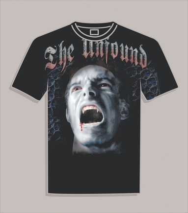
You can use these concepts in several ways to create drama on dark shirts, but a lot of the success of these ideas relates to how you separate the artwork. Creating elements that seem to form slowly out of the shadows in the fabric itself is a common tool that artists use to create the sensation that there is more there than meets the eye. Mystery and form combine to develop interest above a normal shirt and can create something that everyone will talk about (Figure 1).
Developing a method that separates artwork for dark shirts with a lot of shadow drama requires a clear approach that is practiced from the ground up. Without some of the base testing and understanding of the production process, the separations will never have a high percentage of success. The key is to utilize the known properties of the inks and how they sit on the shirt with their inherent qualities and then adapt to the inks as necessary, or agree to change them if they won’t work. A functional method that has a high percentage of success is to start with some simple tests and then separate the design using your knowledge of the fall-off points to create depth and shadowy details. Once the you determine fall-off points for the ink, you can make a separation map to quickly create an image that will have the maximum illusion in the minimum amount of time.
Why spend the extra time?
One of the things that separates an average printer from one who wants to reach the next level is the good enough equation, when the printer may look at an art reproduction and decide that, even though it isn’t perfect, it is good enough to be accepted and not rejected. The difference is that the printers who want to grow beyond the basics are the ones who are willing to document and test their processes so they achieve more control and consistency with difficult printing tasks.
“But these are only T-shirts,” some printers say. “Why spend the extra time and redo the screens?” The reality is that the retail buyer and consumer may not know why they pick one shirt to buy over another, but it is a known marketing trend that customers pick shirts that make them say wow at a rate of ten times to one for every shirt that is simply good enough. The extra time and effort are often intangible values, but the potential that they add up to can be amazing with word of mouth and development of new business factored in.
Determining the ink-fall-off point
General-purpose plastisol ink has a certain opacity and viscosity that affects how it covers a dark shirt without an underbase print. This property is very difficult to guess without testing how the ink will perform in a certain separation set. Artists commonly produce a set of separations based solely on their experience and make an educated guess as to how much of an underbase is needed and when the ink will start to change color depending on the percentage of underbase beneath it. Unfortunately, this method requires a high percentage of press downtime and film/screen reshoots. The entire job must often be torn down when the underbase shows in areas where it shouldn’t and when the fix requires more of the top colors to compensate. The best way is to print an art reference of your inks so that you don’t have to guess. Then the artist will be able to quickly see what color will result with a given percentage of top color (Figure 2).
The ink-fall-off point is a specific percentage of underbase where the overprinted ink changes hue from its main color. It may not be an obvious spot and may encompass a range of values, but this range is where an artist can create some very interesting effects by using a color that barely appears on a dark shirt to develop drama in the shadows.
Another equally critical element in this process of testing the underbase and top color overprint is to determine at what percentage the underbase color still shows through the top color’s halftone. This issue is a common cause of on-press failures and shirt rejections from clients. The last thing a printer wants is for the underbase to show where it shouldn’t.
Using a simple gradient overlay is a quick way to determine the fall-off point for the inkset in use (Figure 3). Test several of the inks in a set to make sure the properties are consistent from ink to ink. Don’t assume that the red has the same opacity as the blue, only to find out on press that it doesn’t even show up on the black shirt and, as a result, you have to remake two screens in a mad rush.
Once you determine and record the fall-off points, you can quickly prepare art without a lot of worry about how it will reproduce on press. One key is to make sure that the final screens, films, mesh, and inks share all the same values with the test. Things like screen tension and mesh count can make a big difference in the amount of ink that is laid onto the shirt and how opaque the colors appear.
Separating art for underbase fall-off and deep shadows
The curve-based separation in Photoshop is my favorite for capturing this style of separation and reproducing the best results on dark shirts. The colors in this style of separation are isolated using a variety of methods (Image>Mode>Color Range/Index Split/Calculations/etc.) and then editing them by using the Curves Palette dialog so that the density of the color will perform in concert with the testing performed. The ideal situation is for the final file to have the same values in underbase and overprint color as in the test file while using all of the same variables. If this is the case, chances are good that you won’t need to make adjustments on press.
The example shown in Figure 4 shows how this works in an image-separation set. The color that’s separated is captured first using an Image>Mode separation. This means that a duplicate of the image is split into CMYK using maximum black GCR in a custom setting to force all of the other colors into the CMY channels. These channels can then be used in whole or in part as separations when combined into the original design’s alpha channels that were built.
The next step is to apply the Curves menu to the selected area to boost the blacks and create a clear value range that will echo the necessary colors as in the fall-off test. Pay special attention to the image areas that’ll have very little or no underbase yet still need to show up slightly on the shirt (Figure 5). These areas can literally make or break the over-all design and either create the wow fac-tor or make people walk on by.
The role of the underbase
A big challenge to dark shirt printing is in getting the top colors bright enough while still maintaining some subtle effects in the shadows (Figure 6). The brighter the top colors are, the more opaque they tend to be and the less they will change as they fall off of the underbase. In an effort to create the best of both worlds, you can make some choices that improve the brightness of the most intense areas while maintaining the integrity of the murky shadows without flattening everything and losing the appeal. To define the choices, ask these questions:
Will a color other than white work as an underbase? With dark shirts, white isn’t always right—especially when the overall image has a color cast (as in an old west photo or one of those night shots with an infrared camera). In cases like these, the use of an opaque color instead of white as an underbase can be very effective. A large run with a bigger investment would benefit from a test run to see how this option would make top colors shift in hue. I have used cream, gray, and cool or warm gray as underbase alternatives. One Halloween shirt came out amazingly well using a lavender underbase for the spooky trees and haunted house.
Will this design only go on black? If the separation set needs to work on other garment colors then, you’ll need to use a very opaque underbase. White is typically the best choice. You’ll have to make additional allowance for the separations to work in a black separation if needed.
If I use a gray underbase, will the design work with a highlight white or will a composite underbase be needed? Some designs just need a little more care than others. An image that has an extreme value range with a lot of highlights and an equal amount of shadowy details benefits from a gray-flash-white-flash underbase sequence to create an underbase with a complete value range that can provide a more significant gamma boost to hot colors and not kill all of the shadows. The downside of this scenario is the tendency for this to push the print into three flashes on press. A lot of printers won’t consider a job with three flashes unless it’s a manual job or a small revolver run on a press that can cycle around.
Can I reduce the top colors slightly to minimize tack without killing opacity? One of the biggest issues with printing a lot of colors on black shirts is that the inks for the top colors pick up on the backs of the screens, which leads to dot-gain shift after several dozen shirts. A great way to avoid this is to add some dulling agents and viscosity reducers to the inks to make them less sticky. The key is to keep the maximum brightness and opacity while slightly adjusting the inks to help them stabilize on press so that more flashes aren’t needed.
Take time to test
Greater detail in the shadows of your prints is available if you take the time to test your ink set and see where the fall-off point is with your inks. Using this tool as a guide can help to reduce colors in designs, create more drama on dark shirts, and give artists some clearly defined variables to create the best separations possible. The result will be prints that really knock customers over and boost your dark-garment sales.
Thomas Trimingham has worked in the screen-printing industry for more than 15 years as an artist, art director, industry consultant, and head of R&D for some of the nation’s largest screen printers. He is an award-winning illustrator, designer, and author of more than 45 articles on graphics for screen printing. Trimigham can be reached through is Website, www.art2screen.com.


Subscribe

Magazine
Get the most important news
and business ideas from Screenprinting Magazine.
Most Popular
-

 Art, Ad, or Alchemy1 month ago
F&I Printing Is Everywhere!
-

 Case Studies1 month ago
High-Density Inks Help Specialty Printing Take Center Stage
-

 Andy MacDougall1 month ago
Functional and Industrial Printing is EVERYWHERE!
-

 Columns2 weeks ago
8 Marketing Mistakes Not to Make When Promoting Your Screen Printing Services Online
-

 Editor's Note2 weeks ago
Livin’ the High Life
-

 Thomas Trimingham2 months ago
“Magic” Marketing for Screen Printing Shops
-

 Marshall Atkinson2 weeks ago
How to Create a Winning Culture in Your Screen-Printing Business
-

 News & Trends1 month ago
What Are ZALPHAS and How Can You Serve Them in Your Print Business?