Prepress & Screen Making
Published
18 years agoon
The limitations of traditional four-color process are well known to graphics and garment screen printers. A big one that comes to mind is the restricted ability to reproduce strong reds, blues, violets, purples, and greens. The most common solution most screen printers try is to add a bump or touch plate as a fifth or sixth color in an attempt to expand the color gamut in a specific region. This is exactly the approach employed when using Pantone Hexachrome, which adds orange and green to the process.
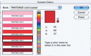
The limitations of traditional four-color process are well known to graphics and garment screen printers. A big one that comes to mind is the restricted ability to reproduce strong reds, blues, violets, purples, and greens. The most common solution most screen printers try is to add a bump or touch plate as a fifth or sixth color in an attempt to expand the color gamut in a specific region. This is exactly the approach employed when using Pantone Hexachrome, which adds orange and green to the process. Poor reproduction of saturated secondary colors is the direct result of using primary magenta and cyan pigments. These are far from the ideal theoretical magenta and cyan color positions. With the advent of digital color-management systems based on an IT8 target, correction due to pigment deficiency has been improved somewhat. Nevertheless, the fundamental contamination within these two pigments makes it impossible to easily achieve a wide range of common colors we see in our normal environment. Hue shift Pigment contamination comes in two forms. The first is hue shift, which occurs when the pigment value has moved away from the ideal mathematical position of the color. Rhodamine red and rubine red are the two most common primary pigment choices for the magenta position. Both are hue shifted toward yellow. Rhodamine appears to be slightly pinker (redder) than rubine red, but this is not the case. It is a more saturated (pure) color, but it lacks density (strength). As color density increases, the color appears to shift toward the blue side. Since rubine reds have higher density, they exhibit this distinct blue shift when compared to rhodamine red. The amount of color shift from the target magenta value can range between 38-74%, depending on the ink density printed. The lower the ink density, the more dramatic the yellow shift. This explains why it is impossible to achieve a very strong red, violet, or purple using these available pigments. The addition of yellow means the secondary red (magenta + yellow) is shifted toward orange and away from pure red. The violets and purples appear desaturated, and they generally lack purity. This is the result of the gray that develops from the addition of the yellow complement in the magenta. The most common cyan pigment is phthalocyanine (phthalo blue), which is derived from copper sulfate. This highly transparent pigment also suffers from a significant yellow shift. Depending on the ink density, the shift ranges between 18-24%. When this amount of yellow is added to the yellow in the magenta, it becomes virtually impossible to obtain shades of violet or purple with any degree of saturation. Grayness Grayness is the second type of contamination. It occurs when a pigment contains significant amounts of both primary colors. In the case of cyan, there is almost as much magenta contamination as there is yellow. When two contaminants are present, they form the complementary color to the primary. For cyan, the complement is red, which is formed by the mixing of yellow and magenta in the subtractive color model (CMY). In the case of cyan, the amount of grayness ranges between 18-24%, depending on printed density. The grayness component desaturates, or grays, any color being reproduced. This is another reason the aqua blues, teals, purples, and violets fail to reproduce very well. Grayness in magenta isn’t as great an issue. Magentas made with rhodamine red typically have a grayness value of about 9%. Rubine-based magentas can have as much as 15% grayness. The grayness tends to darken reds; consequently, it is not as noticeable or objectionable as the problems we see in the aqua blues, teals, purples, and violets. What’s the solution? So what are our options for overcoming these limitations? Image files with problem areas are typically corrected in Adobe Photoshop. Several approaches work. The most common is Color Range. Found under the Select menu item, targeted colors are selected and adjusted using the Fuzziness slider. This expands or contracts the targeted color into a section that can be added to another channel and printed as a fifth color. Further, the production artist has the choice of eliminating the undercolor from the CMYK channels or printing the fifth color on top of the resulting color generated by the pigments in use. The best alternative is to use Color Range. However, the problem with this method is that we’re left without an accurate way to determine whether the color being used as the fifth color is the right color for replacement. To overcome this problem and position ourselves for a perfectly accurate reproduction, we must trick the separation process by altering the Color Settings. Expanding the gamut Photoshop, like most color-separation programs, uses color-look-up tables (cluts) to transform RGB color spaces to CMYK. In order to achieve this, it’s necessary to tell the program the primary color values of our C, M, Y, and K pigments, as well as the color values of the resulting secondary colors of C+M (blue), M+Y (red), and C+Y (green). These values are obtained by taking colorimeter or spectrophotometer readings of the printing inks’ values. Photoshop allows for direct input of L*a*b* colorimetric values or XYZ spectrophotometric values. These values reflect the actual red, green, and blue values obtained by overprinting. They also reflect the grayness and hue-error contamination that limits the possible gamut. To expand the gamut, we can force the gamut outward by changing the values. The goal is to essentially add a fourth, fifth, or even sixth primary color to the look-up table. When we change the value, we essentially cancel the amount of contamination with the knowledge that we’ll be adding color(s) to the printing process. This is what expanded-gamut printing is all about. The process of achieving an expanded gamut is really quite simple when you understand how the program works. Let’s use an example where we add two additional bump plates to the process. For illustration purposes, we will be adding a Pantone 186 (Figure 1), which is a blue-shade red, and Pantone 2728 (Figure 2), which is a neutral blue. These colors both have very high saturation levels (92% and 100%, respectively), meaning they have little or no grayness contamination. The addition of the 186 will allow us to obtain intensely saturated reds. The addition of the 2728 will allow us to obtain the violets and purples we desire. In both cases, the addition of these colors reduces the amount of the cyan and magenta components that would normally occur in the resulting secondary colors. To achieve the desired results, it’s necessary to tell Photoshop what it should expect to see. Instead of printing the overprint colors, we will replace them with the known values for the Pantone 186 and 2728. In other words, we are telling Photoshop that when magenta and cyan are mixed, the resulting color will be 2728, and when yellow and magenta are printed in 100% values on top of each other, Pantone 186 will result. We begin the process by obtaining the L*a*b* values for 186 and 2728. This is done in the Photoshop Color Picker. Click on the foreground color in the tool pallet. This brings up the Color Picker. Click on Custom to bring up the Pantone color pallet, and enter 206 to make the chip for Pantone 186 appear. In the sRGB working color space, the L*a*b* value displayed is 45, 69, 37. For 2728 the values are 33, 20, -69. These are the values we will force into the look-up algorithm. To establish the new values, go to Color Settings. This is located in different places, depending on which version of Photoshop and what platform you use. Regardless, the settings are the same. The path is: >Color Set-tings>CMYK Working Space>Custom CMYK>Ink Colors Custom (Figure 3). This brings up the Ink Colors Look Up Table where you will enter the L*a*b* values for Pantone 186 and 2728. You will name this setting something that represents the addition of the two added colors (e.g., CMYK+RB). Now, when you convert an RGB image to CMYK under the >Image>Mode>CMYK menu, Photoshop will build a color gamut with the resulting reds and blues based on the established values of Pantone 186 and 2728. But our job is not done yet. This is still a CMYK separation with no added colors. To build the touch plate or spot channels, we will use the >Select>Color Range command. Sample a pure red and adjust the selection as desired. Save the selection to a new channel. You now have the choice of knocking out the undercolors in the CMYK channels or overprinting the 186 red on top of the CMYK. I normally knock out the undercolor. By selecting the red, you are selecting a red based on Pantone 186 in the look-up table. The resulting selection has better integration with the existing CMYK separation than would normally be possible. The new spot color will flow smoothly into the existing areas, and the adjacent related colors will also benefit. The resulting appearance is much improved and more natural. You will repeat the process for the 2728 channel and see the same improved results. One thing to be careful of is to keep the Fuzziness values lower than you might normally select. Since you chose new colors with much higher saturation and less hue shift, using a high Fuzziness value can cause the final separation to look oversaturated and artificial. Proofing the resulting image also can be a problem. The multichannel separation will reflect the rendering of the final separation using Photoshop’s display technology. This can sometimes be a problem. If you have a wide-gamut (six colors or more) inkjet for digital proofing, it may be possible to capture the increased gamut of the final separation. However, since these devices are usually CMYK+LcLm or similar, you still have the deal with the primary CMYK gamut. Proofing wide-gamut separations is a subject for another column. At the moment, just be aware that what you see on the monitor may be quite different from the final printed result or the inkjet separation. The final press print is usually quite close to the monitor (if it has been accurately calibrated) if the ink values you actually print with are close to the ink values you entered into the look-up table. Even if the results are different, the final product will be vastly better than if you had used another method of selecting and replacing bump plates or touch colors. © 2005 Mark Coudray. Republication of this material in whole or in part, electronically or in print, without the permission of the author is forbidden.


Subscribe

Magazine
Get the most important news
and business ideas from Screenprinting Magazine.
Most Popular
-

 Case Studies2 months ago
High-Density Inks Help Specialty Printing Take Center Stage
-

 Art, Ad, or Alchemy2 months ago
F&I Printing Is Everywhere!
-

 Andy MacDougall2 months ago
Functional and Industrial Printing is EVERYWHERE!
-

 Columns3 weeks ago
8 Marketing Mistakes Not to Make When Promoting Your Screen Printing Services Online
-

 Editor's Note2 weeks ago
Livin’ the High Life
-

 Thomas Trimingham2 months ago
“Magic” Marketing for Screen Printing Shops
-

 Marshall Atkinson2 weeks ago
How to Create a Winning Culture in Your Screen-Printing Business
-

 News & Trends1 month ago
What Are ZALPHAS and How Can You Serve Them in Your Print Business?