Articles
Published
16 years agoon
What’s the real hang-up when it comes to producing separations? Those who say consistency are the ones who settle into a specific method that they feel will deliver the same result each time. But I believe it’s quality, because separations are so image-dependent that trying to force every image through one separation process is, in many cases, a guarantee of lower quality.
What’s the real hang-up when it comes to producing separations? Those who say consistency are the ones who settle into a specific method that they feel will deliver the same result each time. But I believe it’s quality, because separations are so image-dependent that trying to force every image through one separation process is, in many cases, a guarantee of lower quality.
Introducing a new method of separating to artists who are set in their ways can yield mediocre results. They then determine that the method is inferior to the one they’ve always used. However, we all know that making a determination based on one test is premature. Realistically, a trained artist—one who is also experienced in printing—can innovatively use of a variety of separation methods to complement an image and deliver the best reproduction method for the design. Several approaches to separating garment graphics are at your disposal. This month, we’ll consider at one of the more powerful options available in Adobe Photoshop.
A look at quad-tones
A dogmatic, static approach to separations can limit the full potential of speed and efficiency when challenging graphics are due and time is short. Experimentation with new processes exposes new concepts and illustrates their weaknesses and strengths. Many times, what results from an experiment is an overall stronger method that is more flexible and efficient, even though it may appear to be similar to the original process. But small changes can add up over time and result in big improvements. For instance, a savings of 15 minutes per design in separation time adds up to hours every month.
The four standard methods of separating colors for garment screen printing are four-color process, simulated process, spot color, and index. Our discussion will focus on an alternative to these: the quad-tone. As is the case with the four common methods of separation, your decision to use quad-tone separation should depend on the image—its artistic style and design composition. The initial creation and setup time in Adobe Photoshop’s quad-tone mode might make this separation process seem intimidating at first, but once established, it can be a blazingly fast way to quickly knock out some simple separation sets.
The quad-tone method is good for higher volume shops that have to generate many sets of separations very quickly. The greatest advantage when this style works well is incredible speed. In fact, separations are truly generated in seconds. The downside is that sometimes a fixed method such as this can’t handle the subtleties in image graduations and can simplify and posterize some graphics and make them clunky in transitional areas. Again, base your separation method on the image. Careful observation and execution bring the strengths of this method to the forefront and minimize its weak spots.
The process of creating a quad-tone separation is similar to using the Curves menu to create an image split. The values in the image are converted into specific colors that can then be pulled out as channels.
An easy method of setting up a quad-tone separation set of curves, as a demonstration, is to take a test band of graduating color and then carefully adjust the curves that are input into each color so that they re-present a section of that value range. This set of curves can then be saved and used to separate other images that exhibit the same set of tonal ranges (Figure 1).
The next step, after practicing this system of pulling out colors using the Curves menus on a tonal bar, is to move forward and work on a design. It’s easier to begin with a design in grayscale mode. First, open the image in Photoshop and then convert the image to grayscale and adjust if necessary to make sure the darkest blacks are 100% and the whitest white is 0% (Figure 2).
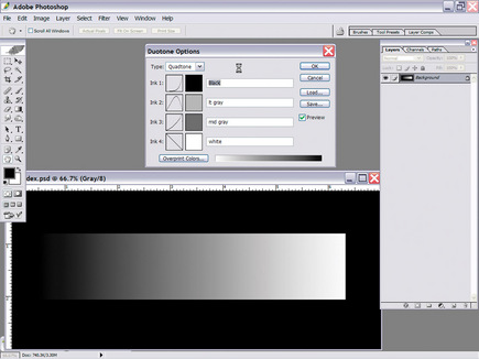
Next, convert the image into a quad-tone design by using the duo-tone selection, found under >Image>Mode>Duotone. A dialog box opens, and the pull-down menu at the top allows you to select quad-tone. Four colors become available for manipulation as soon as you select quad-tone (Figure 3). A couple of grays, plus a white and a black, can create all of the basic colors that are needed to quickly reproduce a grayscale design.
The tricky part is that you need to set the proper curves to build the quad-tone values that will recreate and separate the image. A simple way to do it is to create a reference point to emulate when creating curves in the quad-tone. The Color Range tool can provide a reference point. You can select several channels in the original image using the Color Range tool—for instance, several shades of gray, a white, and then a black. Then save the channels for recreation in the quad-tone. Now you can then build the quad-tone a-round these selections by recreating one color at a time. Before you produce the final separation, apply the quad-tone to a duplicate grayscale of the original image with the preview turned on to show how things shape up.
The design will more than likely need some manipulation to look good. The curves may benefit from some gentle adjustments to blend properly with one another. If the design looks really good, then it can be split apart and tested quickly. In the design example, I had to modify the gray underbase by adding the white channel information to it. This would allow a bright white to be printed in one step. To do this, hold down the Ctrl/Cmd key, select the channel information in the white, and use it to fill in the areas in the gray underbase channel.
Testing the quad-tone separation set
Now that you’ve completed your first separation set using the quad-tone method, are you staring at the Channels menu, wondering what to do next? The answer is very simple: Just convert your quad-tone image into a multi-channel design by using >Image>Mode>Multi-channel.
It is important at this stage that you copy and paste the channels into alpha channels on the original design for viewing and editing purposes. The original channels in the multi-channel document show them as spot-color channels with no solidity, so they can blend with each other completely. For emulating screen printing, you’re best served by having them as alpha channels with the proper color input in the Channel Options menu.
Create a shirt channel above all of the alpha channels and below the image channels in the original design, and turn on all of the channels that you have copied and placed. This is the best way to determine whether you made a mistake or whether the image is too choppy. The final design should be 80-90% safe to send to film and screens with the channels placed in the proper print order (Figure 4).
Developing this method to suit your shop and making many sets of separations greatly reduces the time and effort required to separate designs that already have quad-tone formulas. Even if this approach isn’t right for your shop, practicing with this style of separation is bound to jump start a new level of learning about how to split images and utilize the strengths of the Curves menu to create colors for screen printing.
A final example shows how using curves to decorate a multicolor image can be achieved (Figure 5). The colors were all created using preset curves, and then, using saved quad-tones, they were quickly separated from the same formula sets to create a super fast method of colorizing and splitting into separations. You also can personalize quad-tone separating for specific design styles, types of art, and even certain images, such as footballs and flames.
Putting a plan together and dedicating time to testing is one of the most underrated and least used practices in screen printing. More often customer requests get the R&D wheels churning up to speed, and knowing that other clients may jump aboard from the effort certainly sweetens the deal. However, a spectacular printing effect makes more of an obvious splash than a crafty separation technique. Still, plenty of satisfaction can come from other areas: saving time in the art room and on press, saving effort in revisions, and, hopefully, creating a more experienced staff that can handle issues as they arise.
Failure is OK with your first attempt to complete a new type of separation. In fact, if it doesn’t work well at all, you can still learn a tremendous amount. Artists and printers typically learn a lot more from a failure than a success—as long as everyone stays constructive, objective, and the experiment doesn’t occur at the last minute. And even if everything works great, it doesn’t mean success will happen with every image. It’s just another step in the process of expanding the ways of dealing with images for garment screen printing.
Thomas Trimingham has worked in the screen-printing industry for more than 15 years as an artist, art director, industry consultant, and head of R&D for some of the nation’s largest screen printers. He is an award-winning illustrator, designer, and author of more than 45 articles on graphics for screen printing. Trimingham can be reached through his Website, www.art2screen.com.


Subscribe

Magazine
Get the most important news
and business ideas from Screenprinting Magazine.
Most Popular
-

 Art, Ad, or Alchemy1 month ago
F&I Printing Is Everywhere!
-

 Case Studies1 month ago
High-Density Inks Help Specialty Printing Take Center Stage
-

 Andy MacDougall1 month ago
Functional and Industrial Printing is EVERYWHERE!
-

 Columns2 weeks ago
8 Marketing Mistakes Not to Make When Promoting Your Screen Printing Services Online
-

 Editor's Note2 weeks ago
Livin’ the High Life
-

 Thomas Trimingham2 months ago
“Magic” Marketing for Screen Printing Shops
-

 Marshall Atkinson2 weeks ago
How to Create a Winning Culture in Your Screen-Printing Business
-

 News & Trends1 month ago
What Are ZALPHAS and How Can You Serve Them in Your Print Business?