Articles
Published
17 years agoon
I discovered a great way to turn clip art into a trendy, screen-printed graphics. All you have to do is use the wide array of filters in Photoshop to create an interesting composition and apply several different halftone patterns for a stylish print. Demand is strong in today’s market for a sort of composite look where images from a variety of sources with different halftone patterns are printed together in the same graphic to create an artistic reference back to the printing process.
I discovered a great way to turn clip art into a trendy, screen-printed graphics. All you have to do is use the wide array of filters in Photoshop to create an interesting composition and apply several different halftone patterns for a stylish print. Demand is strong in today’s market for a sort of composite look where images from a variety of sources with different halftone patterns are printed together in the same graphic to create an artistic reference back to the printing process. In some ways, graphics of this style are more about the sum of the printing process than any particular statement of content.
To create and print a graphic using this process requires a good understanding of the different halftone options individually before they can be combined so that each element works together to provide a harmonious whole. The easiest way to develop a solid grasp of halftone styles is to apply them separately on duplicate pieces in the same design and then test several combinations to see which will look the best. Using this trend wisely involves three simple steps: creating friendly graphics from clip art, testing the graphics with different halftones, and prepping the art for easy separation.
Creating friendly graphics from clip art
The hardest part of developing good compositions from stock art is finding decent graphics to begin with. An easy way to judge the quality of stock art is to look at an image’s outline and see whether the drawing that defines the shape of the image is correct and visually appealing. The drawing should be in proper proportion and shouldn’t look like a kindergartener created it. The final artwork is only as good as the basic drawing that created the clip art, so many styles of clip art will never be good choices because they were made in a hurry and lack any sense of an artistic contour drawing. Here are some simple things to look for when sourcing clip art to use in this sort of process:
1. Find clip art with clean, well-defined contour lines.
2. Look for clip art that demonstrates a good value range that will help illustrate structure for the final piece.
3. Try to find art with a sense of dimension and style rather than just a simple rendering.
4. You can sometimes combine several pieces of clip art should you be unable to find one source that is perfect. Look for pieces that will work together.
5. Find clip art that has a sense of lighting and shadow, rather than just flat planes of color, so it will look more natural when converted.
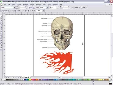
An example piece I created was for a local tattoo shop that wanted a skull with tribal images in the background. I found a skull in some clip art that looked okay and then created some simple flames that could be duplicated and rotated for a background (Figure 1).
Next I created the type, set it to a circular path, and then exported the final as a shape layer (EPS format) for placement in Photoshop. I edited the clip art slightly by removing the medical type and lines on the skull and then exported it and the flames as another EPS file that could be placed into Photoshop. CorelDRAW proved simpler for the edits than Photoshop. Had I just exported the file as-is, then the type would have combined with the background in a bitmap version—a pain to extract from the final graphic. Any serious structural changes to the outline of either the skull or the flames would also be made in CorelDRAW rather than later on in Photoshop. Vector images are usually easier to edit in a pinch than bitmaps, which might have required me to create a complicated selection to change a large area or take out pieces.
I created a new document in Photoshop that was 12 x 12 in. at 200 dpi. I then located the files that I exported from CorelDRAW and used the Place command in Photoshop to place them into position in separate layers within the one file (Figure 2). I started to edit my clip art once the files were all in place so that it would look more original and make a much more interesting printed piece.
Removing vector-like elements from clip art is a big part of adding realism to the design. I started on the skull layer by selecting it and then creating a duplicate layer that I could edit. That way, if I screwed something up, I could always go back to the original layer for pieces of the artwork or even the whole thing. I used the Modify Selection command to contract the selection (move it away from the edges of the skull), and I then used the Feather command to blur the edges of the selection so I could apply the Gaussian Blur filter to the middle of the skull. Next, I wanted to make the skull look meaner, so I copied and pasted the eyes on a separate layer and then skewed their edges so that the eyebrows of the skull were slanted inward toward the center of the nose. The final stage of the edit was to use the Dodge/Burn tool and Smudge tool to smooth the edges of the shapes so that everything looked more rendered (Figure 3). I knew I was on the right track when I had a skull that looked like a real illustration—and it only took ten minutes to create!
I used the Airbrush tool to quickly edit the background tribal graphics and the Burn tool to create a shadow around the skull and near where the type would overlay the tribal flames. I created red glow inside of the type and the eyes of the skull and saved it as a separate layer so I could edit it in the next step. Finally, I completed the stock-art conversion into a more original looking illustration with the overlay of a tribal pattern onto the surface of the skull itself. I used a tribal brush pattern, reduced the layer’s opacity to 50%, and then selected part of the brush pattern and used Spherize filter to distort it. In the end, the pattern looked like it was wrapped onto the skull (Figure 4). The next several steps involved integrating custom halftone patterns into the artwork.
Testing the artwork with custom halftones
Custom halftones proved a fun way to create a more modern look for this graphic without changing the composition or altering the color scheme. I first worked on the background tribal design to pick a custom halftone that would work with the overall image. Working on the background piece first was important because when the largest area of coverage in a design has a pattern, it visually dictates what other effects will work with the rest of the image. In this manner, I could test from the larger areas to the smaller and then test them against each other accordingly.
I first started with the background by testing it with the conventional halftones that are available in Photoshop’s filters. I did this by saving the background as a separate document that I then converted to a bitmap (>Image>Mode>Bitmap), set it as a 600-dpi halftone, and ran through some of the patterns in the dialog box by selecting them and then undoing them. After the test I realized quickly that none of Photoshop’s original halftone patterns looked very appealing, so I decided to use a software plug-in for a solution. Fortunately, I had a copy of Andromeda Software’s Artistic Screens, which included some great effects that were super easy to test. The best effect appeared to be a wavy line that would work perfectly as a halftone effect. The style of the halftone work would also be suitable as a foundation for high-density ink or a gel overprint.
The background halftone pattern looked really good so I started to test the red glow in the lettering and eyes. I chose a conventional halftone pattern from Photoshop, a 15-dpi elliptical dot at 45°, and brought the effect back into my original design by converting a duplicate file of the red glow to a black-and-white bitmap halftone, resizing it to fit back in the original file, copying it, pasting it as an Alpha channel, and then quickly using the channel to make a selection that would be filled on a new layer. This process was one that I often used for including custom bitmaps into otherwise rendered images when I needed to create them in completely separate image files. I always save the conversion files as well, just in case I might need them in prepping the file for the separation stage of this method.
Prepping the file for separation
Conflicting resolutions, edge quality, and overlapping halftone patterns/moiré are the areas I concentrate on the most when I prep a file that has custom halftones for separation. Addressing conflicting resolutions is especially important when using a combination index separations and conventional halftones. The final resolution must be able to work with all of the halftone patterns.
The edge quality of a custom halftone is a direct result of the resolution. It boils down to how many pixels are available to make a dot that looks round. If I generate a medium- to high-resolution halftone from a low-resolution file, I end up with really fuzzy halftones. Likewise, if I generate a high-resolution bitmap halftone and then convert the file to a low-resolution grayscale image for resizing, then my edge quality will suffer. The trick in these situations is to know what resolution will work as a printed separation and what won’t. To make a good separation dot, you should have at least twice the resolution in the image file as in the final separation. A custom halftone’s resolution often needs to be much higher than that or the edges of the smaller dots will not hold up.
A rule that I like to follow when working with custom halftones is to primarily overlap organized patterns with random patterns. This overlap eliminates most issues with frequency and/or clumping of pieces. In some cases, if the pattern is large enough, I can clearly see any potential problems with the final print on the computer display. Overlapping the positives is another way to check for moiré in the print. Moiré can sneak up on you if you have grayscale gradients in a design that fall behind a custom pattern in the art. You won’t see the halftone overlap in these areas on screen, but the printer’s RIP will generate it on the positives.
Resolving issues with resolution, edge quality, and custom-image overlap that may cause moiré in the final print can be challenging to figure out at first. That’s why I like to work at higher resolutions and create files that have no halftone patterns produced by the RIP when I have a graphic created with a lot of custom halftones in Photoshop. True, the image file can get huge in a hurry when created at actual size and with a lot of layers. But due to the nature of screen printing, poor edge quality on a halftone pattern may not even be apparent unless closely inspected.
I made separating the tattoo art for printing a far simpler task by first converting the skull into an index separation. The reason that this worked so well was that the original design came from clip art and already had nicely defined areas with minimal blending. I converted just the skull on a duplicate RGB file and made a custom Color Table (>Image>Mode>Index Color>Color Table>Custom) of four shades of gray (Figure 5). I then copied the converted file and pasted it back into the original file as an additional layer. Next, I used the Color Range tool for all of the major separating work because it could easily select areas within the indexed skull that I could then save as different channels. Finally, I built the white underbase by duplicating the selection of the white, red, light gray, and medium gray channels and then contracting this selection by a pixel so that it undercut the top colors.
As you can see, custom-halftone graphics can breathe new life into boring clip art (Figure 6). All it takes is some careful manipulation and testing to make an exciting and original illustration that is surprisingly simple to separate and print.


Subscribe

Magazine
Get the most important news
and business ideas from Screenprinting Magazine.
Most Popular
-

 Case Studies2 months ago
High-Density Inks Help Specialty Printing Take Center Stage
-

 Art, Ad, or Alchemy2 months ago
F&I Printing Is Everywhere!
-

 Andy MacDougall2 months ago
Functional and Industrial Printing is EVERYWHERE!
-

 Columns3 weeks ago
8 Marketing Mistakes Not to Make When Promoting Your Screen Printing Services Online
-

 Editor's Note3 weeks ago
Livin’ the High Life
-

 Marshall Atkinson3 weeks ago
How to Create a Winning Culture in Your Screen-Printing Business
-

 Thomas Trimingham2 months ago
“Magic” Marketing for Screen Printing Shops
-

 News & Trends2 months ago
What Are ZALPHAS and How Can You Serve Them in Your Print Business?