Articles
Published
23 years agoon
Today’s print buyers are demanding more and more process color–and at line counts higher than those traditionally done with graphics screen printing. The ability of digital-printing technologies to easily reproduce four-color process has enabled them to encroach on markets previously dominated by screen printing.
So it is not surprising that many of our process improvements during the last decade have focused on enhancing the competitive position of screen printing by controlling the quality and methods we use to screen print process color. The majority of this work is now being produced with UV-curable inks, which in some ways are well suited for the job, but in one particular area present a major hurdle that has only recently been given the serious study it warrants.
In this article, we will discuss a phenomenon inherent to printing process color with UV inks. Most printers have learned to live with it and work around it, yet they can’t identify its causes. More importantly they cannot prevent it. The situation is the pits–which is, coincidentally, the name of the phenomenon. In this first part of our look at PITS, we will consider the problem, focusing on what it looks like, why it happens, and which common “workarounds” have offered limited success in controlling it.
Piling ink
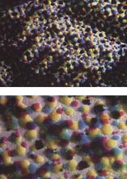
PITS is the acronym for piling ink tone skewing. It refers to image-reproduction errors stemming from printing–or piling–dots on top of previously printed dots with an ink that produces a thick deposit. At first glance, the image shown in Figures 1A and 1B looks like plastisol puff ink printed on fabric. In fact, the four-color-process image is a magnified look at conventional UV-curable ink printed onto a compact disc.
These images clearly illustrate the tendency of UV ink to deposit a thick, mounded dot. As subsequent colors are printed, the buildup of mounded dots creates a substrate thick with ink and uneven in surface texture. This leads to the perfect conditions for printed dots to collapse sideways or to fall into the valleys of previously printed dots. Ink piling on ink results in a type of dot gain and loss that we do not currently compensate for, leaving us with an uncontrolled area of the printing process.
The more we suffer from PITS, the more we decrease our color gamut and increase gray-balance error. As a result, most screen printers get far less from the process than it is capable of delivering. When compared to other traditional four-color printing methods, screen printing has a reputation for being very “lossy.” We are less effective at reproducing the original artwork and accept highlight dot loss and heavy gain in quarter tones and shadow areas as “the nature of the process.”
Recent studies of the PITS phenomenon indicate that we can get more from screen printing. Although it may seem logical to look for all the answers in the ink we use, the solution, which will be addressed in next month’s installment, is actually found in the ink and another basic component of our printing process, the screen.
Tone skewing
All printing processes produce dot gain, and many printers attempt to measure and compensate for it. We measure the mechanical gain due to a physical change in the perimeter of the dot during the transfer process. Optical gain is the result of light refracting at the perimeter of the printed dots, causing them to appear larger, as well as to measure larger, than their actual size. We sum the optical and mechanical gain value to arrive at total gain.
What we see when examining a print suffering from PITS is a skewing of the tone curve resulting from piling ink onto ink–hence the term “piling ink tone skewing.” PITS produces dot gain and dot loss. Our ability to accurately reproduce the image is compromised as a direct result of the way in which a 100%-solids ink behaves when it is overprinted. Although we routinely measure and compensate for mechanical and optical gain, we do not currently take PITS-related gain into account at any stage of the process. Since this type of tone-curve skewing is not compensated for in the film positive, we still suffer gray balance error in our prints.
Puppy paws and melting clocks
PITS is produced by two little demons called piling-ink skipping and piling-ink stacking. While they show themselves differently in print, these problems remain the fraternal twin products of our stencil when it is not optimized for four-color printing.
Skipping (Figure 2A) leads to dot loss, which occurs when printed dots fall between previously printed dots and become dissected into a pattern that has been aptly dubbed “puppy paws.” Stacking (Figure 3) produces dot gain and is the result of progressively piling one dot on top of another until, at a given point, the printed dot collapses sideways, looking similar to one of Salvador Dali’s melting clocks.
As each color is transferred onto the substrate, you might see ink stacking, which results in dot gain; or you might see ink skipping, which leads to dot loss and voids in the image. As the halftone line ruling increases, the sum of the perimeter of all the dots also increases, which translates to more gain. The movement to higher line count screen-printed process color has exacerbated a problem that always existed, and the potential for PITS is now greater than ever.
When compared to other printing processes, screen printing’s ability to produce a consistent and repeatable thick ink film is both its strength and weakness. (Consider that the thinnest ink deposits resulting from the highest mesh counts recommended for a UV ink may be twenty times thicker than the deposit left by offset ink on the same substrate.) Screen printing allows for full opacity and unparalleled lightfast properties, and it enables printers to meter their ink deposit for a wide variety of purposes, such as ensuring the functionality of electrical traces on printed and flexible circuitry. Screen printing offers superior chemical and mechanical resistance, as well.
The downside to our thick-film printing process is that it hinders our ability to reproduce high-resolution deposits. The effects of thick ink layers interacting and skewing tonal information is relatively uncharted and perilous territory, and it is fraught with hidden demons. Our process strength has become our process weakness. Thick film has be-come the enemy of image fidelity!
What constitutes image fidelity
Ultimately, four-color printing is all about achieving gray balance in the print where it existed in the original art. Beyond that, we strive to make up enough tones and use inks of the right hue so that we also reproduce the color gamut found in the original art. But first and foremost, we must achieve our gray-balance target if we are to meet our goal of accurate reproduction.
Process colors are said to be balanced when the proper concentration of all three primary subtractive colors (yellow, magenta, and cyan) have produced neutral gray in print where neutral gray existed in the original artwork. Fluctuations in stencil profile or EOM of as little as 1 micron carried over four printing passes can create a visual shift in the printed image.
Image fidelity is most affected by microscopic changes in the printed “percent” area relative to print area of the original image. We need to hit the same percentage of each of the subtractive colors in the print to recreate the concentration of tones found in the original artwork. Large changes in image density may not affect the overall image quality, but small changes in the “percent print area,” or tone, will have a dramatic effect on the final image. This percent print area is among the most important image attributes to control.
In process-color printing, we need to print dots that are true in size, shape, and color. (Figure 5). To accomplish this, we must faithfully reproduce what is on the film positive. We need to strive for the best possible resolution and edge definition, but above all, we need to begin thinking more about acutance, or the accuracy of the print relative to the film. Getting from the starting gate to the finish line involves clearing all the hurdles of artwork and film production, screenmaking, and printing with the fewest possible deviations from our “ideal” image.
Even at their highest resolution settings, all imagesetters produce bitmaps, and under magnification, image areas do not appear perfectly shaped. If the original film is bitmapped, but the resulting printed dot is straight edged, there is an “averaging” of the original image information showing up in print. This averaged dot represents poor acutance in the same way a non-bitmapped film reproduced with sawtoothing (bitmapping) in the print would demonstrate low acuity. A printed “sharp” dot represents poor acutance when a lack of bitmapping in print does not reproduce the bitmapping found in the original film.
Next month, in the second part of this discussion, we will examine the factors that combine to produce the best possible printed acutance in four-color process UV printing. For now, we continue with our look at the role of PITS on the printed image.
PITS and ink behavior
When I think of ink transfer, I form a mental image in which each mesh opening is represented as a faucet. The stencil controls each individual faucet, allowing the transfer of ink to the substrate when the valve is open.
The job of the stencil is to be the valve–to allow or not allow the transfer of ink. In a sense, screen printing becomes a digital process when you reference it from this perspective. The mesh limits all droplets of ink to a given size, and, therefore, to a given volume based on press parameters such as off-contact and squeegee settings. Wherever the stencil permits, individual droplets of ink pass through mesh openings down to the substrate where the droplets collapse, flow together, and create a continuous ink film. Without this flow, we would have truly digital images made up entirely of spots of color, masked by areas of no color wherever mesh threads were present. Upon hitting the substrate, the flowing ink heals possible voids that would otherwise be caused by the mesh.
With the proper wavelength and intensity of light, the printed ink film will crosslink, turning from a liquid to a solid. With the crosslinking transition comes a reduction in the ink-film height, and the amount of this reduction will vary with the ink formulation. If you choose an ink that gives very good gain curves (high image fidelity) as you print color upon color, it will likely also lead to ink skipping. This would be an ink that tends to “stay put” rather than flow freely when it reaches the substrate. The cured ink height would be greater, creating a situation where subsequent passes of ink would skip over the bumpy surface and fall between the previously printed dots.
On the other hand, an ink formulated to reduce skipping would flow more freely, creating a thinner cured ink film. But in avoiding skipping, this type of formulation often suffers dramatic gain curves and worse gain from stacking. A good illustration of this point is pancake batter on a hot griddle. One recipe may spread to form a thinner and wider pancake, and the same volume of a different recipe may produce a thicker pancake with a smaller diameter.
Several ink manufacturers have allocated considerable resources to develop UV inks that produce thinner cured ink films with high image fidelity, but they have not been able to completely avert problems with the PITS phenomenon. The minimum printable spot of ink is limited by the thread diameter of our mesh. Ink is dumb! It can’t go through a thread, so it must go around it. If elements of the image become as small as the thread, they will often be lost by thread blocking or eclipsing (Figure 6).
Therefore, reproducing the linear range of tones produced by an image-setter (e.g., a 2% dot on film produces a 2% dot on the print) is simply not possible with higher screen rulings due to thread eclipsing of the highlight dots. In other words, highlight printing difficulty increases as the halftone line count increases.
As we move up in line count, we generally go to higher mesh counts to support the smaller “bits” of positive and negative information in our stencil. We also select thinner threads as we increase mesh count so that we balance strength against printability and keep some open area to provide an orifice for the ink to pass through.
It takes relatively simple physics to explain that decreasing the size of mesh openings, or faucet openings, simply makes it more difficult to transfer ink. In essence, increasing the mesh count in the UV range keeps the length of the faucet consistent, but narrows the faucet orifice. There is little relative change to the length of the faucet, since there is a limit to the minimum diameter of the thread we can use.
The result of this constriction of the nozzles is an increased resistance to ink transfer. As the ink manufacturer changes the rheology of the ink to produce printed results that match the tonal values in the film (referred to as a one-to-one gain curve), it becomes possible that some, or all, of the ink will remain behind in the mesh opening and only partially transfer out. By adjusting the rheology of the ink such that it easily releases from these tiny openings, we find ourselves with inks that exhibit heavy gain in the more open areas of the screen. From quarter tones through shadows, dot gain skews the printed percent area to a value greater than that found on the corresponding area of the film positive. This gain happens as ink “columns” hit the substrate and flow together to form a continuous film, filling in the voids made by the mesh.
PITS and the substrate
Of course, the substrate must be acknow-ledged as having some influence on the quality of the printed image. As PITS research continues, we learn more and more about this factor, but so far there have been no surprises. Rougher substrates predictably show more piling ink stacking and skipping, as the ink “searches” for a flow point during transfer. This irregular type of deposit results in less consistency in the print, and it is measurable as an average increase in gain.
This randomness is compounded by the fact that some ink does make it into the valleys of the substrate. The result is an ink cross-sectional height that is even greater. The mound sticking up from the substrate has the potential for making it more difficult to get subsequent passes of ink down onto the substrate. The effect of either of these conditions is an in-crease in overall gain.
Much can be said about the substrate’s receptivity to UV inks. Since UV-curable inks do not “bite” into the substrate (unlike solvent-based systems, which do), absorption into the substrate that would reduce the PITS effect is negligible. Prints affected by PITS have been produced on coated papers, styrenes, and pressure-sensitive vinyls, using a variety of UV inks. Few differences have been noted purely due to the type of substrate being tested.
Common “fixes”
We have developed quite a bag of tricks to ward off the skipping and stacking that result in skewing. But in spite of all our efforts, we can seldom remove all of our print-related problems.
One of the most important steps in ensuring the best final result starts at the front end. Many printers are now using a process called linearization to “bend” the film positive image to compensate for any subsequent gain, loss, or ink-hue error that will skew our gray balance from the ideal. The correct way to accomplish this correction is to make screens from films that have not yet been “bent,” and then print them using the same inks and substrate that will be used in production.
With a densitometer, we measure the percent tone that shows up in the print, plug that information back into the front end, and make final production films that will compensate for potential dot gain and loss. In the highlight area, where we tend to lose tonal information, we replace the dot in the original artwork with a larger one, knowing what value it will shrink to. For the quartertones through the shadows, we replace the tones in the original image with smaller ones knowing that the dot will grow in print due to gain.
We maximize our color gamut by measuring the percent area in print, and modifying the tone value in the film so that after printing we arrive at the same tone value in the original image. Once the film positive is produced to specification, however, the objective is to reproduce it as accurately and consistently as possible in subsequent steps of the printing process. The printed image will not exactly match the stencil image, but, if the film is properly linearized, the print will deliver the intended tonal information to reproduce the best approximation of all the color in the original artwork.
That’s the theory. In practice, however, we have varying degrees of success in achieving exactly what we want. Properly implemented, the linearization process brings some relief, but it still leaves some problem areas, as well. Time and again, printers who make a stencil that prints a sharp dot discover that they simply can’t use those screens to print accurate process color. They find their prints suffering from the effects of putting four passes of UV ink down in succession. They notice image voids (skipping) and excessive gain (ink stacking). PITS can sabotage the best efforts at controlling the screen-printing process. But we have other tricks at our disposal.
Lacking a preventive measure for problems resulting from PITS, we have become chemists at the press. We doctor our inks with clear base to move our density down or we add toners to bring density up to adjust for color deficiencies. Unfortunately, large changes in color density have little impact on the overall image. We manipulate our print order. This sometimes helps with the color-critical part of an image, but it is never a “fix-all” and is not predictable or repeatable.
At the front end of the process, we apply gray component replacement (GCR) to our films in an effort to compensate for piling ink. This is certainly a step in the right direction, but it often requires so much subtraction of the underlying color that it becomes unpredictable and will potentially shift the color. None of these fixes are certain, and none can be applied across the board to minimize the image voids and dot gain we get from PITS-induced skipping and stacking.
Solutions in sight
Identifying the problem is the first step toward a solution, and next month, we will zero in on the critical processing parameters that we have found to hold the key to piling ink tone skewing. But to avoid PITS, we have to rethink the way we make our screens!


Subscribe

Magazine
Get the most important news
and business ideas from Screenprinting Magazine.
Most Popular
-

 Case Studies2 months ago
High-Density Inks Help Specialty Printing Take Center Stage
-

 Art, Ad, or Alchemy2 months ago
F&I Printing Is Everywhere!
-

 Andy MacDougall2 months ago
Functional and Industrial Printing is EVERYWHERE!
-

 Columns3 weeks ago
8 Marketing Mistakes Not to Make When Promoting Your Screen Printing Services Online
-

 Editor's Note2 weeks ago
Livin’ the High Life
-

 Marshall Atkinson2 weeks ago
How to Create a Winning Culture in Your Screen-Printing Business
-

 Thomas Trimingham2 months ago
“Magic” Marketing for Screen Printing Shops
-

 News & Trends1 month ago
What Are ZALPHAS and How Can You Serve Them in Your Print Business?