Garment Printing
Published
20 years agoon
Dot gain for textile printers is an ongoing battle because there are so many factors that come into play. Rare is the garment screen printer that can completely master the mix. Dot gain also is a misunderstood subject. Printers frequently tell me they have it under control or that they are really good printers and don’t have dot gain. This is ridiculous. When I hear such a statement, I can be sure of only one thing: This printer has no clue of what he’s talking about.
Let me state right here and now that everyone experiences dot gain. It is a physical part of the screen-printing process. So in this month’s column, I’ll introduce some often-overlooked and fundamental concepts and share some quick and easy corrections you can make to improve your print quality. Let’s start our discussion with some basic background.
Dot gain defined
Dot gain comes in two varieties: optical and physical. The optical kind increases as the line count increases. With nothing else changing, a finer line count will flatten and desaturate an image. Decreasing the line count (fewer lines/in.) will increase contrast and saturation, which is why I normally recommend 55 lines/in. or coarser for textile applications. It is a trade-off in the sense that the coarser line count carries less detail. You can hold finer detail, but the necessary dot-gain correction is more severe.
Physical dot gain is the most common and has the greatest impact on the printed image. The dot grows in the border area around its perimeter, which increases the total dot area, resulting in an increase in tonal value. The width of growth around the perimeter is constant for each and every dot; however, this does not mean the total growth in area is equal from dot to dot. As the dot size increases toward its maximum at the 50% tonal value, the area represented by border growth also increases. Dot-gain values are mirrored on either side of the 50% value. For instance, dot area of the 40% dot is the same as the dot area of 60%. The 40% dot is a positive dot, and the 60% dot is a negative dot. The maximum dot gain occurs at the 50% value because this dot has the largest area; therefore, it also has the largest perimeter. This is why dot gain is always measured and calculated at the 50% value.
The increase in dot area is an absolute number, meaning that if you have 35% dot gain, you would get 35% 50% = 85% final dot size. If you have 20% dot gain, the equation would be 20% 50% = 70%. The natural tendency is to think that lower is better. In practical terms, it almost doesn’t matter whether you have less or more gain, as long as you have consistent gain from job to job. If you change mesh counts, tension, squeegee pressure, squeegee durometer, off-contact, or ink brand, you will affect the gain values. Maintaining consistency is the real problem for screen printers, but consistency is the solution to most prepress problems.
Almost everyone sets gain values far too low, even if they’re experienced. This is a very big mistake. What happens when the dot-gain value is set too low? Consider Photoshop. Its default dot gain is 20% until you enter specific dot-gain values. Unless you are printing a 30 lines/in. halftone on 305 mesh, there’s not a snowflake’s chance in Hades that you will be successful. The overall print will look very dark and muddy, the tone range will be compressed and flat, and there will be a clear lack of detail in the image.
You can typically compensate for low dot-gain values in two ways, both of which negatively affect the image. The first approach is to base the ink back to a lower concentration of color with halftone clear. All this does is lighten the image. The contrast will still be flat, and there will be no improvement in detail. Now the image will simply look dull and washed out.
The second approach is to reduce squeegee pressure, then reduce it again and again in a futile attempt to lighten the image. Backing off the squeegee pressure may work on a temporary basis, but doing so creates problems like loss of ink penetration into the garment and reduction of ink-film thickness. Your prints will look weak, splotchy, and have a “cheesy” feel. Massive fibrillation will surface the first time the shirt is washed, and you’ll get an angry call from your customer.
Determine your dot gain
Most printers have a difficult time figuring out exactly what their dot gain is because they don’t have a reflection densitometer. This lack of measurement instrumentation forces them to guess at what their dot-gain values really are. Here is an easy way you can come close without using any measuring devices:
Start with a grayscale document in Photoshop that’s about 1.5 in. high x 12 in. wide. Set foreground color to 0% and background color to 100% black. Use the gradient tool and blend from one end of the image to the other. Now, posterize the grayscale to 21 steps. This will give you 5% steps from clear to solid. Save this file as Master Grayscale. Duplicate this file five times and save each with a different name. They will be MGS-12, MGS-14, MGS-16, MGS-18, and MGS-20. These will each represent a different amount of tonal reduction at the 50% dot. The number at the end of each name represents the amount, in absolute percentage value, by which you will reduce the 50% dot. For example, MGS-20 means you will reduce the 50% dot to 30%.
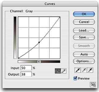
To correct each scale to the appropriate value, open the Curves dialog in Photoshop, (Alt M on PC, Command M on Mac) put a point at 50%, and decrease the value by the amount associated with that particular scale. For MGS-12, you would simply decrease the 50% value by 12 to get 38% (Figure 1). Put all of the scales into one new document and image the scales to film. Use whatever line count you normally use. You also can image this test at different line counts and expose the test image onto different mesh counts to see what difference these changes make.
When you look closely at images printed with the test screen, look for the 100% value to be totally solid with complete ink penetration into the garment and the ink film fully developed. Look closely at the 95% and 90% values. You want to see a tonal difference between solid and either of these values. If you cannot see a difference between any of the test scales, you will have to go even deeper into the curve. You may not find an image that works properly in your first set of test scales. If this is the case, repeat the test with larger tone-reduction values of -22, -24, -26, -28, and -30. You will certainly find an acceptable grayscale from this second round of testing.
Correcting for gain
Once you have determined the value, you will need to apply it. This is done in two steps. The first step is to use Photoshop to open the raw, grayscale image that has not been corrected (Master Grayscale). Now, under Color settings (the location of this dialog changes with each version of Photoshop) check the Advanced box, go to Spot Channels, and experiment with different dot-gain values. What you want is for the uncorrected Master Grayscale image on the screen to look like your results on press. You will need to start with at least 35%, more likely 38-42%. Keep entering values in 1% increments until what you see most closely matches the print. Enter and save this value.
Now, to check which dot-gain correction works best, open Curves and decrease the 50% value until the grayscale image matches the original, master image. This is the value you will enter each and every time you output a channel to make a halftone. You must apply the curve to each channel that will be printed. To speed this process up, make a blank document with 12-16 spot channels, depending on how many colors you can accommodate on your press. Activate all of the channels and make them visible. In the Curves dialog, enter the dot-gain value you decided to use for each and every channel. When you have done this for each channel, save the curves as -x%DGCorrection, where x is the amount of reduction. Now, no matter how many colors in an image, as long as they are active, you will apply the correction to all the channels at once when you load this master correction Curve.
If you print a job with fewer channels than declared on the master correction Curve, Photoshop will simply ignore the unused corrections. Here is what happens. If you do not enter a dot-gain value for Spot Channels, Photoshop does nothing. In other words, zero on-screen rendering of dot gain. This is fine for digital photographs and Web images that are not intended for print. But screen printers need to show dot gain because the gain is so high. The dot-gain value you enter into Photoshop does not change the digital gray-scale value; it only approximates on screen what will happen to that tonal value as it grows by the entered dot-gain value on press.
To compensate for the dot growth on press, you need to physically reduce the dot area by reducing the digital values in the image. This is done by entering the curve value you just determined, which will create an immediate change in how the image looks on the computer screen. You want the image on the screen to represent what will actually print. This is a huge concept and one I hear printers crying about on a daily basis. Emulating dot gain on screen in this manner is not a perfect method for predicting what will happen on press, but it is much more accurate than any other techniques you have used in the past.
©2004 Mark Coudray. Republication of this material in whole or in part, electronically or in print, without the permission of the author is forbidden.


Subscribe

Magazine
Get the most important news
and business ideas from Screenprinting Magazine.
Most Popular
-

 Case Studies2 months ago
High-Density Inks Help Specialty Printing Take Center Stage
-

 Art, Ad, or Alchemy2 months ago
F&I Printing Is Everywhere!
-

 Andy MacDougall2 months ago
Functional and Industrial Printing is EVERYWHERE!
-

 Columns3 weeks ago
8 Marketing Mistakes Not to Make When Promoting Your Screen Printing Services Online
-

 Editor's Note2 weeks ago
Livin’ the High Life
-

 Marshall Atkinson2 weeks ago
How to Create a Winning Culture in Your Screen-Printing Business
-

 Thomas Trimingham2 months ago
“Magic” Marketing for Screen Printing Shops
-

 News & Trends1 month ago
What Are ZALPHAS and How Can You Serve Them in Your Print Business?