Articles
Message on the Bottle
Published
24 years agoon
Screen printers have seen dramatic technological improvements in the equipment they use to place ink on substrates. The speed, controls, and registration capabilities of today’s presses are leading more and more shops from the traditional line-art applications of a few years ago to increasing use of process color. Additionally, automation has become a desired and even demanded feature in an industry that used to claim hand printing as one of its greatest advantages.
Today’s graphics printing shops have no choice but to respond quickly to customer demands and deliver high-quality prints if they wish to remain competitive. And increasingly, satisfying customer needs involves process-color printing. Container printing is no exception.
Despite the belief of many US screen printers, it is possible to print process-color images directly on containers. In fact, it’s really not very different than printing photographic designs on flat stock. Yet few container printers have taken the plunge, even though the machinery and systems used to print containers have seen significant improvements over the last decade.
This article presents a case for direct process-color printing on containers, looking at changing conditions in the market and emphasizing opportunities for container printers. It considers why the vast majority of container decorators in this country have been so reluctant to screen print halftones directly on containers. And it reviews the basic steps required to make the process work.
Why not process-color printing?
AdvertisementI will speculate as to why direct process-color container printing is still an exception rather than a rule–and I will bet I’m not too far off target. Process-color printing may be viewed as more difficult when it’s done on contoured surfaces, and since container decorators tend not to print flat stock, their first and only experience with process work is what appears to be its most difficult application.
In truth, very few differences exist between flat-stock and contoured-surface process-color printing, and they are noted throughout this article. The most obvious difference is the container itself, which must often be pretreated to accept ink and is often inflated during the print stroke, enabling the squeegee to pass over an even surface.
In container decoration, the substrate presents unique challenges. In addition to learning the nuances of process-color printing, decorators also must deal with parts that can vary slightly from piece to piece. These variations may include low or high spots, flat areas, dimensional instability, and other variables inherent in the many materials from which containers are made.
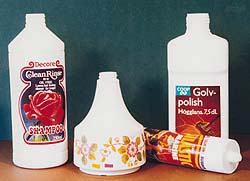
Also keep in mind that printing rapidly is an important requirement that is only made more difficult by the contoured surface of containers. These factors aren’t always easy to overcome, but they can be addressed with well-maintained, high-quality printing equipment to produce impressive prints, such as the examples shown in Figure 1.
Process-color printing on containers
The best reason to consider process-color container printing is that consumers are attracted to color, and your customers are increasingly asking for it. Everyone has different tastes, but for the most part, consumers survey the shelves in stores and are drawn to packages with interesting designs and lots of color. Even though the design of the package generally has little or nothing to do with the product contained inside, consumer opinion is still influenced by aesthetics.
AdvertisementAn example of this is the compact disc, which, according to one award-winning CD printer, must be printed with high-quality colorful graphics, even though the consumer doesn’t see the image before the purchase. And when the disc is visible, as with direct-mail promotional discs, consumer response to the most colorful discs is substantially higher than to those printed in just one or two colors.
European screen printers often dictate the printing trends that will eventually take hold in North America. And in Europe, process-color printing directly on containers is common. European container decorators understand how to work with process color and are making money at it.
Some say that American consumers have much different tastes than their European counterparts, but I doubt it. For some industrial or mass-produced commodity products, the look of the image may not matter, but in most cases, it matters a lot. Consumers want color, so it stands to reason that wholesale purchasers of printed containers also want color.
Everyone else is doing it
In spite of alternative printing methods, screen printing remains the dominant method of printing on glass and plastic containers, due primarily to the large volume of pieces that are typically decorated. In the late 1980s, many expected that pressure-sensitive labels and heat transfers would make screen printing on containers an obsolete process. This hasn’t happened–at least not with spot-color work, which is most often screen printed directly on containers. For process jobs, however, labels and heat transfers are the first choice–and they are probably used more often then needed.
The printing industry is no stranger to process printing in a production environment. Customers have demanded it of all printing industry segments: offset, flexo, letterpress, and yes, screen printing. Everywhere you look, you see screen-printed four-color process–on T-shirts, posters, banners, and, on occasion, even membrane-switch overlays. You also see process-color printing on decals and labels that are applied to containers.
AdvertisementThese are prime examples of the direction customers are taking decorators: toward more color and higher-definition graphics. Flat-stock and textile screen printers know that process-color printing is not a mystical process, yet you still do not see a proportionate amount of process-color on plastic or glass containers.
And let’s not ignore the role of digital printing in this scenario. The concept of digital printing is great. It increases your ability to do short runs of full-color graphics without the need for films, plates, or screens. It enables you to be more responsive to customer needs.
You may see digitally printed containers at trade shows and marvel at the technology, but at the moment, weak color opacity and limited image durability are disadvantages. Digital printing on containers is still in its infancy, but it will grow up. That puts container decorators with screen-printing capabilities behind the eight ball, and even further behind technology and market trends.
Screen-printing inks possess excellent opacity and are able to withstand the difficult environmental conditions of their end use. This begs the question: Why print and apply a separate graphic when you can print the image directly on the container?
Satisfying customer demand is one advantage of direct process-color printing, but there are others that hit a bit closer to home–and your bottom line:
• Cost savings Material and labor savings are realized when containers can be loaded onto the printing machine, printed, offloaded, and shipped to the customer. The added steps of printing labels or heat transfers and then applying them to the containers is costly in terms of time and materials.
• Response time to the customer Outsourcing process-color label printing is counterproductive when you have in-house screen-printing capabilities. By printing the containers directly, you can eliminate your dependence on a label supplier. For container manufacturers or contract printers, direct printing offers greater production freedom, especially when faced with tight customer deadlines.
• End-use performance The durability of a properly screen printed and cured image will generally exceed that of an applied label.
• Aesthetics A direct-printed container has an attractive look and feel, with no visible label edge. Even “no-label look” labels do not fool everyone into believing the image was printed right on the container.
• Inventory efficiency When you eliminate the label or heat transfer and opt for direct printing, you no longer need to maintain large label inventories. This reduces waste from damaged or outdated printed labels, frees up valuable inventory space, and again, increases your production flexibility.
Conditions are right for a change
When competing in an industry that, at times, seems to hold unlimited demand, you can often get mired in price wars and reduced profit margins. Entering the container-decorating industry is easy at the basic level, but for more lucrative orders, competition can be very tough to beat unless you have a competitive advantage. At times, it’s a “me-too” business, but it doesn’t have to be. So how do you gain a competitive edge in a mature industry? You differentiate or add value to your products, and direct process-color printing is an ideal way to do so.
The tools required for process-color container printing are widely available. Additionally, the procedures required to print process color are proven, repeatable, and being used successfully by flat-stock printers as well as many European decorators who print directly on containers.
The term “process color” can be looked at in several ways. A print doesn’t need to be photographic to be considered process color. In basic terms, printing any colors together to make other colors can be thought of as process-color printing. Process-color images can consist of two, three, four, or more colors (Figure 2). But in all cases, you print very small halftone dots in such close proximity to each other to fool the eye into “seeing” an array of additional colors.
If you insist on reinventing the wheel, yes, the steps to mastering process color can seem mystical. But there is no need to figure out all the details for yourself, because your best suppliers already know how to assist you in achieving the desired outcome. Most already work with process-color printing customers in other market segments, and the process commonly used in flat-stock printing is surprisingly similar when applied to a contoured substrate.
But you must keep several specific considerations in mind to achieve successful process-color prints. The concerns include a broad range of variables that must be controlled to achieve good process-color prints. For simplicity’s sake, I’ll summarize these variables into six major control points:
• film specifications
• the screen
• the stencil
• exposure
• printing a screen with a screen
• machine features
Your first area of concern is the artwork. If you do not have good film-separation capabilities in-house or a dependable service bureau providing your separations, you should locate a company that has experience producing film specifically for process-color screen printing. Your separator’s abilities will largely determine whether you succeed or fail at process work, since there is virtually no way to compensate in the screenmaking or printing stages for a bad set of separations.
Experienced process-color screen printers know that lithographic separations are not suitable for screen printing because of the way our “plates” are made, and because of the significantly higher amount of ink screen printing deposits. To ensure the best dot reproduction, your separator will need to take various production parameters into account.
Tonal range and dot shapes are other issues you will take up with your separator. While litho printers can print the whole range (1-100%), screen printing does not offer that luxury. A more realistic range for container printing would be 15-85%.
For halftone printing on containers, an elliptical dot will give the best result. The reason for this is illustrated in Figure 3. With a square-dot pattern, we see an increase in coverage, due to the fact that the dots connect at four corners. In contrast, the elliptical dots join only at two ends, minimizing the unacceptably dark look that occurs with standard dots.
The imaged areas of your film separations must also have sharp, distinct edges and a density (D-max) of at least 4.0. If you require high quality, have your separations outputted from an imagesetter at 2400 dpi, at a screen frequency of 85-100 lines/in. In most cases, your customer will supply the original artwork, which today is usually a digital file. For assistance with on-press registration, you can have the films output with registration targets that can be taped or blocked out when you are ready to start a production run.
The screen
Once you have a good set of separations in hand, screenmaking becomes the next critical area of concern. First you need to consider the mesh and screen tension. For the screen frequencies recommended above, use plain weave meshes in the range of 380-390 threads/in. Your mesh supplier will help you pinpoint other appropriate mesh parameters, such as thread diameter, which will be influenced by factors such as the type of ink you’ll be using.
You will also want to use dyed mesh, which is probably all you’ll be able to find when shopping for such high thread-count fabrics anyway. The dyed threads prevent unwanted light scatter that interferes with the production of sharp, clean stencil edges during exposure.
Many theories exist about the proper tension level to use in order to provide the desired amount of snap-off or off-contact distance. This is where container printing differs from flat-stock printing. Although proper off-contact distance will improve printed edge definition and prevent smearing, remember that the rotation of the substrate during the print stroke is a unique snap-off feature inherent to the container printing process. By nature, the curved surface only makes contact with the screen at the point of squeegee contact, so you can print with lower tensions than might be acceptable for flat-stock jobs.
The most successful process decorators tension screens to 18-20 N/cm and then allow a 24-hour relaxation period during which tensions drop to 15-16 N/cm. If you have been printing single-color jobs and intend to expand into multicolor work, now might be a good time to invest in a good tension meter.
Although proper tension is important, it is not as critical as maintaining consistent tension levels in all the screens for a job. Variations in tension from one screen to another can result in perfectly registered artwork becoming misregistered on press.
Another concern involves printed ink thickness or profile. While lithographic ink deposits are very thin and allow overlapping dots to reflect desired colors, screen-printed inks result in a heavier deposit which, when overlapped, can appear muddy or black. A good screen-printing separator will know how to output films that compensate for this phenomenon.
Rules for stencilmaking are the same as for spot-color printing, but the finer points of making the stencil become more critical when you are resolving tiny process-color dots. Whether you choose direct emulsion or capillary stencil film, your stencil must do two things: It must be built up to the point where it conceals the knuckles of the mesh, creating a flat, gasket-like seal during printing, and it must be as thin as possible to minimize ink deposit and allow the mesh openings to be cleared with each print stroke. When a stencil is too thick, ink builds up in the openings and, when released during the print stroke, leads to dot gain and smeared images.
Creating a thin stencil that is also flat and smooth can be a dilemma for the screenmaker, because it is often easiest to get a flat stencil with successive coats of emulsion–which adds to the thickness. Use a very high quality, high-solids direct emulsion that is recommended for halftone printing, or select a capillary stencil film that is matched to your mesh count.
Your emulsion coating technique will play a big role in the quality of the finished stencil, and this may take some practice, as will capillary film-application techniques. If you want to measure and control stencil thickness and surface roughness, consider purchasing a thickness measurement device, such as a Deltascope, and an Rz meter, which measures the stencil surface profile or roughness.
Exposure
Much has been published on the control and determination of correct exposure, so I won’t review it all here. Correct exposure for halftone printing is very critical, though, because over- or underexposure affect dot size, which in turn affects the quality and color integrity of the printed image. These are things that may not be noticeable on spot-color jobs where solid areas of color aren’t so visibly affected by minute changes in image size. An efficient exposure is essential, and a light integrator will help to compensate for power fluctuations and bulb degradation. To maintain the most consistent results, regularly perform exposure tests using an exposure calculator.
Printing a screen with a screen
There have also been volumes written on the subject of moiré, which I will also address in general terms. When you print a halftone separation, which is technically a screen, with a piece of screen mesh, you will invariably get an unacceptable printed pattern from the overlap of the two patterns: the artwork and the screen. This is moiré, and there are ways to minimize it.
Again, your separator will need to get involved here. Each color separation must be angled, yellow being the least angled and black being the most angled. You want to ensure that each successive color doesn’t interfere with the one printed previously. All separators do this as a matter of course, but you need to specify angles that will be most effective for screen printing–not lithography. A separator well-versed in screen-printing artwork will be a great help here.
Even with proper halftone screen angles, you will still be exposing the art onto a gridded carrier: the coated screen mesh. Mesh interference can generate moiré in the stencil, so in some cases, container printers address the moiré problem by tensioning mesh on a bias. This isn’t always easy to do, unless you’re using stretch-and-glue frames, and it can also add to your mesh wastage. But since you will not be able to angle the substrate on a container printing press, you might find it necessary to angle your mesh in the screenmaking stage.
To determine the correct angle for the mesh, lay each film separation on top of a piece of stretched mesh and rotate it until the moiré effect is minimized. Note the relationship of the mesh threads to the angle of the dots on the positive, and tension your mesh at that angle. This will need to be done for each separation, and it also means that the screens for this job cannot be used for any other jobs. If you choose to tension mesh on a bias, don’t plan on reclaiming them.
Many container decorators heavily invested in machinery over the last decade. They put hundreds of thousands of dollars–sometimes millions–into printing equipment. They have also witnessed a transition from one- and two-color decorating jobs to four- and five-color jobs as the norm.
Not all container-printing machinery is capable of producing good process-color work. You must look at your tolerances. A critical aspect of process printing on containers is to have a well-maintained machine that is able to hold registration to ±-0.005 in (Figure 4). In addition, your tooling supplier should supply base-cup tooling within an accepted manufacturing tolerance. Proper tooling is a vital part of the solution. These two parameters will give you the ability to get started decorating with process colors because they control registration, which is critical.
Ideally every container you print is heavy-walled and won’t require inflation to enable it to be printed, but that’s not realistic. You need to ensure that inflation pressure is always consistent, because excessive inflation creates the effect of printing on a balloon, while insufficient pressure is like printing on a pillow.
Over the years, machinery manufacturers have developed printing systems that can effectively deal with substrate variables. Even if the image isn’t placed exactly in the same spot from bottle to bottle (due to minor variations in the containers), it can still be printed with consistent coverage and part-to-part registration. Again, proper tooling is a vital part of the solution.
Not a black art
With so many screen-printing applications being produced in full process color, you have to ask yourself why the container decorating segment is still slow to follow the trend. Container decorating poses special challenges, but these challenges are certainly not impossible to overcome.
As with every other process, control is the key: control from the art department all the way through to the pressroom. It takes commitment and it requires education and a learning curve to be successful. If you think about what today’s customers are demanding, you can’t help but be convinced that there is a payback in accepting the challenges.
About the author
Steve Gilbertson is Midwest sales manager for Kammann Machines, Inc., St. Charles, IL. Before joining Kammann, he worked in the healthcare and cosmetic industry, where he was involved with roll-to-roll screen printing of container labels. Gilbertson holds a Bachelor’s degree in Marketing from Winnona State University.
SPONSORED VIDEO
Let’s Talk About It
Creating a More Diverse and Inclusive Screen Printing Industry
LET’S TALK About It: Part 3 discusses how four screen printers have employed people with disabilities, why you should consider doing the same, the resources that are available, and more. Watch the live webinar, held August 16, moderated by Adrienne Palmer, editor-in-chief, Screen Printing magazine, with panelists Ali Banholzer, Amber Massey, Ryan Moor, and Jed Seifert. The multi-part series is hosted exclusively by ROQ.US and U.N.I.T.E Together. Let’s Talk About It: Part 1 focused on Black, female screen printers and can be watched here; Part 2 focused on the LGBTQ+ community and can be watched here.
You may like


Advertisement

Inkcups Announces New CEO and Leadership Restructure

Hope Harbor to Receive Donation from BlueCotton’s 2024 Mary Ruth King Award Recipient

Livin’ the High Life

Advertisement
Subscribe

Bulletins
Get the most important news and business ideas from Screen Printing magazine's news bulletin.
Advertisement
Most Popular
-

 Art, Ad, or Alchemy1 month ago
F&I Printing Is Everywhere!
-

 Case Studies1 month ago
High-Density Inks Help Specialty Printing Take Center Stage
-

 Andy MacDougall1 month ago
Functional and Industrial Printing is EVERYWHERE!
-

 Columns2 weeks ago
8 Marketing Mistakes Not to Make When Promoting Your Screen Printing Services Online
-
 Editor's Note2 weeks ago
Livin’ the High Life
-

 Thomas Trimingham2 months ago
“Magic” Marketing for Screen Printing Shops
-

 Marshall Atkinson2 weeks ago
How to Create a Winning Culture in Your Screen-Printing Business
-

 News & Trends1 month ago
What Are ZALPHAS and How Can You Serve Them in Your Print Business?