Prepress & Screen Making
Published
20 years agoon
Anyone who has worked in screen-printing prepress, even for a very short period of time, quickly develops a set of personal peeves. These are the things that drive you crazy–the errors and oversights that continue to occur no matter how obsessed or vocal you become about them. What really sets me off is the frustration and high-dollar headaches they always seem to lead to.
Some of the problems that have become my peeves are caused by inattention and some by carelessness or ignorance. Others are created deliberately. But I can’t think of any problems that are caused solely by the technology we use–the human factor seems to be the real source.
One thing is for sure, all of the problems that become personal peeves will cost you money, and potentially your client too. This month, I would like to share with you some of the things that really get my goat. I could probably fill a book with descriptions of the many peeves I’ve developed over the years. Thankfully, I’ve taken care of a good number of them in my business. But a stubborn handful persist.
Incomplete or incorrect art files
I frequently encounter art files at the very beginning of the prepress process that do not contain everything needed. This may include missing fonts or linked files, incorrect versions, files that do not match the proof, and art files prepared in programs like Microsoft Word. You can’t do professional work if you don’t have the proper resources and materials to begin with.
No matter how thorough you are in preparing art guidelines, style sheets, and so forth, it seems that clients are simply too busy to pay attention. The attitude is, “They’ll fix it in prepress.” Of course, this puts tremendous pressure on the prepress staff and sets everyone up to fail. The mere act of accepting an incomplete art file pretty much guarantees you will have some–or many–problems down the line.
In all the years I’ve prepared art, I would venture that more than 95% of files submitted required some sort of repair or overhaul. I have come to expect this. No matter how philosophical I get about it, it does not change the simple truth: A majority of what comes through the door will need to be reworked to some degree.
When it comes to original artwork, the problems will only get worse. Desktop publishing has become a virtual commodity due to the massive amount of information that must be published in some form or another (Web, print, etc.). As technology continues to rush ahead, we face a wider assortment of graphic formats designed for applications other than screen printing and have less time to deal with the specific challenges of each. Our only option is to suck it up and get on with it.
Specified color that isn’t specified
Color matching is so subjective that I could spend all of next year discussing just this one area. Problems in this category occur when designers want a specified color, but really do not know how to communicate their needs. Color matching does not involve telepathy, yet we are asked all the time to operate this way.
Simply noting that a color is Pantone so-and-so means nothing. Was the stock coated or uncoated? How old was the book? Was a book even used? Was the color chosen from a monitor? What were the lighting conditions under which the decision was made? How old was the designer and has he or she ever been checked for color blindness? The variables go on and on.
Oh yeah, I forgot, am I supposed to match something that has already been printed, like a brochure, poster, package, or postcard? Continuity is incredibly important. Many times it is better to match the already-printed collateral materials than to create an exact color match for the item we are working on. Always ask if you are matching other printed materials.
The only real way to ensure an accurate color match is to have an actual sample, on the stock to be printed, in your possession. If you have a physical target, your chances of success are very good. In reality, screen printers almost never get physical color chips. Instead, we’re given an indirect reference that we can’t trace. In other words, we have no way to verify that the colors we are separating or matching on press are anywhere close to those the designer or client wants. The only logical choice is a physical press proof. This is very expensive to conduct, and it’s murder on the production schedule.
Hurry up, go slow
How about customers in too much of a hurry to give clear directions, but with plenty of time to tell you what an idiot you are when you have do the job over? I try not to be too impatient. I realize the business world today is functioning on limited capacity and everyone is working too thin. There aren’t too many businesses I know that have extra people hanging around waiting for work to develop. Most companies have downsized so significantly that any one person is doing the job that three did just a few years ago.
These conditions do not change the situation. To be effective in minimizing this type of problem, you must be very efficient at preflighting and file analysis. You should take a triage approach with all incoming art. Immediately assess the art and determine if all the major elements are there and able to be opened. Make sure each design is in a form compatible with your equipment and at the right size and resolution. You should make these determinations within the first hour or so after the file or disk comes into your possession. Any delay will cause big problems downstream. It is best to have one person dedicated to just the preflight tasks. Being proactive at the front end goes a long way toward avoiding a crisis on press when a mistake or omission occurs.
Carry the right kind of insurance
Speaking of mistakes and omissions, these problems can be serious financial risks for any printing company. Printing something that doesn’t belong, or failing to print something that was part of the design, can bring about grave consequences. I highly recommend you carry Printer’s Errors and Omissions insurance to manage the risk. This type of policy is generally inexpensive and covers you in the event something gets missed or something extraneous is printed. Without the insurance, you can potentially ruin both your customer and yourself.
Now for a quick horror story that happened to my business. Several years ago, we received an electronic file from a print broker on behalf of our client. It was to be separated and printed for the launch of a new product. We did the separation work and everything ended up looking great–elements registered, information appeared to be complete. So off it went to the client, who printed the job and air freighted it halfway across the country to meet the launch deadline. The job was 4000 T-shirts.
The next day, I got a panicked phone call saying that the logo of the company launching the product (our client’s customer) was missing from the shirts. Sure enough, it was in the file, but disappeared when the file was viewed under a different version of a computer operating system. In the end, our insurance company compensated the customer with a negotiated payment of $15,000. We lost the client, but at least we didn’t lose the shirts off our backs.
Sloppy and damaged positives
There is no excuse for this problem. The positive is critical to the success of your business and your client. If the positive is trash, you can forget it. Yet, films are routinely sent to production and demolished. You simply cannot do good work if your positives are covered in layers of tape, dirt, ink, or fingerprints. The same goes for positives that have creases, kinks, or folds in them.
Keep positives isolated from print production. This means not letting them get to the production floor. Send proofs, blue lines, inkjet and laser prints, or whatever out to the floor–but not the positives. Protect them at all costs.
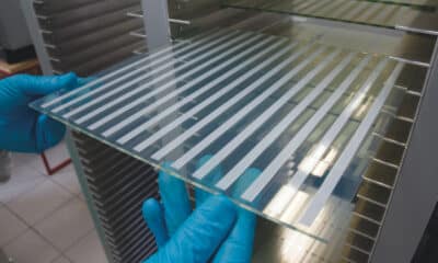
In screenmaking, keep the positives flat and clean. Make sure the light table also is free of contamination and that you have film cleaner on hand. Always wipe the positive with anti-lint wipes (Kim Wipes or equivalent) and film cleaner before each and every exposure. Positives develop static charges and attract dirt out of the air. Start clean, end clean. This practice is an absolute must for all work and is essential if you print any kind of halftone jobs.
Screens not degreased properly
This one really gets me. Screens that aren’t degreased prior to coating are worthless. While the screen may appear to coat and go through exposure with no problems, the danger is on press. There, the mechanical forces of the flood bar, squeegee, repeated cycling, and peel, combine with aggressive inks to accelerate the physical breakdown of the emulsion.
If you don’t degrease a screen before you coat it–or try to use a screen that you degreased weeks before–you’ll end up chasing dozens of pinholes that will spring up unpredictably and uncontrollably. It is a downward spiral. Improperly prepared mesh rejects the physical bond of the emulsion, and a pinhole develops. When this happens, your production run will turn into the job from hell. You’ll spend your time contorted under the screen looking for that pesky pinhole to tape out. You’ll never get into a rhythm. The day will drag on and on, and the print quality will be marginal at best. You’ll go home at the end of the day frustrated, mad, and exhausted. Take the extra minute to degrease the screen immediately before you coat it. Doing so will save you from all this grief.
Get proactive about peeves
As you can see, it is possible to control some of the problems that become peeves over time. However, some will just never go away. Passively resigning yourself to accept these annoyances is not the answer. To get ahead of the game, you must be proactive and detail oriented. Proactive solutions result when you acknowledge that a situation cannot be changed. When you do, you can develop ways to work around the variables that lead to trouble. It takes time. It takes commitment. It takes real effort, on a consistent basis, to resolve or reduce these problems.
Being detail oriented means paying attention to the things that matter. It means not taking shortcuts, ever. As soon as you allow one shortcut, the system falls apart. It’s too easy to justify a reason to not follow through as planned. The details determine success, and it takes time to get the details ironed out. This is where the conflict comes in. We never have enough time to do the job right, but we always have enough time to do it over. Paying attention to the details will help get the job done right the first time.

Subscribe

Magazine
Get the most important news
and business ideas from Screenprinting Magazine.
Most Popular
-

 Art, Ad, or Alchemy1 month ago
F&I Printing Is Everywhere!
-

 Case Studies1 month ago
High-Density Inks Help Specialty Printing Take Center Stage
-

 Andy MacDougall1 month ago
Functional and Industrial Printing is EVERYWHERE!
-

 Editor's Note1 week ago
Livin’ the High Life
-

 Columns2 weeks ago
8 Marketing Mistakes Not to Make When Promoting Your Screen Printing Services Online
-

 Thomas Trimingham2 months ago
“Magic” Marketing for Screen Printing Shops
-

 Marshall Atkinson1 week ago
How to Create a Winning Culture in Your Screen-Printing Business
-

 Press Releases2 months ago
Big Frog Custom T-Shirts & More of Round Rock Celebrates Grand Opening


