Prepress & Screen Making
Published
22 years agoon
One of my favorite quotes regarding technology came from Arthur C. Clarke, who said, "Any sufficiently advanced technology is indistinguishable from magic." I often feel that screen printers using digital prepress are viewed as some sort of magicians who can make any file provided by a customer into a workable graphic. In many cases we can, but learning the right tricks can be a painful process.
One of my favorite quotes regarding technology came from Arthur C. Clarke, who said, "Any sufficiently advanced technology is indistinguishable from magic." I often feel that screen printers using digital prepress are viewed as some sort of magicians who can make any file provided by a customer into a workable graphic. In many cases we can, but learning the right tricks can be a painful process.
Screen printers typically inherit files designed for projects ranging from Web-page building to offset printing. But we rarely see files prepared specifically for our process. So we’re forced to compromise, adjusting the file to get the job out on time while maintaining a reasonable quality level. However, customers are becoming intolerant of compromise, expecting us to maintain the quality of the original design despite the fact that it wasn’t created for screen printing.
Our problems are further compounded by the drive for sales. Unfortunately, our sales people usually don’t understand the nuances of digital art for screen printing, and their view is that we should be happy they got the customer to supply an electronic file in the first place. As they see it, the job of the prepress and production staffs is to produce the final product–no matter what the client furnishes.
Whether we inherit or create a digital file is immaterial. In either case, we must optimize the file for production and prepare it quickly and accurately. I could easily make a short novel out of my experience doing just that. But instead, I want to focus on some of the major factors that differentiate digital artwork for screen printing from graphic files used for other purposes. Among other things, we’ll look at a few real-world approaches to improve the speed, quality, and consistency of our output, regardless of the process or end use for which a file was originally prepared.
The digital workflow
Let’s start with workflow issues. This relates to how quickly the job will move through prepress, how easy the digital file is to work with, and what methods and procedures prepress technicians must use to prepare the file for screen printing. In today’s production environment, speed is the top issue.
The stress on production efficiency and fast turnaround has its roots in the ever-increasing speed of computers. It seems like just yesterday (I think it was, really) when a 100-MHz processor was considered blazingly fast. But according to Moore’s Curve, processing speed will double approximately every 18 months.
This principle has proven remarkably accurate since it was introduced at the end of the 1950s. And following its predictions, by the year 2000, we will be using desktop computers with processing speeds in excess of 800 MHz. (High-end workstations, such as the DEC Alpha, currently run faster than 1000 MHz. But these machines rate a few notches–and dollars–higher than a conventional desktop system.)
Along with faster processors comes software that is more and more complex and feature loaded. Consequently, our customers have developed the expectation that with all this hardware and software power at our disposal, we should be able to turn a job around almost instantly. Don’t we all wish it was so!
The fact is, raw speed does little to streamline prepress or production if the files we receive are improperly prepared for screen printing. And the situations in which files most often fall short include the following: improper placement of graphic elements or trapping, which make it necessary to rework a file extensively images of the wrong resolution for the needed print size color-separation decisions (screen angles, dot gain, etc.) made for lithography or another end use that has little or no bearing on how we use process color in screen printing choices for proofing the digital image that may provide an inaccurate representation of the final screen-printed piece.
While this list may seem extensive, we can take several specific actions to improve the quality of the files we work with and the overall efficiency and accuracy of the process. Setting those heavy traps… <P><B>Placement and trapping issues</B>
The first area where digital designs fall apart in terms of their usefulness to the screen printer is in the placement and trapping of graphic elements. Because the images we print may start as digital files prepared for print ads or some other non-screen-printed application, graphic elements within a design may be arranged too tightly to support the more limited resolution capabilities of our process.
Screen printing’s ability to produce high-quality graphics is also influenced by a long list of variables faced by no other printing process, such as mesh selection, screen tension, squeegee parameters, and a wide range of ink chemistries and characteristics. As a result, the graphic elements within a screen-printed design often require heavier trapping than images prepared for lithography or flexography.
If these corrections aren’t made by the customer before you receive the file, it will be up to your own artists and prepress technicians to make the image ready for screen printing. Of course, it also will be up to your staff to determine the actual trapping parameters required based on the type of work you print and the capabilities of your shop. <P><B>Incorrect resolution</B>
The resolution issues with screen-printed graphics start as resolution issues with our digital artwork. As noted already, when outside designers create digital graphics for our customers, these files are produced for a variety of uses, but rarely for screen printing. And one of the biggest issues we face is that the graphic files are generally not created with the final size of the screen-printed image in mind.
For example, image files prepared for brochures do not work well when enlarged to produce bus graphics or other large-format displays. This is especially true when the graphic is a bitmap (e.g., TIFF, JPEG, EPS, or similar file format) designed for process-color reproduction. A bitmap may have been scanned at an appropriate resolution to support brochure-size reproduction, but as the size of the graphic increases, the resolution of the bitmap decreases.
To illustrate this concept, imagine a digital image created for use in a brochure. Say this image measures 4 x 6 in. and has a resolution of 300 dpi. Conventional wisdom holds that the resolution of a digital image needs to be roughly double the value of the line count you wish to print. So at its original size, this image could easily be reproduced as a 150-line halftone–an ideal line count for offset printing on a brochure.
Now imagine a customer provided the same image for reproduction as a 12 x 18-in., 85-line/in. screen-printed poster. The image would need to be expanded to three times its original size, which would drop the resolution to 1/3 the original value or 100 dpi. At 100 dpi, the maximum line count you print while maintaining image accuracy is 50 lines/ in., not the 85 lines/in. requested by the customer.
For screen printers, the solution is to interpolate the image. This means relying on software to boost the apparent resolution so that the image contains enough information to be enlarged and support printing at a higher line count. But interpolation really only provides an approximation of the image at a higher resolution, which is a compromise rather than a solution. Fortunately, a new option to correct this problem has recently made its appearance.
Color-separation hurdles
With files we receive in CMYK form, all color-separation parameters, including screen angles, dot gain, gray balance, and more, are already established. If the file adheres to lithographic parameters, which is likely the case, you can probably use it as is, provided the line count of the screen-printed graphic is 50 lines/in. or lower. For applications such as large-format and P-O-P display work, lines counts in this range are frequently adequate because the image is viewed at a distance and the dots are large enough to maintain the tonal-range and dot-gain profiles used in litho.
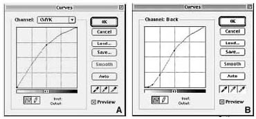
But we begin to run into problems when the line count increases to 65 lines/in. or beyond. Even if we use fine mesh counts and print UV ink, the extreme highlight and shadow dots will become increasing difficult to hold. The dot-gain profile transforms from a traditional, uniform litho profile (Figure 1A) to the more typical screen-print profile (Figure 1B) as the line count increases. The higher the line count, the greater the influence on the dot-gain profile and the bigger the difference in the printed file’s appearance.
To minimize the problems, always ask for both the CMYK and RGB versions of the file. Regardless of how the CMYK file was produced (whether it was created in Photoshop or captured with a high-end scanner), the separation parameters are not easily changed without damaging the color information in the file.
Almost all color-separation programs will discard digital color information when converting from the larger RGB color gamut to the more compressed CMYK gamut. And during this conversion, ink color settings, total ink limit, dot gain, gray balance, and UCR/GCR parameters are also established. But they are established based on standard web offset printing (SWOP) values, and screen printing inks do not match SWOP color parameters. So these values are almost useless.
However, if we can get the RGB file, we can establish the correct separation parameters for your particular application before the conversion to CMYK. This allows us to maintain color continuity with other CMYK pieces created through lithography or other printing methods <B>(Figures 2A-C)</B>.
If we cannot obtain the original RGB file, we may be able to convert the CMYK file back to RGB, then apply the correct parameters for screen printing. But the final image will not be as accurate as the original RGB image. The problem is that because black is added to the image during the RGB-to-CMYK conversion, reconverting to RGB will tend to produce too much black, which will be carried over and increased even more when the image is again reconverted to CMYK for the final separations.
Screen printing also requires specific screen angles, line counts, and dot shapes unlike those used for other printing methods. These screen angle sets are one of the most commonly overlooked sources of moiré. For coarse halftones of 50 lines/in. or below, conventional litho angles (Y = 0 °; C = 15°; M = 75°; K = 45°) will work if the mesh is a plain weave of 355 thread/in. or more. The dots are large enough that the angular interference of the mesh with the halftone structure is not too much of a problem.
But as the line count gets higher (smaller dots), we must rotate the entire angle set away from the traditional litho angles, primarily because the angles for the yellow and black dots correspond exactly with the weave of the screen mesh and are likely to cause moiré. In most cases, these angles are corrected at the imagesetting stage on the RIP when separations are output to film.
The most common corrected angle set for screen printing is Y = 7.5°, C = 22.5°, M = 82.5°, and K = 52.5°. These values will work for 95% of all screen-printing applications, even with the very fine line counts used by CD decorators. Also note that by using mesh with a lower thread diameter and plain weave, your chances of success increase substantially.
When rotating angles away from the default set used by the imagesetter, be aware that you may need to disable what is known as a screen filter. This is a subprogram or routine used in some RIP programs to help avoid conflicts when many different design elements are placed into a file for output.
Often the placed images will include their own halftone information, which is embedded in the overall design file. This means that each placed file could have different dot shapes, angles, and line counts than those established for the entire graphic. The screen filter makes sure that all of the image elements, including placed files, output with the same angles, dot shapes, and line counts. Unfortunately, such screen filters only apply the standard output angles for lithography and rarely support line counts below 65 lines/in.
To avoid the screen filter, you must open every placed file and make sure the screen angles and halftone information correspond to those used throughout the image. The screen filter must then be disabled on the imagesetter RIP. If you use a service bureau to output your separations, the bureau may need to restart its RIP in order to disable the feature, then turn on the feature when your separations are complete. <P><B>Proofing digital files</B>
Another challenge we confront is how to proof the images we will be printing. Since screen-printed images at 65 lines/in. or lower have color and halftone characteristics similar to lithographic prints, traditional overlay proofs, Chromalins, or Matchprints will work just fine.
These proofs show halftone dots the way they will appear on the film separations. The physical dot gain you can expect on press is represented by optical dot gain (higher color density) on the proof. Since most proofing systems are designed for offset printing, the standard optical gain is typically about 20%, which means the colors on the proof print will appear 20% darker than on the actual printed piece. Overlay and laminant proofing materials work for offset litho because the dot-gain profile is uniform. Since it is uniform, we can use an optical approximation to represent the actual physical dot gain likely to occur from screen printing.
Screen printers often get into trouble by matching their process-color ink densities to the color printed on the proofing material. This is usually done by matching the color strength of each of the solid CMYK values on the proofing media. In the end, the final screen-printed graphic may end up being 40% darker than the original image because of the 20% proofing adjustment made to the file plus an additional 20% physical gain that naturally occurs on press.
On halftones with line counts above 65 lines/in., the accuracy of our proofs begins to falter due to changing dot-gain profiles. Dot gain when screen printing at finer line counts results in a loss of highlight and shadow information, and more gain in the quarter-tone, mid-tone, and three-quarter-tone areas than the proof can show.
The applications most likely to face these circumstances include fine-line halftones used on compact discs, fine-art prints, and other highly detailed applications that are viewed at close distances. If you attempt to use a conventional analog proof for such images, the highlights and shadows will print too light, and the middle values of the image will be too dark. The overall visual effect will be a very high contrast image with major shifts in neutral colors, such as gray, beige, tan, and brown.
If you have an accurate profile of the gain that occurs on press, you may be able to adjust the proofing system to represent this profile. But even then, many proofing devices lay down the images with a continuous, fine inkjet spray or dye sublimation. Neither of these proof types show the halftone dot structure, which limits their usefulness to screen printers.
<P>The only real solution is to produce the proof image on a screen printing press. If the job in question will be a high-volume run, this is a very viable solution. It’s the only way to be assured that the printed piece will meet client expectations.
<P><B>Conclusion</B>
<P>To provide our customers with the printed graphics they expect, we have to take control of file preparation, even when they (or their designers) provide the artwork. And one of the first areas we need to focus on is educating our production and sales personnel about what we expect to see in customers’ digital files and why.
<P>We can help our customers produce more useful files in number of ways. For example, we can establish our own internal specifications or guidelines and submit them in writing to our clients. We also can offer workshops and seminars on file preparation and explain why screen printing is different from other printing processes. Finally, after we’ve done our magic and produced the job, we can provide personal feedback to the designers or agencies that created the graphic files, pointing out the problems we discovered and recommending how they can optimize the images for screen printing in the future.
<P>Mostly, however, we remain on our own when it comes to fine-tuning digital artwork for screen printing. So we need to develop standard procedures for checking and correcting (also called preflighting) the files, which will help us uncover problem areas quickly and streamline file preparation. All files should go through this procedure as soon as they arrive–not days or weeks later. This way, if there is an unresolvable issue with the file, we or the customer may be able to correct the problem without sacrificing the job deadline. <P><B>About the author</B>
<P>Mark A. Coudray is president of Coudray Graphic Technologies, San Luis Obispo, CA. He has served as a director of the Screenprinting and Graphic Imaging Association International (SGIA) and as chairman of the Academy of Screenprinting Technology. Coudray has authored more than 70 papers and articles over the last 20 years, and he received the SGIA’s Swormstedt Award in 1992 and 1994. He covers electronic prepress issues bimonthly in Screen Printing magazine. He can be reached via e-mail at drdot@aol.com or mcoudray@aol.com.


Subscribe

Magazine
Get the most important news
and business ideas from Screenprinting Magazine.
Most Popular
-

 Case Studies2 months ago
High-Density Inks Help Specialty Printing Take Center Stage
-

 Art, Ad, or Alchemy2 months ago
F&I Printing Is Everywhere!
-

 Andy MacDougall2 months ago
Functional and Industrial Printing is EVERYWHERE!
-

 Columns3 weeks ago
8 Marketing Mistakes Not to Make When Promoting Your Screen Printing Services Online
-

 Editor's Note2 weeks ago
Livin’ the High Life
-

 Marshall Atkinson2 weeks ago
How to Create a Winning Culture in Your Screen-Printing Business
-

 Thomas Trimingham2 months ago
“Magic” Marketing for Screen Printing Shops
-

 News & Trends2 months ago
What Are ZALPHAS and How Can You Serve Them in Your Print Business?