Garment Printing
Published
14 years agoon
A conversation I had with a screen printing company owner stuck with me over the years. He said, “Newspapers are all printed using the same settings and processes. Why can’t we color separate T-shirts and get the same result every time?”
A conversation I had with a screen printing company owner stuck with me over the years. He said, “Newspapers are all printed using the same settings and processes. Why can’t we color separate T-shirts and get the same result every time?”
Although this might seem very obvious at first thought (we would all have to go around wearing newspaper clothing), it does bring up some background points that deserve continued consideration. If the whole process cannot be standardized due to the variables in art, shirts, and ink values, then what parts of the process can be made more consistent so that time is saved and press set ups go much faster?
Upon close inspection, there are parts of the separation process that can be standardized to a degree and particularly troublesome areas can become less of an issue or disappear altogether. Though the process will never reach the true consistency of newspaper printing, it can be possible to increase the success rate of separations and thereby increase the live production capacity of your equipment and inversely get rid of nagging downtime when separations don’t work.
The strange and somewhat maddening nature of screen printing often requires thinking out of the box when trying to develop systems that will work for a wide variety of art, printing styles, and different garments. With this alternative approach in gear, it is far easier to look at standardizing support functions and systems that surround separations first, prior to tackling the actual process itself. The reason for this is that a lot of the variables in screen printing are dictated by elements that happen before and after the actual separation is created. Pushing to control and define a standard for the outside processes first will yield enormous benefits to the attempts to control consistency on separations. A big side benefit of taking these steps is that they will also create highly profitable production and art department due to the greater productivity and consistency that will be realized overall.
To increase consistency and standardize the separation of designs, first create an inbound art checklist and prepping process. The next logical step is to control and set up standards in the ink and printing departments for inks and press settings. Once these are both done, then the final step is to create several recipes that work for quick, consistent separation processes.
The inbound art checklist
Touching a client’s artwork prior to separation is always a careful process. Many printers don’t want the hassle of trying to edit someone else’s work and will send the job out to another vendor, or they will just print whatever they get from their separation software without worrying about it. Problems can be solved if there is a clear set of checks that can be made for each job as it comes in and then the burden of proof is off of the artist/company and it becomes a company policy issue during discussions with the customer as to why the artwork needs some editing.
A part of this is a delicate political discussion with the client and there needs to be some education included, assuming the customer is receptive. The goal is that the client will get a better final product at a lesser cost if art revisions are done prior to separation. An additional aspect of this is the cost of revisions. While many times this cost can be passed on to the client, there is occasionally a decent reason to edit artwork and not even bill the client due to the reduction in colors, the increase in production time, and the overall improvement in the final product that more than pays the company back for spending half an hour on a design before it gets separated.
The steps to creating a checklist for inbound artwork will vary depending on the specific company and the styles of artwork and printing that is commonly handled. As a general rule, the basics can be covered first and then more exacting requirements can be added afterwards to make designs fit into the right category prior to separation.
Start the process immediately after artwork is dropped off. The first step in the check is to do a quick artwork review looking specifically at these areas: resolution, edge quality, color values, overall complexity, and specific trouble areas. One critical point is to not review the art until the garment colors and order volumes have been established. The last thing you want to do is to spend time reviewing a complex design and then find out that it is supposed to be printed on only two shirts. Knowing the garment colors that are required prior to the review will also give a far more accurate picture of what the difficulties might be and if the shirt color itself can be used in the separation process.
Review the checklist
It is a good rule of thumb that the final output resolution should be multiplied by three to give a good minimum for the file size. This means that if the file is to be output at a 55-dpi halftone, then a minimum of 200 dpi should be a good file resolution (55 x 3 = 165). Many printers will use a standard of 300 dpi for their file sizes. While this can certainly provide enough information it is common for a full size 14 x 14-in. design with a lot of layers and effects can really bog down the computer. A good compromise is to go with 250 dpi. Even a drop of just 50 dpi can equal thousands of dots and make a file run twice as fast without affecting the final printout.
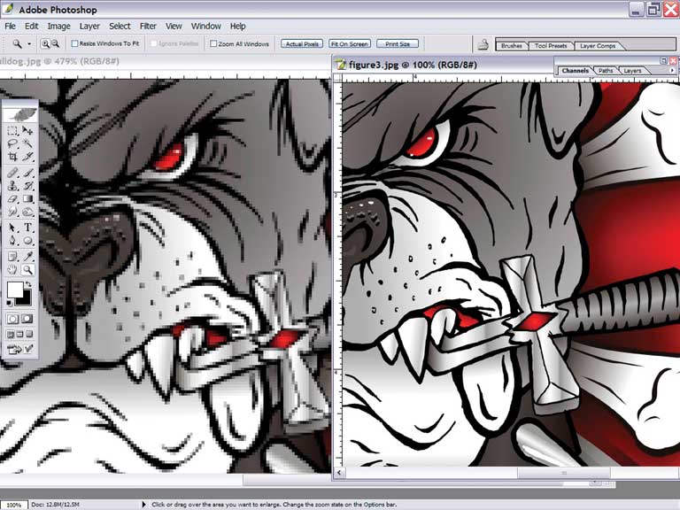
Edge quality This attribute can be a function of resolution but it is actually more an issue of image development and conversion. When a file is created in vector software and then converted into a pixel or raster-based file, its edges are then turned from lines to edges of pixels. How well these pixels align to create the edges in the design can be defined as the edge quality of the design. A file with good edge quality will have clear areas of contrast, and one with poor edge quality will have blurry edges (Figure 1).
Color values This review is an examination of how the file has incorporated colors into the areas of the file. Some graphics may have very controlled areas of color that are contained by shapes. This style of graphic typically will print really well. Other images may have a lot of color noise(Figure 2) that can pollute colors and make them both difficult to separate and very challenging to replicate on press. The actual color values in an image relate to how bright, saturated, and what the hue of the colors is in the image.
Overall complexity The complexity of a design doesn’t always mean that there are a lot of pieces in the image. Complexity can also be a function of how difficult the design might be to replicate or separate properly. Determining overall complexity is usually a combination of art/visual, separation, or production art challenges, and printing concerns with the image, or both the image and the garment.
Trouble areas The most common trouble areas in an image to be separated are usually parts of the design that are easy to see if they are off in hue, position, and or clarity. Sometimes an image will contain a lot of memory colors, which are colors that need to be correct in HSB, or the average person can tell that something just doesn’t look right.
Memory colors often include objects made out of wood, metal, stone, or flesh. Even a non-artist can tell if a person’s face doesn’t look right in hue because they have so many memories of what a normal face color looks like.
Controlling the ink
Controlling ink is not everyone’s favorite task, and it takes a dedicated employee to really dive into the inks and get some good results. One particular effort that can yield tremendous benefits to a printing company is the establishment of a standard set of inks. Choosing from the most commonly ordered inks, and then only stocking these 25-30 inks can be a wonderful guide for clients to pick from and it can really help to avoid costly ink mixing and matching (Figure 3).
While it is certain that PMS matches will still be made, the standard ink palette can save boatloads of time if the sales force properly embraces it and sells from the stock ink list first.
Once the standard inks are defined, then it becomes a process of how separations can be manipulated to attempt to use these inks whenever possible to increase profitability. Whenever a separation set is not a critical color match, efforts can be made to steer the artwork (and the client) into approving a proof using stock inks.
Press standard settings
Getting a working shop to do testing is like taking the chain off of a bicycle. All of a sudden everything stops! But testing to determine the best press settings is a very rare process in most shops. Truthfully, the majority of screen printers do not have a clear idea of what settings on their presses give them the best results. The common objection to this is that each job requires a setting change to perform well, but remember that this is because there are issues in the separation and art departments. Once the standards in these departments are followed, then the press can be set up and left with the optimal settings for the majority of jobs.
One way to set up standards on the press is to run tests with ink colors to look at colors on and off of an underbase (Figure 4). This has the dual purpose of creating an ink reference book and an art guide at the same time to show how the inks perform on and off of an underbase. Creating this book is an excellent time to dial in the press settings and see what pressure, off-contact, and screen tension, etc. creates the best prints that hold the details.
Standardizing separations
Creating standards in the separation process is greatly simplified if the inbound artwork, inks, and press setup are already consistent. It is amazing how quickly a job can be split and sent to films when other systems are in place and ready.
A couple of keys to creating consistent separations can make even shorter work of the process of splitting a design into a set of positives: Adjust the original file to average and combine stray colors (some call this color crunching); boost edge quality and contrast; then create a digital build of the artwork to define a system that will work time and time again to create separations that can be relied on to replicate a design.
Adjusting the original file is simple enough. The hardest part of any color correction is to select the color without affecting the rest of the image. One fast way to save a lot of time and avoid making paths is to use the color range tool, make a color selection, then squeeze the selection using levels on a saved channel version of it. This channel can then be used like a path. Just control or command click (Mac) on the channel picture and then you can select the color from just those areas in a snap. I commonly use this process on faces or skin areas in images to average the hue.
I average the hue on a drawing by creating the previously mentioned selection channel, then copy and paste just this area of color as a new layer. This new layer can then be set as a color adjustment layer by using the hue/saturation dialog and selecting the colorize option in this menu (Figure 5). This will force the color in the layer copy to be averaged to the same color family. This layer can then be merged down and saved as a final. Using this method can tremendously help standardize separations and also assists with forcing a design to work with specific ink colors that are in stock.
There are only a few ways to really boost edge quality. A favorite way of mine is to make a duplicate of the black channel and then use a sharpened/unsharpened mask on it at a low setting to clean up the outline edges in a design. This cleaner black can then be recombined with the image or overlayed as a modification layer in Photoshop.
The final and most important way to standardize separation methods after the support systems are in place is to always create a digital proof of the separation positives in Photoshop. A channel is created that will represent the shirt and block the image channels. Then the separation channels can be viewed as they are made visible by selecting the eye button in the left of the channel box. If the right color has been put into the channel options to simulate the ink color the digital proof should show a fair example of what the final print will look like on the color garment that has been placed into the file.
If these systems and steps are put in place to support each other, then it should drastically improve the consistency and quality of the final separations. With practice and careful observation, each area of a printing shop will improve in productivity and efficiency when support systems are in place.
Subscribe

Magazine
Get the most important news
and business ideas from Screenprinting Magazine.
Most Popular
-

 Art, Ad, or Alchemy1 month ago
F&I Printing Is Everywhere!
-
 Case Studies1 month ago
High-Density Inks Help Specialty Printing Take Center Stage
-
 Andy MacDougall1 month ago
Functional and Industrial Printing is EVERYWHERE!
-

 Editor's Note1 week ago
Livin’ the High Life
-

 Columns2 weeks ago
8 Marketing Mistakes Not to Make When Promoting Your Screen Printing Services Online
-

 Thomas Trimingham2 months ago
“Magic” Marketing for Screen Printing Shops
-

 Marshall Atkinson1 week ago
How to Create a Winning Culture in Your Screen-Printing Business
-

 Press Releases2 months ago
Big Frog Custom T-Shirts & More of Round Rock Celebrates Grand Opening

