Articles
Published
22 years agoon
If you are in the business of printing color, you are also in the business of mixing and matching color. Every printer has been faced with the challenges of duplicating the color on a customer-supplied swatch or the frustration of having a carefully matched Pantone color rejected by the client–sometimes more than once. Indeed, mixing and matching color can be a frustrating experience, with customer approvals granted more on whim than anything resembling logic. As for matching color using four-color process or halftones, we won’t even attempt to go there in this discussion.
After nearly 30 years of working with color directly and with other printers in demanding color-matching situations, I’ve come to the conclusion that color is the most sensitive and difficult aspect of our process to master. We face technical issues related to color specification, digital display, mixing systems, pigment and printing technology, measurement and viewing, and surface application, and each of these areas impact our ability to match colors.
It simply is not possible to cover every aspect of this subject in one feature, but it is possible to cover most of the major considerations and how they relate to each other. Some of these considerations are not well known and are seldom discussed at length. I think this stems primarily from our tendency to believe what we are told and to not question the underlying principles.
Color specification
At the very heart of color management is the way color is specified to us. By far, the most common and popular method is the Pantone Matching System from Pantone Inc. This is a registered system that at-tempts to provide color-specification capabilities to designers and their clients. Printers then attempt to replicate the specified colors in a number of different ways. Most will usually rely on an ink company whose color-matching ink systems have been approved by Pantone through a specific certification process. The ability to use Pantone color references all sounds wonderful on the surface, but it is fraught with potential problems.
Almost every printer is familiar with the primary reference guide for the 1012 Pantone colors: the Pantone color-selection book. It contains printed color chips on either coated or uncoated paper, along with the Pantone color-mixing formulas used to obtain the final colors.
As screen printers, we face a major color-matching challenge right from the start: All of these books were produced using offset lithography, and the formu-las are designed for use with offset inks. In fact, Pantone colors that have been matched using the screen-printing process are referred to as “Pantone simulations.”
Pantone Inc. provides its color-matching guides to all licensed ink manufacturers once it approves their specific versions of the matching system. The top cover of the book is typically customized and personalized for each ink company.
When attempting to match colors to the Pantone book, screen printers have several limiting factors to keep in mind. The first is the age of the book used to specify the colors. As the books get older, the printed colors oxidize or fade. The recommendation is to replace books over one year old, and in recent years, Pantone began printing the date on the book for reference.
But because the books tend to be fairly expensive, printers are reluctant to discard them. In an attempt to save a few bucks, they run the very real risk of delivering color matches that are significantly in error compared to the Pantone color in a fresh book. This also goes for the designer or specifier who references the number. Printers should always demand actual samples of the colors their customers are asking them to reproduce. This is the only sure way of having an accurate target.
The second challenge for screen printers is the effect of our wide variety of substrates on the surface appearance of the printed color. For example, if we print on textiles, do we use the coated or uncoated Pantone color chips for matching? No matter which version we select, we are pretty much on our own to deliver the target color. If we print graphics with UV inks, the problem we face is gloss, since UV colors are significantly glossier than the samples on coated stock. In both cases, the client ultimately will be the one who decides if the match is accurate.
When it comes to using the ink-mixing values in the Pantone book, I would have to say the overall matching capability is fragile at best. There are simply too many factors in color reproduction that are beyond the control of Pantone, the designer, or the printer.
Still, we can reign in color to a large degree by following the tips and suggestions that appear in following sections. But if we rely on visual matching, achieving an accurate color becomes a matter of subjective decision making at best. Under such circumstances, a matched color that is completely acceptable today may be unacceptable tomorrow.
Digital display
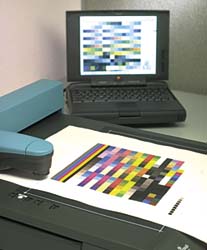
Few printers would argue that we are now living in a digital prepress world. Virtually all of our art is delivered electronically as a file in either vector or raster format. Regardless of the application that was used to create the graphic, color was displayed on a monitor, and color decisions were based on what the designer saw there. But no two monitors or viewing conditions are identical.
Digital color management attempts to address this through monitor characterization and calibration using various accepted values. As printers, our job is to make sure that we are as close to these specifications as possible when we look at the file and evaluate the colors specified by the customer.
This is not an article on color management in the ICC sense, yet the various components that make up an ICC monitor profile can have a profound influence on what we see, or what the specifier sees. Among monitor viewing factors to consider are the following:


Subscribe

Magazine
Get the most important news
and business ideas from Screenprinting Magazine.
Most Popular
-

 Art, Ad, or Alchemy1 month ago
F&I Printing Is Everywhere!
-

 Case Studies1 month ago
High-Density Inks Help Specialty Printing Take Center Stage
-

 Andy MacDougall1 month ago
Functional and Industrial Printing is EVERYWHERE!
-

 Editor's Note1 week ago
Livin’ the High Life
-

 Columns2 weeks ago
8 Marketing Mistakes Not to Make When Promoting Your Screen Printing Services Online
-

 Thomas Trimingham2 months ago
“Magic” Marketing for Screen Printing Shops
-

 Marshall Atkinson1 week ago
How to Create a Winning Culture in Your Screen-Printing Business
-

 Press Releases2 months ago
Big Frog Custom T-Shirts & More of Round Rock Celebrates Grand Opening