Articles
Published
17 years agoon
Have you found the best method of separation for your screen-printing operation? Has trial and error and the process of going through variables led you to a preference for a certain method of separating garment graphics? In my experience, the best separation method for a specific printer is the one that causes the least amount of trouble. And trouble can show up in any area of a company.
Have you found the best method of separation for your screen-printing operation? Has trial and error and the process of going through variables led you to a preference for a certain method of separating garment graphics? In my experience, the best separation method for a specific printer is the one that causes the least amount of trouble. And trouble can show up in any area of a company.
It boils down to the people factor in each department and how well the leadership for each division in a company rises to new tasks and adapts to change. One person’s trouble is another person’s challenge and chance to learn new ideas. Ideally, the leader of the art department should take the reins and dictate the best method of separation for the company by careful analysis of the average style of artwork. This determination is then converted into action and implemented in the other departments. Depending on the artwork, the art supervisor may decide to separate using four-color process, simulated process, index, or spot colors.
Let’s look at these four types of separations and the styles of artwork for which they’re suited. Each separation method has advantages and disadvantages that can dramatically influence production capacity and downtime. The important thing to remember from the beginning is that no method works on everything.
Spot color
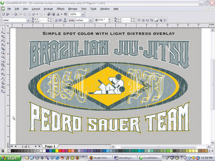
Every screen printer prints spot colors at some point. Essentially, spot-color separations are colors that are not used to create other colors. They maintain their own color integrity in their own location (or spot). Most printers start out printing spot-color designs, and these are the bread and butter of many shops. Spot-color prints tend to be more opaque prints that try to simulate a specific hue in a controlled area (Figure 1). Which shops need spot color separations? Those that work on simple designs, without significant blending of colors or gradients, as well as athletic prints or images with flat areas of color and designs that have a lot of geometric or outlined shapes with fills of specific colors.
Some art can be executed as spot color, while other designs really need to be separated into halftones. Often it is simply a matter of not having enough available heads on a press that pushes a design job to the next level. I’d be willing to bet that some printers would rather set up for a 20-color print than work with four-color process, but press limitations force them to consider it and other options.
Companies that print mostly spot-color designs tend to develop an affinity for artwork that is vector-based and utilize software to accommodate this preference (e.g., CorelDRAW or Adobe Illustrator). Printers who work with bitmapped images and more complicated methods of separation may develop a negative attitude about spot-color printers. I like to remind those who get too high-tech to take a second look at the spot-color prints and take a particularly close look at the profit margin on those boring spot jobs. It doesn’t take an engineer to figure out that companies that get more simple spot-color work tend to be very profitable because these types of jobs are quick and easy to produce.
Printers should always consider how they can push up the percentage of spot-color printing to help offset some of the less profitable and more challenging work. Some printers I’ve worked with have redefined their catalogs and even recreated preprint lines to include more spot-color designs (particularly name drops) to make production far more profitable.
Four-color-process separations
Many garment printers frown upon this method of separation and printing because all of the variables must be controlled to achieve consistent results. I have received some seriously dirty looks when suggesting this method as a solution. I think that the issue is more about the fear of the unknown than anything completely logical.
Four-color-process separations use the printing method of cyan, magenta, yellow, and black (CMYK) broken up into small dots that reproduce a wide array of colors by visually blending these colors to create other hues. Most commercial printing on paper and for magazines uses a variation of process printing to reproduce colors. Screen printing four-color process is more of a hassle because garments and screen mesh can contribute to visual inconsistencies in color and clarity.
Why consider four-color process? Full color, photographic reproduction is the primary reason. If a printer consistently gets work that requires a full gamut of colors, this option can be the only choice (Figure 2). On the management side, it looks really enticing to print four colors instead of 12 to recreate an image. Process-color inks are transparent so they recreate transparent hue shifts very well. They’re extremely effective on white garments, and they lend themselves to designs that have a lot of realistic blending and overlapping transparent effects and hues. Four-color process also may be appropriate for printers who are already very proficient in either index or simulated-process work and want to convert some incoming jobs to increase profit and efficiency.
Few printers take the time and effort to master the four-color-process print. Being able to reproduce a wide gamut with four simple colors and print consistently is a very valuable skill. The real challenge is developing a function-al process that is consistent, repeatable, and profitable. Whether to separate the designs in house or send them out is another issue because a high level of skill is necessary to color correct and then properly separate a four-color-process design so that it recreates all of the right colors in the right areas and prints easily. Printers who work very successfully in the realm of simulated process can and should investigate the possibilities of integrating four-color process into their workflow. The advantages to printing fewer colors and getting more hues are easy to perceive, but there’s also an advantage in that they’ll be able to accept work that others would not attempt.
Simulated-process separations
This method of separation became the number one technique for reproducing stunning prints on dark shirts because of its ability to recreate secondary hues by blending colors and preserving brightness and opacity. Most of the difficulty with this method is in consistently producing high-quality separations. The separations for simulated process can be an art form. Experience can help a great separator know what colors to substitute and blend to create subtlety and drama in an image, as well as what is just not possible to recreate without adding a color.
Simulated process produces the brightest prints, but the production end of it is not a simple matter. Overlapping hues and halftones often re-quire custom color matching, and press issues can create unwanted dot gain in colors as they stack up on top of each other. Handling all of the variables effectively takes practice and consistency with separations, screens, and press setup.
Should you use simulated process? This premier separation method is an obvious choice for companies that produce a lot of full-color, illustrative work on dark shirts. Biker shirts and a lot of nature/animal apparel are printed using simulated-process separations. Companies moving out of spot-color separations and working more into process with a lot of halftones and blends will find that the simulated-process prints are forgiving on press and tend to maintain quality better than some of the other processes. Finally, printers who have a large call for dark shirts and designs with lots of shadows and transparent effects need to consider simulated process.
Illustrative work on shirts is back in vogue right now, so a lot of printers are looking at simulated process to try to develop a method that will create bright prints on dark shirts (Figure 3). Printers who win a lot of awards are usually experienced at simulated process because this method of separation provides the most control over the final print and gives extraordinary results if the time is put in.
The largest downside to high-end simulated-process separations and printing is that each job needs its own tweaking to be really successful. In many cases, you’ll have to customize a separation set so that the design’s saturated colors are incorporated in areas like shadows and highlights to really give it a pop factor. For some printers, this level of individual, per job, adjustment is a nightmare; for other companies, it’s an exciting challenge. A shop’s personality and mentality really make the difference. I respect those who enjoy a challenge, but I equally respect the mentality of knowing what works for a business and when to say no way.
Index separations
The screen-printing industry still has yet to make the most of this method of separation. I would guess that the reason for this is twofold: Most printers simply don’t know how to create these separations well, and index has a bad reputation for creating grainy prints that lack subtlety and need too many colors. You will regularly require six to eight colors at the minimum to create decent index prints. It isn’t uncommon for an index print to bump up the colors into the 12-14 range for painting and complex design recreation. This can scare a lot of printers away from the method entirely.
The truth about index separations and the printing of these designs is that the process is so simple it can become quite addictive, especially for a printer who commonly separates by way of simulated process. I’ve worked with companies that print nothing but index seps, and they no longer use the other processes because they can’t deal with all of the downtime. That is the huge advantage of index separations for screen printing. Printers can save tons of time on the separation side, as it’s typical to separate an index set of posi¬tives in fewer than 10 minutes, even for a very complex design that requires some customization. Index separations shine even brighter on the printing side of the process.
Index separations were originally developed to convert images into fewer colors by using a unique color table to replace a much larger gamut. The computer averages the colors and forces them together in a ratio of pixels similar to the way they are displayed on screen. Each dot in an index separation is actually one square pixel, and the colors fit next to each other like a checker-board. The big advantage of this in screen printing is a reduction in dot gain. Very opaque colors are printed next to each other, not on top of one another as they are in process-color printing. Index separations have many other advantages in comparison to traditional halftones (Figure 4).
Why use index separations in your shop? Index printing can maintain detail when you reproduce paintings or illustrations that would otherwise be at risk with traditional halftones. Index printing is a great method for shops where number of colors is less of an issue and ease of printing and separation is more important. Finally, index separations work great for templates where vector designs are laid on top of them or quickly layered into the image files. Name drops can be properly viewed and then quickly printed out using index separations.
Index separations and prints have a unique look and seem complex, but many printers don’t realize just how simple they are to create and print. A couple extra colors are not a very big sacrifice if hours of separation and press setup are saved. However, index seps aren’t perfect. A major downside to index printing is the loss of control on transparencies and long, graduated shadows on designs. Index is a variable square dot, so it can’t recreate fading and transparent effects as well as simulated process can without adding a lot of extra colors.
Combining methods
Deciding on a primary method of separation for your screen-printing shop can be a simple process when the art leads the way. Printers who already feel they have a good handle on a separation method would be well served to investigate the ones that they are not using. Simulated process is a fantastic method, but it is often slow and tedious compared to index separation. On the other hand, index separation by itself can not effectively recreate many images that have shadowy effects. One solution is to learn and merge several of these methods and create an original method that breaks down the barriers of definition.
Use index separations with simulated-process areas incorporated to handle the shadows and transparencies. Use four-color process inks as spot colors with some gradient overlays to help crunch down colors on simple jobs. Try index separations using four-color process inks and simulated spot colors to reproduce difficult images without the worry of frequency problems or dot gain. Concepts like these can separate you from your competition and help you produce fantastic prints consistently and without a lot of downtime.
Thomas Trimingham is an award-winning art director, illustrator, and separator who has more than 16 years of experience in the screen-printing industry. He can be reached at ttrimingham@yahoo.com.


Subscribe

Magazine
Get the most important news
and business ideas from Screenprinting Magazine.
Most Popular
-

 Art, Ad, or Alchemy1 month ago
F&I Printing Is Everywhere!
-

 Case Studies1 month ago
High-Density Inks Help Specialty Printing Take Center Stage
-

 Andy MacDougall1 month ago
Functional and Industrial Printing is EVERYWHERE!
-

 Editor's Note2 weeks ago
Livin’ the High Life
-

 Columns2 weeks ago
8 Marketing Mistakes Not to Make When Promoting Your Screen Printing Services Online
-

 Thomas Trimingham2 months ago
“Magic” Marketing for Screen Printing Shops
-

 Marshall Atkinson2 weeks ago
How to Create a Winning Culture in Your Screen-Printing Business
-

 News & Trends1 month ago
What Are ZALPHAS and How Can You Serve Them in Your Print Business?