Expert Perspectives
Published
15 years agoon
Blending one color into another to get a third color should be a simple enough process, right? Sure, yellow and red make orange—but numerous challenges await when it comes to blending these colors as halftones on a screen-printing press. Dot overlap, bleeding, dot gain, and poor coverage are just a few of the issues that can plague an otherwise simple process in a hurry.
To make progress with blending colors, especially on dark shirts, it is a good idea to first cover the basics and then move into some intermediate areas before you can move to the next level. The control over blending colors typically starts with the artwork, then moves into the screens, and then balances finally when the ink is printed onto the garments. Following this linear process forward would seem to make the most sense, but, in reality, the easiest thing to do is to carve through the whole mess backwards by starting with the inks, then taking a serious look at screenmaking, and finalizing the effort by collecting all of the information and funneling it into the artwork creation and separation process.
Doing things backwards is a common way to align the variables in a production process—as long as the controls for the end result can remain consistent. In other words, the press needs to be in good shape and hold registration for the whole refinement to take shape. It makes no sense to try to work backwards from test prints done on an uneven press with dull squeegees, warped screens, and bumped platens. Results will vary too much, depending on the uncontrollable surfaces and pressures presented. Only by dialing everything in will it make sense to work through the process backwards and isolate the necessary elements that can provide a new standard for color-blend printing.
Test your press and printing surfaces
A quick press check is essential to keep everyone honest. And if asked, the majority of screen printers would shrug if you were to ask them to identify the last time they checked the level and consistency of their presses. Why? For the most part, the machines are pretty consistent, so they tend to stay in spec for long enough that issues can be addressed as they come up. Only when a serious break to a part or a printhead failure occur are maintenance concerns brought up.
A better way is to schedule press checks on a bi-monthly basis—or monthly, if you specialize in high-volume printing. The check should include testing all arms for level, consistent off-contact, and even stroke and pressure to the flood and print motions. Small inconsistencies should be adjusted, if possible, and large ones need immediate attention. There is simply no way to print consistent halftone blends on a press that has uneven printing surfaces or other misaligned elements. In addition, this is a great time to grease fittings and replace any worn parts that may cause an issue at a really busy time later on.
Testing the related printing equipment
Painters use brushes to create their shapes and carve out details. Screen printers have their squeegees as tools to create a perfect print. Just as a painter would never attempt to create a great painting with a worn out, bent-up brush, a screen printer needs a squeegee that is sharp (for most printing), flat, level, and the right flexibility for the type of ink that is being used and the image type being printed.
Busy shops need to check squeegees on a weekly basis. The blades get dinged up and dull, depending on how they are handled and cleaned. Serious printers carefully clean their squeegees and place them upright to dry, which helps save the edges. The habit of tossing a valuable tool into a solvent sink to bang around with other items is a sure route to a pile of dull urethane that won’t create a decent print.
Clues that squeegees are getting worn will show on the print side of the screen after the squeegee has passed. Look for lines of ink that may indicate a groove in the squeegee and areas on the sides or front/back of the screen that look like the pressure changed and ink wasn’t cleared off. This can indicate an uneven blade or an inflexible blade that is skipping across. Dull blades are a little harder to diagnose from the print but are easy to see with a close visual inspection.
Having quality squeegees to create a good print is a must, and you must pay equal attention to the care and maintenance of your screens. A good concept to follow is to check each screen for tension and holes after each reclamation so you can have a label that will show screens that are low in tension and that need to be isolated or discontinued. One of the biggest troubles that printers have in screen printing higher quality work is lack of control over screen tension. The biggest concern is really having an acceptable level of tension that is consistent from one screen to the next so that each screen flexes the same amount. This prevents issues with registration by requiring less squeegee pressure on press. The ultimate goal is to use the lowest pressure necessary to create a decent layer of ink that will sit on the surface of the garment rather than penetrate deep into the material (this is the case for the majority of standard screen printing applications with plastisol inks).
Testing the inks and finding the best dot
If you’re armed with great squeegees and perfect screens (or close at least), it should be a simple matter to print beautiful blends. Unfortunately, the inks can still cause some issues depending on their composition and attributes. The fundamental characteristics of your inks will dictate whether you’ll need to modify them to a certain degree to make sure they create the best blending of colors and remain the brightest during the print run (a list of these characteristics is provided in the sidebar “Ink Attributes” at the end of this feature article).
Additives, such as viscosity modifiers, are commonly used to optimize inks for halftone printing. You must take care when using additives to not mix in too much and damage the print’s washfastness or make the ink too transparent. The best method is to follow the manufacturer’s instructions and slowly add in these products to achieve the proper viscosity. It is a known fact that most plastisol inks come in the door a little too thick and tacky for perfect halftone printing. Perhaps inks are manufactured that way because it’s easier to loosen an ink with modifiers than to try to thicken it.
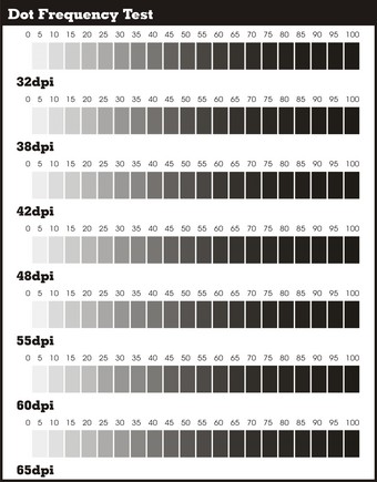
Start with the most printable dot for your shop when testing inks for blending. Finding this dot is accomplished by creating a test pattern of assorted resolutions (measured in dots/in.), which is then output as a positive your best film, exposed, and printed through the higher mesh counts reserved for halftone printing (Figure 1) on garments. Typically, this is a 200- to 390-thread/in. mesh count.
Evaluate your test print and identify the halftone line count that prints with the best tonal range. Careful inspection is required to see the best test strip—the one that maintains a clear 0-100 set of steps. If you have trouble finding the division between the 80-90-100% tonal ranges on the printed strips, tonal compression is to blame and a bigger dot will likely solve the problem. Also keep in mind that a lot of tonal compression in this test is a sure-fire sign of printing with too much pressure. Remember, it is critical that you perform this test with everything in the same process as the final job and with the same pressure levels, which as stated earlier, should be as low as possible. Also, using extra flashes or other production steps will only cheat you out of the results that show what you need to do to prevent problems in production.
Run a couple of blending tests after you’ve identified the ideal halftone line count. You might be thinking, “I don’t have time for all of these tests.” While I understand the urgency of making money by keeping presses running with production orders, it is impossible to standardize and create better prints without determining and documenting best practices, and this requires a little downtime. The blending tests demonstrate the best method and standard for creating extra colors without frequency issues, underbases showing, or a lot of dot gain. The reality is that you don’t need to conduct this test more than once, as long as equipment and other printing parameters (e.g., mesh tension) don’t change. Running the test establishes an ideal scenario that you can recreate to standardize and reduce ink costs, speed up production, and help prevent a lot of press downtime.
A blending test can also provide a benchmark for defining the right amount of color overlap and what the densities should be (Figure 2). The colors destined for blending are placed in the proper screens and then printed on a variable underbase and on a light shirt to reveal the best combination for achieving a quality blend.
A common process is to first run what might be called the blend’s foundation color. The foundation color is usually the lighter color or the one that is used in a larger amount in the final blend—yellow is probably the most common one. The next color is the accent color or modifying color that will shift the foundation color to approximate the secondary or tertiary color that you want to achieve.
Also consider the underbase and its density in this process, because—believe it or not—some inks run a lot better without using a 100%-solid underbase. And if you intend on running the print fast with wet-on-wet blending, the inks will always run better with some of the shirt coming through to which they can bind.
The final results will make clear which colors run the best. Record all of the information related to the inks and any modifiers that you added to them. Other important considerations are screen tension, print speed, and squeegee pressure. These records will enable your shop to rise up to the upper 5% of screen-printing shops that truly know their prints from the ink backwards. The final results can then be feed backwards into the art department. Just imagine a printer going into the art department and saying, “Give me an 80% underbase on this job so I can run it twice as fast with one flash and use half the ink and the final print will look better than the original.”
An ironic twist to knowing your blending standards is that the more blending of colors you have in an art piece, the easier it is to break up the underbase and use fewer flashes. I know printers who are experienced with this process advise clients to add blends to their previously solid prints so that the final shirts will look better and, at the same time, be much easier to print (Figure 3).
One interesting side effect of establishing a standard for blending colors with a set resolution, angle, specific screen meshes, tensions, and modified inks is that the somewhat painful process relieves a lot of pent-up issues between the art and printing departments. After all, setting standards makes it easier to agree and to process jobs without having to blame each other for things that go wrong.
Ink Attributes
Hue The color that the pigment in the ink reflects determines the color that we see.
Viscosity The thickness of the ink that determines how quickly it will flow through an object.
Tack The function of how sticky the ink is and how much it may get picked up by other screens or not release easily from the mesh onto the garment.
Opacity Relates to how well a layer of this ink will block light from going through it. The functional application is so that the shirt or the underbase won’t show through the ink.
Finish The ink has a certain look to it when it is cured, varying from glossy to dull or matte. Inks that are more transparent tend to have glossier finishes and inks that are very opaque tend to have duller finishes.
Value Relates to how dark or light the ink color is. Ink opacity can dramatically affect value and how much of the printing media’s color shows through.
Saturation Relates to how much pigment is in a specific ink. Higher pigment load equals higher color saturation, which makes the ink look very bright and rich with color.
A fundamentally good ink for printing blends is one that has lower viscosity, medium-high opacity with low tack, a semi-glossy finish, a deep saturation with a strong hue and value.
Thomas Trimingham has almost 20 years of experience in screen printing as an award-winning artist, separator and industry consultant. You can contact Thomas through his Website, www.art4screen.com.


Subscribe

Magazine
Get the most important news
and business ideas from Screenprinting Magazine.
Most Popular
-

 Case Studies2 months ago
High-Density Inks Help Specialty Printing Take Center Stage
-

 Art, Ad, or Alchemy2 months ago
F&I Printing Is Everywhere!
-

 Andy MacDougall2 months ago
Functional and Industrial Printing is EVERYWHERE!
-

 Columns3 weeks ago
8 Marketing Mistakes Not to Make When Promoting Your Screen Printing Services Online
-

 Editor's Note2 weeks ago
Livin’ the High Life
-

 Marshall Atkinson2 weeks ago
How to Create a Winning Culture in Your Screen-Printing Business
-

 Thomas Trimingham2 months ago
“Magic” Marketing for Screen Printing Shops
-

 News & Trends1 month ago
What Are ZALPHAS and How Can You Serve Them in Your Print Business?