Thomas Trimingham
Trending Artwork: Distress or Grunge?
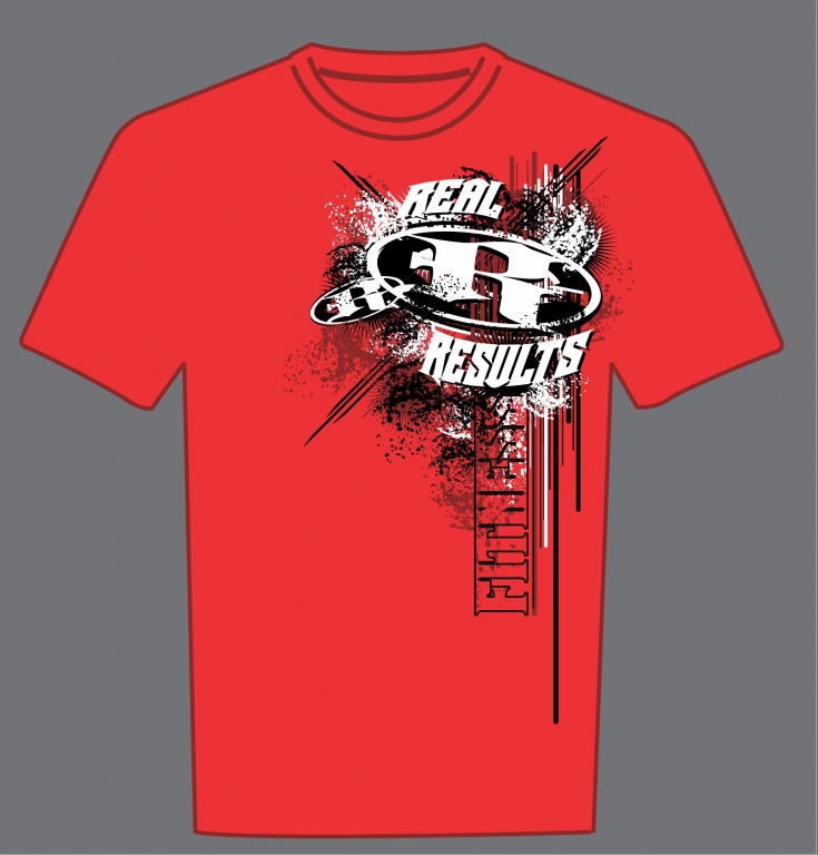
ONE POPULAR EFFECT TODAY that is often mistaken for a distressed graphic is what some call a “grunge” design. They are similar, but it’s useful to differentiate between the two because they are created in different ways.
 In a distressed graphic, pieces of the design are removed by the filter overlay to make them appear worn away, cracked, or broken down. A grunge design may also have such elements, but the essential difference is that the image will also be distorted, squished, splattered, and fundamentally extended beyond its borders in what appears to be an accidental way. A grunge design will often have paint splatters, smears, and other intentional defects that can make it look like a bad screen print that was smashed onto the shirt.
In order to make a clean design appear to be “grunged out,” additional pieces of artwork need to be placed in strategic places. Afterward, a grunge design may be distressed as well. These extra steps are why a grunge design may be distressed, but a distressed design may not necessarily be grunge.
Let’s Talk About It
Creating a More Diverse and Inclusive Screen Printing Industry
LET’S TALK About It: Part 3 discusses how four screen printers have employed people with disabilities, why you should consider doing the same, the resources that are available, and more. Watch the live webinar, held August 16, moderated by Adrienne Palmer, editor-in-chief, Screen Printing magazine, with panelists Ali Banholzer, Amber Massey, Ryan Moor, and Jed Seifert. The multi-part series is hosted exclusively by ROQ.US and U.N.I.T.E Together. Let’s Talk About It: Part 1 focused on Black, female screen printers and can be watched here; Part 2 focused on the LGBTQ+ community and can be watched here.


The Profit Impact of a Market Dominating Position

Inkcups Announces New CEO and Leadership Restructure

Hope Harbor to Receive Donation from BlueCotton’s 2024 Mary Ruth King Award Recipient


Bulletins
Get the most important news and business ideas from Screen Printing magazine's news bulletin.
-

 Case Studies2 months ago
High-Density Inks Help Specialty Printing Take Center Stage
-

 Art, Ad, or Alchemy2 months ago
F&I Printing Is Everywhere!
-

 Andy MacDougall2 months ago
Functional and Industrial Printing is EVERYWHERE!
-

 Columns3 weeks ago
8 Marketing Mistakes Not to Make When Promoting Your Screen Printing Services Online
-

 Editor's Note3 weeks ago
Livin’ the High Life
-

 Marshall Atkinson3 weeks ago
How to Create a Winning Culture in Your Screen-Printing Business
-

 Thomas Trimingham2 months ago
“Magic” Marketing for Screen Printing Shops
-

 News & Trends2 months ago
What Are ZALPHAS and How Can You Serve Them in Your Print Business?