Digital Printing
Published
16 years agoon
If you had to put your finger on the hot point of conventional screen printing or digital printing, the first consideration would be the printing equipment, right? Where is the weakest link? At what point can the project come to a screeching halt?
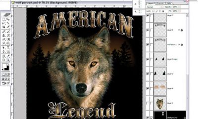
I believe the gateway to our world of printing is a critical doorway—and that entrance is the Mac. Yes, some designers or in-house corporate ad departments utilize PCs, though generally a Mac file is provided from which to print. There are many methods of madness to achieve the same visual result within the various graphics programs, though techniques may result in vastly different time frames. Tricks of the trade is not a course that is offered in even the best of the graphic-design schools, so I dug deep into the minds of some quirky Mac individuals and found some nuggets of wisdom. I hope these tricks will save you some time and frustration.
Most files are generated with the Adobe products within the Creative Suite (Photoshop, Illustrator, and InDesign), so I will focus my thoughts on these programs and the Mac OS platform. We are dealing in a world of color, and the files generated within these graphics programs are at the heart of the color equation. The files are prepared, manipulated for digital printing, and sent through a computational process (RIP) so that the printer will represent the intent of the graphics file. The color can be translated within the workflow at many points; therefore, a reduction of possible translation points will create a more repeatable color product.
Trick one
Use the Adobe Bridge Tool to synchronize color settings with-in all the Creative Suite programs. Bridge is an organizational program created and released by Adobe Systems as a part of the Adobe Creative Suite. Its primary purpose is to link the parts of the Creative Suite together, and the ability to manage color intent more easily is one of the benefits. It is accessible from all other components of the Creative Suite. Synchronization through the Bridge tool standardizes the translation of color information from your client’s file through your print workflow, across Photoshop, Illustrator, InDesign, etc.
One of the best things that Bridge can do is show extraordinary detail in an image that has not yet been opened in Photoshop. How many times do you want to see the resolution effect of a multi-gigabyte file while the client is waiting on the phone? I can still hear the Jeopardy! clock ticking. Well, if you want to check the sharpness of an image or see detail in a high-resolution image, you can click on its preview in Bridge. The program (after a few seconds of disk-grinding) will display the full-resolution image under an on-screen magnifying glass. Move the magnifier around, and you’ll see a different part of the image. I find it really extraordinary, and I use it often now that I know how powerful it is. And I never actually opened the image!
Another use I recently found for Bridge was to read a logo in a very small area of a huge photo. The graphic was photocomposed, and apparently one component was flopped for effect (and unbeknownst to the client, so was the logo). There was no way I’d have seen the logo without printing the display. The magnifying tool allowed me to read these elements with-out difficulty—and without opening the file. Neat stuff.
Trick two
This trick involves a bit of housekeeping: Optimizing the Mac system should be kept in the back of your mind, as the graphics world utilizes huge files and requires processing power to be efficient.
The Mac operating system, called OS X, doesn’t include a registry, which is a feature of Windows that holds information that programs need to operate properly. So there’s no need to clean or maintain any registry on a Mac. But Mac hard disks, like those on Windows computers, can become fragmented—a condition in which parts of files are so scattered on the disk that the disk runs slowly. Apple uses the term optimizing to say defragmentation. Tools for optimizing reside in Disk Utilities, and the path is Applications/Utilities/Disk Utilities. Our maintenance schedule calls for performing this housekeeping once a week, and it takes minutes to perform. You can even set the utility to run in the background.
Trick three
This trick falls under the I really do not know what is wrong category. IT people always say if it doesn’t work, wiggle the cord. That same methodology holds true for program issues that just do not make sense and will not go away. So, when in doubt, reboot the computer. This trick resolves half of your problems. Just make sure you save everything and quit all open programs before rebooting.
Trick four
This trick is a method for troublesome programs that don’t react the way you would predict. If the program quits unexpectedly too often or becomes glitchy, the time has come to trash the program’s preferences. Rather spending a multitude of hours trying to figure out why the program is not running correctly, it’s usually a safe assumption that the preferences have become corrupt. The resulting crashes mean your productivity really takes a downturn.
The route to trash preferences is as follows: Open your hard drive icon in Users/Your User Name/Library/Preferences. Now you will see all the preference folders for all the Adobe applications. For example, if Illustrator is giving you trouble, trash the Adobe Illustrator CS Settings folder. As you open the program again, the settings will populate as you make selections prompted by the program. Each program has preference folders. Do not go into the launched program preferences. This is not the location of the corrupt preference.
Trick five
This one fixes what I call irritation issues for Mac operators, especially those dealing with fonts. If you are preparing a file for another company to print, please supply the fonts with your file. Better yet, outline the fonts within the program and supply the fonts. Font substitutions and angry clients will become things of the past. Have you ever noticed how clients ask, “How does that happen?” when things go wrong with their files? Clients really don’t expect an answer, as the question is rhetorical. But if they would outline the type, font substitution problems or RIP issues would be a thing of the past. The moral of the story that becomes trick five is make sure they supply two files—one with fonts and one outlined.
When you save the file as a PDF, make sure to embed all fonts within the final file. Many times a PDF is made to lock the file to prevent the printer from changing the file or mistakenly altering the file. That being said, font issues will crop up if the fonts are not embedded. The same thought process could be applied to the workflow on your printing devices. The digital printing process may be optimized or standardized by a workflow that converts your client’s native file into a PDF environment. Save yourself some grief, and embed the fonts first before RIPing to your printing device.
Trick six
This trick addresses the challenges of transparency. Newer graphics programs allow designers to create wonderfully photorealistic imagery through the use of transparencies, which are layers that allow the blending of images to generate the desired effect. Transparency is an extremely complicated software activity that results in challenges for the RIPs to understand. As the RIP converts the native file into a form that the printer can utilize, the RIP software must process this layering effect. The long and short of it is that not all calculations are correctly processed, resulting in print anomalies that would never have been predicted, and our clients asking, “How does that happen?” The trick is to flatten the layers by saving the file in a way that flattens the transparency before printing. This will give a visual of how the RIP will see the file with transparency effects.
Embed .psd files within the Illustrator program. This will prevent the image from breaking out into multiple individual pictures when the file is opened again. While we are on a roll, here are a couple suggestions for your client when they design files: In Illustrator, use filters as opposed to effects. Though, if using effects, make sure to Expand Appearance before saving file, as this will show what the file will really look like when RIPed. Also, avoid styles and effects. They look great on screen but may cause problems at output (RIP issues). Instead, create the effect you want as another artwork element.
Other helpful tricks
The final tricks are a few little-known short cuts on the Mac: zooming in on the file, inverting the colors on screen, and utilizing the Automator program to resize a group of files.
Zooming in or out is usually performed pressing the Cmd key and + or -. To bypass this process, hold down the control key while spinning the tracking wheel. This method is a much easier way to magnify images.
To view files for traps, add con-trast in order to assess resolution, and perform other tasks, it would be great to be able to reverse the colors on the screen. This can be done quickly by pressing the Cmd + Option + Control + 8 keys at the same time.
The Automator program is not usually on the radar screen for the classic graphics Mac operators, as their focus is imagery and not workflow. Following are instructions to set up the Automator workflow to resize selected photos:
Open Automator (in the Applications folder). In the Library column on the left, select Finder. From the Action column in the middle, select Get Selected Finder Items and drag the action into the large, empty Workflow area on the right. Next, select Preview in the Library column, and drag Scale Images from the Actions column to the Workflow area. Make sure it goes below the Get selected Finder Items action because actions occur in the order they appear in the workflow.
When you use Scale Images, an alert will appear asking if you wish to make a copy of the selected items before you change the image files. After the Scale Images action is added to the Workflow, enter the size in pixels of the desired longer side for your re-sized photos. Finally, click the Run button. Automator resizes all the selected photos and reports the results in the View Results area. Save the workflow with a name that you can easily recall. There are many other actions, and you can use the Explore Automator’s Actions list to find any that may wish to add to your workflow.
The last item I would like to address is a debate by all IT people, which is whether or not to turn off your computer at night. The argument comes down to the stress on the device of keeping it on versus the stress of booting up the computer every morning. Also, there is the question of energy savings, as the computer can be in sleep mode. According to the technical specs provided by Apple, with the Macbook, the power consumption is 11-17 watts when idle, 1.41-1.75 watts when sleeping, and 0.74 watts when it is turned off. Check your computer manufacturer’s Website for the specs on your machine, and if they’re not listed, ask for them.
So it seems that the real energy savings comes from having computers power down from on to sleep. The difference between sleep and off is minimal, but still has impact, especially when we’re talking about large com-panies with hundreds, if not thousands, of machines.
My opinion is turn off the computer each night. Heat kills. The stress of start up versus the heat generated by continuously keeping it on is the better choice, and will lengthen the life of your computer.
Tricks and shortcuts on the Mac are as widespread as the people operating the computers. Talk to enough people, and you will learn great ways to enhance your productivity. The programs and the operating systems have so many capabilities that it is impossible to digest the information all at once, so collaboration and relationships are the keys to knowledge. With the Internet, it is possible to be part of a network of professionals to ask any question about software, with instantaneous results. Join Apple bulletin boards and focus groups or print-related networks. Post a question and see how many replies you get. And please e-mail me with your tricks of the trade, as I enjoy passing on these fantastic tidbits.
Rick Mandel is president/owner of the Mandel Co., a 110-year-old graphics firm. He also serves as CEO of Screentech, a division of the company that specializes in large-format color separations for the screen-printing and P-O-P industries, as well as large-format digital imaging. Mandel is a speaker for SGIA, SPTF, MWSPA, POPAI, and more, and he's a member of the Academy of Screen Printing Technology.


Subscribe

Magazine
Get the most important news
and business ideas from Screenprinting Magazine.
Most Popular
-

 Case Studies2 months ago
High-Density Inks Help Specialty Printing Take Center Stage
-

 Art, Ad, or Alchemy2 months ago
F&I Printing Is Everywhere!
-

 Andy MacDougall2 months ago
Functional and Industrial Printing is EVERYWHERE!
-

 Columns3 weeks ago
8 Marketing Mistakes Not to Make When Promoting Your Screen Printing Services Online
-

 Editor's Note2 weeks ago
Livin’ the High Life
-

 Marshall Atkinson2 weeks ago
How to Create a Winning Culture in Your Screen-Printing Business
-

 Thomas Trimingham2 months ago
“Magic” Marketing for Screen Printing Shops
-

 News & Trends2 months ago
What Are ZALPHAS and How Can You Serve Them in Your Print Business?