Articles
Published
19 years agoon
Digital color-management systems (CMSs) that rely on ICC profiles have made quite an impact since their introduction a little more than 10 years ago, particularly in the lithographic printing field. The idea was to migrate the color-separation process to the desktop and away from the dedicated, closed-loop, high-end, proprietary scanner-based separation systems. CMSs evolved from the need to provide some framework for effectively managing color from a variety of sources.
It has been a long haul, but color management works, and not just for lithographic printing. Color management can be applied to any imaging process and is completely capable of delivering everything it promises, provided–and this is a big condition–the printing process is consistent, predictable, and capable of delivering repeatable results on demand. This is the stable base on which all digital graphic files and color profiles depend. Without that base, there is no system to manage.
Anyone involved in graphics screen printing knows just how difficult it is to achieve consistency and repeatability when reproducing process-color images. The fundamental challenge is that press operators are taught and raised in an environment that depends on “tweaking.” Every press operator has his or her bag of tricks to twist the press results so they can match the proof. Therein lies the problem.
Digital color management relies on holding the variables constant at each step of the reproduction process and printing to known values. When these values are met, the image is guaranteed. If they are not met, it means you have problems with the original profile, the components of the press setup, or the substrate and ink combinations. That’s it. The CMS approach is to reduce the number of variables to the point where shops can effectively manage the ones that remain without the heroic and inconsistent efforts of valiant press operators.
Effectively managed color is about meeting client expectations. A CMS approach takes away the need for last-minute creativity of the press operator. From the client’s perspective, it makes little sense to have press operators in a position to make the final decisions when they weren’t part of the creative process up to that point. Many press operators may fight to keep control, but mostly because they do not understand the value of color management.
The digital-imaging world has turned more than one segment of the graphics industry on its head. For screen printing to remain an effectively competitive imaging option, it will have to play by the new rules. To successfully use ICC profiles and a digital CMS, press operators need to understand that the game has changed. They are still a very important part of the team, but their role now involves new players and new strategies.
The control points
Control is critical, whether the print process is analog or digital. A digital color-management model simply adds a new layer of control in the form of an ICC profile. Back in the day, building this color-rendering profile was referred to as “fingerprinting the press.” In a CMS model, you go well beyond simple linearization of tone ramps and grayscales. You create a linearization of the color space (the gamut or range of colors you can reproduce) to ensure that color information is translated accurately from one stage of production to the next. With the resulting profile, you are telling the digital separation software that a known color reproduces with a particular combination of variables in a specific way.
However, for this profile to have any benefit, you must be able to recreate identical production conditions every time you print. From the printing-press perspective, you need to identify and maintain control of key variables in order to achieve consistent, predictable, repeatable results. The rules or standards you establish for these control points serve as your recipe for correct setup.
I’m a champion of the “if you can measure it, you can control it” school. Indeed, with only reasonable effort, it is possible to screen print 85-, 100-, or even 120-line/in. halftones. My friend and colleague, Michel Caza, has applied these principles and, for decades, has routinely printed 300-line/in. halftones.
The trick to all of this is paying attention to the details and not changing the recipe once you have it set. This is where traditional printers get into big trouble. They are forever tweaking the ingredients–a little more squeegee pressure here, more off-contact there, slow it down, speed it up, thin out the ink, body it up, and so on. This is why results are so inconsistent.
Some printers rely on so many random tweaks that they can never get back to the same place twice. How many times have you been on press and not been able to hit the proof? You start the process of messing around, hoping to pull the rabbit out of the hat. It goes on for hours, only to have the client say, “I think I like this version we did this morning, can we go back to that?” By this point, you have little chance of ever getting back to hitting that earlier version exactly, on demand. Furthermore, if the client needs a rerun of the job in the future, how are you going to do it? Will the future operator have any idea of what you did to make it work? Or will the process start all over again? In either case, the client and the company lose. You simply cannot be economically and commercially competitive working this way.
Aiming for density and tone
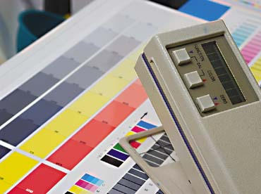
Ink density and tone are two key areas that you ultimately must control when you use CMS profiling software. With any given ink set, you need to be able to print a solid patch to a specific value. The standard approach is to judge density, or how dark the patch is with a color reflection densitometer (Figure 1), a device with-out which you simply cannot measure and evaluate your performance.
The second key control is the ability to maintain a minimum and maximum dot value at a specific line count, as well as the midtone target value. It is not so important what the exact value is, as much as it is to keep the values constant within a point or two over the run length. To do this, you will again need to evaluate your results with the color reflection densitometer.
Ultimately, your goal is reproduce the correct tones and dot sizes on demand. This is where nearly all screen printers fail. You may be able to make that perfect, sweet screen once every 10 shots, but can you do it every time? If not, you have to back down the resolution of your print until you find the point where you can deliver accurate, predictable results every time, in exactly the same way, no questions asked.
In the beginning, achieving this level of control will not come easily. You currently may be printing 65-line/in. work that is reasonable, but inconsistent. To find the perfectly controllable values may require you to drop as low as 35 lines/in. While this line count is not acceptable for images viewed at close range, at least you will know you have attained the consistency and predictability you require. Then you can start the process of moving up to higher line counts.
Consistent ink-film thickness
Printing with transparent process-color ink requires you to control both the ink-film thickness and the shape (area) of the dot. I’ve grouped the controls necessary to achieve this into specific categories:
* screen (mesh tension, thread diameter, weave, and count)
* press setup (off-contact and peel)
* ink (viscosity, thixotropy, color concentration)
* squeegee (durometer, edge sharpness) and floodbar (profile)
* print settings (angles, pressures)
* print environment (specifically temperature)
* substrate
I purposely excluded the prepress film requirements from this list because the focus here is on the physical factors that contribute to consistent and repeatable printing. The line count, screen angles, tone curves, and other settings you choose in prepress depend on your ability to control printing parameters and deliver consistent results. The looser your control of the printing process, the lower the line count at which you’ll be able to generate accurate color on your prints.
Screen controls
The screen is a major component of the control process. Its job is to carry the image information and to act as a precise metering mechanism for ink deposit. For this discussion, I will avoid going into extensive detail about screenmaking techniques. Instead, I will focus on the major points of control in screenmaking and why they are so important.
My Prepress Wire column last month (Sept. 2004, page 26) covered the importance of consistent mesh tension as it relates to the distribution of force within the screen. The dynamic tension (tension at the print surface) is the critical value, not the static or stretched tension. However, dynamic and static tension are re-lated. The higher the static tension, the easier it is to control the dynamic tension. Our goal is a to maintain a variation of ±2 N/cm or less at the print surface. The higher the line count and the more critical the tone control, the tighter this allowable variation becomes. With half-tone above 100-lines/in., the tolerable variation shrinks to less than ±1 N/cm.
Pay attention to the placement of the image on the screen–and in particular to the free mesh area around the edges of the screen. The smaller the free mesh area, the more difficulty you will have. The closer the edge, the faster the dynamic tension will rise. As the graph in Figure 2 shows, excessive variation occurs as you move across the screen. This variation results in a drastically changing rate of ink shear, which changes the ink deposit and makes it impossible to control density and tone.
In my experience, any screen with less than 20 N/cm static tension is uncontrollable above 65 lines/in. Ideal static tensions for large-format screens fall between 25-30 N/cm. Tensions above these levels, while attainable, are not desirable because the physical job of transporting screens leaves no margin for error. The slightest bump to the mesh will cause the screen to tear because there is almost no elastic capacity at those high tension levels. Higher mesh tensions are only for very experienced printers who are completely comfortable stretching, printing, and handling oversized screens.
Besides mesh tension, you also must consider thread diameter, thread count, and weave. For consistent halftone printing, my experience has been that the following plain-weave meshes–listed as count (in inches)/thread diameter (in microns)–give the best performance: 305/31, 305/34, 355/31, 355/34, 380/31, and 427/27.
The 305-thread/in. fabrics work well with halftones up to 85 lines/in, the 355- and 380-thread/in. meshes work up to 100 lines/in., and the 427-thread/in. mesh works well between 100-133 lines/in. All stretched, unbiased, to the mid-20 N/cm range. The 427-threads/in. mesh performs best at about 22 N/cm. If I were to pick a single mesh count that would deliver the thinnest deposit while still carrying the most information, it would be 380/31 fabric. This mesh offers good tensioning capability, thin ink deposit, broad range of detail, and excellent durability over time.
Using direct emulsion with a high solids content will deliver a thin, yet predictable, stencil. Capillary film is also an excellent option, even though the price is substantially greater than that of direct emulsion. Coating technique and the emulsion-over-mesh (EOM) required will vary with the stencil material you use. I achieve good print results when I keep EOM at 10-15% of the total fabric thickness (Figure 3). So if the total fabric thickness is 60 microns, EOM should fall between 6-9 microns proud of the mesh.
The screen-coating room should be below 85°F (30°C) with relative humidity between 40-60%, and it should have ample air circulation. These are the ideal conditions for achieving maximum sensitivity and resolution in the stencil.
To ensure accurate image capture on the screen, you must expose the stencil with a UV spectral output that matches the receptivity of the sensitizer and use a properly calibrated light integrator to measure the UV wavelengths. This will allow you to keep exposure time to a minimum and reduce the potential for unnecessary light scatter (halation).
Controls for press setup
With the screen properly tensioned, coated, and exposed, it’s time to move on to press setup. This is always a challenge. It seems every plant I visit has a different approach to setup. Sadly, most of the time it is incorrect because the press operators simply do not understand everything that is happening.
Once you establish the proper static-tension level on the screen, you need to focus on three key elements in the press setup: off-contact, peel, and squeegee speed. These parameters act in combination with each other, and they are the major factors that influence the transfer of ink through the mesh. I’ll review the first two elements in this installment but hold off on squeegee speed until next month, when I’ll look at ink characteristics–the key determinant of squeegee speed.
Let’s begin with off-contact. This is the fixed distance of the screen above the substrate. It should be kept to an absolute minimum. The higher the off-contact, the more negative influence it exerts on the dynamic tension of the mesh. Again, refer to Figure 2 to see the influence of excessive off-contact.
Substrate, vacuum, and size of the image area influence off-contact distance. The larger the area, the greater the off-contact required. On large presses, it is common to have 0.25 in. or more off-contact, which, in my opinion, is excessive. What you are really doing is increasing the distance from the substrate so you can use the squeegee to stretch the mesh to a higher tension. Whether you achieve the higher tension with high off-contact or higher static mesh tension is irrelevant. In either case, the ink will shear properly when the yield point is reached. But from a control perspective, it is much better to have higher static tension and lower off-contact so that the ink shears without the risk of image distortion from extensive mesh stretching.
In my experience with halftones up to 150 lines/in., it is best to keep the off-contact between 0.04-0.08 in.–a distance that’s considerably lower than most printers use. It is possible to print at these off-contact levels with substrates up to 36 x 48 in. Beyond these dimensions, additional off-contact is required, but it should be just enough to ensure separation–I suggest increasing off-contact in 0.01-in. increments until good snap-off is achieved. I never exceed 0.125 in., even on very large screens, because I rely on high mesh tensions.
With very low off-contact, you also must consider the influence of the press vacuum bed. This is particularly true when printing onto porous substrates. Because of the large surface area, there is a tendency for the vacuum to suck the screen down onto the substrate. To overcome this most printers increase off-contact and peel. While these adjustments help to separate the screen from the substrate, they have very negative effects on your ability to accurately control the half-tone information you are printing. A better solution is to either partially mask the vacuum bed, or decrease the vacuum hold-down pressure. Both approaches allow you to further decrease the off-contact distance.
In addition to off-contact, a peel feature is frequently added to presses to further separate the screen from the substrate. The amount of lift added by the peel function can be substantial. I have seen large-format presses that provide 3-4 in. of added separation on top of the initial off-contact. Many presses also have a fixed minimum peel. Most of the time, peel is not really necessary if the static tension is within range. This is particularly true when using short-bodied halftone inks. These inks tend to shear quickly and cleanly, thereby negating the need for added screen separation.
If you are unable to eliminate peel, you must at least be able to counteract it. The problem is most printers will set up the off-contact with the screen parallel to the print bed. This gives uniform off-contact over the entire screen. But most presses have their peel pivot point at the rear frame holder, or even behind the rear frame holder. As the print stroke initiates, the pivot activates and the screen begins to rise away from the substrate as the squeegee continues its stroke to the back of the screen. Since the pivot point is in the rear, off-contact increases as the stroke progresses (Figure 4).
It is obvious that in order to achieve a print at the back of the screen, you will need to add more squeegee pressure to stretch the screen to the print surface. This changes the dynamic tension continuously across the screen. The result is far too much pressure at the beginning of the stroke, which results in excessive dot gain and smashed detail. At the end of the stroke you have premature ink expression, which also results in dot gain and fuzzy detail. Both situations hinder accurate ink transfer.
You must alter the press setup to overcome these problems. Each press is different, and the ideal fix may not be achievable on every machine. The solution is to measure the off-contact all around. You especially need to measure the peel height at the end of the print stroke. This is the peel plus the initial off-contact distance. Your job now is to lower the rear off-contact amount by a distance equal to the added peel height.
For instance, if the rear off-contact were 0.08 in. and the peel added 0.05 in. for a total off-contact at the rear of the stroke of 0.13 in., you would decrease the initial off-contact to 0.03 in. (subtract the peel of 0.05 in.). When you do this, the screen will be mounted in the press with higher off-contact at the front and less in the rear. As the print proceeds, the added peel will increase the off-contact to the point where it was initially set. This will help to maintain even printing pressures during the entire stroke.
You won’t have a perfect balance of off-contact and peel–unless you own a cylinder press–but you should be able to achieve a reasonably successful combination. Remember that the goal is to maintain uniform printing forces over the entire image. When distances change, the force necessary to get the mesh to the print surface also changes, necessitating an increase in pressure.
Depending on the make of your equipment, the rear frame clamp may need to be replaced or modified in order for you to achieve lower off-contact heights. This is necessary because the thickness of the rear frame holder is of-ten 0.125 in., which is far too excessive. On such a press, the minimum off-contact would be limited to no less than the thickness of the rear frame holder and, when combined with peel, the minimum separation at the rear of the image may be as high as 0.250 in.–excessive in my opinion. The easiest way around this limitation is to reengineer your screen clamps so they attach to the top of the screen frame rather than grip the frame from top and bottom (Figure 5).
Almost there
The critical control points discussed here have a substantial influence on the accuracy of your prints, but they are by no means the only variables you have to reign in to ensure accurate color reproduction. Next month, I’ll talk about additional press-setup concerns and point out other elements of the printing process that must be dealt with before you can implement digital color management.
About the author
Mark A. Coudray is president of Coudray Graphic Technologies, San Luis Obispo, CA. He has served as a director of the Specialty Graphic Imaging Association Int’l (SGIA) and as chairman of the Academy of Screenprinting Technology. Coudray has authored more than 250 papers and articles over the last 20 years, and he received the SGIA’s Swormstedt Award in 1992 and 1994. He covers electronic prepress issues monthly in Screen Printing magazine. He can be reached via e-mail at drdot@aol.com.


Subscribe

Magazine
Get the most important news
and business ideas from Screenprinting Magazine.
Most Popular
-

 Case Studies2 months ago
High-Density Inks Help Specialty Printing Take Center Stage
-

 Art, Ad, or Alchemy2 months ago
F&I Printing Is Everywhere!
-

 Andy MacDougall2 months ago
Functional and Industrial Printing is EVERYWHERE!
-

 Columns3 weeks ago
8 Marketing Mistakes Not to Make When Promoting Your Screen Printing Services Online
-

 Editor's Note2 weeks ago
Livin’ the High Life
-

 Marshall Atkinson2 weeks ago
How to Create a Winning Culture in Your Screen-Printing Business
-

 Thomas Trimingham2 months ago
“Magic” Marketing for Screen Printing Shops
-

 News & Trends2 months ago
What Are ZALPHAS and How Can You Serve Them in Your Print Business?