Articles
Published
20 years agoon
Recently, as I was driving with my grandchildren, my attention was caught by a learning video that was playing on the entertainment system in my van. (Tip: If you have small children or grandchildren, I highly recommend you opt for the TV upgrade on your next vehicle!) The video included a cute little song about color mixing that said, “If we mix blue and yellow, we get green. If we mix blue and yellow, we get green. If we mix red and blue, we get purple. If we mix red and blue, we get purple.” It continued into red and yellow makes orange and so on.
I must admit that the little ditty started driving me crazy after awhile. But it got me thinking about the principles behind these elementary color teachings and how they are often misinterpreted by screen printers who produce process-color work.
Kiddy-song logic
The simple truth reflected in the kiddy-song example is that we create the color we want with primary colors. Primary colors are red, yellow, and blue. But many times screen printers try to apply this truth to their CMYK ink sets. Here’s how their thinking usually goes: If we mix cyan and yellow we get green. So if we want a darker green, we have to use darker cyan or darker yellow. Right? Similarly, if we create a red, and we want a darker red, we just use a darker magenta and a darker yellow. Right? And if we mix blue from cyan and magenta and we want a darker blue, we just use a darker cyan or magenta. Right?
WRONG! If we make any of the moves mentioned here, we will not get the expected color. Our perception of color has been programmed since our first art class in kindergarten to make us believe that we can control color by changing the value or density of the primaries. However, when it comes to mixing translucent colors to make secondary and tertiary colors, the final color is influenced by more than just the two primaries. It also is affected by a third component–the neutral color. To understand how this neutral component impacts the final color, we must begin with a basic understanding of additive and subtractive color space.
Additive versus subtractive color
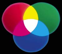
The foundation of color control is knowing the difference between additive and subtractive color space. Red, green, and blue light are the components of additive color. When these components are blended in equal proportions, the result is white light. Any time a color is created by adding together red, green, and/or blue light, we are dealing with additive color space (Figure 1). The most natural color–light from the sun–is additive. Additive color also is represented by the images shown on most TV screens and computer monitors.
Subtractive color, on the other hand, is based on the concept that an object being viewed absorbs or subtracts components from white light. The remaining components are reflected back to the viewer and perceived as a particular hue. The pigments used in CMYK inks are subtractive colorants (Figure 2).
In printing, we subtract light to get the desired color, which is why printing is considered a subtractive-color process. We start with a white substrate that is reflecting almost equal amounts of red, green, and blue light. Then we apply ink that absorbs the RGB components of light unevenly, meaning that unequal amounts of red, green, and blue light are reflected back to the viewer. The more unequal the amounts of red, green, and blue light that are reflected back, the more distinct the color or hue that appears will be. The more equal the absorption or reflection of the red, green, and blue components, the more colorless, or white, the color will appear. Deviations in the amount of RGB absorbed and reflected are what create the range of visible hues that we perceive.
Remember, perception of color is based on whether light is being added or subtracted, not pigment. This is why adjusting the density (pigment load) of cyan, magenta, or yellow inks will never result in more accurate visible color.
Confusing the brain with process color
Overlapping inks that consist of semi-pure hues like cyan, magenta, and yellow gives us very different results than we would get from mixing the opaque blue, red, and yellow inks mentioned in the kiddy song. The colors we use in process-color screen printing are translucent colors, which means that light will pass through the ink film, but the ink color will diffuse or change the appearance of the light as it is reflected back to us.
Although we mix colors in process-color printing in a manner similar to the basic theories represented by the song, we have to deal with the additional influence of neutral colors. As mentioned previously, the neutral color is the primary process color (cyan, magenta, or yellow) that remains when the other two primaries are blended to form a particular hue. If we refer to Figure 2, we can identify the neutral complement for any pair of primaries as follows: When magenta and yellow are combined to create red, cyan is neutral; when cyan and magenta are combined to create blue, yellow is neutral; and when cyan and yellow are combined to form green, magenta is neutral. The neutral colors create a neutral gray phenomenon by absorbing light that would not otherwise have been absorbed. Through the correct use of neutral color, we can achieve accurate shades and create hues that look more realistic and lifelike.
For example, to get a red hue with process-color inks, we would rely on the primaries of magenta and yellow. In this example, the neutral color would be cyan. The fact that it’s the neutral color means that if we were to place a cyan dot on top of a combination of yellow and magenta dots, the cyan dot would appear dark gray or dirty black. It is now a neutral gray. Similarly, in creating a green hue, the primaries would be cyan and yellow, while magenta would become the neutral color. Once again, if we place the magenta dot on top of solid cyan and yellow dots, we’ll achieve a dark gray.
Common color-blending mistakes and solutions
In the following sections, I present several examples that depict color-matching problems I regularly see in print shops throughout the US, Canada, and Mexico. In most cases, the printers attempt to fix the problems in the wrong way, creating inaccurate and unpredictable results. The examples I provide demonstrate what not to do when you’re trying to achieve a particular hue (in these examples, I chose hues that are based on the additive color primaries of red, green, and blue). In each of these “color brain teasers,” I also describe the correct actions that should have been taken to resolve the problems.
Color brain teaser #1 The first example represents a problematic hue that just about every graphics screen printer has had trouble reproducing–the deep, caramel-red shade of a soft drink. As Figure 3A shows, prints involving this hue often turn out looking too red. So printers attack the problem by increasing the density of the two primaries that make up the red–magenta and yellow. The belief is that by increasing the density of the primaries, they can deepen the color.
But the problem is not the magenta and yellow at all, nor is it the black. The problem stems from the cyan. Here’s why. Red is created with magenta and yellow. In order to make the color more realistic, we need to add the color that turns to neutral gray when overprinting the magenta and yellow primaries, which is cyan. By varying the tonal percentage of the cyan, we can control the darkness and lightness of the final color. In this example, increasing the tonal value of cyan shifts the appearance of the final color from bright red to a caramel shade of red (Figure 3B).
The problem is that our brain doesn’t compute the influence of cyan. We simply can’t visualize how the opposite color of the two primaries will alter a particular hue. So we need to rely on densitometers and spectrophotometers for measuring and controlling color values, not our eyes. We must trust that the densities of our process-color inks are correct, then work to achieve the proper hue by controlling the tonal value of the neutral color. When we begin measuring color in this manner, we start to understand why we can’t change the darkness or lightness of a color by altering the primaries from which it is created.
Color brain teaser #2 In the second example, we’ll turn to another troublesome color for screen printers– deep green. Most of the screen-printed deep greens that I see look like something out of a Kermit the Frog cartoon. They are too bright and don’t look at all real (Figure 4A).
The common approach a screen printer takes when attempting to fix a green that is too bright is to increase the density of its darkest primary–cyan. When that doesn’t work, the printer will monkey around with yellow, the other primary. Nothing ever really works. So the salesman then tries to convince the client that the green on the print looks better than the intended target. This might work if the print involves cabbage, but what if it’s a retail poster of a green sweater that will hang over a display of the real sweaters? The store owner will want an exact match, which can only be accomplished by working with the neutral color.
The correct move in this case is to increase the tonal percentage of the green’s neutral component–magenta–to darken the cabbage (Figure 4B). When the magenta overprints a green, the magenta dot turns dark gray, creating the correct shade of green. The gray dots also enhance detail, and the image looks life-like rather than cartoonish. If you think about most detail in printing, it is created by the neutral color. The magenta, not the cyan or the yellow, defines the shape of the leaves on this cabbage. Printing the magenta in the correct tonal value will produce a high-quality image.
Color brain teaser #3 The third example I will use here is a blue. The blue water shown in Figure 5A is too light and looks fake. Let’s say the client wants a much deeper and more realistic depiction of blue water. Again, the adjustment that many screen printers will make is to increase the density of one or both primaries. But if they increase the cyan density, they only end up with a more unnatural blue, and if they adjust the magenta’s density, the water begins to look purple.
The only correct move is to increase the tonal value of the yellow, which is the neutral color in blue. It turns dark gray when printing over cyan and magenta, giving our blue a third dimension of color that makes the hue look natural (Figure 5B).
Lack of understanding about the role of neutral yellow is one reason why screen printers hate matching blues in process-color work. While cyan and magenta would seem to have the greatest impact on the blueness of a blue, it’s actually the neutral yellow and its impact on quarter tones and highlights that gives us the ability to adjust blue hues.
Neutralize your colors
As the previous examples demonstrate, natural, realistic colors are never the product of just two process-color primaries. All colors produced with CMY inks also depend on the third primary to create a gray component that adds balance, depth, and detail to the print.
Successful process-color screen printing isn’t a reflection of kiddy-song logic. It’s about basing our color densities on the proof we are trying to match, then controlling the tonal percentages of our halftones to achieve the correct color. Think of the neutral color first when tackling any troublesome color match, and printing accurate process color will become easier and much more enjoyable.
About the author
Mike Ruff is chief technology officer for Reyhan PGF, a service bureau providing prepress and film-output services. During Ruff’s 32 years in the graphic-arts industry, he has worked in the signmaking and screen-printing fields as both a manager and business owner. A frequent instructor of process-color printing courses for the Screen Printing Technical Foundation, Ruff has authored articles for several industry journals and frequently speaks at trade events. He also provides consulting services to screen printers throughout North America and Mexico.


Subscribe

Magazine
Get the most important news
and business ideas from Screenprinting Magazine.
Most Popular
-

 Art, Ad, or Alchemy2 months ago
F&I Printing Is Everywhere!
-

 Case Studies1 month ago
High-Density Inks Help Specialty Printing Take Center Stage
-

 Andy MacDougall2 months ago
Functional and Industrial Printing is EVERYWHERE!
-

 Columns2 weeks ago
8 Marketing Mistakes Not to Make When Promoting Your Screen Printing Services Online
-

 Editor's Note2 weeks ago
Livin’ the High Life
-

 Marshall Atkinson2 weeks ago
How to Create a Winning Culture in Your Screen-Printing Business
-

 Thomas Trimingham2 months ago
“Magic” Marketing for Screen Printing Shops
-

 News & Trends1 month ago
What Are ZALPHAS and How Can You Serve Them in Your Print Business?