Graphics Printing
Published
18 years agoon
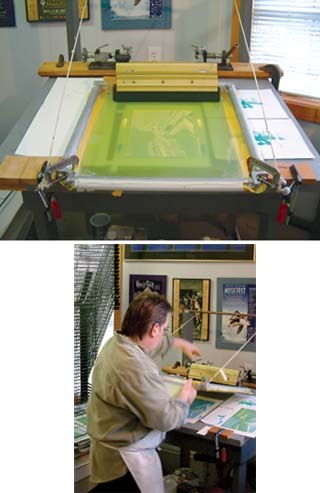
If you’ve missed some of my misadventures over the last half year of Shop Talk, let me bring you up to speed. I’ve been explaining how one might go about printing a process-color graphic using low-tech, manual equipment, as shown in Figure 1. This month, I conclude the series by taking you through the actual printing process.
If you’ve missed some of my misadventures over the last half year of Shop Talk, let me bring you up to speed. I’ve been explaining how one might go about printing a process-color graphic using low-tech, manual equipment, as shown in Figure 1. This month, I conclude the series by taking you through the actual printing process.
I cheated a bit when writing this installment and enlisted the help of a high-tech separation and film house. I decided to go with a professional film provider because my previous experiments with various film-output devices showed it all begins with the film, and the film begins with a quality color separation.
I may be showing my age, but the last time I was printing process color on a regular basis, I got my films from a camera. Things have changed a bit since then! Because I print process colors infrequently, I don’t have any of the instruments a modern screen shop should have—a densitometer, a thickness gauge for the stencil, a UV dryer, a decent pair of eyes—so I’m as interested as anyone to see how, or even if, I can print this.
I could actually hear Chris Taylor from Chromalogic in Toronto cringe as I explained that we would be flying blind on this print. Chromalogic usually gives new clients test films to run on their printing equipment. The shop then analyzes the results and adjusts the screen angles, tonal ranges, and, most importantly, dot gain of individual colors at specific tonal ranges to arrive at an optimal set of positives for a particular client. These guys take their film seriously.
"You have to customize process film for screen printing," Taylor explains. "SWOP (standard web offset print) proofs have built-in dot gain that simulates typical offset press gains. Screen printers don’t experience the same gains."
He went on to say that matching a SWOP proof is almost impossible without adding gain to the highlights through the three-quarter tones and pulling back the gain in the shadow areas on the film. "This lack of understanding of dot gain and its relationship to a standard target proof is probably the single biggest contributing factor to printers pulling process inks out of the press and altering the densities on almost every job, which leads to tremendous amounts of down time," he says. "I think linear film is the beginning of the end on most screen-printing jobs."
Whatever Taylor did seemed to work. I used the TW 5000 series process inks straight from the can and, other than the yellow being brighter than the proof yellow, the inks ended up printing almost the same as the graduated color bars on the proof. Imagine if I had tested first!
I used the positives from Chromalogic to expose 380-thread/in. mesh tensioned to 21-24 Newtons and coated with Murakami GFX emulsion (double coat on both sides). The screen had been dried to 38% relative humidity for three hours prior to exposure. I used my solar exposure system (described in my article "Tools and Techniques for Economical, Environmentally Friendly Screen Printing," Screen Printing, Apr. 2004, p. 51) to expose three of the four screens. The fourth was exposed on a conventional exposure system. The sky was overcast when I used the solar exposure unit, and I wondered if this would affect my ability to reproduce fine process dots. Chris had some ideas on that, too.
"A big problem we see with regards to dot gain and linear (uncorrected) film is that when a screen printer exposes the stencil correctly in order to achieve optimal curing, they lose too much detail to accurately reproduce their target image," he says. "In an effort to deal with this situation, many screen printers try to compensate by underexposing their screens. This, in turn, leads to weak stencils that are full of pinholes and can break down on press or become susceptible to ink and solvent penetration, crosslinking with the emulsion, making reclaiming very difficult, and leaving nasty stains behind. I believe it’s easier to compensate the film in the first place."
I carefully controlled all the screen exposures, and the stencils washed out easily and produced clean, sharp images, with the emulsion completely cured. Without a microscopic micrometer, it was hard for me to judge comparative results between the film and the stencil. I looked for the smallest dots and checked to make sure they were in the stencil. The further I got into this process work, the more I saw the need for some basic measuring devices.
Time to print. Temperature in the shop was 65∞F, humidity steady at 49%. I used three types of material: some 10-pt card stock, some vinyl, and some acid-free fine-art paper. Cyan was the first color I printed. I quickly realized a few things. Everything in the image was printing—if it was on the stencil, ink went through it. There was no moiré. That was a relief! The cyan color bars matched the proof, and if I had a densitometer, I could have been a bit more exact. In any case, it looked good to my untrained eye. Unfortunately, the squeegee still was showing streaks on the flood and the print! I compensated by using a thick flood and applying another quick buff to the squeegee with 300-grit sandpaper. That seemed to work. Best of all, I didn’t appear to lose fine detail. The 90% dark areas stayed open.
Yellow was next. The worst problem I experienced with the yellow was trying to see to adjust register. I noticed after the run that the pure yellow was much brighter than the proof, and I had also lost a bit of detail in my 5% coverage. Uh Oh.
Magenta came third. I expected a visit from the evil Dr. Moiré, but he failed to appear thanks to Chromalogic’s screen angles and the 55-line halftone and 380-thread/in. mesh combo. Staying in register while printing manually required me to be consistent with my squeegee pressure and angle. This would be so much easier on a semiautomatic press. My sloppy screen cleaning produced a pimple right between my grandson’s eyes—amazing that one blocked dot out of 907,500 possibilities can land where it is most visible!
Black provided the snap. Although the coverage was minimal, it made the final print jump! Some junior-grade moiré showed in the 5-10% color bar—but not on the image. After seeing all the colors down, I realized I could have been a little more accurate with registration. There was quite a difference between the results on the different materials. Good to know.
I have to say I was impressed with the final result (Figure 2). I know that improving only a few of my procedures could make my results even better. And if I had some rudimentary testing equipment, look out! Manually printing process-color graphics might still have a future. That will come as good news to young Joshua. He’s getting tired of those 22-color art prints. "Get modern, grandpa! Go process!"
The opinions and recommendations expressed in this column are Mr. MacDougall’s and not necessarily those of Screen Printing magazine.
Author’s note: Part 1 of this process-color-printing series appeared in Dec. ’05, p. 60; part 2 in Feb. ’06, p. 52; and part 3 in Mar. ’06, p. 52. Read more about Chris Taylor and Chromalogic in Screen Printing, Oct. 2005, p. 58.


Subscribe

Magazine
Get the most important news
and business ideas from Screenprinting Magazine.
Most Popular
-

 Case Studies2 months ago
High-Density Inks Help Specialty Printing Take Center Stage
-

 Art, Ad, or Alchemy2 months ago
F&I Printing Is Everywhere!
-

 Andy MacDougall2 months ago
Functional and Industrial Printing is EVERYWHERE!
-

 Columns3 weeks ago
8 Marketing Mistakes Not to Make When Promoting Your Screen Printing Services Online
-

 Editor's Note3 weeks ago
Livin’ the High Life
-

 Marshall Atkinson3 weeks ago
How to Create a Winning Culture in Your Screen-Printing Business
-

 Thomas Trimingham2 months ago
“Magic” Marketing for Screen Printing Shops
-

 News & Trends2 months ago
What Are ZALPHAS and How Can You Serve Them in Your Print Business?