Articles
Published
19 years agoon
I still remember the first time I painted on colored paper. Everything I painted looked washed out and dull. I was so used to drawing on white that I didn’t know what to do with a darker color. I tried to counteract the effect of a colored background by applying more and more layers of paint, but the final artwork just ended up muddy and overworked. It took some significant practice with colored surfaces before I started using the color in the paper as a design element instead of trying to force my palette onto it.
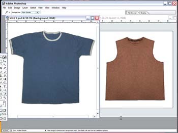
I still remember the first time I painted on colored paper. Everything I painted looked washed out and dull. I was so used to drawing on white that I didn’t know what to do with a darker color. I tried to counteract the effect of a colored background by applying more and more layers of paint, but the final artwork just ended up muddy and overworked. It took some significant practice with colored surfaces before I started using the color in the paper as a design element instead of trying to force my palette onto it. This allowed me to experiment and become comfortable with the feeling that a color can create when it is the foundation behind a design. Two theories stuck with me after I experimented with drawing and painting onto colored surfaces: 1. Less is more. Don’t overwork the design in an attempt to block out the surface color. Instead, use the background color as an overall pre-wash like you’d find in a watercolor painting. 2. It’s all about values. Pay specific attention to the value of the surface color (value refers to the color’s dark or light factor—imagine what you would get if you converted it to grayscale and what color gray it would be), the value of the colors that will be on top of the surface, and, if the colors on top are transparent, what the final value the base color/overprint combination will be. If the substrate and printed-color values are too close, then there will be no contrast and a loss of clarity. These principles transfer perfectly to screen printing on garments. The colored garment simply becomes the paper or canvas that you will use as your drawing surface. You don’t have to be a fine artist to adapt designs to a colored surface. All you need is a basic understanding of the dynamics and vocabulary that describe color interactions and a willingness to do some testing. A noticeable trend has emerged towards the printed T-shirt becoming a unified presentation, rather than a blank garment that simply has a design added to it. One of the simplest ways to accomplish this kind of unified look is to first find a shirt that you really like (this means that you like certain attributes of the shirt, such as the shape, seams, collar, fabric, weight, color, and weave). The next step is to work with the ink colors and composition to develop a presentation where the art blends into the T-shirt to create a vintage look. You will achieve the best blending if you use lightweight garments with medium to dark hues. This will allow the shirt color to become a prominent element in the final design. Start with a great garment No matter how fantastic your artwork is, you will soon discover that it will fall short if it is printed on a dull garment. The closer the final product’s function is to fashion (more decorative than informative), the more important it is for the garment to work as a design element. If you are selling the shirt and a design as a complete presentation, then you will have to do your homework on the garment end. The best way to start with this is to contact your suppliers and have them tell you what the latest trends are in apparel that they think will work with the style of art that you are contemplating. Remember that the shirt needs to echo the final design in style, so if you are creating a garment with a vintage or European look, you will probably want garments with lightweight fabrics and some stretch elements in the fabric, such as Lycra. When I was working on some vintage boxing apparel recently, I focused on garment styles that would support the boxing theme I had in mind. I looked through offerings from several vendors and ended up choosing a sleeveless concept shirt and a ringer T-shirt. You could substitute many different garments to suit the styles you want to achieve. I felt that both of these garments had a modern look that would still work with the vintage/worn style that I was trying to develop. I wanted a garment with a classic appeal that was still very comfortable. In addition, I knew that graphics had to fit with the shirts really well to click everything in place. The next step was to start considering what form of artwork I could develop to play off of the color of the garments and produce the effect that I wanted. Before we delve into the artwork and its development, it is necessary to discuss the look that we want to achieve. Often this is done as more of an afterthought in the process, but that isn’t the correct way with a fashion-oriented piece. The overall look of a finished product for the fashion retail market is more critical than the artwork itself. In fact, the artwork will commonly become more of a decorative accent to the garment in a retail setting. Essentially, the overall impression of apparel as it hangs in the store will motivate a consumer to purchase faster than a targeted design alone. The garment as a whole will catch attention sooner, whereas the image has to be approached and then observed for proper effect. All of this knowledge together will lead you to develop the garment and artwork together as a unified piece. The way to accomplish this is to create templates of your garments on the computer and then map your artwork on to the templates to illustrate what the piece as a whole might look like. The easiest way to create a template is to lay a sample garment flat and then shoot a digital photo of it that you can edit on a computer. When you take such photos, you should be directly above the garments so that the images are free of distortion. Save these photos as templates in Adobe Photoshop (Figure 1). Don’t forget to create the template based on the standard size that you intend to print, and be aware that if you are destined to use a unique printing location or technique, then you will probably need to make templates of each different garment size to determine final location and results. The goal of creating a shirt template is threefold: 1. It will help to finalize your total composition to get a clear picture of how the graphic will fit on the garment. 2. The template color will show how the graphic’s color will influence the look of the garment, especially if you are using semi-transparent inks or techniques. 3. The template will help you determine an appropriate size for your design. Finish with a graphic that fits the mood A little homework is necessary before you can sit down and create best-selling designs. If there is one thing that kills most retail lines before they ever have a chance, it’s something I call “creating in a bubble.” You know what types of designs appeal to you, but what appeals to your customers is what really counts. And often it is even more important to find out why the customer likes a particular look. Without this understanding, the design process becomes a guess and a prayer, rather than a calculated risk. The bubble is your own experience and bias that influences your designs. To break out of the design bubble, it is necessary to be as objective as possible and follow a set of rules for creating fashionable graphics. An easy way to break down the creation process is to divide it into three stages: research, style, and execution. The research and style areas are closely linked and dictate your method of execution. Pay special attention to the research phase of your development. Listen to everyone about their feelings towards your ideas. Don’t just isolate yourself to doing target-market research. Some of my best ideas have come from people who were outside of the market to which I was selling a project, yet these people had wonderfully objective thoughts. Research The critical part of designing a print for a colored garment is to think about what the final color will be when the ink and shirt merge. That can be a scary issue if you are trying for tight control over how your hues may shift. A good way to estimate when potential color shifts are likely is to do some color studies for your graphics on the actual colored fabric (Figure 2). In this manner you can investigate the color of the final print before you incur the cost of setting up and printing the whole job. In addition, this method of testing will allow you to overlap and print many color combinations in a short time. The idea of overlapping colors may seem strange to us old-school printers who are used to working with each color in its own area (unless it’s an underbase). Actually, this look in printing is showing an amazing rebirth. The goal isn’t necessarily for prints to appear sloppy—though sometimes it does this too; rather, the idea is to echo the printed process so that the garment graphics obtain genuine, crafted looks that clearly show the steps and qualities of screen printing interacting with the various garment colors. Style and execution The style is a combination of both the garment and the graphic working together to create a specific look. For your printed garment to stand out in the marketplace, it must have a unified style and method of execution that signals to buyers and their customers that you thought through your whole process and really believe in your final product. Defining the style of a graphic involves combining what you want with what research suggests that you should have. To achieve a unique vision, follow your research, but don’t be afraid to take a chance if you feel it might be beneficial to experiment with something new. One strategy that works well with a semi-transparent print on a colored shirt is to use the garment color to set the general design direction. For instance, if you use a heathered garment, then you should avoid graphics that have a lot of texture and stick with simpler shapes and colors for this application. If the garment is a deep brown, you might decide to use an off white-color that would turn a pleasing shade of tan when printed on the garment. The style for my boxing graphics was straightforward. The design themes fit with the customer base and their desires. I tested some more colors to get an idea of what would look good in a semi-transparent graphics on the ringer shirt (Figure 3). The research and testing of this style of application required that I monkey with the ink formulas quite a bit. Talk to your ink supplier about which additives are best to use with your ink system to achieve a semi-transparent look that will wash well and produce a vintage appearance. In my case, I printed reduced ink through a higher mesh count to enhance the inks’ transparency and really let the garments’ texture and color punch through the print on the brown shirt (Figure 4). To execute the design, standard screen-printing procedures were used. The only difference from a standard print was that the reduced inks tended to show clumping or slight build up in areas around seems or stitching. But this actually added to the crafted look and appeal of the garment. I printed my designs using 230-thread/in. mesh directly on the colored garments (no underbase). I only flashed a color if it looked too light after all the other colors had been printed. A soft-hand vintage print on a colored garment is an exciting alternative to using distressed artwork with standard inks. The color of the garment becomes an integral part of the composition and creates a statement of classic appeal. If you have done your research and put together great garments with dynamic designs, you will have the buyers knocking down your door for this great look.


Subscribe

Magazine
Get the most important news
and business ideas from Screenprinting Magazine.
Most Popular
-

 Case Studies2 months ago
High-Density Inks Help Specialty Printing Take Center Stage
-

 Art, Ad, or Alchemy2 months ago
F&I Printing Is Everywhere!
-

 Andy MacDougall2 months ago
Functional and Industrial Printing is EVERYWHERE!
-

 Columns3 weeks ago
8 Marketing Mistakes Not to Make When Promoting Your Screen Printing Services Online
-

 Editor's Note2 weeks ago
Livin’ the High Life
-

 Marshall Atkinson2 weeks ago
How to Create a Winning Culture in Your Screen-Printing Business
-

 Thomas Trimingham2 months ago
“Magic” Marketing for Screen Printing Shops
-

 News & Trends2 months ago
What Are ZALPHAS and How Can You Serve Them in Your Print Business?