I’m not sure who the first garment printer to decide he could do a Pantone color match was. It was many years ago, and I’m sure the individual never realized the trouble he started. But I hope he had as much difficulty producing that job as most printers have today when trying to match Pantone colors, or even explaining them to their customers.
I’m not sure who the first garment printer to decide he could do a Pantone color match was. It was many years ago, and I’m sure the individual never realized the trouble he started. But I hope he had as much difficulty producing that job as most printers have today when trying to match Pantone colors, or even explaining them to their customers.
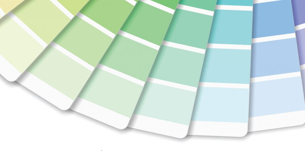
Our problems begin with the designers and the swatch books they use to select Pantone colors. These books, many designers don’t realize, were made for offset printing on paper. That’s why the Pantone books have “C” colors, for printing on coated white papers with a glossy finish, and “U” colors, for uncoated white papers, which have a matte finish.
So, what’s wrong with this picture? Well, we aren’t offset printers. We don’t print paper. Many of the garments we print aren’t white. Yet, this is the color reality that most garment printers must work with, at least some of the time.
Understanding the Challenge
Let’s start with the “C” colors. In order to get the glossy print shown in the Pantone book, we would need to lay down a substantial amount of ink. That translates into a hard hand, which is the opposite of the soft-feeling prints that most of our clients want. Or, we could use a high-density ink printed through a thick stencil, but most clients today aren’t willing to pay for HD. And while the ink in the bucket may resemble the specified “C” color, it will change after printing on a white garment because the ink will soak into the shirt, resembling something closer to a “U,” matte finish.
Advertisement
What about the “U” inks? They’ll also look glossy in the bucket, but will have a matte finish on the final shirt, so long as the ink deposit isn’t too thick.
So, should we tell clients they should always specify “U” colors in order to get finished prints that are within an acceptable range of what they see in the Pantone book? No, because you’d be telling them to specify colors based on a chart that was made for specifying offset-printed colors on white paper.
I did a web search for “Pantone Color Specifier” and got a lot of results, but the one that caught my eye was a Pantone page describing where the book should be used. The first paragraph states: “Thousands of market-proven colors for fashion, home furnishings, cosmetics, products, paints, and more.”
But the second paragraph begins: “Ideal for non-fabric materials.” No wonder designers are confused. This particular book contained all 2100 Pantone colors, and lists for $595. The book that most screen-printing shops use is the “Pantone Plus Series Formula Guide, Coated & Uncoated,” which lists for $155.
You may be asking yourself if there is a Pantone Color Guide for fabric. The answer is yes! So, why don’t textile screen printers use it and make sure their clients do as well? Several factors are involved, both pro and con. The pluses are that the swatches are actually printed on fabric, and the book has no “C” or “U” color designations.
On the downside, all of the swatches are on white fabric. As textile screen printers, we do print on white, but also on every color under the sun. You may be able to get a perfect match with the Pantone fabric system on a white garment. What happens when you print the same ink on blue, black, red, or any other color? It no longer matches because of the influence of the garment color.
Advertisement
The biggest negative is the price. Pantone offers a Cotton Chip Set for $1995, though it does include over 2300 colors. If you’re feeling flush with cash and want to impress your clients, you may want to spring for the Pantone Cotton Swatch Library, which has seven binders filled with 2 x 2-inch fabric swatches as well as many other features, and lists for $7395. I’m sure your ink person will love you for it.
Minimizing the Damage
You can do several things to try to lessen the headaches that come from working in a color space that wasn’t designed for you. Some make sense and some don’t.
You can lay down a very thick, opaque white underbase on any colored shirt. That would probably maintain the color integrity of the overprint colors, but it produces a stiff hand that most find unacceptable.
You can adjust colors so that they come as close as possible to the correct shade when printed on a specific color of garment. The only problem is that many clients want to have the same design printed on six different garment colors. Most clients don’t want to pay to have a single color matched, much less matching the same color six times.
So is there a solution? The best one I can come up with is customer education. Explain the realities of Pantone color matching to your clients. Send them a copy of this article. Consider making a series of test prints where the same ink is printed on different garment colors so they understand why it changes.
Make another series of test prints to show the difference between “C” and “U” inks. Mix up a Pantone “C” color based on the formula provided
by your ink company. Print it through a line mesh such as a 230 (threads per inch) on a white, light blue, athletic heather gray, red, and black shirt. Now print the ink again on the same shirt colors using an 86 mesh count. Then do all of these prints again, this time with a “U” color.
Advertisement
Will this resolve your color matching problems? No, not completely, but at least you can get your clients to understand what’s involved in color matching and be more sympathetic to what you do for them. You might even be able to get them to pay a little more.


 Art, Ad, or Alchemy1 month ago
 Case Studies1 month ago
 Andy MacDougall1 month ago
 Columns2 weeks ago
 Editor's Note2 weeks ago
 Marshall Atkinson2 weeks ago
 Thomas Trimingham2 months ago
 News & Trends1 month ago


