All businesses have their accepted practices. These are the methods used year after year without question—even when better options exist. The accepted practice in the world of color reproduction and approval is to work toward achieving one exact color match. Experienced color matchers know that it’s highly unlikely for any reproduction process to match a color exactly. So we end up spending a great deal of time determining how close is close enough. This article explains why such an approach is unprofitable and describes a new way to go about color matching, one in which you work smarter and match in a more productive manner.
Absolute zero-tolerance color matching
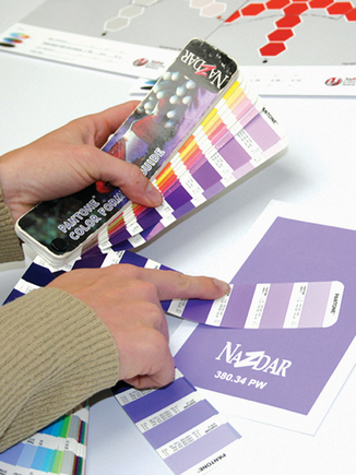
A common practice in the reproduction of a spot or match color in the printing, molding, or painting processes is to work toward matching a specific color chip or sample (Figure 1). In printing, this is commonly a Pantone color chip or a paint chip. Then we have someone who gets the task of approving or judging the reproduced color as it compares to the original sample. And in many cases this person is trained to reject the reproduced color should any difference between the two samples be detected visually. The art of rejecting any visually detectable deviation between two color samples by the observer is known as absolute zero color tolerancing.
This type of color matching and tolerancing is responsible for press and equipment downtime and material waste, and it can be an overall drain on motivation for the skilled workers who are trying to match the color. They spend enough time as it is trying to determine how far off the color can be and still be sellable or acceptable. They often spend this time to the detriment of the manufacturing process because of costly machine idling.
The likelihood of any printer involved in reproducing color to actually reproduce a color exactly is quite low. And it’s even more unlikely that they’ll be able to do so on a repeat basis. According to benchmarking conducted by Nazdar Consulting Service on screen presses and digital printers, most printers tragically set a Delta E (a measure of color variation between samples) target lower than what their presses can accommodate. So setting a tolerance for reproducing color goes way deeper than picking a number that keeps you on a par with your competition. Tolerances should be established and set for your equipment, people who approve color, and the requirements of the product being printed.
Advertisement
The practice of color tolerancing
So this is where tolerancing comes in to help us. Since we know we cannot reproduce something exactly each and every time, we work towards manufacturing things within certain accepted tolerances. This holds true for all manufacturing. It is necessary to establish these tolerances based on what is acceptable to the buyer, what is necessary to the function of a product, and what the production equipment can achieve consistently and profitably. Tolerance is how much deviation you permit from a standard. The printing world maintains industry-wide tolerancing numbers for the reproduction of perceptual/process-color images, as well as for spot colors like Pantone colors.
Let’s take the case of perceptual/process-color images. Most color printers use some form of color proofing to predict what color will look like once the image is on press. That proof may be built around SNAP, GRACoL, SWOP, or G7 specifications—all of which have particular tolerances for manufacturing flexibility. For example, a SWOP proof may have a targeted solid ink density for cyan of 1.35 on proof and press. But in the fine print the specifications also say there’s a ±0.05 tolerance for the solid ink density for the cyan on the proof and a ±0.10 tolerance for solid ink density of the cyan on press (Table 1).
If the printer has one proof for ap-proval on press, which is a universally accepted practice in all printing, and the solid ink density of the cyan on that proof is 1.32, the proof is within SWOP proofing tolerances. Then, if the printer runs the solid ink density of the cyan to a 1.45 on press, that too will be within SWOP on-press tolerances. The problem is that color approval will be based on the visual comparison of the print to the proof. And we all know that a solid ink variation of 1.32-1.45 will probably result in a visual difference in any parts of the image where cyan prints at a percentage greater than 50%. There is an almost guaranteed difference in areas where cyan prints solid or at 100%.
The point is that using one visual representation of an image, such as a proof, is practicing absolute zero color tolerancing. And this leads directly to press downtime as someone determines whether the printed image is as close as it’ll get to the proof within the time allowed to deliver the job. This is an example of printers doing things the way they do them simply because that’s the way they’ve always been done.
But things have changed. Digital proofing has become the predominate method of evaluation for all the printing processes. Most printers have found digital proofing to be a superior way to proof images, because they can create more accurate proofs in house and for less money. Unfortunately, that’s as far as most printers usually take it. This is where we need to apply some new practices.
Advertisement
We can slightly alter digital proofs to give us a visual representation of perceptual/process-color images that have a slight shift out of balance. This is not to say that you should print your process-color images out of balance. But, in reality, you’ll not always be able to print in perfect balance. You’ll work with many images in which one area or subject is far more important than the rest of the image. In those cases, we can generate several proofs or one large proof with critical image areas that are slightly shifted out of balance to get a visual representation of how it’ll affect the critical image areas. Doing so before the job hits the press permits us to establish a visual representation of that on-press tolerance that all of the print specifications allow. The big difference is we can now see what that tolerance does to the entire image or isolated critical image areas.
Spot-color tolerancing
Absolute zero color tolerancing creates a similar disconnect with spot colors. Either you try to match a single color chip and allow someone to reject the color based on their ability to perceive any difference in the color, no matter how slight, or you use one of the color-tolerancing methods that relies on Delta E math. The recent formulas used for determining color tolerancing, such as ones offered by the Colour Measurement Committee and other organizations, are much more accurate for predicting how a color will appear to the human eye. But does it predict the way your customer will see the color? Remember, we all see color differently as it is one of our unique senses, just like taste. And there are people out there who will eat kimchi or liver and onions! Being a print buyer doesn’t necessarily mean the person has excellent color discrimination or an understanding of printing limitations.
Some printing facilities base their color matching on printing to a Delta E tolerance of 3.0, 2.0, or some other magical number. Remember, the Pantone folks will tell you they print their specification guides to a Delta E of 3.0. They too need to print their books within a tolerancing specification; otherwise, a formulation book would cost $2500 or more if Pantone were required to match each page of each book to the point that a QC person could not visually see a difference in the colors.
If you do take L*a*b* readings of colors, you begin to find that one Delta E tolerancing number, such as 3.0, is not visually consistent with all colors. For example, a person with normal vision will probably be able to see a difference in a mid-tone neutral gray with a Delta E of 1.0. That same person will probably not be able to visually perceive much of a difference in a Delta E of 3.0 on a saturated color, such as a Pantone 185 Red. So using one Delta E tolerancing number for all co-lors may be causing you to reject colors that could be visually acceptable to your customer. You’re throwing money away!
Advertisement
The smart use of digital proofing
If there were a way to generate fast, accurate, low-cost visual representations of slight color variations for your customers prior to going to production, you would be creating color tolerances specific to your customer’s perception of those particular colors. How cool. How can this be done? You can do it by making smart use of today’s digital proofing methods (Figure 2).
When you start to create visual color variation with a digital proofing system, you begin to see how Delta E variations don’t always line up with visual variations. You also see another unusual variation—different colors demonstrate greater or fewer visual deviations depending on the axis in color space toward which they shift (Figure 3). Your understanding of color space is important here. Try to focus on L*a*b* color space, because it’s the only one of the three color spaces available in Photoshop and Illustrator that that you can measure on a printed sheet (Figure 4).
No matter how elaborate our color matching instrumentation and software may be, we always seem to end up in the same old situation: The customer or final buyer of the color ends up approving or rejecting the color visually. So they use their eyes, in their lighting, in their environment. So all the work and money spent controlling and viewing the color is now in jeopardy.
The better way is to work backwards from the ways in which you’ve traditionally approached the process of color matching. Since the use of digital inkjet proofing is now universally accepted for basic color evaluation, it also makes sense to use digital technology to create inexpensive, highly accurate visual color-tolerancing models for the key colors you need to reproduce. These prints can be for perceptual images and spot colors. And since most inkjets now use digital proofing or modeling, you can use these printers to create very accurate simulations of target colors with slight deviations in order to present a visual tolerance prior to production. Then, use the visual model to determine which variations from the absolute color are visually acceptable to the customer, print buyer, or QC person based on their eyes, lighting, and environment.
Once the acceptable visual tolerance has been established (Figure 5),0 then the manufacturer/printer can take readings (Figure 6)0 from the visually approved color samples and can then use those readings in the reproduction process. This now completes the circle in making use of instrumentation in manufacturing for consistency and accuracy, but by having manufacturing targets that have been approved visually by the person who would approve or reject the color in the first place.
Zero tolerance for zero tolerance
Moving beyond absolute zero color tolerancing gives you the opportunity to establish print tolerances that directly relate to your clients or QC people. Using digital proofing in the ways describ-ed here is a powerful way to make use of new printing technology and reinvent the way we control color—that is, to manage color so that the accuracy of our work meets our clients’ requirements and does so within the limits of the manufacturing process. The result is more profit in reproducing color with-in tolerances that we define visually.
Bruce Ridge is business director for Nazdar Consulting Services. He has worked with Nazdar in product management, product training, and sales. Ridge began and facilitated the Masterprint Color Training Program, which has been presented to more than 2500 printers in North America. He is now working in Nazdar Consulting Services, where the focus is on developing and delivering improved print productivity. A frequent speaker at SGIA events, Ridge is a member of the Academy of Screen Printing Technology and has won many Golden Squeegee awards. He is a graduate of California Polytechnic State University’s Graphic Communications Program.


 Case Studies2 months ago
 Art, Ad, or Alchemy2 months ago
 Andy MacDougall2 months ago
 Columns3 weeks ago
 Editor's Note3 weeks ago
 Marshall Atkinson3 weeks ago
 Thomas Trimingham2 months ago
 News & Trends2 months ago