Articles
Published
24 years agoon
Four-color-process reproduction has challenged screen printers since the moment the first halftone separation hit screen mesh. During the past decade, sophisticated design software, alternative screening methods (e.g., stochastic), improved digital prepress tools, and refined printing equipment have boosted the predictability and repeatability of the process. But fundamental limitations in both the four-color model and the screen-printing method guarantee that as long as we print this way, consistent color quality will never be fully in our grasp.
Historically, process-color screen-printed graphics were produced with single-color presses, and the entire run was printed and dried, one color at a time, until all four colors were printed. If we were forced to continue in this way, we would have to resign ourselves to color drift on press and, ultimately, failure. In recent years, however, we’ve seen a trend toward increasing use of multicolor in-line graphics presses, machines that allow us to apply the same levels of accuracy and consistency to each and every color we print. These multicolor systems, which started appearing in two- and four-color lines, have now given way to systems that print five and six colors.
Thanks to this trend, we can begin to divorce our thinking from the historic approach and begin investigating alternate multicolor process-printing solutions. In this, the first of a two-part series, we’ll start our look at an unconventional but superior approach to screen-printed color reproduction: six-color-process printing.
The shortfalls of four-color printing
Four-color-process printing is a technical model that is driven by concerns of economy. It’s the lowest common denominator to approximate full-color reproduction, and it has been the approach of choice for almost 150 years. However, for all of its economic advantages, four-color-process printing brings screen printers an equal or greater number of technical disadvantages to contend with.
Despite recent improvements in graphic-arts technology, four-color reproduction is an inherently unstable process that takes too much effort to control. More often than not, it plagues prints with moiré and dot gain and results in final images that are either too flat or show too much contrast. And with the four-color approach, some visible colors are simply impossible to reproduce.
On top of all this, four-color printing is difficult to control consistently. On press, color can drift over time and may even shift noticeably over the course of a single run. This is due to a number of environmental and physical factors, including, but not limited to, squeegee-edge degradation, temperature changes on press, changes in screen tension, and ink inconsistencies, such as pigment packing and viscosity and rheology changes.
The degree of control we have over color reproduction depends on where in the tonal range the printed dots of our process colors fall. Over the past two years, I’ve carefully investigated and analyzed tonal shifts and color-reproduction issues associated with screen printing and have come to one conclusion: A six-color approach to process color provides superior control, accuracy, and repeatability over conventional four-color printing.
Six-color benefits
Extending the traditional four-color-process approach to a six-color model is not a new revelation, but it is a subject that deserves much more close and careful attention than it has received in the past. The six-color approach builds upon the traditional four-color model by expanding the standard four-color set. But unlike the Pantone Hexachrome approach, which adds orange and green to CMYK, we’ll be looking at an approach that maintains CMYK as the only colorants in the image.
Instead of using two additional colors, our six-color system begins with traditional yellow and black. But instead of standard cyan and magenta, it uses light and dark versions of both colors. To represent this six-color set, we use the designation CMYKLcLm, where C and M respectively represent the dark cyan and dark magenta and Lc and Lm the lighter versions of both colors (alternately, this set might be represented as CMYKcm or CcMmYK).
Note that these designations do not necessarily indicate color printing order; they merely indicate that we will be printing with the traditional process colors, but using some of them in different concentrations or densities. This use of two different ink densities is called dual-range or dual-colorant reproduction. It is one variation of an emerging trend called nChannel color reproduction, where “n” represents the number of colors we print.
Using a process-color inkset that is expanded with dual colorants offers several significant benefits. The biggest is that it greatly increases tonal range. Epson and several other inkjet manufacturers are using the same six-color approach in their equipment to replicate continuous-tone photography. As a result, inkjet printing has become a popular digital alternative to film processors, with even low-end inkjets producing extraordinary results. Adjusting the strength, or density, of the color we print, we can increase apparent resolution. Apparent resolution is enhanced because the use of dual colorants reduces color-to-color contrast. For instance, when we have a solid field of very light magenta, and detail is printed in dark magenta on top, we tend to lose the dark dot against the light dot. This enhances printed halftones by hiding the halftone dot pattern of the detailed print and creating an overall image that appears almost continuous in tone. P-O-P displays and other large graphics applications designed for close viewing have the most to gain from these improvements since coarse halftone dot patterns are most readily noticeable in such prints.
With the six-color approach, not only does image sharpness and resolution improve, but the smoothness of tonal transition is much better, too. Difficult colors, such as fleshtones, baked goods, watercolor washes, sky shades, and chrome and similar metals all benefit from the light tonal values added in dual-colorant printing.
Dual-range printing also reduces the textured appearance of process-color prints, both by minimizing the appearance of halftone dot patterns and by improving the range of reproducible colors. With six-color printing, a coarse halftone will not appear coarse–50 line/in. halftones look like 100 lines/in. and 65 lines/in. look like 120 or better. Using the six-color method, I’ve even printed 85-line/in. posters that have been represented as 150 lines/in. by trained graphics professionals.
Printing with dual cyan and magenta colorants also increases the dynamic range of the images we reproduce. Dynamic range is the difference between the lightest and darkest areas of the image. Simply put, the blacks are blacker and the whites are whiter.
Most printing has a maximum dynamic range of less than 2.0. We rarely achieve this in screen printing. Most of the time, our work is in the 1.6-1.8 range. A dynamic range of 2.0 means that 1/100th of the light hitting the darkest color is returned, creating black that absorbs 99% of incident light and reflects only 1% (in contrast, screen-printed blacks fall between 97.5% -98.4%).
The human eye, however, has a dynamic sensitivity range exceeding 4.0 (1/10,000th of the light returning, or 99.99% black). This is why in the visible world, we see detail in shadows that is absent in our printed work. With a dual-range color model, we can increase the dynamic range of our prints to 2.2 (99.4% black). This may not seem like a big deal, but the depth of the resulting blacks we print is noticeably better than what we attain with four-color-process printing.
With dual-range printing, we enhance both the light and dark ends of our tonal range. Historically, our process falls short when we’re printing very light pastels or very dark shadow elements. The dual-colorant approach enhances the appearance of pastels and gives better depth and detail to shadow regions. We will explore the reasons for this shortly.
As a benefit of controlling very light colors, we gain better control of previously problematic light neutral colors like beige, sand, ice, crystal reflections, washes, khaki, and so forth. These colors all have very small amounts of tertiary color contamination. Dual-range printing allows us to use much larger dots in these areas to represent the very light colors. This leads to more accurate color reproduction while simultaneously giving us more latitude to absorb environmental and physical variables on press without experiencing visible color shirts.
We also benefit in shadows. By using darker values than normal for the primary magenta (M) and cyan (C), we can better control the amount of tertiary color needed to strengthen the apparent color in very dark areas. One major advantage is that we do not need to use as much black to make a deep, dark color. By using less black ink as a tertiary component, we can preserve the richness of colors such as mahogany, walnut, crimson, maroon, hunter green, indigo, and others. In the four-color model, the additional black we must add completely kills the chromatic component of these colors, leaving us with flat, dark colors.using dual colorants to compensate for the difficulties of reproducing very light and very dark colors, we also address a phenomenon called hue shifting. This term refers to the characteristic of a color to change its apparent hue as it gets darker.
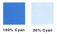
A good example of this concept is a swimming pool. Despite the fact that the water is the same throughout the pool, to an observer, water in the deep end appears much bluer than water in the shallow end, which has an aqua cast and appears shifted toward yellow. This has to do with how light is absorbed and reflected by the greater and lesser volumes of water at each end of the pool. The same phenomenon occurs with printed inks (Figure 1).
Both examples involve subtractive color, where certain wavelengths of light are absorbed and the reflected wavelengths make up the color that we perceive the object (or ink) to be. Light colors tend to hue shift to the yellow, while dark colors hue shift to the blue.
The challenge we face on press is that as we increase any ink’s color density (the Dmax of the ink film), we tend to get too much blue. The higher density gives us great dark colors, but it tends to blow away lighter pastel shades, shifting their tones with a noticeable blue component. Conversely, if we decrease the color density of a printed ink, the resulting yellow shift may not be apparent in the lighter tones. But the decreased color strength will definitely show in darker colors, which will appear flat and washed out, with a yellow cast.
Two factors combine to cause hue shifting. The first is that due to pigment characteristics, a solid layer of cyan or magenta ink absorbs longer wavelengths (yellows, reds, and oranges) and reflects shorter wavelengths (blues, purples, and greens). This is why higher dot percentages display a natural shift in apparent color to blue.
The second factor that influences hue shifting is the halftoning effect. When the small percentage halftone dots used to create light colors are surrounded with a large percentage of white substrate, the white substrate adds significantly more long-wavelength colors to the total reflected value. This means that proportionally more yellow, orange, and red wavelengths are perceived by the viewer, and the color appears to shift toward these warmer colors.
Additionally, the cyan and magenta used in four-color printing typically use pigments with too much of a yellow component. So when we attempt to produce certain very dark colors, this excess yellow keeps us from accomplishing our goal. The extra yellow “grays” or muddies the clean, deep colors in the red and blue color regions, including violets and purples. What we really need is more blue component in the darkest colors, and by splitting the color range, we can get this increased blue while decreasing the amount of yellow.
The final benefit to note in the dual-colorant approach is that it significantly reduces the moiré we experience. Moiré occurs for two reasons. The first is eclipsing of the dot opening by the screen mesh as we approach a 0% dot. The second is high contrast between the printed dot and background color. When the background is white, we have the highest contrast, and any patterning becomes much more visible.
In the first case, changing the dot size to overcome thread eclipsing is immediately visible to the eye because humans are extremely sensitive to highlight variations. As we approach a 0% dot (pure white), tonal changes as small as 0.25% are easily visible. But by using a light version of a process color like cyan and magenta, we can print a much larger dot that is less impacted by thread eclipsing. The dot shape is maintained, but at its larger size, the dot creates less contrast with the substrate. This means we do not notice the halftone patterning as readily.
As tone gets darker, the contrast issue becomes even more important. But with the dual-colorant approach, we are again able to reduce visible contrast, or, more precisely, disguise the contrast change. Instead of comparing a magenta dot against the white substrate on which it is printed, we are comparing a dark magenta dot against a field of lighter magenta. This essentially gives us red on pink, a very low contrast situation. If any moiré is present, it is absorbed by the light magenta background we are printing on. It’s like hiding a green Easter egg in green grass–you really have to look to find it.
The Technology
Let’s begin investigating this dual-range approach by carefully looking at tone reproduction curves. Those involved in prepress will understand the traditional “gamma curve” used to plot the tone of printed dots against their corresponding halftone dots on film. When the printed dots exactly reproduce the tonal percentage of halftone dots on film (dot in = dot out), the graph is shown as a 45° diagonal line.
In screen printing, this tonal curve is rarely achieved. Most often, we must deal with dot loss in the highlight regions, relatively stable transition in the midtones, and compression and gain in the 3/4 -tone and shadow areas. The curve of typical four-color-process screen print looks like an “S” as shown in Figure 3. The finer the line count of the halftone, the more exaggerated this “S.”
The stable part of the curve (red portion) is the gradually changing portion in the midtones. Here, the dot-in, dot-out translation is relatively linear and smooth. The unstable portions are at the toe of the curve (highlights) and at the shoulder (shadows.) These areas change direction rapidly, making adjustment on press difficult. But we can use this information to our advantage to develop a workable six-color alternative that is much more stable and repeatable.
To apply the six-color solution, we must understand that tone and color reproduction are achieved through two different mechanisms. The first is the strength or density of the ink we are printing. The value is carefully chosen so that when we apply the second mechanism, halftone dot percentage, the visually reflected values we see come very close to the actual values in our image.
For instance, if we print with standard magenta ink of density 1.15, the physical area represented by a printed 20% dot will be very close to the optical reflected value for a 20% tone. However, if the density of the ink is increased to 1.45, the actual reflected value of the 20% dot would be much darker than you expect–closer to that of a 40% dot.
Halftone dot value and ink density go hand-in-hand. This is one of the reasons printers have such a hard time controlling the process. If either one–or both–are off, the final color will be off. The severity of this shift is also multiplied by the number of overprint colors you apply, making the whole issue of accurate color reproduction with four colors a big mess!
With the use of traditional cyan and magenta halftones in four-color printing, we have a problem. While the midtones remain relatively stable, information is lost in the highlights, and we gain information in the shadows. We cannot compensate for one without compounding the error at the other end of the tonal range. The only answer lies in splitting the tonal range.
With dual-colorant printing, our objective is to alter the density or color strength of light and dark versions of both cyan and magenta so that we can maximize the stable slope of the gamma curve. This sounds very technical, but it really isn’t. To accomplish this objective, we simply must use halftones in a different way.
The principle we’ll rely on is that as we alter color strength (ink density), we can make corresponding adjustments in dot size (Figure 4). Let’s say we cut the color strength of magenta ink in highlight areas to about 1/4 of the normal value. This means a printed 100% dot of magenta would have the same reflected value as a 25% dot printed with normal density ink. In other words, we need to increase the size of the light magenta dots by a factor of four in order to get a 25% reflected value. (Typical density values measured with a color reflection densitometer for light cyan and light magenta would be in the 0.15-0.25 range.)
Extending this thinking, a just printable 5% dot would have the reflected value of a 1.25% tone, an extremely light color. This gives us much greater control over color, because for every 1% of dot gain or loss, the reflectance value will visibly change by only 0.25%. This minimizes the impact of dot loss and prevents the color shifting we’re used to seeing in highlights. In more practical terms for a screen printer, a 16% change in dot area would only represent a 4% change in reflected value–any printer serious about process-color reproduction can easily work within those limits.
Another benefit of using this light ink is that if a printed 5% dot does moiré, we would be unlikely to see it against the white background of the paper. Printers working with large areas of very light pastel colors and vignettes that fade to 0% will immediately see an improvement using this approach.
On the dark end of the color range, we double the density of cyan and magenta (in the range of 1.45-1.60). This means that a 50% printed dot of dark cyan or magenta will be optically equivalent to a 100% dot printed with standard ink (density 1.15). This means we can now greatly reduce the largest dot we are printing to about 75% while simultaneously increasing darkness and depth at the shadow end of the tonal range. We’ll have little difficulty keeping a 75% dot open, so we can greatly improve the detail and definition of shadow elements and begin to see success with previously difficult images, such as black leather and velvet.
If this approach works so well for cyan and magenta, why don’t we split the yellow and black into dual-range inks as well? The explanation is simple: Yellow is a noncontrasting color because it is naturally light, and its influence lies primarily in the lighter areas of the tonal range. The darker primary cyan and magenta inks used in the six-color approach also feature pigments with less of a yellow cast than traditional cyan and magenta inks and tend to be bluer due to hue shifting. Unlike four-color-process printing, where black was added to compensate for yellowing and increase shadow density, the dual cyan and magenta in six-color printing actually reduce (and in some cases, eliminate) our need for black.
Salvation in six colors
Splitting magenta and cyan into dual ranges allows us to shift the screen-printing tonal curve into a much more stable profile. We’re able to control dot loss in highlights and open shadows to improved detail. And color shifting on press decreases greatly because we use double the standard dot sizes for dark tones or quadruple the sizes for light tones to achieve the same amount of tonal change as we get with four-color process and its single cyan and magenta.
Now that we’ve reviewed the basic theories of this color-reproduction method and discussed its benefits for screen printers, it’s time for rubber to hit the road. Next month, we’ll investigate all of the production issues and different techniques that we can use to apply dual-channel separations in production. Among other things, we’ll look at issues such as gray balance, splitting color channels, producing separations, selecting halftone line counts and angles, proofing, using DCS 2.0 for output, color print order, ink consumption, and registration concerns. Finally, we’ll consider resources available for evaluating this technology.


Subscribe

Magazine
Get the most important news
and business ideas from Screenprinting Magazine.
Most Popular
-

 Case Studies2 months ago
High-Density Inks Help Specialty Printing Take Center Stage
-

 Art, Ad, or Alchemy2 months ago
F&I Printing Is Everywhere!
-

 Andy MacDougall2 months ago
Functional and Industrial Printing is EVERYWHERE!
-

 Columns3 weeks ago
8 Marketing Mistakes Not to Make When Promoting Your Screen Printing Services Online
-

 Editor's Note3 weeks ago
Livin’ the High Life
-

 Marshall Atkinson3 weeks ago
How to Create a Winning Culture in Your Screen-Printing Business
-

 Thomas Trimingham2 months ago
“Magic” Marketing for Screen Printing Shops
-

 News & Trends2 months ago
What Are ZALPHAS and How Can You Serve Them in Your Print Business?