Prepress & Screen Making
Published
19 years agoon
All "output for hire" industries have their fair share of idiosyncrasies, and screen printing is no exception. But one lesson that applies to all of them is this: Those who pay attention to the details of process and quality control typically get to go home at the end of the day rather than stay and rework digital artwork or reprint jobs. The strict habits and practices developed when implementing process and quality control create a solid foundation for the introduction of other technologies, among them the tools and techniques for color management.
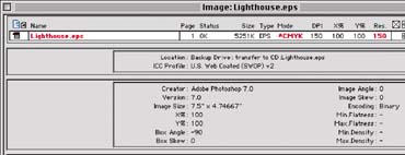
All "output for hire" industries have their fair share of idiosyncrasies, and screen printing is no exception. But one lesson that applies to all of them is this: Those who pay attention to the details of process and quality control typically get to go home at the end of the day rather than stay and rework digital artwork or reprint jobs. The strict habits and practices developed when implementing process and quality control create a solid foundation for the introduction of other technologies, among them the tools and techniques for color management. When I talk about color management, I am referring to the process in which ICC-compliant software is used to help predict and quantify the digital color content in a printing environment of any kind. The tool used to describe this content is called an ICC profile. Ultimately, the data describing the "color space" of the printing device (and all its settings) can be used to make sure imaging files are prepared correctly well before they arrive at the press. This makes the entire workflow more efficient and color more accurate. Use of ICC profiles is not an emerging technology, nor something to watch for in the future. It is a concept that is here now and being used in print shops of all descriptions around the globe. Applied to any flatbed, roll-fed, digital, or screen-printing process, color management can save time and money while enhancing the color-imaging workflow. Simply put, if you can establish and communicate a description of your final color-output scenario, you provide everyone in the workflow with a target to aim for and a benchmark against which they can assess the results. This works just as well for screen printing as it does for any other printing process. With this in mind, I propose to discuss how ICC-compliant software can be used to help predict and quantify the digital content in a screen-printing workflow. I will talk about each stage, including content creation, prepress, screenmaking, and printing on press. I also will review the issues that affect color management and compare traditional solutions to ICC-compliant strategies. My objective is to show you that implementing color management at the front end of the workflow will minimize the need to correct color on press. Content creation Content creation is an interesting aspect of any output-for-hire workflow, if only because we rarely have any control over it. Nevertheless, we are expected to understand the content creator’s expectations. Oh, and by the way, the language spoken by content creators is not always understood by the industries that will be outputting their creations. However, the designers and content creators leave bread crumbs and other tell-tale signs along the path. If we are to implement an ICC workflow, we need to identify them and incorporate them into our workflow so that we can control and streamline the process. Most digital files are created outside of the screen shop by designers or creative agencies using industry standard applications, such as Photoshop, Illustrator, QuarkXPress or InDesign. These files are supplied in their native formats, or possibly as Portable Document Format (PDF) files. In most cases, whether the creator of the artwork knows it or not, the digital content color settings of the file have already been optimized for some type of commercial printing situation. However, unless the content creator has an understanding of the color-management tools in their applications, we may be left to guess what they are passing along to us. The issues These digital files are usually created using color configurations, color settings, preferences and color libraries that are configured to default settings for offset printing. This means that what the content creator saw on his or her screen is not what we will print. Furthermore, when we view the digital files in our shop, what we see will not be what we print. If PDF files are supplied, we are certain to get a mix of both properly and improperly created files. Ideally, the PDF files are created to conform to a specification such as PDFX-1a. PDFX-1a requires that all elements within the layout be in the CMYK color space, that all fonts are included, and that profiles describing the source and destination color spaces are included. Unfortunately, in many cases we do not receive PDFX-compliant files. The traditional approach In a traditional scenario, we would send the supplied file onto screenmaking without determining the color settings it contains. This makes the results we can deliver on press unpredictable and inevitably leads to trouble. The ICC approach More and more screen printers who have implemented color-management systems also have developed communication methods to help educate content creators about proper file preparation. This approach is consistent with the color-management principle of anticipating challenges as early in the workflow as possible. Remember that while content creators aren’t inherently enamored with color-management technology, more and more of them are aware of how ICC profiles are created and used. Reaching out to content creators, especially those at large clients, could be regarded as the first step in the color-management process. Some screen printers are using an even more aggressive strategy that involves beefing up their creative departments as a way of pre-empting problems involved with incoming files. For some, creating content in house for clients has evolved into a significant source of additional revenue. In any case, there is some point in the workflow in which the image file will have to be either created or modified to deliver the benefits of an ICC workflow in your shop. If the content creator doesn’t do it, your staff will have to. Order entry and prepress In many ICC workflows, the order-entry stage is more than the recording of customer information, job parameters, and scheduling. It also is an opportunity to anticipate and correct problems that may appear later in the workflow. For shops implementing ICC color management, order entry can function as a staging area in which some of the preflighting processes discussed in this article take place. Color-separation films produced by outside sources also may be checked at this stage. It all depends on how you set up your workflow. But whether filmmaking is outsourced or performed in house, incoming files need to be checked or preflighted before they are used to produce positives. The issues Opening and checking the digital files takes time and requires a high level of application experience in order to define potential problems or catch inconsistencies and errors. If a problem is not caught, it will mean wasted time and material, both of which lead to increased costs. The traditional approach Typically all supplied digital content is opened and checked for missing fonts and placed, linked, or missing graphics. We also determine if the resolution is sufficient and examine file size, orientation, and other basic parameters. But this doesn’t help us with color accuracy. The ICC approach Preflighting is a term that comes from the preflight check that pilots perform on aircraft prior to taking off. In graphics reproduction, instead of opening each file to ensure that all the required parameters are in place, we can use an automated preflighting software package to do this for us. This software issues a report that tells us whether we have a pass or fail situation. It is useful for checking all non-color problems, but the software really comes into its own when it comes to inspecting the color settings. Examples of preflighting software are FlightCheck from Markzware (www.markzware.com) and PreFlightPro from Extensis (www.extensis.com). These applications allow the user to apply prede-fined settings, or create settings that apply to the expectations of their workflow. In addition to file resolution, file size, and image orientation, this workflow-automation tool has the capability to define the color spaces (RGB, CMYK, or other) and determine whether supplied graphics have an embedded ICC profile, as shown in Figure 1. This is the heart of an ICC workflow. This embedded file serves as a digital road map that tells us where the file is coming from. It becomes important in prepress, where it allows us to effectively preview the file the way the content creator envisioned it. A drop folder, or hot folder, is a typical preflighting tool. The digital content is dropped into the folder, where the software quickly and efficiently checks the parameters that we have defined, then creates a text report. Upon reviewing the text report, our operators can either pass the digital content to the next stage in the preparation for printing, or open the offending graphic(s) and make necessary changes. More issues Now we can consider the color settings the content creator used when assembling or creating the content. This process will tell us whether the colors we are seeing on our monitors are what the content creator was seeing and what the content creator wanted to print. The traditional approach We use the same graphics applications that the content creators use. We also may use the same default color settings, or preferences, within these applications. Visits to customer sites, as well as communication with end users, have convinced me that default color settings are used more than 85% of the time. These default settings are created within applications such as Adobe Photoshop, Adobe Illustrator, Adobe PageMaker, Adobe InDesign, Quark XPress, and the like. All of the Adobe applications use a subset of the color settings used for Photoshop, which at least creates consistency within the Adobe program suite. The most important thing to be aware of at this stage is that the default color settings create an onscreen preview with a specific appearance for each application. Most users rely heavily on the monitor when looking at the digital content. Using the settings that are configured as the application defaults, color edits are performed based upon operator experience in the screen-printing process. These edits often create an image that looks terrible on screen, but may print quite acceptably, assuming that variables are consistent and standardized within the print process. These variables include mesh count, screen preparation, press settings, etc. The ICC approach In order to use profiles correctly, we first must understand how color settings can be modified in graphics software. Most graphics applications allow us to define how color is handled. The color settings we select are used to describe how RGB and CMYK content will be created, as well as previewed. We also can define rules that define how content is handled if it does not conform to the color settings we have established. When an image is being previewed onscreen, either the ICC profile that was embedded in the image or the default setting is being applied. A key point to bring up here is that it’s far easier to alter the color space of the file to match printing conditions than it is to alter printing conditions to match the color space of the file. If we can trust our monitor and its preview by properly configuring the color settings, our subsequent color edits can be more effectively made and trusted. In the ICC world, we can take the knowledge that the typical content creator uses default settings and use this knowledge to our benefit. Since we know that Photoshop and other applications almost always default to offset printing standards, we will be dealing with a scenario similar to the Photoshop color settings shown in Figure 2. As we move through the list of common CMYK color settings, we see such options as US Sheetfed Coated, PhotoShop 5 Default, US Web Coated SWOP, and so on. Hey, where is the screen-printing option in this list? And what about settings for creating a digital or analog proof? There is a very simple answer in almost all cases: These profile options don’t exist. In order to implement an ICC color-managed workflow, we need to define a CMYK profile that accurately describes the printing scenario. In other words, we have to make one. Once we’ve done so, Photoshop will list the new profile(s) among its standard color settings. Then we can select the new profile and get an accurate preview of our images on screen. Let’s consider another key concept: The same CMYK values printed to two or more different devices will result in graphics with noticeably different color appearance. This can be seen in Figures 3 and 4. Figure 3 shows a file previewed through the default settings within Photoshop. Figure 4 shows the same file using the soft-proofing capabilities of Photoshop with a profile that reflects the actual printing characteristics delivered by our standard prepress procedures and press settings. This soft-proofing option is accessed by selecting the Proof Setup option from the from the View pull-down menu. Returning to Figure 4, we see how the image created for offset printing will print on our screen-printing press. Note the color values displayed within the Info Palette in both Figures 3 and 4. The values for the Images are the same, but the preview in Figure 4 is not acceptable. Now compare Figure 5 and Figure 3. Note the preview and the values displayed within the Info Palette. The preview looks very much the same in both images, but the values displayed in the Info Palette are different. We have changed the file in order to compensate for the color-reproduction capabilities of the press. In order to make that change from the customer-supplied color space to our desired color space, we used ICC profiles. The point here is twofold. First, as described previously, the same color on different devices prints differently. Therefore, in order to change the color, we need to change the ingredients. Secondly, once the ingredients have been changed, the on-screen preview can be used to soft proof the change. In other words, the traditional approach involves trying to alter the device or the process (screenmaking, press, or ink formulation). Conversely, in the ICC scenario, we performed a color-space transformation on the digital file itself, changing the ingredients so it will work under our final printing conditions without requiring that the screen-printing process be altered. This color-space transformation is accomplished using profiles supplied by the customer or designer (source profile) along with the profile that describes our standard printing conditions (destination profile). The destination profile we used in Figure 4 was created for a screen-printing press and was then used for soft proofing. This profile reflects what results we can expected when specific prepress and printing parameters are maintained. We use this same destination profile to perform a color-space transformation that results in the image shown in Figure 5. (For a closer look at constructing this final profile, see the sidebar "Characterizing and Creating an ICC Profile for the Screen-Printing Process" on page 40.) Proofing Proofs can be created using four or more colors on a single substrate or generated as composite or progressive proofs in which each color is laid down on a separate sheet of clear film. The films can be viewed independently to assess individual colors or assembled in register to be viewed as a full-color composite image. If a proof is supplied with the film or design file, it should be reviewed for size, color, and layout. If a proof will be created internally, it also must be reviewed for size, color, and layout. The issues Does the proofing system use inks and media that are similar to or consistent with the inks and materials used in screen printing? Is the proof a halftone proof or a continuous-tone proof? If we have a screened (halftone) proof, is the proof supplied using the same line count and screen angles that we will be running on the press? If the proof is a continuous tone or contone proof (an inkjet proof is a typical con-tone proof), was the proofing device calibrated to print like our screen press? The traditional approach If the answer to any or all of these questions is no (the answer is no virtually all of the time), then there is a problem. The proof will not create a visual match with the image we screen print. Nor will the proof create a visual match to the monitor when the image is previewed at the workstations. This means we will have to alter one or more of the following factors in order to get a match to the proof: digital content, screenmaking procedure, press setup and printing parameters, or ink formulation. The ICC approach The whole proofing issue can be solved by creating your own proofs internally using inkjet technology and a raster image processor (RIP) that is configurable for proofing. By obtaining or creating an ICC profile of our final print conditions, as well as a profile of our calibrated, optimized inkjet printer, we can quickly and accurately generate color proofs. In this situation, the source profile will describe your final screen-printing conditions, and the destination profile will represent the inkjet printer’s color space.What we are telling the RIP to do is exactly what we saw in Figure 5. We know the color values have to be changed, but we want the RIP to make the adjustments for us. This approach lets us use one file as the source for all output devices rather than multiple files for multiple devices, which creates confusion. The objective is to use the RIP’s ICC capabilities to drive the inkjet printer in such a way that it mimics the printing characteristics of the screen-printing press. This results in a color-accurate proof, which should also now conform to our onscreen preview of the file within Photoshop. By using a quality RIP and an inkjet printer, accurate proofs can be created for less than $7.00 per sheet (based on the average cost of hardware, software, and materials). Any ICC-compliant RIP can be used to generate proofs. However, to achieve the best results, the RIP should provide the following capabilities: * ability to calibrate for new media, resolution, number of passes, etc. * ability to load and apply ICC profiles or linked profiles (two or more profiles merged as a single profile) * ability to create an automated workflow The ability to calibrate, and subsequently recalibrate, the printer is very important. When the printer drifts (and they all do), or if ink or media is changed, you will no longer be able to print to the standards upon which the profile is based. The use of profiles or linked profiles will ensure that the color-space transformation occurs within the RIP and does not have to be performed manually during prepress. Workflow automation allows the operators to select specific groups of settings in the various print queues to perform different tasks using the same RIP. The Hot Folder feature offered by the better RIPs is an ideal feature for this process. The operator need only drop the digital files into the watched, or hot, folder and the RIP will automatically RIP and print the digital content. EFI, GMG, ORIS, ONYX, and Wasatch are examples of RIPs used for inkjet proofing. The RIP you use to drive the imagesetter for film output also may have proofing capabilities. Make sure that the features outlined above are included, or you will be disappointed with the results. Screenmaking and press setup By this point, the ICC workflow is in place. But to keep this workflow intact, we have to remember one important thing: The ICC profile we are using to transform the file into the final color space is built on a set of parameters that must be standardized. All of the process parameters that come into play from screenmaking through printer setup are part of the process standards. This set of parameters includes screen mesh count and thread diameter, screen tension, emulsion thickness, exposure, squeegee blade selection, and press settings such as off-contact, squeegee pressure and speed, floodbar angle, and other variables. If these conditions aren’t exactly the same as they were when the printing system was profiled, the profile itself will be rendered invalid. This is essentially the same principle that applies to calibrating an inkjet printer. In screen printing, the calibration starts at screenmaking and includes standardizing every variable that comes into play as the print moves to completion. Ending pandemonium on press This is the payoff. If we have correctly implemented an ICC profile-enabled workflow from start to finish, the odds of our print matching our proof are greatly enhanced. Am I claiming that this is a fool-proof process and that we won’t have to color correct on press? Of course not. However, I am saying we will find ourselves doing far fewer color adjustments on press (from squeegee pressure to ink doctoring) if we implement this type of strategy. As a quick review, we have seen that profiles are used as a form of color communication between your customer, your staff, and all of the devices within the workflow. Preflighting allows the operator to check digital content for color space issues and to identify embedded ICC profiles in the file. In prepress, a final print profile will enable soft proofing of the digital content to ensure that the file will print accurately on press. With these checks and balances in place throughout the workflow, problems can be detected and remedied early. In other words, when the digital content is actually prepared for the screen-printing process instead of for offset printing or another reproduction method, press operators will find less need to make big changes on press in order to achieve accurate color. Characterizing and Creating an ICC Profile for the Screen-Printing Process The first step in creating an accurate profile of the screen-printing process is characterizing the printing process. This involves defining the shop standards for screenmaking and press setup so that they are repeatable and the printed results are consistent from run to run. Once this is correct, we can analyze the full color-rendering capabilities of the process and create a profile based on these capabilities. To create the optimum printing environment, you will need a good, calibrated densitometer. Most densitometers can measure density and tone value increase (dot gain or dot area). Higher-level capabilities include measurement of hue error and grayness, trapping, and print contrast. Identify the types of substrates you print on. If they are similar to each other, you may only need to develop a single profile. But more than likely, you will need to create a profile for each major substrate type you print. Next you will need to develop a test target for the press. This target will contain color bars, gradients, color patches, and a series of typical photo images if possible. The color bars will need to include tone range scales from 1-100% in cyan, magenta, yellow, black, red, green, and blue, as well as a three-color grayscale. To define the cyan, magenta, and yellow values for the three-color grayscale, create an RGB gradient within Photoshop from white to black. Use the US Web Coated CMYK Setting and convert the RGB file to CMYK. Using Photoshop’s eyedropper tool, move the cursor over the image to display the percentages, or ingredients for the creation of a three-color grayscale within the Info Palette. Record these values for the creation of the three-color step wedge. The wedge should show tonal values in at least 10% increments. Do not use black in the three-color step wedge. A target for determining the total ink limit, or total areas of coverage, will also be required. Chromaticity (www.chromaticity.com) offers a digital file that will assist you in defining this important aspect of print quality. Next, place an ICC profile target, or set of patches into the layout. Copy various elements of the layout into different locations of the total image area, which will allow you to check for consistency from side to side and top to bottom. Output the target as film separations, coat and expose screens with the separations, then print the target to the desired density with the completed screens. After printing, check the tone-range scales. Determine what dot size is the smallest you can hold and what is the largest for each of the process colors. Make any changes in screenmaking or press setup that will create consistent appearance and identical measurement values for all colors. Visually evaluate the three-color grayscale for a color cast. Ideally, this grayscale will be a neutral gray. The objective here is to achieve the most saturation or intensity in each of the printing primary colors (CMY) while creating the smoothest reproduction of tonal range. Adjust your print parameters as needed to achieve an optimal result. If you change the color order, halftone line count or angle, or any other parameter, the process will need to be repeated. Once the press has been optimized for print quality, this setup or configuration will be your press standard. From this point on, the standard will dictate how the press is run and how production parameters are controlled. Use your densitometer to record the dot values delivered under this print standard, or better yet, measure the results with a spectrophotometer. Following the procedure recommended by the maker of the ICC profiling software you use (examples include Profile Maker from Gretag MacBeth and Monaco Profiler from X-Rite), also define various ink settings. Ink settings are required in order to define how the printing inks will be used, including how black ink will be used. Typical settings here include a total ink limit (how much of all four inks can be put onto the media), black start and black maximum, and type of black-generation control. Now you can print your ICC profile targets for the press. Then measure and average a series of targets from various press sheets and locations on the layout to ensure that variations are accounted for among the values you collect. As a quick overview, the process is as follows: 1. print the target on the calibrated or controlled device 2. measure the printed patches 3. define the ink settings 4. create the profile. Before plugging your profile into the workflow, take some to evaluate it for accuracy. Create a new test layout with a customer-supplied file, a series of images that you are familiar with (skin tones, food groups, etc.), and a three-color grayscale. Using the newly created profile, transform the original files into the color space supported by your screen-printing process. Next, access the soft-proofing capabilities of Photoshop and review the design for color accuracy. Make sure to check the three-color grayscale to ensure that you have achieved gray balance (neutral gray). Finally, create the screens and print the job file. Compare the printed piece to the onscreen preview and verify that the process has been optimized. Once the profile has been proven, add it to the list of ICC-compliant profiles in your design software. With the profile in place, color can be more accurately predicted, saving you time and money in your day-to-day operation. This is the true value of the ICC workflow. About the author Roy Bohnen is chief technology officer for Chromaticity, a Grand-Rapids, MI-based company that provides color-management tools and consulting services for the printing industries. Bohnen’s career spans more than 25 years and includes overseeing quality and process control for multiple printing operations across the country. He also has been active in research and development for digital printing workflows and has implemented color-managed workflows in more than 1000 graphics operations, including photo labs, commercial print shops (flexographic, gravure, and screen printing), large-format digital output companies, service bureaus, and ad agencies. He can be reached by email at rbohnen@ chromaticity.com.


Subscribe

Magazine
Get the most important news
and business ideas from Screenprinting Magazine.
Most Popular
-

 Case Studies2 months ago
High-Density Inks Help Specialty Printing Take Center Stage
-

 Art, Ad, or Alchemy2 months ago
F&I Printing Is Everywhere!
-

 Andy MacDougall2 months ago
Functional and Industrial Printing is EVERYWHERE!
-

 Columns3 weeks ago
8 Marketing Mistakes Not to Make When Promoting Your Screen Printing Services Online
-

 Editor's Note3 weeks ago
Livin’ the High Life
-

 Marshall Atkinson3 weeks ago
How to Create a Winning Culture in Your Screen-Printing Business
-

 Thomas Trimingham2 months ago
“Magic” Marketing for Screen Printing Shops
-

 Case Studies3 weeks ago
Screen Printing for Texture and Depth