
How to Trap Artwork for Screen Printing: 4 Essential Steps to Avoid Gaps and Misregistration
From equipment testing to vector vs. bitmap traps, learn how to fix common screen-printing artwork issues before they hit the press.
TRAPPING ARTWORK SHOULD be a simple thing. It certainly is simple in theory. To properly “trap” artwork you want to overlap a color slightly onto another to compensate for a variety of printing issues. In the old days we would use a camera to accomplish this task, with varying success. Now that we have the computer things should be easier and faster, right?
Well, the dream of a one-button-click trap still is just a dream for most artwork. To properly trap vector or bitmap artwork, you not only need to know where and what to trap, but also how to adjust the amounts of overlap for the ink and press properties of your printer. Anyone who has spent some time in the printing arena has felt the aggravation of playing shuffle with an outline screen that just won’t line up with its fill color. The solution should have been done before the screens were made!
Proper trapping makes printing complex we may or may not be ere snap, even with older equipment. There are four secrets that I have discovered to help you create the quickest and most effective methods of trapping artwork for your shop. A combination of testing your equipment, analyzing your art, defining your minimum trap, and then creating the best method of trapping dramatically will reduce any issues that you have with outlines and adjoining colors.
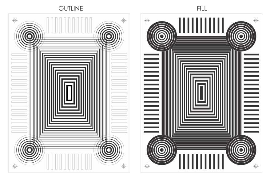
Figure 1
1. Test your equipment and printing process.
Theoretically, you shouldn’t have to trap artwork at all if the printing variables aren’t an issue. But theory doesn’t help when you forget to trap a job that goes to press and you have a glaring white space between your image’s fill and its outline.
Every shop has different capabilities when it comes to holding good registration in a print. I have seen manual shops that could hold perfect registration, and fully automatic shops that couldn’t register an oversize number on a jersey. The size of your shop and the complexity of your equipment will not guarantee that you have little need for trapping in your artwork.
Before you can effectively trap separations, you must determine where any image distortion may be coming from. The best way to do this is to use a test file that you will walk through the entire printing process and record where and how much distortion you are experiencing at each stage.
For a test film, I chose a file that would display several common distortion issues so they carefully could be recorded (Figure 1). You first will check for any distortion that may be occurring from the positives being created. This especially is likely if you have a thermal device creating positives due to heat and humidity affecting the media as it is fused with toner.
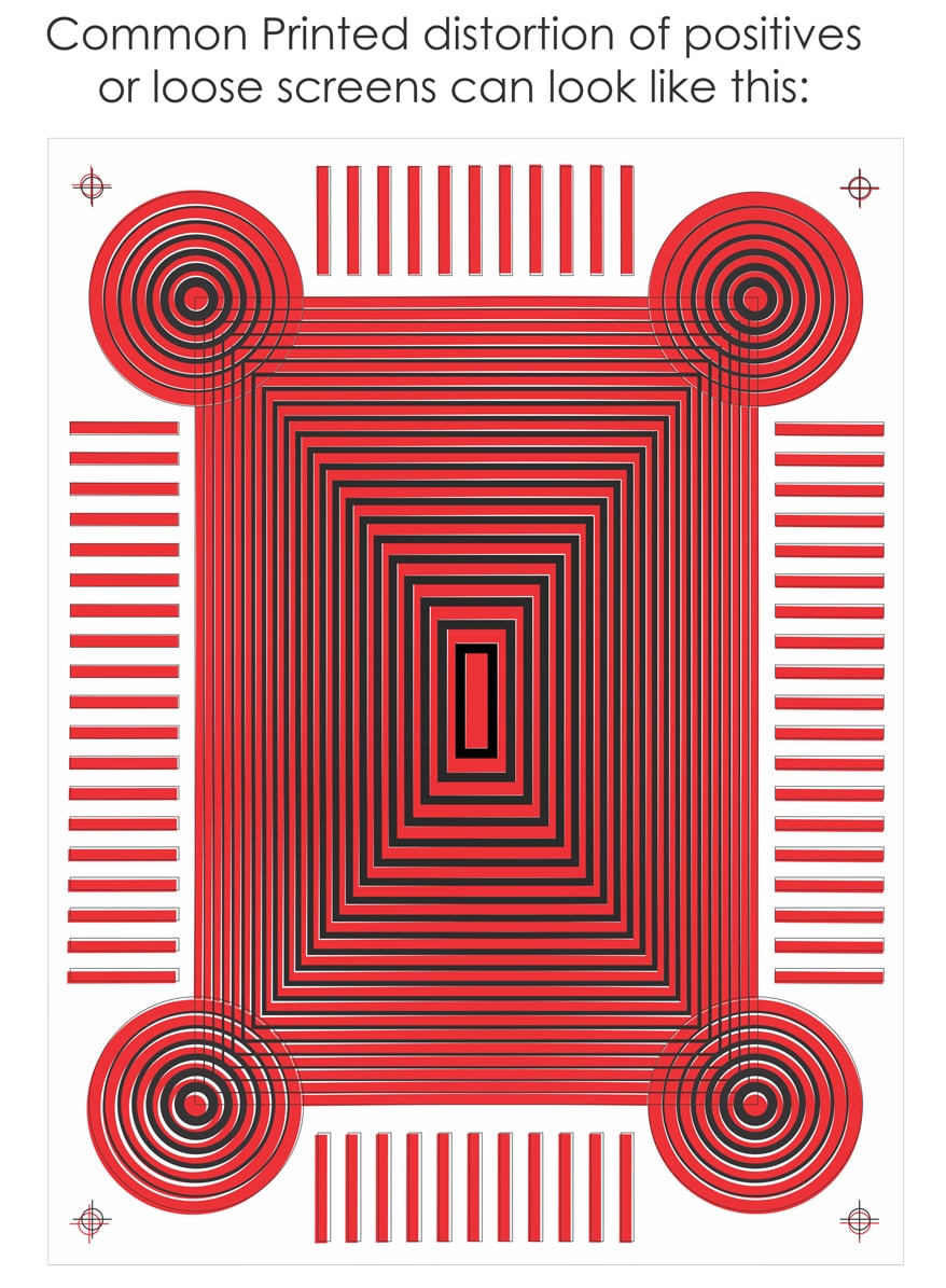
Figure 2
If you notice significant distortion at this stage (Figure 2), it may be a serious red flag that you must deal with immediately. Positives that don’t line up with each other are not going to get better when you add in screen and press variables. Take careful note of the distortion’s direction, angle, and amount in different areas.
It also is advantageous to run several sets to see if the problem is consistent or if it gets better as the printer warms up. In some cases, you may want to test a variety of media (vellum, acetate, polyester film) that often can yield better results before you move on to screen issues. You can skip this step if you are fortunate enough to have an image setter or a non-thermal device.
Once you have your positives under control, it is time to check your screen making. Expose several screens with the films that you checked the positives with. After the screens are exposed and washed out, lay the dry screen on top of the original film to see if there is any distortion. If you see a difference at this point, it can indicate a poorly tensioned screen that may not be level, or a problem with the exposure system (poor vacuum seal, etc.).
Assuming the screens line up with the films properly, it’s time to test the printing of the image. This is where the greatest number of variables can affect the registration and increase the need for trapping. After you have printed your two-color test image, examine it to get an idea of what kinds of shapes you need to trap and how much overlap these elements will require. When you see distortion happen at the press level make sure you first check the basics:
- Are the press pallets and screens level and flat?
- Are the screens properly tensioned?
- Is the off-contact set at a minimal necessary distance?
- Is the flood or print pressure too high?
- Is the squeegee’s printing angle proper (45°) and perpendicular to the print?
- Does the press show any movement of the screens or palettes in print position?
If these variables are under control, then you can decide what you can adjust in the artwork. Take a careful look at how much distortion you have in the final print after you have the press and screens in place as the best they can be. This will tell you how much of an overlap you need to create to properly trap an image.
An important issue before you finalize your printing test results is the viscosity of your inks. If you are printing heavy white ink through fine mesh with extra pressure, you will see more distortion than you would with smooth, process ink. Don’t forget to test some of your thicker (high opacity) inks in combination with some smoother ones to get a good idea of how much image stretch you may expect with different inks. This is one of the reasons that an underbase color may experience more screen stretch that the colors that go on top of it.
A fortunate few printers will have little or no visible distortion of their printed test images. Does this mean you don’t need to trap? Not likely. I still would trap a minimal amount due to the stress that the screens will be under the course of a run.
Note that they will lose some tension due to stress and expand slightly from the heat of friction. And, depending on the artwork, even a small gap may be painfully obvious to an observer. The purpose of testing your equipment first is to be comfortable enough to move onto the next step of looking at your art.
Advertisement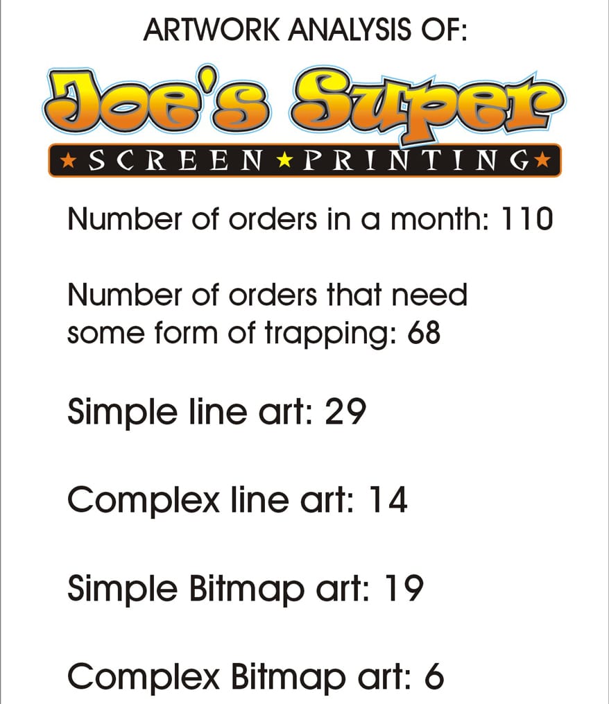
Figure 3
2. Analyzing your artwork.
The nature of the screen-printing business is that artwork is constantly changing and, with it, the variables it creates on press. If you print a large amount of custom work, be aware of how different artwork will require a variety in overlapping of the colors. It is very common for an artist and her company to treat trapping on a job-to-job basis.
But there’s a big advantage to developing some standards in your art department for the types of trapping that commonly are needed. It will be easier to train new artists, believe it or not. You can have a constant reference on press for the trapping allowances for types of jobs, and have much easier set ups and registration on tough jobs.
Obviously, for trapping to be an issue at all we are talking about multicolor artwork where the colors are touching or overlapping. Looking at an average screen printer’s shop, we see that out of the percentage of jobs they do for multicolor job that has these variables we can further isolate the best methods for that shop and its art.
The way to analyze your artwork is to get a snapshot of the most common jobs your company does and group them into categories that have different trapping needs. Some companies may find this difficult. But the point is to get general areas that typically are treated with the same trapping methods.
For an example I’ll use a small print shop called Joe’s Super Screen Printing. This size company could have the widest variety of trapping needs because it will take on “whatever walks in the door.” In this case we need to analyze the most common jobs Joe’s will need to trap their artwork. A snapshot of Joe’s artwork and orders show that he has the following breakdown of artwork (Figure 3):
The artwork was sorted in the following categories:
- Simple line art: This is the most common screen-printing artwork. It usually is type with vector cartoons or elements that are defined by an obvious trap outline.
- Complex line art: This is line art that uses gradient fills and blended elements that can make it more challenging to prepare.
- Simple bitmap art: This is a Photoshop file or other bitmap program file that creates an image using groups of colored pixels. Though I use the term “simple” for this type of file, they rarely are a simple matter to trap properly.
- Complex Bitmap Art: This includes realistic illustrations and complex rendered graphics that can be blended with type and vector elements.
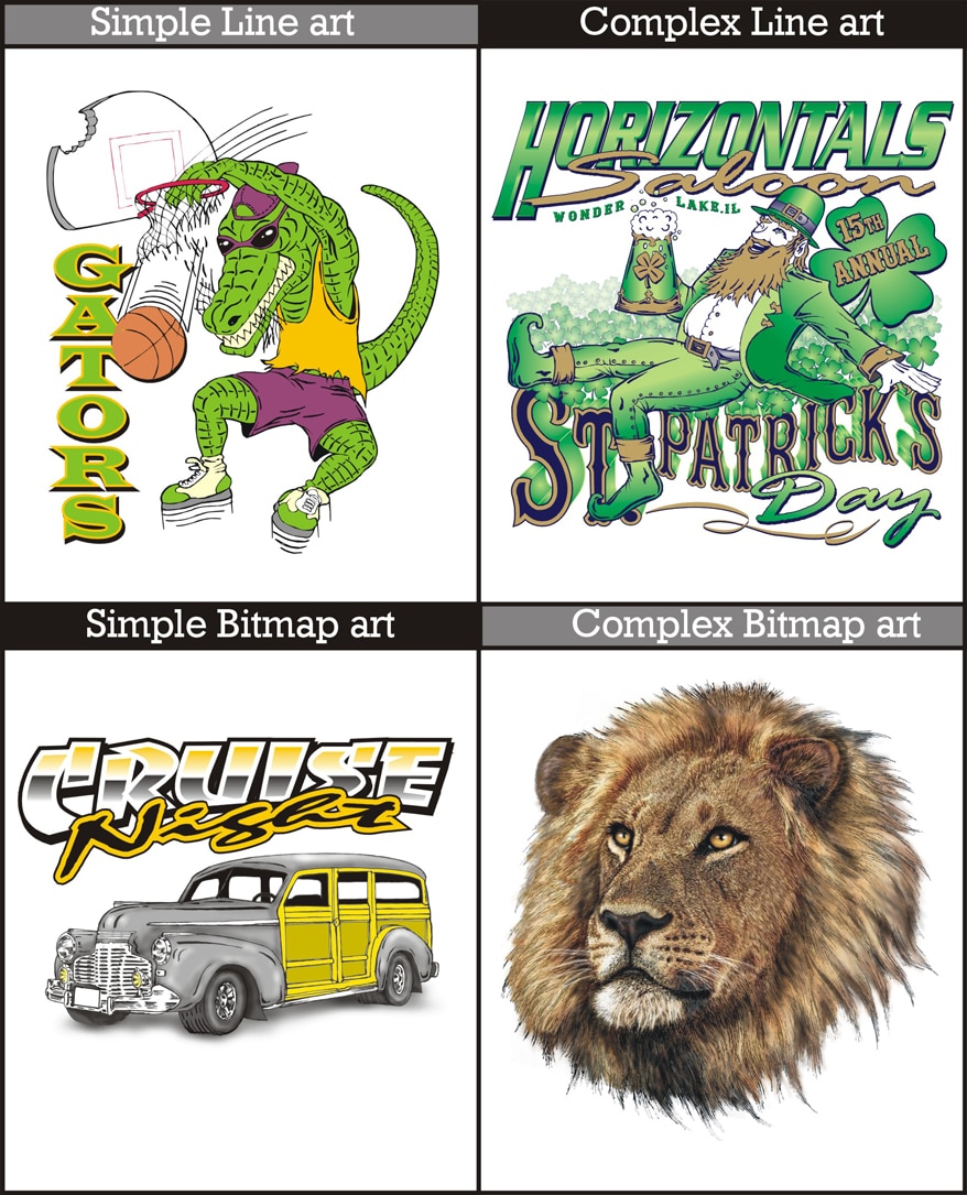
Figure 4
An example of artwork rendered in these four ways is shown to illustrate how the challenge of trapping may change depending on how the art is created (Figure 4).
For each of these designs the trapping needed will change depending on three factors:
- How well your shop can maintain image size and shape of their positives into final prints will affect the overlap needed.
- The composition and contrast of the art against the value of the shirt the image is to be printed on will often dictate a trapping method. For instance, if you have a red triangle with a black outline that is printed on a white, black, and gray shirt, you will need to trap on the white and black shirts. But not the gray because the contrast of the shirt is close to the red color.
- How and where an underbase is used will determine how the image is to be properly trapped and in what areas.
Having four different categories with three variables each sounds complex, but it is simply a matter of mentally sorting artwork and assigning standards to the different types. Artists that regularly do screen-printing separations will do this mental sorting automatically as they separate a design.
The point for doing an analysis of the shop’s whole art flow is to develop some guidelines that will tell artists: Okay, on this job you need to trap the artwork this way to achieve the most “printer-friendly” results. And that is what effective trapping in the art department really means.
The last two tips on trapping work together are designed to give the art and printing departments some standards on the four types of jobs that we sorted.
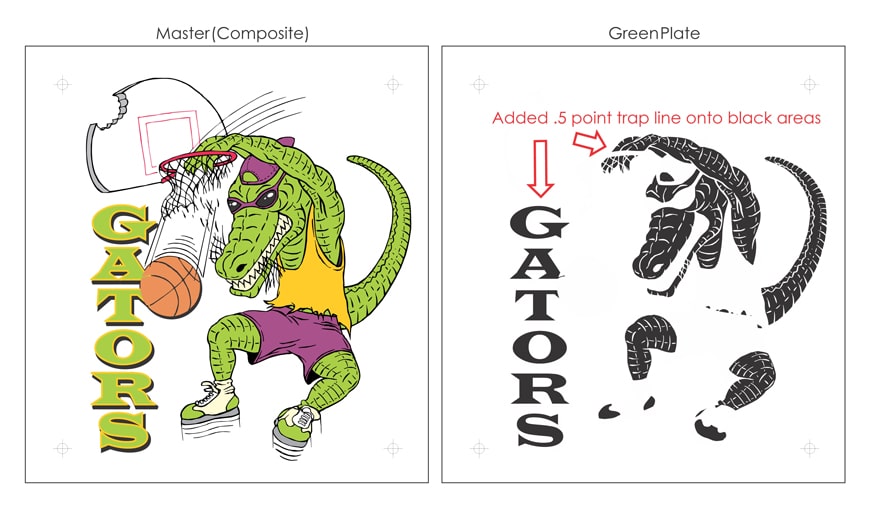
Figure 5
3. and 4. Creating the best method is defining a minimum amount to trap.
Remember that since we “theoretically” shouldn’t need to trap any artwork, it follows that the minimum amount to do the job will give you the best results. But what is a good minimum trap? I have talked to a variety of print shop owners and you would be amazed by the differences. The most common response is something like, “I add a point trap to everything that has an outline.”
But if you work with specialty products that have difficult setups and printing methods — such as balloons and mugs — your trap could be as much as ¹⁄₁₆ to ¹⁄₁₈ an inch! This is why it is important to not skip the testing of your printing equipment so you know exactly how much you need to trap. Overcompensating with a trap line can cause bleeding, loss of detail, color shifts, and numerous other problems that are just as ugly as a gap in the print.
When you look at the test files you printed, you can measure a degree of accuracy of what your gaps are and predict a trap that you will need. A good way to define a minimum trap amount is to double the largest gap you see in a test file. This way you are covered if the print distorts in more than one direction.
For instance, if you have a ¹⁄₆₄-inch gap (or 2.25 points), you should consider a ¹⁄₃₂-inch (4.5 point) trap. This is the amount you need that directly will lead into your trapping method for the type of art that you are dealing with.
The minimum amount you trap art and the method you use are intertwined due to the nature of the tools in the art programs. In Illustrator or CorelDraw you are using primarily vector-based tools and the trap lines precisely can be controlled as to how they are executed. The first two types of art that require trapping were Simple and Complex line art (line is another term for vector art). In both cases we can simply create a separate file for each color and then assign the necessary outline to where it is needed (Figure 5).
For the bitmap files trapping can be a more difficult matter. The artist must address the artwork areas of color that are touching. Then he must check that the final separations effectively can modify just the borders of these selections to overlap a desired amount.
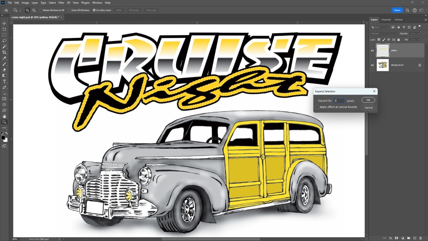
Figure 6
Several ways of doing this in Photoshop are possible depending on the art style. If the art has a lot of solid-colored areas, the best way is to use the Magic Wand on a selection. Next, use the Expand command under the Selection/Modify menu to expand and fill the outside edges of this particular color for a certain amount of pixels (Figure 6).
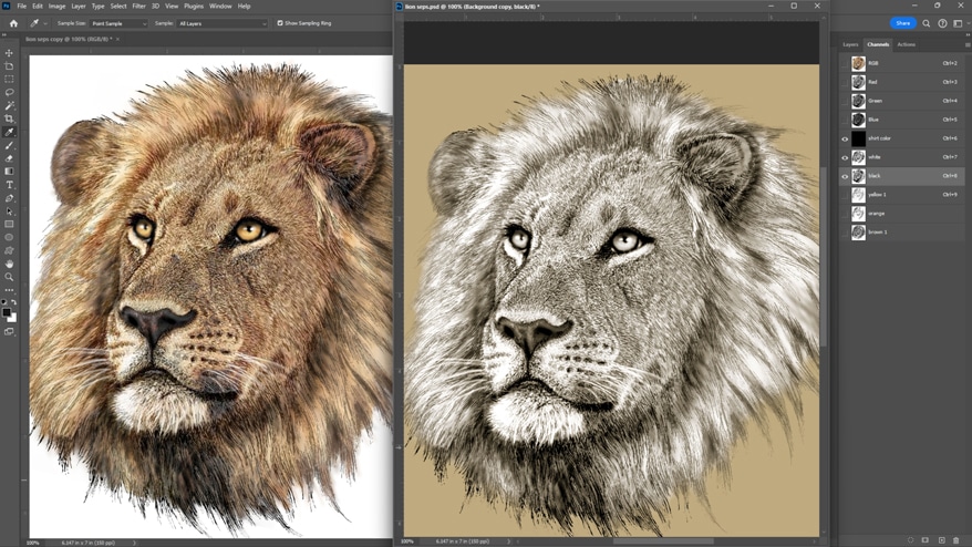
Figure 7
If the bitmap file is very complex and blended, the artist must address the color trapping as the separations are created. This is done carefully by checking the overlap of the colors by pasting the separations as Alpha spot channels and assigning fill colors that echo the final ink colors (Figure 7).
The “old school” way of doing this was to print out a set of preliminary films and tape them together on a light table. You’d then alternately lift and lower one film at a time and see how much they overlap in the blended areas. You could then make notes and go back and correct those areas that needed it.
In some ways this can show you more than the Photoshop channels mockup because you see how the halftones work with each other. Of course, the disadvantage is the cost in film and the time spent outputting, taping, and going back and doing it all over again.
A final method of trapping to consider is to use a composite file where you separate and trap bitmap elements in Photoshop and import the file back into Illustrator or Corel. This is a point at which you can add precise trapping of type and other vector elements. This is considerably more time consuming than the other methods, but it can allow for the most flexibility in trapping. This is because you can control the elements in the proper file structure that they were created in while maintaining the most image clarity.
I usually separate the bitmap elements first, as they tend to be the less flexible of the file types. Then I create a different vector file for each ink color and change the vector pieces to either black, white, or shades of gray, depending on how much of that color is in that file.
A noticeable benefit to properly trapping artwork is that it is one of the first areas of separation that spills over from the art department into the printing department. If the file is prepared with the printing allowances accounted for, no one in the art department is likely to notice because the job will be set up and run in one smooth process. The team will move right on to the next job. The management will notice, however, when they see how the production-friendly art can boost production.
AdvertisementLet’s Talk About It
Creating a More Diverse and Inclusive Screen Printing Industry
LET’S TALK About It: Part 3 discusses how four screen printers have employed people with disabilities, why you should consider doing the same, the resources that are available, and more. Watch the live webinar, held August 16, moderated by Adrienne Palmer, editor-in-chief, Screen Printing magazine, with panelists Ali Banholzer, Amber Massey, Ryan Moor, and Jed Seifert. The multi-part series is hosted exclusively by ROQ.US and U.N.I.T.E Together. Let’s Talk About It: Part 1 focused on Black, female screen printers and can be watched here; Part 2 focused on the LGBTQ+ community and can be watched here.


How Screen-Printing Supplies Impact ROI: Inks, Squeegees, Mesh, and Emulsion Explained

Fluid Color Expands North American Reach Through New Partnership With Glantz

How to Create Vintage Screen Prints: Distress, Duotone, and Ink Opacity Techniques

2025 Women in Screen Printing Awards: Celebrating Six Leaders Driving the Industry Forward

How the No BS Rule Improves Screen Printing Shops: Efficiency, Staffing, and Craftsmanship
How to Create Vintage Screen Prints: Distress, Duotone, and Ink Opacity Techniques


Bulletins
Get the most important news and business ideas from Screen Printing magazine's news bulletin.
-

 Expert Perspectives1 month ago
Five Hard-to-Copy Strategies That Keep Competitors Chasing You
-
 Shop Management4 weeks ago
DTF vs. Screen Printing: Why Both Technologies Will Shape the Future
-

 Shop Management2 months ago
Cylindrical DTO Printing Is Revolutionizing Drinkware, Packaging, and Personalization
-
 Case Studies2 months ago
Seattle’s Central Saloon Prints Its Own T-Shirts, Boosting Monthly Sales 5X
-
 Tips and How-To2 months ago
7 Faceless Video Ideas to Boost Your Business Without Being on Camera
-
 Women in Screen Printing2 weeks ago
2025 Women in Screen Printing Awards: Celebrating Six Leaders Driving the Industry Forward
-

 Kevin Baumgart4 weeks ago
Why Print Shops Need a CRM: How to Capture More Sales and Create Predictable Growth
-
 Marshall Atkinson2 weeks ago
How the No BS Rule Improves Screen Printing Shops: Efficiency, Staffing, and Craftsmanship