Prepress & Screen Making
Published
17 years agoon
Color management is very important in the screen-printing marketplace. The key is getting each color right based on the substrate in use, whether the job involves spot colors or separated colors. Predicting exactly how specific inks will print—given the transparency of the ink, the color and physical characteristics of the material being printed on, and the chemistry of the pigments being used—is a big part of the challenge. Color management has become more and more a scientific process in recent years, but it still is not a simple one.
Color management is very important in the screen-printing marketplace. The key is getting each color right based on the substrate in use, whether the job involves spot colors or separated colors. Predicting exactly how specific inks will print—given the transparency of the ink, the color and physical characteristics of the material being printed on, and the chemistry of the pigments being used—is a big part of the challenge. Color management has become more and more a scientific process in recent years, but it still is not a simple one. The essential problem is that screen printers work with such diverse materials, inks, and processes that it’s difficult to do the testing and evaluation necessary to manage all of the variables involved. But help is definitely available.
The Pantone guide
The Pantone Solid Color Guide is one tool that every screen shop should have. It contains more than 1100 Pantone Solid colors. The guide is printed on white paper, but it still serves screen-printing operations as a starting point for achieving the correct color. At the very least, it’s a reference that indicates the color the customer expects to get in the finished product. However, the guide won’t tell you how to get there when fabric bleed, ink transparency, and other factors are working against you.
In many cases, the screen-printing process is so different from printing on white paper that other means, such as white overprints, changing the color print order, and so on, are the only effec- tive answers. To help with the special needs of screen printers, Pantone also makes special swatch books for printing on plastics and textiles.
Tricks for visualizing color
You have plenty of options for visualizing how a color will actually look on a finished product. Software, such as Adobe Photoshop, can allow print providers to simulate a colored background and can even allow the user to simulate transparency. The process can be hit or miss until you determine which transparency setting will approximate the actual look of the inksets you are using, but it can get you reasonably close. Best of all, once you are satisfied that you can create a file that will consistently simulate the final printed piece, you can use those settings to create inkjet proofs or soft proofs so your customer can approve the job before a single screen is created.
Soft proofs are digital color proofs that you can send to the customer electronically in JPEG or PDF format. The caveat here is that both you and your customer must be using color-calibrated monitors to assure you are both looking at the same thing.
Monitor-color calibration is probably the easiest and least expensive first step to color management. A product like the new Huey from Pantone sells for less than $100 and does a good job of keeping your CRT or LCD monitors consistent. You even get a regular reminder to check the calibration in case you’re one of the many people who tends to let things ride.
The keys to color management
Calibration and consistency are the keys to effective color management. In the proofing stage, that means all of the processes involved in creating the proof need to be monitored on a regular basis (daily calibration is often needed). Inkjet proofing devices have become increasingly popular because of their consistency. Some new inkjet devices, notably Hewlett-Packard’s Z series of inkjet printers, have built-in spectrophotometers to make the calibration process quick and painless. They actually calibrate themselves automatically whenever needed.
A good spectrophotometer is a basic component of any device-calibration system. The price of these units has come down into the range where even small print providers can afford them. One of the industry standard spectrophotometers, X-Rite’s GretagMacbeth EyeOne (the same type of unit found in the HP Z printers), sells for around $700. More automated versions sell for about twice the price. Spectrophotometers pay for themselves over time by keeping the process consistent and eliminating errors and remakes. Knowing exactly how your equipment prints and monitoring any changes is critical to increasing production efficiency. The more time you can save in tweaking color, the more productive your employees and machinery will be.
Color management is more than hardware, though. Good software is important for profiling and maintaining your color workflow. Many of today’s digital Raster Image Processors (RIPs) are designed to use profiles created to the standards of the International Color Consortium (ICC). These profiles are designed to compare how a printing device actually prints in comparison to known color targets. Basically, you output a color grid consisting of known and measured color values and print them on the device you’re profiling.
The color-profile process
You can make different profiles for each of the substrates on which you print—or if you’re printing on a wide variety of materials, you might group similar materials into one overall profile. Clearly, the more specific the profile you create, the more accurate and consistent your color will be.
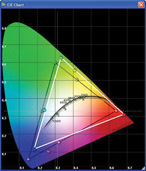
Once you print the color grid on your device, use a spectrophotometer to read the printed color values. Profiling software compares the printed piece with the known color values. The profile is actually the software’s best attempt to match the output of the printing device to the known values. What it attempts to do is correct the output to match the original as closely as possible. In truth, it will never be an exact match. All print- ing devices are a little bit different (Figure 1), even those that are made in the same factory at the same time.
To create the profile, the operator reads the individual color squares on the printed target (Figure 2), and the software compares the values read with the known color values of the original image. There can be anywhere from a couple hundred to a few thousand squares to be read, and the more squares on the target, the better the profile will be. It is easy to see why it can pay to buy an auto- mated reader. Reading small, individual squares by hand is tedious and time consuming, not to mention error prone.
The quality of your calibration and profile depends a lot on the software, targets, and spectrophotometer used, as well as the color algorithms plugged into the software. In general, the more you pay for software and hardware, the better the profile. But it’s also true that even the most basic machines offer pretty good results.
What is color gamut?
Another way to describe color gamut is the color space in which every color-sensing device operates. The device could be a human eye, a computer monitor, or a printing press. You might be surprised to learn that no two people see color exactly alike. And even though a spectrophotometer is better at seeing color than the human eye is, it’s even true that two different machines will read the exact same color grid slightly differently.
Every printing device has a specific color gamut—the widest range of colors it can possibly print, given the inks and substrates used in the process. The screen-printing process often uses brighter, more opaque inks than the commercial printer, and that’s an asset when it comes to printing brilliant spot colors or using fluorescents or other specialty inks. But that asset can quickly become a real problem when it comes to printing process color, something that we’ll cover a bit later. For now, the important point is that perfect color is often a technical impossibility. The science of color management is much more about controlling color and keeping it consistentent than it is about making perfect color.
When a color is out of gamut, that means there is simply no way a specific machine with specific inks and specific substrates can duplicate that specific color. What ink manufacturers attempt to do is provide consistent colors—but remember that different ink companies use different pigments to create similar colors, and these different pigments can have different effects on different substrates. For color management, it’s reasonable to stick with one ink manufacturer. Of course, in the real world, that is often difficult or impossible to do.
Color conditions
An important thing many screen printers often fail to take note of is the effect of viewing conditions on color perception. You’ve certainly had the experience of looking at fall foliage while driving along with sunglasses on. When you remove them, the color can shift pretty dramatically. The same is true of viewing color under fluorescent or incandescent lighting.
To keep things consistent (remember, color management is all about consistency), the printing industry has agreed—for the most part—on a standard viewing-light condition of 5000° K. This is a fairly pure, white light that closely resembles daylight viewing conditions. Of course, daylight varies too! But for the purposes of viewing color, it is desirable to use special fluorescent lighting that outputs light at 5000° K. Many print shops have viewing booths on site so that colors may be examined under controlled conditions (Figure 3).
Having said that, it is also true that these lighting conditions would make no sense at all for many screen printers. A small change in light temperature can make a huge change in how we perceive certain colors. That’s why it’s important to view the colors under the conditions that the end-user will view them. So if you’re delivering P-O-P signage to Wal-Mart, you’ll want to view color under Wal-Mart’s lighting conditions.
Aid from the trenches
Ink manufacturers have chased the tail of changing color gamut all their lives, and they are a great source of information and tools for keeping things in control and for keeping you as close to perfect color as science will allow. They know very well all the variables you deal with and have a good handle on how different substrates respond to different ink pigments.
Screen-printing ink companies provide great resources for managing color in the context of screen printing. Many have even created their own swatch books, similar to the ones from Pantone, but using their own inks. Virtually every ink company has its own custom color-matching system.
Trade associations also offer training for those who are interested in the fine points of color management. For example, SGIA offers seminars, and PIA/GATF holds an annual color-management conference. Note that members of these organizations who wish to attend seminars and other events may be eligible for reduced rates.
Four-color process
Printing in four-color process offers its own unique challenges, more so for the screen printers who work with both spot and process colors on the same piece. You might also have occasion to convert spot colors into process colors for printing. If so, you may have been profoundly disappointed that the conversions came out looking muddy or flat. It’s not a probem with your output device, but an issue of color gamut. You simply cannot reproduce a significant number of Pantone solid colors with process-color inks.
Pantone makes a color-swatch book called Color Bridge (Figure 4). It clearly shows the effects of converting spot colors to process colors. The book also shows each Pantone Spot color alongside the best possible CMYK conversion of that color. And while this book can be a useful tool to have in a screen-printing shop, remember that the book is printed on white paper with offset-printing-ink pigments, so your results will be somewhat different.
You can also add other colors to the process inkset. Supplementing CMYK with orange and green allows you to print using the Hexachrome sys¬tem and significantly expand the gamut of color that you can print. But doing so also creates new problems. If you go to a Hexachrome system, all of the color profiles created for CMYK go out the window and must be redone with the new inks. The same goes if you wish to use rhodamine red instead of magenta or some other variation. Any time you change the mix, you change the color gamut and thus the profile.
But the good news is that ICC color profiles for CMYK inks work very well in a color-managed system. Using these profiles offers consistency and repeatability, and in this business, those two factors lead to profitability.
Color change is but one factor that can cause a screen printer to create a new color profile. Changes in mesh count or tension, screen exposure, dot shape or angle, line count, ink pigments (and ink manufacturer), squeegee profile or durometer, printing speed, and other variables may require the creation of a new color profile to get optimum results. You must monitor these variables carefully in a color-managed workflow because relatively minor changes can have substantial effects.
Not a lost cause
Many of you might conclude that color management is too expensive and too time consuming. And for some operations, that may well be true. If every job you print uses different inks, different processes, different operators, different presses, and so on, it just might not be worth it to invest in the hardware and software needed for color management. But for most screen printers, comprehensive color management is most likely time and money well spent. Color management can substantially cut make-ready time when your color is right where you expect it to be on the first print. Consistent proofs also make for happy customers, and not having to adjust colors in the middle of a run makes for happy press operators.
You can start with baby steps. At the very least, you’ll benefit from calibrating all of the monitors in your shop. When it comes to creating press profiles, start with the press that’s your biggest producer. You might be surprised how much more productive you can make that press with color management. And if you find a small investment makes a big difference, you can bring the profiling process to all of the output devices in the shop (and don’t forget color management also is a great tool for input devices like scanners and digital cameras).
Color management has proven to be an effective tool for increasing efficiency and consistency in the printing process. For screen printers, that kind of enhancement looks very good in the color of the bottom line.
Stephen Beals
Stephen Beals has been involved in prepress production for more than 30 years and currently works as the digital-prepress manager for Finger Lakes Press, Auburn, NY. He also is a regular contributor to The Big Picture magazine.


Subscribe

Magazine
Get the most important news
and business ideas from Screenprinting Magazine.
Most Popular
-

 Case Studies2 months ago
High-Density Inks Help Specialty Printing Take Center Stage
-

 Art, Ad, or Alchemy2 months ago
F&I Printing Is Everywhere!
-

 Andy MacDougall2 months ago
Functional and Industrial Printing is EVERYWHERE!
-

 Columns3 weeks ago
8 Marketing Mistakes Not to Make When Promoting Your Screen Printing Services Online
-

 Editor's Note3 weeks ago
Livin’ the High Life
-

 Marshall Atkinson3 weeks ago
How to Create a Winning Culture in Your Screen-Printing Business
-

 Thomas Trimingham2 months ago
“Magic” Marketing for Screen Printing Shops
-

 Case Studies3 weeks ago
Screen Printing for Texture and Depth