Articles
Published
24 years agoon
Accurately reproducing a broad range of colors is the goal of every screen printer. However, as we learned in Part 1 of this series last month, taking the traditional four-color approach to process-color reproduction accentuates the limitations of our printing method and restricts the spectrum of colors we can achieve on press.
We reviewed the problems that come with four-color-process printing and looked into an unconventional solution to the moiré, dot gain, and tonal compression that plagues us: six-color-process reproduction. We considered the benefits of using an expanded ink set comprising black, yellow, plus dual-channel separations for light and dark cyan and magenta, and we learned about the basic changes this solution brings to our printed images.
Now the rubber meets the road as we move from the theoretical side of six-color printing to the practical by investigating the production techniques and methods necessary to apply dual-channel separations. We’ll review separation techniques and look at important issues like gray balance, splitting color channels, halftone line counts and angles, proofing, using DCS 2.0 for output, print order, ink consumption, and registration.
When to use six colors
Before tackling the separation process, it’s a good idea to determine if the image we’re working with is suited for six-color reproduction. Two types of images are appropriate for dual-channel printing.
The first variety are images with very dark details and full, rich colors that are difficult to achieve with traditional process color (e.g., dark leather, deep wine, dark bottle glass, walnut, mahogany, and other dark woods). To achieve these colors with traditional process color, we must add black to the separation, which tends to overpower subtle tones in the image, effectively killing the tones we are after.
The other category of images are those with faint highlight details or tertiary color in the lightest areas, images that are often found in P-O-P displays and similar promotional graphics. Examples of such images include watercolor washes, shading on white eggs, lace, and detail in white clothing, clouds, or baked goods. Natural images, such as flowing water, rocks, stone, beach sand, feathers, bark, shells, fur, clear gemstones, and ice are other good candidates for the dual-color approach.
Note that both extremes of light and dark rarely occur in the same image–typically images exhibit problems at just one end of the tonal range or the other. Also keep in mind that the dual-colorant approach is not a universal panacea–it is subject to limitations just as any other printing method. The more extreme the details in light or dark areas of our images, the more care and attention we have to apply to assure success. Additionally, because we use process-color derivatives in six-color reproduction, many colors the human eye can perceive will still remain out of gamut and impossible to reproduce, especially very bright greens, purples, and violets/magentas.
For the sake of simplicity, we will focus on six-color separations for images with fairly dark shadow details and a great deal of highlight color and highlight tertiary color. These are among the most problematic image types for screen printers, with shadows closing up and highlights suffering dot gain and excessive moiré as dot size fades to 0%. The separation subject for our discussion will be the familiar Kodak Q60 test image.
Making separations
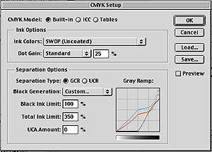
Unless we are working with very high-end separation software, we will likely use Adobe Photoshop to make our separations. (For purposes of this article, we’ll focus on version 5.x.) Working in six colors requires us to begin by making some adjustments to the basic separation setup dialog box. This is accomplished in both Windows and the Mac OS by accessing >File>Color Settings>CMYK Setup (Figure 1).
If we have a colorimeter or spectrophotometer at our disposal, now is the time to measure L*a*b* values for each printed ink color and record the correct values in Photoshop under Ink Colors (selected from the Ink Options window). For the purposes of this article, we’ll leave the settings at SWOP Uncoated. We will only lighten the highlight colors, not darken the normal process inks. This will concentrate the six-color set on developing fine pastel tones in the highlight regions with some limited improvement to color density in the shadows of the image.
A key adjustment to make at this point is to set the Black Generation for our separations. To do this, we go to the Separation Options window and select Black Generation to access the Black Generation curve. Next, we grab the curve at the 0% point (bottom left) and slide it to the right until it is located at the 50% point. This means that no black will be used in the separation below the 50% tonal range. We also go to the top right of the graph and lower the end point of the black curve to 75%. This way, the black ink will not print beyond a 75% value in the darkest areas of the image (Figure 2).
The purpose of setting limits like this is to allow most of the natural gray balance of the image to be produced by the process colors. This is a classic under-color-removal (UCR) approach and is especially appropriate for the lighter portions of the image. It also minimizes the amount of black added to the darkest portions of the image.
Gray balance
The gray balance is the heart and soul of the separation. When we use the dual-colorant approach, we must be careful to preserve the gray balance in the lighter colors. This can be somewhat tricky, but not overwhelmingly difficult. By limiting the use of black ink in the separation, we rely on the process colors to make the neutral gray of the image. Consequently, we must adjust the amount of yellow, magenta, and cyan so that when these colors mix to form gray, it’s a clean gray with no apparent color cast. Once again, these adjustments are made in Photoshop.
To assist in balancing C, M, and Y, it’s helpful to make a neutral gray tone ramp to include in the test image. We always start with an RGB image, since Photoshop only applies separation settings when we convert from RGB to CMYK.
To make a neutral gray tone ramp, we create a narrow rectangular box using the rectangular selection tool. We set the foreground color for this box to 255, 255, 255 and the background color to 0, 0, 0. These are RGB values entered by double clicking on the Color Picker in the Tool Bar. Next, we use the Blend tool and choose Foreground to Background. Photoshop will generate a neutral gray fill from White to Black within the selection box. Next we go to >Image>Adjust>Posterize and set the value for 21. This makes a 21-step grayscale.
Note that neutral gray is defined using RGB values, so to verify neutrality, we must use the Eyedropper Tool and sample various points of the image, then view these sampled points in the Info Palette under the Window Menu. Neutral Gray is defined as R=G=B. For instance, 128, 128, 128 would give us a midtone neutral gray.
Next, we include this RGB gray tone ramp in the extra canvas area of the image we are separating. The Kodak Q60 target already has a similar gray scale across the bottom of the image. Interestingly, it is not completely neutral across the entire scale, which makes it a good demonstration piece to sample and learn from.
When making the mode change from RGB to CMYK, Photoshop calculates and builds a separation table using the ink values we entered at setup. The calculations determine exactly how much cyan, magenta, yellow, and black are used to make up the gray balance. Photoshop also determines at what point it must begin adding black ink to darken the gray that is made with the process colors. All of this is important because we must manually adjust the gray balance in the highlight and quarter-tone areas. In this particular exercise, we will reduce the amount of SWOP cyan and magenta and replace them with greater amounts of the light cyan (Lc) and light magenta (Lm).
To make these changes, we begin by duplicating the SWOP cyan and magenta channels, labeling the copies “Light Cyan” and “Light Magenta,” and identifying each channel as a “spot color” in the Channel Options window. We also need to set the color value of the new channels and enter “0” for Solidity.
To establish the Lc and Lm color values, we first create a sample print of the Lc and Lm inks. I suggest using Lc and Lm inks that are diluted to 50% the density of standard cyan and magenta for a final measured density of around 0.35. Using a colorimeter, we then obtain the L*a*b* values for each color and enter the values as the channel color (access channel color by double clicking on the channel name–see the Photoshop manual for more detailed explanation). If no colorimeter is available, we can adjust the value by eye until what we see in the Color Picker visually matches what we printed.
Once we have named these new channels, it is time to readjust the curves on the original cyan and magenta channels. Our goal is to adjust the standard cyan and magenta to fall primarily in tonal areas approaching the shadows, while Lc and Lm fall mostly in highlight and quarter-tone regions. For this sample image, we will access the Curves dialog box (>Image>Curves) and move the starting point of the cyan and magenta curves to begin at 25%. This eliminates any standard cyan or magenta below the 25% value. We make no additional midtone adjustments, allowing the gamma curve to adjust itself naturally.
For the Lc and Lm curves, we turn “preview” on and put an anchor point at the 50% value. We then grab the curve at the quarter-tone point and drag it upward gradually until the gray balance in the image looks correct. This requires some experimentation, but it is not too difficult. Once the Lc and Lm curves are adjusted, we can revert to the composite image (comprising all separations) and use the Selective Color Adjustment controls (under >Image>Adjust>Selective Color) to make any necessary edits to the highlight and quarter-tone areas of the image. This procedure is explained in detail in the Photoshop user manual.
When the highlight and quarter-tone adjustments have been completed, we need to pull down the influence of the Lc and Lm in the midtones and shadows by both adjusting the curves for these separations and applying additional Selective Color Adjustments. Once all these adjustments are made, we’re left with a completed six-color separation set. The effects of these changes on our Q60 sample image are depicted in Figures 3, 4, and 5. Total ink limit
The Total Ink Limit (TIL), also located under >File>Color Settings>CMYK Setup, is another important parameter to consider. If not handled properly, it can lead to moiré generation, as well as potential intercoat-adhesion problems. We must try to keep the upper limit at 340-380%. This means that if we do not bend the Lc and Lm curves downward, we will add 200% extra coverage in the darkest colors, leading to screen-print separations with an unacceptable TIL that approaches 500%. By specifying a lower TIL, we not only enhance our color-reproduction capabilities, we also reduce our ink consumption–and costs–during the print run.
Dot gain
Dot gain must be manually adjusted (in the CMYK Setup window) for the added channels, and a single adjustment is generally sufficient for each channel. The reason for this adjustment is twofold. First, we are greatly diminishing the color values of the lighter inks, and the influence of dot gain on the highlight and quarter-tone areas (where these light inks will be used) is not great. Secondly, dot gain occurs at a much slower rate in this portion of the image.
When we go to press, we must carefully observe how the final image prints compared to the original. If further correction is required, we can either lighten or darken the inks a small amount (reduce or increase their density on press) or go back and readjust the color values in each channel to lighten or darken the printed result. Experience is the best guide here, so the first few images any printer creates for six-color printing will typically involve experimentation. The best advice for any first-time user of six-color process is to carefully document any changes made.
Line count
The beauty of using a dual-color approach is that we can reduce halftone line counts with no apparent loss of resolution. This can work in our favor in two ways. If we lower the line count (use a larger dot), we gain control over dot gain and tone reproduction. Vignettes are easier to control, and moiré is less apparent. This makes the image easier to control and much more consistent.
On the other hand, if we keep the line count at our usual level, we will experience an increase in apparent resolution. Detail will appear crisper, and the visual impact of the halftone rosette on the eye will be much less. This is very important for P-O-P displays, where the halftone pattern can visually detract from image quality when viewed close up.
Line-count adjustments, as well as the halftone-angle adjustments discussed in the next section, are modified from the Page Setup window. Simply select >File>Page Setup>Photoshop>Screen.
Separation angles
Separation angles are easy to control for the six-color model. When we split the cyan and magenta channels, we are effectively making them duotones. This means that when the Lc halftone dot mixes with the normal process cyan ink, we must maintain a minimum of 30° between the colors.
Usually the cyan and magenta halftones are separated by 60° (e.g., 15° and 75° respectively, or similar values). Keeping this in mind, we make a simple switch of angles. The Lc would print at 15° and the normal cyan at 75°. The Lm would print at 75°, and the normal magenta at 15°. Now Lc and Lm are 60° apart, normal cyan and magenta are 60° apart, and the color-to-color transition is 60° apart. Everyone is happy, and none of the colors will conflict with each other.
Remember to rotate the full angle set away from the traditional lithographic angles to avoid the 0, 45, and 90° conflict angles that can result in severe moiré. One of the most common rotations is to add 7.5° to all the angles to move away from the conflict areas. For instance if the litho angles are 0, 15, 45, and 75°, the rotated set would be 7.5, 22.5, 52.5, and 82.5°.
Proofing
As with all nChannel color-separation approaches, proofing is the weak link at this time. There are no analog proofing systems (Matchprint, Waterproof, etc.) that will give us a good predictive proof. Several digital proofing solutions are about to enter the market, but at this time, the only reliable method of proofing is to generate a press proof, which is expensive and time consuming.
However, because of improved press performance and the reduced influence of dot gain that comes with the six-color method, the press operator has more adjustment latitude than with traditional process color. Consistency and color drift are much less of an issue, further expanding color-adjustment tolerance for the press operator. We’ll consider this issue in more detail later.
Using DCS 2.0
Saving, placing, and outputting a six-channel color separation is best done using the DCS 2.0 file format. This is a special version of the DCS format developed by Quark several years ago. It uses a low-resolution placement icon and automatically replaces the high-resolution image at the time of output.
To use DCS 2.0 in Photoshop, the separation file must be converted to Multichannel under the Mode menu (>Image>Mode). The Lc and Lm channels must be named and identified as spot colors. Line count and angle for each channel must be set as discussed previously. We do not have to complete the last step if we use a service bureau with experience separating images for screen printing, but it comes in handy if we don’t know how the file will be output.
To save the file, we select >File>Save As>Photoshop DCS 2.0. We then choose Single File, Color Composite as the display option.
These choices will allow us to output directly from Photoshop to the imagesetter, or go through either a page-layout program like QuarkXPress or PageMaker or an illustration program like Illustrator, Freehand, or CorelDRAW!. In any of these cases, when we place the image in the illustration or layout program, all of the separations will import with the image to that program’s color-selection box. We can now access the Lc and Lm for use in type, borders, or backgrounds.
If we do not want to use the DCS 2.0 option, we can select Split Channels under the Channel dialog palette. Now we can output or place each channel individually. This approach is somewhat more time consuming, but it is a popular way of handling multichannel images.
Print production
Normally, a six-color image is printed from darkest to lightest color. In the past, I have explained this approach as a way to minimize the detrimental impact of black as the last color down. When black is printed first, the other process colors will, in effect, bury the Black ink under color. This gives the darkest colors a chance to show through and not be overpowered by the Black. The specific print order I recommend is black, cyan, magenta, yellow, Lc, and Lm.
This color order is beneficial because it allows us to follow a normal approach to printing the separation with the first four colors. The only real experimenting will be done on the last two colors, and these are the lightest colors so there is less chance of making a major color mistake. We can focus on a few key areas to make sure these final two colors print properly.
If we use a densitometer to measure and control the on-press color, our approach with six-color jobs would be consistent with traditional four-color-process techniques. We would measure the solid patch of the light process ink and monitor the highlight, midtone, and shadow dots of that density. When the piece is finished, we evaluate it critically for color matching, gray balance, and overall visual appearance. The first couple of tries with six-color printing will be just like when we started traditional process color–only not quite so scary.
Mesh count and tension
Since we are only printing lighter values of our existing process-color inks, mesh selection and tensioning levels remain unchanged from traditional process color. Follow normal production guidelines and keep tension within ±1 N/cm for each of the six screens. Higher tensions give better control, so we must try to keep all screens at a minimum tension of approx-imately 25 N/cm. If we typically have trouble maintaining consistent mesh tension and experience moiré due to tension variations, the dual-colorant approach will help mask these problems.
Six shades for success
We have covered a great deal of information over the last two months. None of the ideas are ground breaking; rather, they are an extension and refinement of a traditional practice. As printers, our objective is to balance the economic cost of running two additional colors against the increased control on press, improved tonal range, reduce moiré, and enhanced color rendering ability that six-color printing provides.
This particular color model is one of many different separation techniques that are emerging as digital color science continues to develop. The 150-year paradigm of traditional CMYK is yielding to spectral nChannel separation technology. Expect to see and hear much more about it in the months ahead.
Author’s note: If you would like to experiment with six-color-process reproduction, separations for all six plates of the Q60 test image used in this article are available for free downloading at www.netseps.com/q60.htm


Subscribe

Magazine
Get the most important news
and business ideas from Screenprinting Magazine.
Most Popular
-

 Case Studies2 months ago
High-Density Inks Help Specialty Printing Take Center Stage
-

 Art, Ad, or Alchemy2 months ago
F&I Printing Is Everywhere!
-

 Andy MacDougall2 months ago
Functional and Industrial Printing is EVERYWHERE!
-

 Columns3 weeks ago
8 Marketing Mistakes Not to Make When Promoting Your Screen Printing Services Online
-

 Editor's Note3 weeks ago
Livin’ the High Life
-

 Marshall Atkinson3 weeks ago
How to Create a Winning Culture in Your Screen-Printing Business
-

 Thomas Trimingham2 months ago
“Magic” Marketing for Screen Printing Shops
-
 Case Studies3 weeks ago
Screen Printing for Texture and Depth