Articles
Published
21 years agoon
I will never forget the peculiar “snap” that a wood-handled squeegee makes as it’s broken. I heard this sound one evening as I entered the production area, where I found my boss poised near a press with half a squeegee in each hand, mumbling some unkind words concerning artists. It seems that the separations produced for T-shirts ordered by a local bar were giving him some serious pain–not just in the arms, but in the pocketbook.
The job involved very complex artwork that was poorly designed and separated by an outside company. Trying to print with screens produced from those separations was very difficult. The art had a solid white underbase, which took forever to flash, and multiple mixed-fluorescent colors that were supposed to be printed in gradient half tones on top of that “bullet-proof” underbase. What pushed my boss over the edge was that with the delays the artwork was causing, he’d likely see the sun rise before the job was completed. Even worse, the price he had quoted was not going to cover the costs.
Worried by the look on his face, I promised to recreate the artwork if the job ever came up again. Then I grabbed a squeegee myself and took position at the press, praying for daylight.
A night or two like this could cure any artist of producing printer-unfriendly separations. In addition to the headaches it creates, poor artwork raises time, labor, and material costs. But when graphics are designed and separated with the printing process in mind, tempers cool, production flows, and profits rise.
The key to more profitable production is identifying and correcting design problems before a job makes it to press. This means spending more time troubleshooting artwork and modifying graphics so that they maximize your production capabilities. Here, you’ll learn about four design tactics that can have immediate and profound effects on your printing efficiency and your bottom line.
Print fewer colors
The goal of this procedure is to get the maximum color impact with the fewest screens. Two of the most effective ways to limit the number of colors you need to print are to incorporate the garment color into active elements of the design and to blend colors to achieve a broader color gamut. It takes practice to develop these skills and learn when and how to use them, but the long-term benefits are worth the effort.
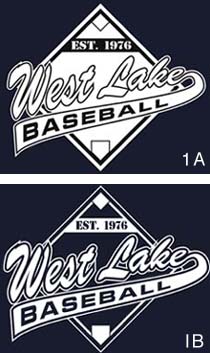
Imagine that a customer supplies you with digital artwork for a two-color logo, such as the design shown in Figure 1A, to be printed on dark T-shirts (blue in this case). The original design uses black outlines to define and highlight white image elements. However, the dark garment color provides enough contrast with the white elements that it can be used in place of the black outlines, leaving you with only one color to print (Figure 1B). The overall effect is that the design blends into the garment better.
This approach is extremely useful with short-run orders. You may not be able to charge as much per print, but the labor time and materials you save by avoiding the second color more than make up for the price difference.
Another good time to use the garment color as an active design element is when the design incorporates large areas of complete ink coverage (Figure 2A). Designs that involve large, unbroken coverage areas are harder to print because the ink can be picked up by other screens and eventually lead to smeared images. You might avoid this problem by flashing the heavy-coverage print, but the added step will increase your production time. Such large, heavy prints also chew into your profits with higher ink costs (it takes more ink to cover a larger area). Customer satisfaction can also be an issue because heavy prints prevent air and moisture from passing through gar-ments, making the garments uncomfortable to wear.
You may face customers who insist on including huge squares or rectangles of ink in their designs. The best way to steer them away from this is to give them a visual presentation of how the design could be adjusted to incorporate more garment color and less ink. When I redesigned the logo in Figure 2A, I tried to maintain the shape and content of the original while letting the shirt come through as much as possible. In the final design, many elements of the original were outlined, and the remaining heavy coverage areas were changed to halftones. This made the print softer without completely changing the art (Figure 2B).
The second way to reduce the number of colors you must print is to practice combining colors as halftones to achieve a wider gamut. This is the main appeal of four-color-process printing–with only four colors, you emulate hundreds. The problem with process-color printing is that it introduces a range of halftone variables that you have to control in order to avoid color shifts.
When working on your color-blending skills, it’s best to start simple. Begin with the ink colors you use most frequently. You will need to create halftone test patterns that you’ll use to make screens. These patterns can be simple grayscale strips stepped in various increments to give you different tonal percentages, or more complex gradient grids. You produce screens with the test strips or grids aligned in register for each of the blending colors you want to test, overprinting the different inks in various tonal combinations to see what the resulting hues will be. Figure 3 depicts the kinds of results you might get if you were to test the blending properties of yellow, red, and black ink in this manner.
The next step is to use your half-tone gradient screens to test the blending properties of the inks you plan to use in a specific design. This will give you a good idea of the maximum color range you can achieve with the selected spot colors. The last thing that you want to do is promise customers that you’ll save them money through blending when you don’t know what the results will be. So the cardinal rule with color blending is to test first and guess later.
Studying color charts on the computer can also help you predict how particular colors might blend, but there is no substitute for direct experience with your own inks. With enough practice, you’ll find that it’s possible to simulate flesh tones, wood tones, or even metal tones by blending the right combination of colors. Just remember to document all of your results when experimenting with different blends, regardless of whether the outcome is good or bad. These records will help you repeat successful blends quickly and avoid the combinations that don’t work.
To demonstrate the impact of effective blending, I created the image shown in Figure 4. This design contains a total of only three colors–the same red, yellow, and black used to create the color tables in Figure 3.
Blending colors reduces labor time and lowers material costs in virtually every stage of production. Not only will screenmakers have to produce fewer screens for each job, but the reduced number of screens also means faster setup times for press operators and fewer colors to mix in the inkroom.
The main disadvantage of emulating colors by blending is that you have to maintain control of the halftone dots you’re printing. You may lose image clarity and experience unpredictable color shifts if any conditions change on press. The larger the print run, the greater the chance that this will happen. For long runs, it’s usually wise to post a color-correct sample print near the press to help the operator spot color shifts and make the appropriate corrections.
Keep your designs flexible
Imagine you’re in the middle of a production run when you get a call from the customer. “Can we add a dozen royal blue shirts to the order?” he asks. “I know that the other three hundred are white, but….” Does this sound like a job you ran lately?
Even if you don’t get such last-minute order changes or additions, it’s quite possible that a customer may reorder more of a particular design, but request a different garment color. Will your designs accommodate these changes?
To create the most flexible artwork, you have to plan for the worst. My approach is to imagine that the finished design will be printed on several garment colors (e.g., red, purple, white, and black). You don’t always have to prepare for such extremes, but if your designs can stand up to multiple garment colors, you’ll be in good shape for those last-minute customer changes.
Having flexible artwork can be especially helpful if your business is supplying preprint designs for retailers. Preprint buyers always seem to want to display the designs on multiple garment colors. So if you can demonstrate the versatility of your graphics on a variety of different shirts, retailers will have more reason to buy from you.
The secret to creating designs that work on multiple garment colors is to use clear borders and develop good contrast between image elements. In Figure 5, the design used in the bottom row is clearly more versatile than the one in the top. The bottom version adds a highlight white to all image elements, which allows them to stand out regardless of the garment color. Think of it as sandwiching the primary design elements with colors of opposite value. With this approach, wherever you have a light color in the image, you should include a darker trapping color to define the edges. And where you have dark elements, you should trap with a light color.
Manage dot gain in prepress
When most printers and artists hear about dot gain, they immediately look for solutions by modifying inks and press setup. The truth is that dot-gain control must begin in the art department. The best solution for eliminating excessive dot gain is for artists to understand the limitations of the press and the inks used in production.
The halftone line count for an image should be based on the characteristics of the ink being used and the amount of detail the print is required to show. The only way to determine what is right for your shop is to test. Start by producing screens (using your normal mesh count) with gradient patterns in a range of dif-ferent line counts. Print these patterns using both black ink and white ink. Measure the printed dots and compare them to the stencil dots to see what kind of dot gain you experience at different tonal percentages.
To get the most accurate results, you should make a couple dozen prints on test fabrics to see if the results change over the course of a short run. When you’re done, assess the samples to determine which line counts hold the most detail without producing excess gain. Take these proven line counts into consideration every time a new halftone job comes up–unless you change inks or alter press settings, in which case you’ll need to run new tests to determine the best line counts.
The reason for running both black and white inks in your tests is to assess the impact of ink viscosity on dot gain. White inks and other high-opacity light colors tend to be more viscous (thicker) than black and dark inks. The thicker inks require lower line counts to produce acceptable coverage and good print adhesion with minimal dot gain.
When your artwork contains halftones with a high concentration of shadow and highlight dots, make sure you know how dot gain will affect these areas. If your test results show that your dots typically gain 30%, and your image contains many dots at the 75% tonal range and above, these highlight dots are likely to fill in.
This is a common problem when art is produced for both black and white garments. The white garment is more forgiving when printed with black ink, but when the black garment is printed with white ink using the same art (and line count), the print may become excessively clogged due to excess gain in the white. When dot gain is controlled in the art department, it will save hours of setup time, considerable ink, and the printer’s good humor.
Create fast underbases
If you are producing images for dark garments, you can literally make or lose money depending on how you create the underbase. Simply copying all the design elements into one big mask to serve as the underbase adds to your costs in a number of ways–more labor, more ink, more screen cleaning, more platen cleaning, more flashing, etc. Considering all of this, it’s surprising how many T-shirts are still printed with big areas of underbase.
As a production artist, you should always strive to avoid heavy underbases. In many cases, you can alter the design, using more outlines and gradients than solid-fill areas (such as in Figure 4). But sometimes, the way a design is laid out makes large underbases unavoidable, and you have to resort to other solutions.
When there’s no way to stay away from a high-coverage underbase, you can try several approaches to limit the amount of ink that you have to put down. First, try to find a color other than white to use as the primary underbase–this will allow the underbase to flash much faster and provide a softer hand. Another benefit of abandoning white for another color is that you will likely be able to print the underbase through a finer mesh.
I will often use gray in place of white, even if no gray will be visible in the design. Besides the fact that gray provides a faster initial flash and softer hand than underbase white, it also can be overprinted with a smoother, highlight white. This way, you get the opacity of the gray underbase along with color accenting benefits of the highlight white, but avoid the heavy hand of a traditional white underbase. The only disadvantage to this method is the extra screen that you have to make. But even with the extra highlight white, the gray underbase method only requires one flash after the underbase is printed–the highlight white can be overprinted while wet.
The second way to limit the amount of ink you put down is to break the underbase into a halftone tint screen, using a dot percentage of approximately 75-80%. The pattern will fill in slightly due to dot gain and appear solid if the colors you print over it are properly aligned. A disadvantage of this method is that you really need to test the impact of the broken underbase on the each of the colors you plan to overprint. Some may appear dull or change hue without a solid underbase. Again, remember to record the test results so that you can suggest this method any time a job with appropriate colors comes along.
Saving dollars by design
Each of the tactics discussed here is based on one fundamental truth: The best way to create a profitable print is to think about the printing process before you design the artwork. To make these four methods work in your operation, you’ll have to devote some time to testing, commit to careful record keeping, and convince customers that there are better ways to produce their products. Once you’ve taken control of the artwork, your business will save money, increase profits, and satisfy customers like never before.
About the author
Thomas Trimingham is senior artist and head of research and development at Holoubek Inc., Waukesha, WI. He has created screen printing artwork and separations for more than 12 years, and his work has won awards in a number of national screen-printing competitions, as well as computer graphics, wildlife illustration, and logo design contests.


Subscribe

Magazine
Get the most important news
and business ideas from Screenprinting Magazine.
Most Popular
-

 Case Studies2 months ago
High-Density Inks Help Specialty Printing Take Center Stage
-

 Art, Ad, or Alchemy2 months ago
F&I Printing Is Everywhere!
-

 Andy MacDougall2 months ago
Functional and Industrial Printing is EVERYWHERE!
-

 Columns3 weeks ago
8 Marketing Mistakes Not to Make When Promoting Your Screen Printing Services Online
-

 Editor's Note3 weeks ago
Livin’ the High Life
-

 Marshall Atkinson3 weeks ago
How to Create a Winning Culture in Your Screen-Printing Business
-

 Thomas Trimingham2 months ago
“Magic” Marketing for Screen Printing Shops
-

 News & Trends2 months ago
What Are ZALPHAS and How Can You Serve Them in Your Print Business?