Articles
Published
18 years agoon
The worn-out, vintage look for garment graphics is hotter than ever. Customers want the look and feel of a shirt that they have had for years. Thanks to some simple tricks in graphics programs like Adobe Illustrator, Corel Draw, and Adobe Photoshop, you can easily create and edit graphics so they’ll come out aged in no time. The key to this look is to have a variety of ways of accomplishing the effect so that it’ll work with the image that it modifies. I think it’s a mistake to apply the same distress effect to every design without considering how the final composition will work.
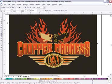
The worn-out, vintage look for garment graphics is hotter than ever. Customers want the look and feel of a shirt that they have had for years. Thanks to some simple tricks in graphics programs like Adobe Illustrator, Corel Draw, and Adobe Photoshop, you can easily create and edit graphics so they’ll come out aged in no time. The key to this look is to have a variety of ways of accomplishing the effect so that it’ll work with the image that it modifies. I think it’s a mistake to apply the same distress effect to every design without considering how the final composition will work. I have compiled three different methods of creating a distressed look that can be viewed and edited without damaging the underlying graphic. The first distress effect is useful for vector-based art (Corel Draw or Adobe Illustrator). The second and third distress patterns are created in Photoshop. Creating a vector-based distress pattern It helps to have a vintage design—an image that looks simple or classic—to start with so that the worn-out pat-tern will enhance the appearance. I chose a design that would echo a retro look while still having some modern elements to create an overall logo with a well-rounded appeal (Figure 1). When working with vector art, it’s important to have a smaller number of pieces to the pattern or you may see significant slowdown with the redrawing phase of the design. With this in mind, I decided to create a worn look using a paper technique. I crumpled up a piece of paper and then scanned in the result. I saved the image of the crumpled paper in Photoshop and then used the Levels command to squeeze out the grays in the image and leave the graphic as a high-contrast bitmap. When I used the Levels command, my goal was to leave the black areas of the bitmap separate from one an-other. That way, when I traced them, I’d get separate, distinct pieces that I could pick from and use as an extra layer that would then overlap my vintage graphic and make it look cracked when I imported the pieces and placed them on top (Figure 2). The advantage to this style of distress pattern is that it is quickly adjustable. You can remove pieces where you need to and duplicate others and rotate them to fit around the design and really customize it. Another advantage of creating vector-based distress overlays is that they can be copied and pasted onto designs on various shirt colors. And if you group all of the pieces—or leave them on the same layer—they can be color matched to the background with a single Fill command. Creating a computer-generated distress pattern One of the biggest challenges of creating a pattern for aging a design inside a bitmap program like Photoshop is to make the pattern look random—not a generated texture. Using several of Photoshop’s filters in combination is a good way to go. I started with a document that was sized at 6 x 8 in. at 150 dpi. The next step was to set the foreground color to black and the background to white and then apply the Render Clouds filter. The cloud pattern was changed into a texture with the Graphic Pen filter set at stroke length of 15, light and dark balance at 12, and a vertical position. This started a good, rough texture. I could still notice a pattern, so I used the Gaussian Blur filter at a 0.50 setting and then used the Motion Blur in a 90° setting with a 10-pixel distance to finalize the worn look for this layer. The last step integrated the effect into the design. I placed the graphic underneath the worn layer in Photoshop (>File>Place) and then changed the top layer to Multiply and lowered the opacity to 85% (Figure 3). A big advantage of making a distress pattern in Photoshop instead of Illustrator or Corel Draw is that I could adjust the opacity of the distress so that certain areas would have a more realistic worn appearance and some image detail would remain in the washed-out areas. To separate an effect like this, I used the distress to knock out the underbase and leave the top colors at 70%. This way, the shirt would keep an edge quality to the graphics yet still have a realistic, washed-out look to it. An approach like this works especially well for black shirts because of the contrast level between the shirt and the artwork. Working with patterned distress fills in Photoshop I really enjoy finding unique patterns to use as distress fills in Photoshop. I particularly like the idea because I can combine several distressed looks into one image and then size the pattern appropriately to work with additional distress layers. To create the pattern fill in the garment graphic shown in this article, I first needed to grab a source image. I found a great crackle pattern in a royalty-free-image site that had some photos of dry, cracked mud. I cropped the image to a perfect square and then used the Levels command to squeeze it down to just black cracks and white background. Making the pattern seamless is a critical part of creating a friendly pattern for filling layers. Photoshop’s Offset filter can help. I applied the Offset filter at 40 pixels and then edited the cracks with the Pencil tool (on black setting) so that they would line up with each other when filed over a larger area (Figure 4). I resized the pattern down to 2 x 2 in. at 200 dpi and then used the Define Pattern command to save this file in the Patterns dialog menu (I named it crackle2). I made the new pattern into an overlay for the design by creating a new layer and then filling it with the seamless pattern. I adjusted the opacity down to 75% on the crackle and sized it around the image using the Free Transform tool to adjust the border to fit within the image area. The last step was to switch the layer-blending mode to Multiply. The crackle was looking good! For a more realistic final touch, I created a second distress layer and arranged it under the crackle layer. I then sprayed several areas on this new layer with the Airbrush tool with a Dissolve setting and used a combination of medium and smaller brushes and a custom brush style that produced a rough pattern. I applied a Gaussian Blur to this layer at 0.50 to make it blend more effectively with the image and then lowered the layer’s opacity to about 40%. My two distress patterns worked well together to age the image and give it the custom appeal of a favorite shirt that has been around for years (Figure 5). Don’t wear out your welcome Producing the appropriate worn look for different graphics often requires that you create and use distress overlay patterns, sometimes several in combination. The best results are always achieved by working with the effect so that it lays across the artwork in the right areas and doesn’t distract too much from the image’s legibility and clarity. Your goal is to create a washed-out appearance that flows with the visual direction of the image. For example, a vertical distress pattern works better with a plain font versus an italicized font. When I create a new distressed pattern for an image, I find it useful to save the pattern in a separate location so that I can quickly locate and use it for other designs that need a worn-out look. If you take the opportunity to develop a strong library of distress overlays, you can save a lot of time when you need to grunge out another graphic in the future.


Subscribe

Magazine
Get the most important news
and business ideas from Screenprinting Magazine.
Most Popular
-

 Case Studies2 months ago
High-Density Inks Help Specialty Printing Take Center Stage
-

 Art, Ad, or Alchemy2 months ago
F&I Printing Is Everywhere!
-

 Andy MacDougall2 months ago
Functional and Industrial Printing is EVERYWHERE!
-

 Columns3 weeks ago
8 Marketing Mistakes Not to Make When Promoting Your Screen Printing Services Online
-

 Editor's Note3 weeks ago
Livin’ the High Life
-

 Marshall Atkinson3 weeks ago
How to Create a Winning Culture in Your Screen-Printing Business
-

 Thomas Trimingham2 months ago
“Magic” Marketing for Screen Printing Shops
-

 News & Trends2 months ago
What Are ZALPHAS and How Can You Serve Them in Your Print Business?