Expert Perspectives
Published
15 years agoon
Recreating fine art on garments is a popular trend in screen printing, and the demand for fine-art garment graphics has really boomed in the past couple of years. Printed art that looks hand-done has expanded through all of types of graphic media and has especially become a big seller for T-shirt companies that have the ability to reproduce this challenging style of artwork.
Recreating fine art on garments is a popular trend in screen printing, and the demand for fine-art garment graphics has really boomed in the past couple of years. Printed art that looks hand-done has expanded through all of types of graphic media and has especially become a big seller for T-shirt companies that have the ability to reproduce this challenging style of artwork.
Fine-art separation can be particularly problematic, and a lot of variables depend on things such as how the artist created the work, how the work is captured for the computer, and how the final print on the garment is intended to look. All of the answers to these questions can affect the way he handle the reproduction process. The best way to tackle this sort of a job is to take it one step at a time and be realistic about the printing capabilities and separation methods that are available. You may be tempted to say yes to great looking fine-art design because it is a fun challenge, but it may end up being very costly and unpro-fitable to reproduce if the final print needs excessive handling in the separation or printing stages.
The nature of fine artwork is about originality and diversity, so any formula will be more likely to work for artwork that has similar attributes and will be printed on similar garment colors. The important point to remember about the theory of recreation using fine artwork is that the methodology can be adopted for other styles because the fundamental concepts will be similar. The following is a compiled list of steps that can work for a selection of fine artwork that’s destined for T-shirts.
How was the work created?
The first step in recreating fine artwork for screen printing is to consider how the artwork was originally created. The reason this is important is because the tools and elements that make up the artwork will commonly suggest a good way to capture the artwork in a separation set. For instance, if the artwork was created with graphite, charcoal, or pastel on a textured paper, then it can work well to consider an index-separation method because the grain of the paper and the drawing media has a pattern that is similar to the random dots in an index pattern.
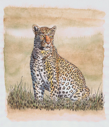
On the other hand, if the artwork was created with very smooth, airbrushed gradients, then it will probably need the subtlety of traditional halftones so that the graduated fades and shadowy effects can be recreated with the most precision and the image won’t look flattened or choppy (see the sidebar on page 25). A challenging style of artwork to recreate in screen printing is a pen and ink drawing with watercolor accents. The reason that watercolor poses such a challenge is that the soft blending and graduations in the imagery are very hard to duplicate without experiencing hue shifts and dot gain. The piece that was separated for this article consisted of a pen and ink design that was illustrated for a wildlife collection (Figure 1). The client wanted this image to be printed on several different colors of shirts which added to the complexity.
How is the work captured for reproduction on the computer?
The largest issue with the capturing or scanning of fine artwork usually comes to the screen printer from digital files supplied by the client. Client-supplied work can be very poor in resolution, lighting, and/or clarity. If this is the case, the first step is to always try to get an original scan or high-quality photo of the artwork. Few frustrations are greater than unhappy clients who bring in the original, low-quality work after you’ve done the printing and say that the shirts look completely different. They usually aren’t any happier knowing that the art matches the poor quality of their image.
Another common issue is art that’s too large to fit onto a scanner. The choice at this point can be to scan and tile the image together or to set up a photo box and do a shoot of it. If you end up having to photograph artwork for reproduction, consult a pro if possible and rent or acquire some good lighting because it’ll make all the difference.
What’ll the final shirt look like?
This question relates to the color or colors of the intended garment and the effect it’ll have on the separation process. Covering the gamut of shirt colors within one separation set is nearly impossible, unless using a solid underbase and flashing every color is realistic. But even if it is, no one likes to wear this kind of shirt. The design in Figure 2 was intended for a tan and army-green shirt. It is critical in the communication process for the client to understand that the shirt color must be finalized before color separation. The biggest nightmares that production artists have are ones where the customer changes the shirt color at the last minute or decides to throw in a couple dozen purple shirts with that order of natural-colored cotton garments. Proper separating technique flows backwards from the final shirt color(s).
Separating the artwork
You have to strike a balance in the effort of separating a piece of artwork for T-shirts. The main consideration is that most clients don’t want to pay big dollars to have every detail captured for T-shirts; therefore, screen printing has to remain an economical process for both the client and the printer. However, the print should look as close as possible to the original. Striking a balance in separation time often involves the decision of how spend the majority of the separation time.
The best way to recreate fine artwork is to split up each element and isolate it so that you can carefully extract each selection of color. On the opposite end, the colors should work together and balance each other so that they form a support for multiple colors and can even be used to create additional colors without the need for extra screens. Achieving a balance with this dual-separation mentality means that only the most important elements are isolated and only the most saturated colors are blended. This compromise allows for the largest gain in accuracy in the shortest time.
A popular contention is that we should separate artwork in the least possible time to establish an acceptable level of reproduction. It’s possible, but we need to analyze the artwork first and consider the shirt color to determine the best solution. In the example image, the leopard is composed of muted earth tones in greens yellows and browns with few hot colors showing. The advantage is there are few saturated colors to worry about. The disadvantage in this case is that the image has a lot of blended watercolors in light tonal percentages, which can contribute to noticeable dot gain very easily.
The decision was a simple one after a careful review of the artwork. With so many earth tones, yellows, and greens, this design was a natural for a split four-color process. I use this method many times for watercolor designs because the split can help compensate for the lower tonal ranges and experiences far less dot gain over the course of the print run.
Split process separations
The steps for creating a split process design are surprisingly simple to execute. The difficult part is usually deciding that it is really necessary. A lot of printers don’t want to add colors unless they absolutely have to, so adding in an extra two or three screens to a four-color design is a tough sell. Instead, save the job using traditional four-color process and then redo it using a targeted split process. The results are particularly convincing when the runs are beyond a couple dozen shirts.
The first step to process separations was to examine the artwork and make sure the art was the best that it could be. I took the original scan and used the Eyedropper tool to determine a white point and then a black point (choosing the darkest and lightest areas on the screen). I then manually adjusted the image to accommodate the higher contrast. The next stage was to adjust the saturation of the colors and make sure that the image was color balanced. I checked to make sure the image wasn’t unbalanced by reading the black and white setting and looking at the gray values. Doing so would’ve indicated whether the scanner had put a color cast on the image. As it was, the retouched image was a lot better than the original scan (Figure 3).
The next step in the separations was to duplicate the art file and save the original. I then renamed the duplicate and converted the file to CMYK. The settings that I used were starting from an Adobe RGB 1998 color space with the file optimized for contrast, hue, and color balance. I then converted the file to CMYK using a custom setting under the CMYK working spaces and plugged in the following settings: SWOP (newsprint), 30% dot gain for the inks, and Maximum on the black (to avoid color shifts) in a GCR separation type.
I quickly previewed the channels and practiced undoing and redoing the conversion (Cmd/Crtl-Z) to watch for bad color shifts. Everything seemed to be working well at this point, so it was time to create the underbase color. Using an underbase at all with process colors is tricky business, so I had to adjust the inks a little. The use of additives made them slightly more opaque and less runny.
Creating the underbase required some masking and piecing together because the client agreed with the suggestion that the background be more transparent to allow the final leopard image pop through a little more (Figure 4). I duplicated the file and then masked around the outside. I then turned the outside of the image into black. The final steps for the underbase included converting the file to L*a*b* mode, copying the lightness channel being duplicated, and turning it into an underbase file by inverting it. I also went through the most saturated colors and made sure to put more underbase underneath those areas.
The last step was to split the process channels. I used the yellow and magenta channels for the leopard image. The cyan and black channels didn’t have enough midtone areas to justify this step so those were left as original. I split the process channels by making a duplicate file of both the yellow and the magenta, and then I curved out the top 50-100% of the yellow channel and bumped up the 30-40% and made that the darkest black in the channel (Figure 5). This step accomplished two things. The new yellow channel, when printed with a split ink (50% process yellow, 50% finesse) would maintain great tonal range in the lower highlights without gaining too much and squeezing out the soft watercolor look. The second is that it would allow for far more ink coverage, which helps to mat down shirt fibers so that the final image doesn’t fade in those soft areas as dramatically when washed.
The original channels that are split to form the lighter versions need to have the lower 40-0% curved out. This allows the lighter, more transparent ink to replace the original process ink in those areas. In the example the original yellow and magenta channels needed to have the low mid tones curved out and then replaced by the extra screens with lighter inks.
I repeated these steps with the magenta channel so that the final print had a print order and screens as follows: white, flash, split yellow, yellow, cyan, split magenta, magenta, highlight white, flash, black. The highlight white is a great idea on shirts with split process as well, because it helps to visually trick the eye into seeing all of the colors as being brighter, and it can help cap some of the highlight dot gain too. Screen mesh was 190 threads/in. for underbase and highlight, 305 threads/in. for top colors—all set at 57 lines/in. and offset by 22.5° from one another. Squeegees were hard 70/90/70 blades, and screen tension was an average of 28 N/cm.
Using this method of separation for a selection of fine-art watercolors simplifies the separation process for other designs because we can follow the same steps (Figure 6). Most importantly, keeping good records of the process makes the separation of the next piece of fine art for garment printing that much easier to complete.
Suggestions for Capturing and Separating Fine Art
Oil paintings and oil pastels with heavy brushstrokes These are best captured by shooting the art with a camera for a transparency with carefully balanced light to keep off excessive shadows. These images are best reproduced using traditional halftone dots and simulated or extended process color.
Watercolor paintings and pen with watercolor accents Most watercolors have a light tonal range as a prominent element in the imagery, so they tend to rely heavily on the 0-40% range to create the detail and softness. A careful flatbed scan or high-res drum scan is the best way to capture this type of art. Split process is typically the best method of reproduction for a majority of these works.
Graphite, colored pencil, pastel, charcoal This style of art recently made a huge resurgence, in part from the popularity of the il-lustrations for books like the “Harry Potter” novels. The specific characteristic of these images is that they use texture to create a moderately rough tone to the whole image. These styles of illustrations are best captured by direct scan into the computer using a high-resolution scanner or a high-quality transparency photo. As stated previously, the index dot is an effective choice at recreating the feel of the grainy image in these styles of drawings.
Airbrushing or smooth illustration Good photography is usually the best answer for capturing these images, which include some acrylic paint styles that are super realistic, into the computer. The incredible softness and detail of these images typically require a modified process color with added spot colors for effective reproduction. Simulated process sometimes works on images that have very limited color palette. All separations of air-brushed art usually require a traditional halftone dot that shrinks in size, depending on the percentage of the halftone.
Thomas Trimingham has worked in the screen-printing industry for more than 15 years as an artist, art director, industry consultant, and head of R&D for some of the nation’s largest screen printers. He is an award-winning illustrator, designer, and author of more than 45 articles on graphics for screen printing. Trimingham can be reached through his Website, www.art2screen.com.


Subscribe

Magazine
Get the most important news
and business ideas from Screenprinting Magazine.
Most Popular
-

 Case Studies2 months ago
High-Density Inks Help Specialty Printing Take Center Stage
-

 Art, Ad, or Alchemy2 months ago
F&I Printing Is Everywhere!
-

 Andy MacDougall2 months ago
Functional and Industrial Printing is EVERYWHERE!
-

 Columns3 weeks ago
8 Marketing Mistakes Not to Make When Promoting Your Screen Printing Services Online
-

 Editor's Note3 weeks ago
Livin’ the High Life
-

 Marshall Atkinson3 weeks ago
How to Create a Winning Culture in Your Screen-Printing Business
-

 Thomas Trimingham2 months ago
“Magic” Marketing for Screen Printing Shops
-
 Case Studies3 weeks ago
Screen Printing for Texture and Depth