Graphics Printing
Published
15 years agoon
Neutral gray is a term used frequently in the graphics-reproduction business but seldom put into practice correctly. The misuse of such a powerful tool is tragic, because neutral gray gives printers the ability to accurately show a client what their creation looks like and then enables the print provider to accurately reproduce what the client intended for their final product. The principles of neutral-gray printing apply to all sorts of processes, screen and digital printing among them.
Neutral gray is a term used frequently in the graphics-reproduction business but seldom put into practice correctly. The misuse of such a powerful tool is tragic, because neutral gray gives printers the ability to accurately show a client what their creation looks like and then enables the print provider to accurately reproduce what the client intended for their final product. The principles of neutral-gray printing apply to all sorts of processes, screen and digital printing among them.
Neutral gray is so potent that when it’s applied after the printer addresses solid ink color, times for press setups that require critical color output can drop by more than 50%. The process involves simply correcting the solid colors, then calibrating and printing to neutral. There is power in understanding neutral gray, and this article will explore how to harness it to benefit print production.
Color control
Unfortunately, our industry has accepted a culture of visual color control. What a disaster! We forgot neutral gray and print accuracy. We even forgot to teach our prepress people and press operators about neutral gray and print accuracy. The introduction of the inline press had screen printers inviting clients to come and stand at the end of the press and sign-off on their creation. Neutral gray didn’t matter. Accuracy to a print target was replaced by subjective opinion and hours of wasted press time. I’ve even heard production managers explain to clients that screen printing is not capable of matching a proof. Now I see the same behavior among users of wide-format digital printers.
Hours of wasted press time wasn’t so bad when prices were high, compe-tition was weak, and runs were long. That has drastically changed. Runs are not long. Profits are not large. We just cannot afford to use very expensive screen or digital equipment as proofing devices. The solution is fourfold:
1. Make sure the clients see an accurate visual representation of what they have created.
2. Make sure we create an accurate visual representation on the color target proof.
3. Print an accurate visual representation of the file.
4. Approve color based on an accurate visual representation of the file.
Proofing and printing to neutral gray is the means of attaining all four of these solutions. Anyone can get the solid densities and ink hues correct through proper fingerprinting, working with the ink supplier, and good color-management tools. But having solids dead on the color target only guarantees that the solid colors are correct. Even having dot gain equal and correct does not fix errors in substrates and ink hues.
Most four-color process images are not solid. In fact, very little of the image has solids in it—unless you‘re printing cartoon art. So in addition to controlling the solids, if we nail the neutral gray, everyone wins. From the client to the owner of the print shop, everyone moves forward at hyperspeed. This is why Don Hutcheson and IDEAlliance developed G7, the most successful color-productivity/color-calibration specification in North America. This is the power of neutral gray. This simple solution is taking the sheet-fed offset industry by storm. Gray balance is back because printers have decided that it is a lot more fun to make money printing rather than allow press operators to become artists.
Neutral gray defines accuracy
We normally can’t control how or where the images we use for print production were created or how the creator viewed or assessed files we receive. Our objective is to just produce the file we receive accurately. The challenge is defining accurately. One definition you can always substantiate and back up with fact is as follows: Accuracy in the print industry means producing a client’s file with no color cast. This means we do not add a red cast, a blue cast, a green cast, or a yellow cast. We print to neutral. We can measure neutral gray and easily explain it because gray balance is not subjective (Figure 1).
The power of a neutral monitor
The creator of a file and the person who inspects and prepares the file for output must pay attention to the monitor. You can judge the accuracy of a monitor by determining how well it maintains the neutral gray. I know the brightness and other gamma corrections are important; however, color inaccuracies show up in the grays. If the grays are neutral on the monitor, then what we see has no color cast. The image on screen is a very accurate representation of the file. You can test this very easily with an RGB file. PostScript Level Two divides color into 256 gray levels, including white and black. One half of 256 grays is gray level 128. This is your midtone gray. So you can easily build gray level 128 midtone gray in Photoshop. Set the RGB color to 128 red, 128 green, and 128 blue. The color you see should be neutral. In other words, you should not see a red, green, blue, or yellow cast.
Having a neutral gray also gives you a chance to perform a simple gray-balance test in the Adobe Photoshop’s Variations mode (Image>Adjustments>Variations). The Variation mode gives you color choices on images you view. You can see the neutral gray shift if red, green, or blue shifts in the variation’s pallet. This demonstrates how gray balance is powerful in shifting the color. You also can be assured any color correction you make to the file will show up on a balanced gray color bar viewed on a monitor.
Neutral gray in proofing
I’ve rarely found a proof that is neutral in my travels to numerous print shops around the country. And seldom have I found a digital printing device that is calibrated to neutral. Our industry should be disturbed because the printer is actually showing the client a color cast he has added to the file. This leads a lot of finger pointing between the client and the printer when the client produces a proof and the printer produces a proof and the two do not look the same.
Who’s right?
There is a way to confirm who’s right. Figure 2 is a proof a client submitted and a proof the printer has proofed and confirmed that his press will match. Which one is right? Neutral gray’s power eliminates subjective opinion a-bout whose proof is accurate. In Figure 2, there is no way to tell whether the client’s proof or the printer’s proof is correct. But what if they both had a neutral gray bar on them? Look at Figure 3. We could easily determine whether the original file had a cast or if it was just the proof that was wrong. In this case, you can see that the file does have a green cast. The client’s proof looks good, but it is not accurate to the file.
The worst thing a printer can do is unknowingly take a client’s proof to press without verifying that it is correct. You can take a measurement in L*a*b* or even with a densitometer in the All Densities mode. It is critical that you begin the print process with a color target that’s verified and accurate to the file.
Neutral viewing of the proof and the print
You may still see a color cast when you view graphics that you proof and print to neutral under lighting conditions that are not neutral. Standard viewing conditions for the graphic-arts industry specify 5000ºK lighting. Other important specifications, such as neutral-gray surroundings, light angle, etc., go along with the call for 5000ºK lighting. All these specifications are detailed in the most recent version of ANSI PH2.30 and ISO 3664 Color Evaluation for the Graphic Arts Industry.
Neutral viewing is important because we do not want an unbalanced lighting condition to add a color cast that is not in our proof or print. Some printers say that a client’s retail store is not neutral, so why does it matter whether they view the prints under 5000ºK light? The answer to this is simple: You probably cannot control this situation unless you only print for only one or two clients and you are their only printer. In real-world printing, the objective is for the printers to have their processes under control. That means producing neutral results. So, an important part of that control is proper viewing conditions (Figure 4). The power of neutrally lighted viewing conditions is the assurance that you’ll not see a color cast added by the lighting. This can save hours of press time, prevent a rejected job, and help retain a client.
Neutral on press
Once you produce a neutral color target and you are confident the color target is accurate, the next challenge is to pro-duce the file with no color cast: neutral. ISO 12647-5 is the specification for screen printing. ISO 12647-5 says midtone neutral gray is C=50, M=40, and Y=40. This refers to the tonal values of the file. If you output linear film from the file, the film would read C=50, M=40, and Y=40. There is no doubt that if you were to print film using these tonal values correctly on the right kind of paper with the right ink hues and densities, it would produce neutral gray. In the real world, we do not print on neutral paper. We some-times do not print with the ISO 2846-4 ink sets, we do not produce the TVI (dot gain) specified by ISO 12647-5. So how can we achieve and maintain neutral gray printing?
The answer actually started with GRACoL in 1996. GRACoL defined gray in L*a*b*, not by TVI values. This was huge, but there were still some problems that had to be solved. G7 (not to be confused with GRACoL 7), developed by Don Hutcheson and IDEAlliance, solved the problem by specifying neutral gray and creating a Neutral Print Density Curve Specification. I personally have witnessed print facilities going from an average setup time of three hours to 45 minutes by just calibrating and training press operators to print to G7 neutral gray. Isn’t it amazing that such a simple process—one the we’ve had under our noses since color separation began—could move our industry so far so fast? That’s the power of neutral gray on press.
How to print neutral
The first step in printing to neutral is learning to measure and know when you have arrived at a targeted neutral gray (Figure 5). GRACoL defined neu-tral on grade 1 and 2 paper. This paper is very white and normally doesn’t have very much of a color cast. Technically, midtone neutral in L*a*b* is L*50, a*0, b*0. However, visually we do not accept this. In my opinion, we have come to think that neutral gray must be slightly cool because it is the ugly stepsister of blue. I’m fine with that as long as it is documented as a specification I can point to and know when I have attained it.
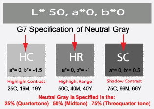
True visual midtone neutral gray is documented by GRACoL 7 and specified by G7 as L*59, a*0, b*-1. G7 specifies neutral gray tones at the 25% area known as the Highlight Contrast (HC), the Highlight Ranges (HR) and the Shadow Contrast (SC) (Figure 6). What is amazing is when I attain this and then measure the color in All Densities mode on a calibrated densitometer, the C, M, and Y are almost identical. These results confirm that what I have is neutral and is not adding a color cast to the image. No C, M, or Y value overpowers the other colors. The standard viewer would have a difficult time seeing any specific color cast in the gray if they were evaluating it in standard viewing conditions.
So with the neutral gray defined and my proof color target neutral, all I have to do is adjust my C, M, and Y press curves to attain neutral values. Adjustments will necessarily change based on the substrates and solid ink colors in use. But because I am now measuring and targeting neutral gray, I can set up a press with a clearly defined objective and know that the prepress work is clearly targeting neutral.
Setting the curves from a gray bar
If we define the L*a*b* gray value of each tonal area in a tonal ramp and ignore the highlight in honor of the different substrates on which we may print, we’ll see an amazing result. Images appear very similar, even when we print on different substrates and our solid colors have slightly different hues. The reason for this phenomenon is that the gray-bar curve requires us to adjust C, M, and Y separately to attain neutral gray. This adjusts for substrate and solid-ink-hue error. Dot-gain adjustment does not address this. Even absolute-density adjustments taken from pure color bars do not report the effect of color-on-color overprint. Taking the curve-value-adjustment numbers from a C, M, Y gray bar does. The G7 Color Calibration Specification uses a gray bar embedded in the P2P25X neutral-gray print target (Figure 7). Each tonal value is a gray built to neutral specification of L*a*b*. When converted to all densities, a neutral curve can easily be created that corrects for substrate and ink-hue differences.
Benefits to the client and the printer
The client who understands neutral gray wants to work with a printer who also understands neutral gray. The benefit here for both parties is that neutral gray eliminates subjective opinion about the visual appearance of the file. Neutral is neutral, and you cannot argue with the purity of a neutral specification. The press operator who understands this can quickly determine whether the print is out of balance and which color is out with a modern densitometer that has an All Density function. As neutral gray becomes the controlling factor in a production facility, clients and printers find that communication reverts back to the professional language of the scanner operator who spoke of accurate gray balance with assurance in his voice.
The simplicity of neutral-gray color control is an example of Ockham’s Razor, a principle attributed to a 14th century logician named William of Ockham. It is often expressed as the law of parsimony, law of succinctness, or entia non sunt multiplicanda praeter necessitatem, roughly translated as: entities must not be multiplied beyond necessity. In today’s language it would be: all other things being equal, the simplest solution is the best. I believe that neutral-gray balance is the Ockham’s Razor for the printing industry. It works for printing and proofing in screen, digital, flexo, and offset, and it’s one of the most powerful tools we have to ensure accuracy and quality.
Mike Ruff is chief technology officer for Nazdar Consulting Services, Kansas City, KS. His experience in the graphics-printing industry spans more than 37 years. Ruff is a certified G7 Color Calibration Expert and a regular instructor at the SPTF Graphics Four-Color Workshop in Fairfax, VA, and he has authored numerous articles published in trade publications domestically and internationally.


Subscribe

Magazine
Get the most important news
and business ideas from Screenprinting Magazine.
Most Popular
-

 Case Studies2 months ago
High-Density Inks Help Specialty Printing Take Center Stage
-

 Art, Ad, or Alchemy2 months ago
F&I Printing Is Everywhere!
-

 Andy MacDougall2 months ago
Functional and Industrial Printing is EVERYWHERE!
-

 Columns3 weeks ago
8 Marketing Mistakes Not to Make When Promoting Your Screen Printing Services Online
-

 Editor's Note3 weeks ago
Livin’ the High Life
-

 Marshall Atkinson3 weeks ago
How to Create a Winning Culture in Your Screen-Printing Business
-

 Thomas Trimingham2 months ago
“Magic” Marketing for Screen Printing Shops
-
 Case Studies3 weeks ago
Screen Printing for Texture and Depth