Graphics Printing
Published
17 years agoon
Contradictions abound when it comes to the best sequence for printing CMYK. Disagreement in the industry, even among the scientists who strive to fully understand screen printing, makes it hard for printers to know what is best for them and their customers. We accept that finding the perfect answer is virtually impossible. The function of our study was to find a good compromise.
Contradictions abound when it comes to the best sequence for printing CMYK. Disagreement in the industry, even among the scientists who strive to fully understand screen printing, makes it hard for printers to know what is best for them and their customers. We accept that finding the perfect answer is virtually impossible. The function of our study was to find a good compromise.
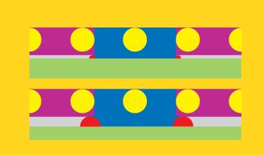
One issue on which we can all agree is dot-on-dot gain (Figure 1). With a small dot, just after the squeegee has passed, a modest amount of ink becomes ready to be printed. A larger dot makes much more ink ready to be printed. A certain amount of ink is printed when the sten-cil is nicely in contact with the substrate. More ink must be printed when the stencil is held above the substrate by the presence of a preceding dot.
The definitive study of this effect was carried out in 2001 by Eiffion Jewell’s team at Swansea University. Their study showed that the amount of gain depended on the dot size underneath. A small dot yielded small dot gain, a large dot (i.e., something approaching a solid) also gives a small gain, and intermediate dots give the largest gain. This means that no simple correction process can compensate for the effect. So we can guarantee that we will have dot-on-dot problems and that no print sequence can be perfect. Let’s move on to some other basic ideas.
The rules
A successful study is one that has the basics in place. The following five aspects of printing four-color jobs are entirely under your control. If you don’t follow these guidelines, the dot-on-dot nightmare will simply get worse.
1. Use a low-EOM, low-Rz stencil. It’s now widely appreciated that a low emulsion over mesh (EOM) gives you the smallest dots and therefore minimal dot-on-dot gain. High EOM regularly causes skipping in addition to terrible gain, and printers often confuse skip-ping and moiré. The rule is simple: Never print four-color work with a high-EOM stencil!
Also appreciate that a low Rz (stencil roughness) is needed to stop squeegee-induced gain. This is why it’s so important never to print four-color work with a high-Rz stencil. If you have a stencil with both low EOM and low Rz, then your single-color prints are under excellent control (dot gains typically < 10% and with a total immunity to squeegee settings, print speeds, etc.) and your dot-on-dot problems are minimized.
In our study, we found no skipping, our dot gain was under good control, and the job was easy to print. The stencil also has a proven high fidelity from film to print, so we were reducing stencil-induced color shifts to a minimum.
2. Make sure you have the right CMYK intensities from your inks. We have to admit a slight error here based on our inexperience. We printed our solid inks onto our chosen substrate (a matte, coated paper) then based the inks until they reached the required ISO density standards for four-color process. What was our error? We forgot that the paper absorbed a small amount of the ink, so the intensity of the first ink down is higher than that of subsequent prints. In hindsight, we should have based the inks to a compromise value based on densities obtained by printing onto a non-absorbent plastic substrate. However, we found that we are not alone. Many printers make this error and ascribe the reduced color of sub-sequent inks to a so-called trapping effect. Simple experiments on non-absorbent substrates show that such trapping is a myth.
3. Choose a set of screens that gives zero mesh moiré. We chose to print at 80 lines/in. and used the MacDermid Autotype Mesh Moiré Calculator to determine that our C, Y, and M screens at 37.5, 82.5, and 7.5° would be free of mesh moiré on a 150-thread/in., 31-micron mesh, but that strong moiré would appear in the K at 67.5°. We therefore printed the K on a 180-thread/in., 27-micron mesh, shown on the Calculator to be moiré free at the same angle.
4. Make sure you have good registration and fit. This was a complex, long-term job, so it was not realistic for us to have substrates all stabilized perfectly to the same extent. And we are, after all, only learners. So our registration and fit were not perfect. However, careful inspection showed that this in no way affected the conclusions about the print sequence.
5. Always have a definition of truth. We used a high-quality color proof as our definition of truth. The definition of good color, good shadows, grey balance, etc. was taken to be the proof.
The test images
Different print sequences have different effects on different images. We therefore chose a child’s face with lots of difficult skin tone, a beautiful lily for aesthetic reasons (but this choice turned out to be important as we will see later on), a fiendishly difficult grey image, and some pretty tulips—including a duotone for educational purposes. In addition, we printed standard test strips from Linotype-Hell, including the all-important grey-balance test area.
The test sequences
We are very grateful for Michel Caza’s active intervention in our work. A member of the Board of the SGIA in the
The results
Needless to say, we found large differences among the various sequences, and some of the prints were appallingly bad (Figure 2). Dot-on-dot gain is not a pretty thing to see! We formed our own opinions of the various sequences but were then fortunate to find that FESPA Slovakia was holding a meeting at which Bill Appleton was speaking. The experienced Slovakian printers gave their own opinions. There was, of course, no agreement about which sequence was best, though sequence 5 and the two Caza sequences had their supporters. Preferences depended, not surprisingly, on what people were looking for. As we will see, the 15° moiré effect strongly biased many of the judgments. As this effect can be taken into account by a very simple process, we will ignore this aspect of the prints until we come to the section devoted specifically to the effect.
Rather than rely on subjectivity, we decided to create an objective measure we call the Color Fidelity Index, CFI. This captures three independent factors, all of which have to be right:
- Good grays: Shifts in grays are a good indication of a print generally out of control.
- Good three-color tones: This captures the fact that a lot of the subjective color judgment was based on the more complex tones which often looked far too dark.
- Good shadows: We want to lose as little shadow detail as possible.
We had anticipated using a fourth criterion—the color gamut. But careful L*a*b measurements and plots on the CIE chart showed that there was no significant difference in gamut in any of the sequences, which, in hindsight, is fairly obvious.
The idea was to obtain objective measures for each of these factors, scale each of them from 0-100 then divide the total by three to give us a 0-100 CFI, where 100 is the perfect print. Getting the objective measure for the grays was easy. For a 20%, 50%, and 90% grey, the L*a*b values of the printed and reference grays were measured and the color difference (Delta E) calculated. The Delta E for the three grays were then summed and put on a 0-100% scale with the average value ~50 and defined so that perfect grays (i.e., a Delta sum of 0) gave 100%.
The most satisfactory method for the three-color tones turned out to be a simple measure of the %K along a 0-100% three-color tone strip followed by adding together the difference between the measured %K and the specified value. Again, the results were put on a 0-100% scale with the average set at 50 and perfection defined as 100%.
Because the shadows are so im-portant for a good print, and because the Caza b sequence showed a clear advantage over the other prints (there is no dot-on-dot gain when the K is printed first) we wanted to do the same sort of measure as with the three-color tones. Unfortunately, our printed four-color strip was a pure theoretical strip with no GCR/UCA. It showed enormous dot gain, making the measurement technique unsatisfactory. We reluctantly resorted to an expert relative assessment of the degree of shadow clarity (using the proof as a reference standard), and to be consistent with the other measures gave the prints a score either side of 50 with a scatter similar to the other measures.
15° moiré
Our subjective judgments of the print quality were greatly affected by the fact that prints one, three and seven had terrible moiré visible in the pretty lily. The reason quickly became clear. In each case, we printed a light M tint on top of a relatively solid Y. This isn’t entirely obvious because sequence 3 is YCMK; but the lily has almost no C, so the M was going directly on top of the Y. The next fact to check was the screen angles. The Y and M are indeed 15° apart. You would not expect any moiré from Y and C as they are 45° apart, and there isn’t much K on Y printing. Why were we seeing moiré only in M on Y? The important answer is that we weren’t! In the four image prints, it happened that only the lily was set up to show the moiré. Very strong moiré of both M on Y and Y on M in the middle tones was evident in the two-color test strips.
As explained in professor Steven Abbott’s book Moiré, Causes and Cures, A Practical Guide for the Screen Printer (available free of charge from MacDer-mid Autotype), moiré depends on three factors. The first is the math, the second is the human eye, the third is amplification of the mathematical effect. Mathematically, 15° moiré is always present. But the human eye accepts it if its amplitude is below a certain level.
What happens when you print a set of M dots on top of a set of Y dots (or vice versa) is that the dot-on-dot effect fades in and out on a regular basis as some dots (say, every third dot) are printed directly on top of a yellow dot (no dot gain), some are printed mostly in the space between yellow dots (no dot gain), and some are printed on the shoulders of yellow dots and give gain. So the dot-on-dot gain rises and falls in a regular manner, giving a more easily visible moiré. If the second color is mostly above midtone, then the larger dots will, on average, spread out fairly regularly so the amplitude diminishes. That’s why the lily print was so important. The M on Y showed up strongly, but Y on M had no moiré. However, on the test strips, the M on Y and Y on M showed equal de-grees of moiré, albeit with different color shifts, be-cause the dot-on-dot effects are the same.
This leads to a simple rule. If you know in advance that the color that is 15° away from Y (some choose M, others choose C) will have significant areas of midtones on top of relatively solid Y (and it seems that Y tends to be more solid than other colors), then make sure you print the Y after that color. If you don’t have such issues, then you can decide your Y print order based on the pure color criteria of the previous section.
The overall winner is sequence 5, MYCK (Table 1). This has good general performance with the best color balance. It was often a favorite of experienced judges. Sequence 3, YMCK, was also quite good but always disliked because of its strong moiré in the lily. If the angles for the M and the C were reversed, then this sequence would have been rated up there with sequence 5 by expert judges.
Caza b, KCMY, has a very strong grey-balance shift and lost a lot of points for general-purpose printing. However, the three-color density shift is less pronounced than in sequence 5, yielding quite satisfactory complex shades. The K-first strategy gives optimal shadow performance, which justifies
Caza’s endorsement of this sequence. It also tends to be less prone to 15° moiré because the Y is printed on top of a jumble of other dots, making it less likely for the 15° moiré to appear.
So, do we have an objective choice? Yes and no. We found the CFI incredibly helpful in debating the various merits of the different prints. By having numbers instead of opinions, we found that we could debate the opinions much more sensibly. If we were real printers, then we would probably choose to restrict ourselves to just two sequences, MYCK and KCMY. For any particular job, we would be able to make a quick decision: If there’s a lot of subtle grey, then we’d use MYCK; if a lot of darker complex tones and shadows, then we’d use Caza b.
Arriving at a good answer
As so often with screen printing, when you strip away unnecessary confusions by getting the basic preparation right, it becomes much easier to make sensible decisions. Choosing the right stencil, the right choice of mesh to remove mesh moiré, the right ink density, and agreeing on a standard of truth made our task much simpler. With relatively few objective measurements and with a simple understanding of moiré, we were able to come up with a couple of print sequences that we would use on a routine basis for four-color printing. We hope that you will be able to reach a similar conclusion by carrying out a few objective tests on your own prints.
Author’s note: This article was written with the assistance of professor Steven Abbot and Bill Appleton. Thanks also to Michel Caza and professors John Davison and Long Lin for their advice and practical help. Tricia Church has worked in the electronics and screen-printing industries for the last 25 years, printing a range of inks onto different substrates using various types of screen-printing equipment.


Subscribe

Magazine
Get the most important news
and business ideas from Screenprinting Magazine.
Most Popular
-

 Case Studies2 months ago
High-Density Inks Help Specialty Printing Take Center Stage
-

 Art, Ad, or Alchemy2 months ago
F&I Printing Is Everywhere!
-

 Andy MacDougall2 months ago
Functional and Industrial Printing is EVERYWHERE!
-

 Columns3 weeks ago
8 Marketing Mistakes Not to Make When Promoting Your Screen Printing Services Online
-

 Editor's Note3 weeks ago
Livin’ the High Life
-

 Marshall Atkinson3 weeks ago
How to Create a Winning Culture in Your Screen-Printing Business
-

 Thomas Trimingham2 months ago
“Magic” Marketing for Screen Printing Shops
-

 Case Studies3 weeks ago
Screen Printing for Texture and Depth