Articles
Published
19 years agoon

One of the many challenges we face as screen printers is getting the colors that we see on our computer monitors to come close to the ink colors that appear on our printed garments. This can be especially difficult when we’re printing subtle, illustrative artwork that has colors blending to produce secondary hues with other inks or the garment color itself. In these situations, we may not be sure how to start the separation process because we’re uncertain about which inks will deliver the final look we expect.
A good way to solve this problem is to develop an ink guide that will show us the properties of the inks that we have and demonstrate how they will change as we print them. The guide will help us identify the right values to plug into our artwork so that we can produce separations that will lead to the correct color in the final design. To create this guide, we must research several variables–stencil, underbase, ink opacity level, and garment color–and determine how they interact with each other to influence printed color. This article will explain how.
Ink and color fundamentals
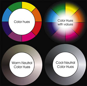
Let’s review some color and ink terminology so we can avoid any misunderstandings when we begin looking at the methods to test our inks. I have compiled a short list of terms and their definitions to help give everyone a working idea of the vocabulary that artists and printers need to use to communicate properly on ink issues. Figure 1 depicts some of these concepts.
Hue This defines the color (red, blue, green, etc.) based on the wavelength of light that it reflects.
Value The value of the color is the amount of white or black that it contains. If you add white to red, you eventually raise red’s value to a pink. When you add black to red, you lower red’s value to a maroon or brown, depending on your black ink’s color temperature.
Temperature When this term is applied to colors, it designates a feeling that is associated with hues that are reflected by a color. Red is considered a warm color and blue a cool color. Where this becomes most important in ink mixing is when you use neutral colors (black, white, or gray). You will find that even the most neutral-looking inks have a temperature. Blacks will often be greenish or reddish in hue, and whites can look slightly yellow or blue. This is critical to realize because adding a small amount of black or white ink to another color can really pollute that color, depending on its temperature. This also is why artists are always on the lookout for the purest pigments, which provide the most neutral temperature. That way, if they want to change the value of an ink, it won’t dramatically affect the hue of the ink.
Primary A primary color is one that is used to create other colors and cannot be created by mixing colors. Depending on the color system that you are using, a primary color could be blue, red, yellow, cyan, magenta, or yellow. Primary colors are mixed to create secondary colors.
Secondary A secondary color is created when you mix two primary colors together. If you mix cyan with yellow you get green. Secondary colors are green, purple, orange, and so on.
Opacity This attribute refers to the ability of ink to block the penetration of light. Generally, inks that are high in opacity tend to be thicker and have more of a matte finish, while inks that are low in opacity (translucent, like jewels) are more likely to have a gloss finish and a runnier texture.
Viscosity This quality refers to how thick ink is. Viscosity directly affects how ink flows through a screen/stencil.
Tack Tacky ink is very sticky. This is most often seen as an issue with white inks after flashing. Remember that inks that have a high viscosity (thick) are not always high in tack.
Finish This quality refers to the surface of the cured ink and how shiny or dull it appears. Gel inks that are fully cured will have a gloss finish, and puff or suede inks will exhibit a dull or matte finish.
You will notice that these terms are useful when describing and isolating the ink/color qualities that you want to understand and control as you test. The better you understand the properties of your inks, the easier it is to make informed choices when you separate artwork for specific ink colors.
Perhaps the most important rule to remember when separating art for garment printing is that the artwork and its style dictate the way the image should be separated and printed, and consequently, the inks that should be used. This means that our system for mixing and matching colors should be more artistic than scientific.
I remind myself of this rule whenever I am trying too hard to put a lot of controls on inks and their use in printing. We need to start with a good working knowledge of our ink properties and then use an “as close as we can get without losing money” approach so that we don’t force an ink into a design just because we don’t want to create a custom color mix. To control these properties, we have to know how printed colors are influenced by the stencil they are printed through, the underbase over which they are printed, the opacity of the ink, and the color of the garment.
Testing the impact of variables
I will illustrate the ink-testing process based on the design shown in Figure 2, which I created for a friend of mine. Again, remember that the artwork is the major factor dictating the method of separation and ink selection. Keep that in mind and you won’t end up trying to force an inflexible color palette into a design.
Many screen-printing companies attempt to corral artwork into predetermined color palettes that correspond to stock inks that they have on hand. While this will save time on the production end, forcing a standard palette on custom artwork rarely brings good results.
The best approach is for artists to work closely with the inkroom personnel to develop an understanding of what can be used from stock inks and what should be custom mixed. In addition to selecting inks with hues appropriate for the design, you must consider the opacity levels of ink, particularly if they will be printed on dark-colored fabrics. For the K-9 patrol design, the inks needed to be semi-opaque so that I could create subtle shadow gradations and fade-outs into the black fabric of the shirt. What follows is the procedure I used to determine which ink colors where best for the project.
Stencil The first variable to consider when you test colors is the stencil that you use to lay down the ink. Visualize the stencil as a layer of emulsion combined with the screen mesh. It has a certain thickness that dictates how much ink passes through and adheres to the shirt, which can affect color and other qualities of the ink layer.
Before you test your inks, you need to make sure that the quality of your screen and its stencil is acceptable. Use a high-tension screen (make sure it’s not warped) to support an even emulsion layer and expose the stencil properly to ensure good image clarity and edge definition. Choose a screen mesh that accommodates the complexity of the design that you want to print. I printed 55-line/in. halftones in my K-9 design, so I chose 180-thread/in. mesh for the underbase screen and 230-thread/in. mesh for the top colors. I stretched each screen to 25 N/cm of tension and made sure that the emulsion layers were consistent.
Note that the frequency of your halftone may give you some nasty moir

Subscribe

Magazine
Get the most important news
and business ideas from Screenprinting Magazine.
Most Popular
-

 Columns1 month ago
8 Marketing Mistakes Not to Make When Promoting Your Screen Printing Services Online
-

 Press Releases1 month ago
Sports Inspired Clothing Market: The Influence of Sports on Fashion Forward Looks
-

 Editor's Note1 month ago
Livin’ the High Life
-

 Marshall Atkinson1 month ago
How to Create a Winning Culture in Your Screen-Printing Business
-

 Press Releases4 weeks ago
Hope Harbor to Receive Donation from BlueCotton’s 2024 Mary Ruth King Award Recipient
-

 Case Studies1 month ago
Screen Printing for Texture and Depth
-

 News & Trends2 months ago
What Are ZALPHAS and How Can You Serve Them in Your Print Business?
-

 Headlines1 month ago
Live Poster Printing Raises $30K for Charity


