Articles
Published
16 years agoon
The index separation can be the fastest and truest proof-toprint system for screen printing. The benefits of index separations are numerous, but one of the biggest advantages to the index model is how simple it is to set up a job in vector software and then proof it and print it with an accurate result from the same file. An experienced separator who uses index well can separate most designs in less than 15 min, and the final set of files can be proofed and then printed with very close approximation because of the opacity and predictability of the inks.
The index separation can be the fastest and truest proof-toprint system for screen printing. The benefits of index separations are numerous, but one of the biggest advantages to the index model is how simple it is to set up a job in vector software and then proof it and print it with an accurate result from the same file. An experienced separator who uses index well can separate most designs in less than 15 min, and the final set of files can be proofed and then printed with very close approximation because of the opacity and predictability of the inks.
If this sounds too good to be true, that’s because of all of the assumptions that are alive and well in the majority of screen-printing shops. When index separations are brought up in conversation, most screen printers immediately talk about how they make grainy looking prints or how an index job always takes 12 colors to work right. The truth is somewhere in between. Index separations do come with headaches, but the printers who really explore index dots and test them thoroughly most likely will regret not using them on a regular basis from the beginning.
It is true that some art will never look very good as an index print, but with proper modification, the majority of artwork works fantastic as index dots and uses surprisingly fewer colors than what printers typically assume. The biggest advantage to putting an index separation process in place at your shop is not necessarily the printing advantages, but the ability to lay out a design, customize it in vector software, and then print out color proofs and final separations from the same file. This means saving the entire step of creating a separation file, importing graphics, and double checking each separation plate for proper placement and accuracy.
Printers often find it difficult to imagine separating a high-end graphic in fewer than 15 min, placing it in CorelDRAW or Adobe Illustrator, customizing the type, and then printing out an accurate proof and final separations from the same file. This can call into question a lot of previous processes and why they were used in the first place.
Following three simple steps will enable you to properly use an index proofing and separating system and get everything running smoothly. The first step is artwork modification to minimize the number of colors in the design. My previous column about color crunching (Dec. ’07, pg. 28) explained how to do this in greater detail. The technique is worthy of review in this context because of the nature of how index color splits a design. The second part is the actual separation method using index color, which is deceptively simple at first glance but still requires some serious finesse to do well. Last is the integration of the separated index file into a vector program like CorelDRAW, where it can be customized, proofed, and then separated.
Artwork modification for index separation
Artwork modification is the most overlooked area of the square-dot-based separation method and typically one of the reasons that it has obtained such a poor reputation for needing too many colors to reproduce designs. A design on a screen-printed shirt has the primary job of looking good and hopefully making the person wearing it look good as well. Unless there is a necessity for specific color matches on multiple areas of a design, you should simplify any colors that are similar in hue and try to combine these colors into a smaller palette before you start separating. The easiest way to accomplish this is by crunching colors.
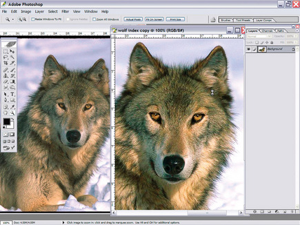
Let’s review the crunching method in the context of prepping an image for index, rather than simulated color, separations. The wolf photo in Figure 1 needed some adjustments before it could be used for an index separation. Animal photos like this one commonly have good areas and bad ones, so the key is to find pieces that will work and build from there. In this case I used the right eye and duplicated it and flipped it to work on the other side of the face. I followed the same idea with the ears by copying the left ear and using it on the right side of the face. The next step was prepping the overall image by bumping up the contrast 15 points and then changing the image mode to L*a*b* color and using the Unsharp Mask filter on the lightness channel to help define the edge quality of the image.
Remember that an image must be the best it can be before you attempt to crunch colors or separate it. The final separations and print on the shirt will never be any better than the detail and information that can be properly reproduced from the original source. Once I adjusted and prepared the wolf, I created several layers that were painted with bright colors on top of the original layers. These painted layers are used for visual reference to see where I would create selections to simplify the final color palette in the image. This method has worked well for me in the past to show how the selections balance against one another. It accommodates a level of subtlety that is difficult to get with a hardedge selection tool like the Magic Wand.
The wolf had several areas in which I wanted to average the color gamut into browns, tans, or grays. This method allowed me to do that to a duplicate of the image in a very short time (Figure 2). When the layers were all finished I just created a selection of a specific layer by holding down the Control key (Cmd on the Mac) and clicking the layer. The next step was to select the original image copy layer that could then be adjusted by using the Hue/Saturation dialog box and its Colorize button. I carefully adjusted the hue on the selection to get the proper color tone so that it knocked out most of the extra colors. On the gray areas I used the Hue/Saturation dialog to take out most of the color by lowering the saturation value. These steps vastly improved the image and dramatically reduced the colors needed so that I could go ahead and finalize the design.
Setting up an image for a good index separation
The order of steps in this process is important, because you don’t want to start the construction of the final illustration with a design that has too many colors. It’s far easier to edit the image before you put it into a design or combine it with typography. The final steps to setting up the wolf for placement were to duplicate and flip the side of the lower hairline and create a quick mask of a duplicate for extraction from the background. I duplicated the layer and used the Levels command to make it solid black and white, copied it to a channel, and created a selection for a knockout.
I then placed the extracted wolf onto the black background with the permanent typography so I could begin my separations (Figure 3). Index prints are a whiz to separate when they are properly prepared. This one was successfully separated into color channels in less than ten minutes. It started out as ten colors in the color table, which is fairly typical for an illustrated index separation, but that was where the finesse came in. I looked at each color individually to see whether it could be created by a combination of other colors or from a dropout of the underbase. The design settled in at seven colors after such adjustments. I could then save the seven colors as separate layers or channels that could then be imported into CorelDRAW or Adobe Illustrator.
Importing the final file into vector software
In Illustrator, I recommend using a DCS2.0 file with the separations saved as spot channels. The colors in these channels will show in the swatch menu and can then be used in overlapping typography or added vector elements. For CorelDRAW you would import the design with the indexed files saved as layers that are then converted to monochrome bitmaps with no fill. The outline color is the separation color. This makes a small file that prints out both separations and color proofs from the same page. One thing that I have found is thata full color layer set below the other layers will greatly improve the display properties of the file on screen without affecting file separation or printing. This has something to do with the way the computer combines the dots in index prints (Figure 4).
To properly view and output this file I had to change all of the outline colors in the bitmaps to the closest Pantone matches. For the underbase file I made sure it was underneath all of the other files, and I set the outline color to transparent white and to overprint (this is a great Corel X3 option). The design was now ready for customization.
This wolf was a snap to personalize with a location right below the type (Figure 5). Other designs could have far more elaborate overlapping type and vector elements on top of the graphic. The important thing to remember is to create an underbase copy that is set to overprint in CorelDRAW or a separate underbase file in Illustrator of all vector elements. This way the underbase will not miss the type and other additions. I moved all of the separations in Figure 6 to show how they work together to build the image.
A properly separated index separation isn’t that much different from a checkerboard in the way that the squares fit together and one color stacks right inside another to create a third color. If the dots were small enough, they might have even blended so that no dots would be apparent to the casual viewer. Were this file to be output on a color printer, it would be very close in appearance to the screenprinted piece. Best of all, after the customer approves the proof, you can just hit the print key and output your films.
Impress with index
There are many benefits to using an index separation and proofing system in the same file. The greatest benefit is certainly speed. The file prints very easily, the printer proofs are very close to the final print, typographic changes are a snap, and the separations tend to be very fast. Depending on how it is done, the index print can look better than a traditional print, or it can be completely grainy without a lot of tonal range.
The downside to this method of proofing is if the customer has a lot of changes, you will have to start over on the artwork and index it again. This is offset somewhat by the quickness with which the separations are done, but it is a concern if you have a nightmare client who pushes a lot of revisions through. The key is to practice with the dots and the file preparation so that everything works together to build a better proof and final print. The profit in proofing with index and then separating from the same file is first measured by speed and efficiency, then multiplied by ease of use on press with fewer issues concerning moiré and dot gain.
A Quick Rundown of Index Separation
1. Start with an RGB file that is actual size and the exact resolution of the dot size you can hold on screen.
2. Use the >Mode>Index Color dialog to bring up the index color dialog. Uncheck the preview button and select Custom from the Palette box.
3. The Index Color table will open. Click the lower right box and drag all the way up to the upper left box and let go. The color picker will open. Select white as a color. The box will open again. Select white again to clear the table as white.
4. Begin by creating the first upper left box as white and the next one in the top row as black.
5. Start by selecting the most saturated colors in the image. What you are looking for are colors that cannot be created by mixing other colors. Don’t forget to grab some grays or neutrals to create highlights and shadows.
6. After you feel you have all of the prominent colors in the design, select OK and then OK again. The design will change to index.
7. The image will probably not be perfect on the first color table. Zoom in and use Cmd or Ctrl Z to undo, and then redo the index and look at areas that seem to be harsh or rough transitions. You may want to add a color or change the table to correct these areas. You can just undo the whole index set, and when you >Open>Custom again, the last palette used will be there already as a starter. Just edit it or add to it until the result looks good. Remember to view the design at 100% or 50% to see it properly.
8. After you have the color table set, look at each color and see whether there is a way to combine it with similar colors. You can drop out the underbase to darken it or add a percent of another color into it. There are many ways to crunch the table down at this point, so be willing to experiment—but be realistic at the same time.
9. To create an underbase all you need to do is select all of the colors in the color table that need white underneath, change them to black, and change all of the other colors to white. Instant underbase!
10. For each separation color, just select that color and change it to black and all of the others to white. Copy and paste this image into a new document layer or channel and then undo it and continue with subsequent colors until complete.
Thomas Trimingham has more than 16 years of experience in screen printing as an award-winning artist, separator, industry consultant, speaker, and author of more than 40 articles in industry magazines. He can be reached through his Website, www.art4screen.com.


Subscribe

Magazine
Get the most important news
and business ideas from Screenprinting Magazine.
Most Popular
-

 Case Studies2 months ago
High-Density Inks Help Specialty Printing Take Center Stage
-

 Art, Ad, or Alchemy2 months ago
F&I Printing Is Everywhere!
-

 Andy MacDougall2 months ago
Functional and Industrial Printing is EVERYWHERE!
-

 Columns3 weeks ago
8 Marketing Mistakes Not to Make When Promoting Your Screen Printing Services Online
-

 Editor's Note3 weeks ago
Livin’ the High Life
-

 Marshall Atkinson3 weeks ago
How to Create a Winning Culture in Your Screen-Printing Business
-

 Thomas Trimingham2 months ago
“Magic” Marketing for Screen Printing Shops
-

 Case Studies3 weeks ago
Screen Printing for Texture and Depth