Garment Printing
Published
18 years agoon
Among the new digital technologies that have been rolling into the screen-printing industry recently, few have had a greater impact on garment shops than inkjets. Inkjet technology is helping to transform prepress in the form of computer-to-screen stencil-imaging systems. And it’s beginning to have an impact on production as well, thanks to the introduction of several direct-to-garment inkjet printers that can fit directly into the workflows of screen-printing and embroidery shops.
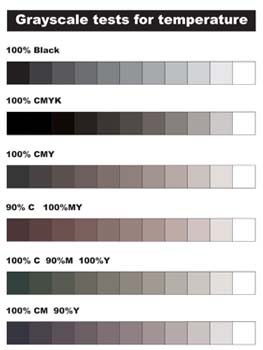
Among the new digital technologies that have been rolling into the screen-printing industry recently, few have had a greater impact on garment shops than inkjets. Inkjet technology is helping to transform prepress in the form of computer-to-screen stencil-imaging systems. And it’s beginning to have an impact on production as well, thanks to the introduction of several direct-to-garment inkjet printers that can fit directly into the workflows of screen-printing and embroidery shops. These garment ink-jets are ideal for taking on short run and custom multicolor jobs for gift shops, ad-specialty customers, and other buyers of single or low-volume decorated garments. The advantages of using these machines lie in the fact that they require no film positives, screens, or press setups, and that they can start printing as soon as image files are ready. However, the file preparation required to achieve the desired look in the final print is a new challenge that printers confront when using direct-to-garment inkjets, a challenge that we’ll address here. Fine-tuning files If you receive files from customers, or create the designs by scanning images, there’s a good chance that you’ll be working with files in RGB color that must be converted to CMYK and edited to print properly on inkjets. Alternately, you may receive customer files that are already in CMYK mode, but unadjusted for inkjet printing. In both cases, the biggest issue you face is the need to adjust color temperatures while keeping good values and brightness. Color variations can be huge when printing digital files and may involve problems with saturation, hue, brightness, light source, and color flatness compared to volume. Not all color profiles and file-preparation theories will work on every file. The strategy you’ll learn about here consists of ground-floor steps for editing and adjusting some basic CMYK issues that are likely to crop up in work that will be inkjet printed. The procedure may not work on every image file that you’ll encounter, but it will leave you prepared to head of a lot of questions and confusion. The steps in this article cover two common scenarios in file preparation: working with customer-supplied art that is already in CMYK but doesn’t print as expected, and working with RGB files that need to be converted to CMYK and then edited in that color space. Getting started One of the ways to get ahead of other printers that have the same equipment is to carefully profile you inkjet and handle all color matching up front. Doing so will allow you to color correct newly arrived images more quickly. Start by printing several grayscales on the inkjet using a variety of CMY combinations. The printed scales will let you determine whether the printer needs adjustment and find out which ink colors seem to have the strongest effect on the gray tones (Figure 1). When you print these tones onto a shirt, you can use the print to decide how color temperatures should be adjusted to achieve more neutral grays. The next step is to print various combinations of the process colors to determine what final colors will result. When you need to match specific colors in future designs, you can use this test print to determine what process-color combinations give the closest results (Figure 2). For example, if a design file shows a bright orange on screen but prints out rather brownish on the shirt, you can locate the brightest orange on your test print and adjust the color values in the current design to echo the values in the test print. You can move on to more specific edits of CMYK files once you become comfortable with the adjustment of gray temperatures and color-comparison editing. Dealing with customer-supplied CMYK art Customer-supplied artwork that is provided in CMYK and destined for output on a direct-to-garment inkjet was probably prepared for offset printing. Unfortunately, art that is filtered into process color for offset may not give you a great print on your digital printer. Offset and inkjet inks are different; as such, they may vary in build up and performance on garments and common paper substrates. The best course of action when dealing with art like this is to quickly run a test print of the image on a scrap shirt. You’ll get to see the results of leaving everything as is, and testing exposes any issues that you’ll have with particular areas of color in the image file. If you’re having a great day and the file is a simple one, adjustment may not be necessary at this point—but I wouldn’t bet on it. Most files that are created for offset have a blending of CMY in grays, browns, and blacks that could produce a bad color cast in an image. At the very least, the way that inkjet inks tend to build up requires the artist to control how much color goes down to reproduce accurate and clear hues. The main idea is to isolate colors as much as possible to their own respective areas and retouch colors that are polluted by opposite primary colors. The design in Figure 3 is made of a variety of intense colors. In this example, I first assumed that the client provided the image file as a standard CMYK file for offset printing. I opened the file in Photoshop and took a look at the channels in the image. I suspected the colors would be blended together in the black and gray areas. There was cyan, magenta, and yellow in equal amounts in both of these areas—not the right combination for producing a quality digital print. If you have too much build up of multiple inks in a digital print, you’ll be more likely to experience bleeding and end up with strange colors. I needed to make the blacks and grays exist only on the black channel, remove them from the other colors, and add saturation to the other channels to create a vibrant image. The best step at this point would have been to call the client to determine whether an original RGB file could be provided. Instead, I went ahead with the editing of the file as if the client couldn’t submit and RGB version (as is often the case). Preparing the CMYK image for retouching involved several steps. I had to restructure the file so that it would allow for better processing when it was printed. For this reason, converting the CMYK file to RGB in Photoshop (>Image>Mode>RGB) was the first action I took. Switching to RGB mode gave me more flexibility to use all of the increased gamut range to my advantage. I opened up the Hue/Saturation dialog box (Ctrl-U, Cmd-U) and carefully added back some saturation (about +15) to brighten the colors and increase intensity for the final print. However, I had to prevent colors from becoming too saturated and losing their values. I just watched the brighter colors in the image carefully, purposely pushed the saturation too far, and then slowly dialed it back down to create more brightness without producing glaring hotspots. The next step involved adjusting the image’s contrast and edge quality. I inspected the image areas to establish a good division in between the edges of rendered color and the outlines and contrasting shapes. When a design has outlines that are blurry or not defined in relation to surrounding shapes, or when the edges are blurred or indefinite, no amount of color separating can create a great final print. I didn’t have to clean up the line work in this case, but if the image had required it, I would have used the smudge tool and the paintbrush at a small size to tighten up the edges of the outlines. Carefully examining the design, followed by a conversion to RGB, left me with an image of slightly lesser quality than if the customer had given me an original RGB. The best image quality comes from images that are created and submitted in RGB color space. Converting an RGB file to CMYK for digital output Now that the design was adjusted for optimum output and converted to RGB, I needed to develop a process to control the conversion back to CMYK that would leave me with the most options as I managed the colors. One of my guiding principles when making separations is to save as much information and detail as possible in every color. For this design, I created a knockout black plate. It had all of the black values on it and was great for subtracting black colors from the other CMY channels. First, I duplicated the original file and then adjusted the original colors settings to Custom CMYK, used SWOP Newsprint, set the dot gain to 30%, used the GCR separation type, and set the black generation to maximum (Figure 4). I essentially forced the file to generate a black plate with a knockout of any black outlines and gray areas in the design when I switched the color mode to CMYK. Then I selected the duplicate file and changed the color mode to CMYK (using the new settings). The image ended up looking dirty, but that was okay because I only wanted the black plate. I clicked on the Channel dialog, selected all of the black channel (Ctrl-A, Cmd-A), and then copied it to the clipboard (Ctrl-C, Cmd-C). Next, I went back to the Color Settings box, adjusted it to have a medium black generation, and changed the mode of another duplicate of the original file to CMYK using these settings. To finalize the knockout black channel, I created a duplicate of the last file’s black channel (I selected and dragged the black channel over the Create A New Channel button on the bottom of the Channel dialog box), and then pasted the knockout black channel from the clipboard into this new channel (Figure 5). Editing the design’s colors was relatively simple. The key was being able to predict what would happen to the colors when I printed the image. The test prints I made earlier helped out. I reviewed my test prints and determined that the blues in the new design looked too purple and the pinks looked too red. Color contamination during the conversion from RGB to CMYK was to blame for both of these issues. The blue turned purple and slightly brownish because it had too much cyan and a bit of a yellow cast to it. I used the original combination image channel in the file to make selections and used the Color Range command and the Magic Wand tool so I could open the Curves menu. I then pushed the white point towards the center and cleared out the yellow in just those areas. For the pinks, I used the same method to select the areas and lightened the cyan slightly, bumped up the darkness in the magenta channel, and added a small amount of yellow. My test prints demonstrated that these ad-justments would accentuate the brightness of the pinks. I then finalized the design for output by using the knockout black (which was saved in the extra channel) in two different ways. First, I replaced the old black channel because it didn’t have enough information to provide a solid foundation once the blacks were extracted from the other channels. Pasting in the maximum black right over the original (medium) black channel in the image channels created a new black that had all the information in the drop shadows and rendering. It was just a little dark, so I bumped this channel’s midtones with the curves menu to lighten it. In the second method, I went back to the extra black channel, opened the Curves menu, and bumped the white point over until the black channel was reduced to only the deepest black outline areas (Figure 6). The last step in the adjustments was to Ctrl-click/Cmd-click on the picture, select all of the white information, then use the Inverse command (Ctrl-Shift-I, Cmd-Shift-I) to select just the black information. After I selected this outline black, I quickly went through the cyan, magenta, and yellow channels and cleared the black selection from each. I was finally ready to review the file and then print it out. My review stage just consisted of cycling through the image channels one at a time and then in combination to see how the information would line up in the final prints. I went slowly at this stage and caught a couple of oversights. For example, the center of some of the letters in the title hadn’t been selected when I extracted the colors. I fixed these areas and was ready to produce a final print that I could show to the client. Taking command of digital color Editing garment graphics for direct digital output can be relatively easy when you develop a system that works with your equipment and is flexible for a variety of image types—and when you realize that exceptions will always exist, no matter how good your system may be. Direct-to-garment inkjet technology is still so new that standards for profiling and ways to adjust color have not been fully explored or developed. Until such standards emerge, preparing yourself by profiling your printer and developing a basic color-adjustment technique will give you a big jump on the shops that just print what they get. About the author Thomas Trimingham is project manager/illustrator at Crown Prince in Franklin, WI. He has 14 years of experience in design and separation for screen printing and has won awards in screen printing, illustration, graphic design, and writing. Contact him at ttrimingham@yahoo.com.


Subscribe

Magazine
Get the most important news
and business ideas from Screenprinting Magazine.
Most Popular
-

 Case Studies2 months ago
High-Density Inks Help Specialty Printing Take Center Stage
-

 Art, Ad, or Alchemy2 months ago
F&I Printing Is Everywhere!
-

 Andy MacDougall2 months ago
Functional and Industrial Printing is EVERYWHERE!
-

 Columns3 weeks ago
8 Marketing Mistakes Not to Make When Promoting Your Screen Printing Services Online
-

 Editor's Note3 weeks ago
Livin’ the High Life
-

 Marshall Atkinson3 weeks ago
How to Create a Winning Culture in Your Screen-Printing Business
-

 Thomas Trimingham2 months ago
“Magic” Marketing for Screen Printing Shops
-

 News & Trends2 months ago
What Are ZALPHAS and How Can You Serve Them in Your Print Business?