Garment Printing
Published
16 years agoon
Every new technology you approach has a learning curve. The steepness of that curve depends on your ability to adapt and modify existing work habits. Those who are interested in direct-to-garment (DTG) inkjet systems are often lured by the notion that they won’t have to separate artwork for it to print; however, any gains realized by stripping away file separation can quickly be lost by spending a significant amount of time testing and adjusting the file to get it to look good when printed.
Every new technology you approach has a learning curve. The steepness of that curve depends on your ability to adapt and modify existing work habits. Those who are interested in direct-to-garment (DTG) inkjet systems are often lured by the notion that they won’t have to separate artwork for it to print; however, any gains realized by stripping away file separation can quickly be lost by spending a significant amount of time testing and adjusting the file to get it to look good when printed.
Preparing artwork for printing on a DTG inkjet can be simple when you develop an understanding of the technology and take the steps to adapt an image file to meet its demands. Creating an efficient method of working with artwork for this new printing process is essential, and the results that you’ll achieve with the garment inkjet printers will flow from the steps that you take in systemizing and standardizing art preparation. The risk in this technology is to become enamored with the time and equipment savings, while not considering the steps that are necessary to create output that is attractive, consistent, repeatable, and profitable.
The best way to harness any manufacturing process is to test and record best practices that you can adjust and improve over time to create the most profitable system. The following is a set of fundamentals that you’ll need to address for the process to become controlled and consistent in your shop, whether you’ve just ventured into the field of decorating with DTG technology or are considering it in the near future.
Know your monitor-to-DTG gamut
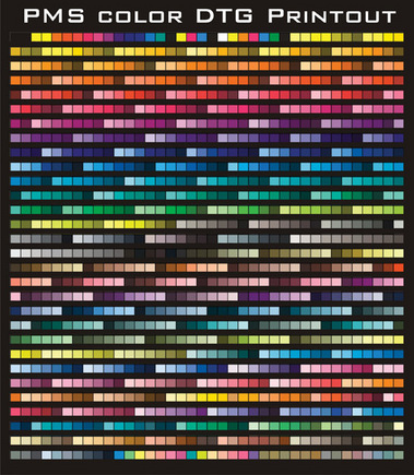
The gamut is the color range or color space that you can achieve with your printing process. We simply can’t reproduce all of the colors that are displayed on our computer monitors, which means the color gamut of a printed piece will have fewer colors available than the on-screen image from which we print. One important step in the DTG process that you can take to better determine gamut is to use a reference to help guide you as you prepare artwork for the printer. There are several ways to produce a reference, the simplest of which is to print out a selection of common colors onto a shirt. You can create another useful reference by printing out several groups of commonly used PMS colors as well (Figure 1).
You should generate references on both light and dark shirts (the latter if your inkjet system offers a white option) so that you can estimate the final color that you will get from the digital file you’re printing. You can then use these printouts as a guide to compare the color values when you are preparing a digital file. Do the color values (CMYK numbers) match up to make a royal blue for the royal blue in the source image? If they don’t appear the same, then odds are you won’t be getting the color you wanted.
For color-sensitive jobs, it is very useful to make a hue set of colors for the colors that you want to hit. Say, for example, that you want to match a front print on a garment to the ringer color on the sleeve. The best way to go in this case would be to print out the closest example color that you have and then create several different versions with slightly varied hues or a selection of PMS colors that seem close. Print this file out on a test fabric or test shirt and you should be able to pick the closest color match.
The RIP you use can affect the gamut range. RIP software explains to the printing device how the pixels are to be set up and printed. The RIP software could be proprietary or a third-party solution, depending on your specific device. RIP settings can dramatically affect your colors. You should always check with the manufacturer and use the recommended settings first, then test some other settings at a later date. If you have continually poor color output that looks like the whole color table was shifted over or is low on gamut (too dark), you may have a problem with the RIP or incompatibility.
Finally, image-mode conversion is another factor to check in controlling the color gamut on your inkjet device. Many of the more popular garment printers out there use a CMYK color space, which necessitates that the file be changed from an RGB color mode into a CMYK mode. Unfortunately, the shift can dramatically change the color if the original image was out of gamut for CMYK. In effect, it can make bright maroons look brown and deep blues appear purple (Figure 2). You may have to color correct your design to properly convert it to CMYK. One really fast way to do this is to select the colors that are out of gamut and save the selections as a channel. Then use the channel selections and lower the saturation until the color-mode change is less harsh. This is best done by using the Undo command (Ctrl-Z or Cmd-Z) in Photoshop to switch it back and forth to demonstrate the before and after of the color adjustment. You can prepare the final image and switch it into CMYK once the colors appear to change as expected.
Review the quality of the artwork
A lot of this may seem like obvious stuff, but you will see a lot more imperfections with a printer that is capable of imaging a high-resolution file onto a shirt than one that prints with lower resolution. This means that low-quality screen captures from the Internet and blurry photos won’t be averaged as much and you may even be able to make out that blocky looking JPEG compression on an enlarged bitmap.
The fine points of artwork revision for digital printing are not that dissimilar to prepping for offset or screen printing. The only real difference is that the file needs to be of a higher resolution than for screen printing, and you may have to adjust the gamut and hue range (as discussed earlier in the gamut section). Many printers strive to have graphics that are at least twice the resolution necessary for the output device. So if your printer can reproduce 150 dpi on the shirt, then you should start with a 300-dpi file. Fortunately, the weave of garment fabric is such that the results from an inkjet print are usually a little more forgiving. You can have a 250-dpi file for DTG output (that is at actual size, of course). Make sure that your file isn’t too big, either, as some of the printers can get stuck or not print properly if the file resolution is too high. Check your specs and make sure to review the quality of the file for the following:
Edge quality The sharpest areas of contrast in an image, such as an outline on a cartoon, should have a clean edge if possible. Try to avoid or correct ghosting and compression glows or distortions. Low-quality images that are enlarged may need to be redrawn on the edges or at least sharpened in places. Sometimes a Sharpen filter that is used on the black channel in CMYK or the lightness channel in L*a*b* color mode can give good results without all of the extra work.
Color blends If the image has smooth transitions of color, then it’s important to pay specific attention to these areas because viewers’ eyes will be drawn to any imperfections in gradient blends. Careful selection and replacement, or blurring using a Gaussian blur to just the affected area, can fix such issues.
Contrast If the image looks dirty and washed out on the computer, it is unlikely to be vibrant on the printed shirt. One thing to try is to boost the contrast by 10-15 points, just to see what happens. Be careful that this procedure does not knock a bunch of colors out of gamut. Changing contrast can really brighten up a dull image—if you don’t overdo it.
Creating the underbase white
Several of the DTG inkjet printers out there have the capability to print white ink. Making the most of this new feature requires that you test the process to see what the results are with a variety of opacities and line weights with overprinted colors. A simple grid, similar to the one that is used to test color shift in screen printing, works well here too (Figure 3). Just remember that the colored inks on an inkjet printer have little or no ability to stand out without the white underbase on a dark garment. Furthermore, ink-film thickness is much thinner than a screen print. A good way to use this file is to run a test print on a shirt, printing bright reds, blues, greens, oranges, yellows, pinks, and assorted rich hues in strips up and down the shirt. This should give you a picture of what you’ll get when you have less than a solid underbase.
The artwork function that needs to take place to generate the underbase is one of the areas many printers overlook. The steps you’ll need to take vary significantly, depending on the DTG printer you have. The common method for preparing a white underbase for a digital file is to turn all areas black that would show through onto the shirt and then convert this copy of the artwork into L*a*b* color mode. The next step is to copy the lightness channel and invert it for a working underbase. This is a passable method when the white underbase is heavy enough, but it may still be too imprecise for other reasons. The brightest reds and deepest blues in an RGB file will register as a 50-60% gray in the L*a*b* lightness channel, yet to reproduce even close to these hues on a final DTG-printed piece, the underbase will need to be the brightest white possible.
The simplest long-term solution is to build a couple of action scripts in Photoshop to create an underbase and adjust it to compensate for the brightest and most saturated colors. A side note to think about when considering the construction of an underbase is whether or not to let the shirt come through the print. The old screen-printing adage says to use the shirt color whenever possible; however, this ability is a mixed blessing on the digital machines because some color separation would be required, thereby negating some of the benefits of inkjet printing. Some designs will look good either way, while others will look really bad without being knocked out (Figure 4).
Printing variables
Thankfully, the list of variables you must control in order for the digital printer to function consistently isn’t too long. A lot of it is common sense. Printers who have worked with sensitive equipment will find that they have an edge in some areas, as will screen printers who have already mastered water-based printing. Here are additional items to consider:
Garment-fabric surface The best surface for DTG printing is one that is as flat as possible, so you may benefit from heat-pressing garments before printing them (whenever it is safe to do this). Smoothing garments before printing can help ensure that no bumps brush the printhead.
Fabric weave and content The quality of a garment’s weave and the material from which it is made dictate ink formulation. For example, some printers won’t work on 50/50 cotton/poly. Test each major shirt brand to see which weave and fabric content give you the best print.
Absorption Inks soak into the shirt, so many of the DTG machines require the use of a pretreatment spray to slow the absorption and keep the colors on the surface. Test the volume and method of spray to achieve the optimal brightness on your machine and best fabric source.
Humidity The use of water-based inks requires that surrounding air have higher humidity to keep the inks from drying inside the printheads. Check the specs on the machine and modify the surrounding air as needed.
Temperature Think about water-based paint in a can and how it responds to temperature. If it gets too hot, you will have a brick in a can (or crusty ink in a printhead). If it’s too cold, it will flow like sludge.
Ink flow A DTG machine is simply a larger version of the tabletop printer that you might use to print on paper. If the ink stays too long without moving, it will gel up or lock into the printheads. These printers need to run consistently to keep the ink moving.
Air flow This is the enemy of water-based formulations in printheads. Keep fans and unnecessary air movement away from the printheads. Al- ways keep the cover on the machine when it’s not in use.
Curing This simplest and safest way to test the proper cure is to wash the garment right after curing. Water-based ink needs hot air flow to cure, so curing can take longer than what you’re used to seeing with solvent-based ink. If you’re working during a really humid day, count on having to extend the drying time to bake out any extra water.
Discovering and managing all of the variables in digital DTG printing enables you to control the process and use it to produce quality results. DTG printing can be rewarding when you learn to create your graphics that print as anticipated without requiring separating, lengthy press set up, and on-press color matching. In this process, your priority must be to keep everything consistent and efficient. If you’re an artist, this means you can focus more of your attention on producing high-quality images on T-shirts!
Thomas Trimingham has more than 16 years of experience in screen printing as an award-winning artist, separator, industry consultant, speaker, and author of more than 40 articles in industry magazines. He can be reached through his Website, www.art4screen.com.


Subscribe

Magazine
Get the most important news
and business ideas from Screenprinting Magazine.
Most Popular
-

 Case Studies2 months ago
High-Density Inks Help Specialty Printing Take Center Stage
-

 Art, Ad, or Alchemy2 months ago
F&I Printing Is Everywhere!
-

 Andy MacDougall2 months ago
Functional and Industrial Printing is EVERYWHERE!
-

 Columns3 weeks ago
8 Marketing Mistakes Not to Make When Promoting Your Screen Printing Services Online
-

 Editor's Note3 weeks ago
Livin’ the High Life
-

 Marshall Atkinson3 weeks ago
How to Create a Winning Culture in Your Screen-Printing Business
-

 Thomas Trimingham2 months ago
“Magic” Marketing for Screen Printing Shops
-
 Case Studies3 weeks ago
Screen Printing for Texture and Depth