Garment Printing
Published
10 years agoon

One great way to elevate the level of detail and quality that a screen printer can handle is to look at reproducing fine-art designs onto garments. The challenge to re-creating fine artwork tends to relate to the fact that styles and media have to be simulated through some form of halftone to be printed onto the garment. An additional challenge to fine-art reproduction is that it may cost more time in hours and effort than most of the profitable work that comes in the door. Having a standard setup that can qualify the order up front can prevent headaches in production.
One great way to elevate the level of detail and quality that a screen printer can handle is to look at reproducing fine-art designs onto garments. The challenge to re-creating fine artwork tends to relate to the fact that styles and media have to be simulated through some form of halftone to be printed onto the garment. An additional challenge to fine-art reproduction is that it may cost more time in hours and effort than most of the profitable work that comes in the door. Having a standard setup that can qualify the order up front can prevent headaches in production.
How to qualify art
Qualifying the artwork for screen printing is the process of estimating the time and effort it will require to reproduce the design, balanced against the amount of garments that the client will need. Assuming that the volume of garments justifies the effort, then working with the artwork to recreate it in the quickest, and most accurate way is essential.
A quick review of the artwork should reveal the best prospect for separation and reproduction, depending upon the way the artwork was created and the different prepress and printing methods that your company is comfortable using. If your production department has worked with index separations and stochastic dots before, then these commonly the best, unless the artwork has an excessive number of blended colors. Designs that are created using chalk, charcoal, graphite (pencil), and pastel all seem to work very well with the small square dots of index separations because the grain in the image echoes the dot pattern.
The other advantage to using index on hand-drawn artwork is that a traditional halftone separation will punch holes into the lines and tones in the image to establish the pattern, which can sometimes make the image appear dull or too light on the garment. A separation that uses an index pattern is created using a dot frequency that will maintain the edge quality more effectively on details and small lines.
The big question about whether it is a good idea to use a stochastic dot in your printing production can be answered by looking at the process of printing the dots first, and then deciding if this is the method that is correct for your shop. The best way to review this process is to run an index-dot test of different dot resolutions and then look at them through a loupe to see whether they are high-quality dots on your preferred screen meshes that you use in detailed printing (Figure 1).
You’ll want to have at least three to four threads per dot to support a good stencil; otherwise, the edges of the dots will degrade, become rounded, or you will lose the dot altogether. If you are comfortable using index dots, this can still be a useful step to see whether you can hold finer dots that you have previously assumed—and to see how they sit on your screen stencil. A 200-dpi dot size is a good, high-detail dot to attempt to hold, though you will likely need at least a 230- to 355-thread/in. mesh to maintain the threads/in. ratio.
Index-process separating
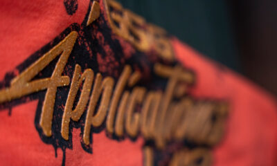
The next step is reviewing the artwork and looking at a fast set of separations to reproduce the design as quickly as possible. Example: A supplied graphic that has some hand-drawn elements incorporated and some border and custom type pieces was presented for reproduction (Figure 2). This design was to retain some of the original rough quality and still look decent on the shirt. Due to the way the artwork was done, it was a good candidate for index separations, so it was prepped for the separations, broken up into the different colors in the index table, and then split into a digital proof for review and output.
The first step was to size the graphic into the exact size that would be printed onto the garments. Fashion garments were specified, so the printed area was smaller than a standard T-shirt and would have to be reviewed from the smallest sample size first to make sure the design would fit on the full range of garments without a costly revision of the screens. Once the size of the design was determined, the file was sized to 200 dpi at the actual printed size with a little border allowance (Figure 3).
The next step was to extract the design from the background. This file came flattened, so it was a little more of a challenge to define the edges. A combination of the Magic Wand, Color Range, and the Channels menu was used to create a version of the design that was separated from the background properly. Once the design was on the background, the client requested that a soft glow be put behind the edges of the design so it wouldn’t fade into the heather pattern of the gray shirt. When this was done, a sepia-tone effect was used on the design to make it look more rustic and give it an antique feel (Figure 4).
Index separation for the design
To separate the design, I created a duplicate of the file and then switched the image mode to index color. I made sure the preview was off and then selected the custom selection from the available palette menu in the index-color dialog box. I then edited the color table that popped up by clicking in the bottom right corner and dragging up to the top left corner and releasing the mouse. This action simulated the creation of the blend in the color table, but I just used it to quickly select white from the first color and also white as the last color so I could turn the whole table to white.
I then went in and selected the colors from the design to pop in as my index-table colors. A fast and effective way for me to do this was to pick my dark brown and then click and drag it over two color blocks and then select my lightest brown. Doing this created a smooth blend in my color table, from my dark to light colors, and saved a lot of time trying to click on just the right colors (Figure 5). Once I had my color table selected, I then saved it and allowed the conversion to index color to proceed. At first, it didn’t look very good, and I had to darken some of the middle brown colors and then add a lighter color; but after a few quick tweaks, it was looking good.
The last piece was my underbase. All I had to do was go back to my original file and then create a grayscale knockout of my glow that I wanted to combine with my underbase file. I created this by control-selecting on the active layers and then creating a layer on top of them and filling them with white. I then converted the layer style from a white glow to a black shadow. I then flattened and saved the file under a different name (glow_tiki.psd).
Recombining, proofing, and outputting
The final step in the separations was to go back to the index file, open the color table, and convert each color that was separated in the table to black one at a time and all the other colors to white. Copying and pasting the resulting file into a digital proof mock allowed me to see how the colors would stack together. When you do this, make sure all working files are of the same resolution so you can import and save the art without any quality issues.
I could have saved the art files without the extra digital proof, but I always like to check files by quickly viewing each separation in print order. I copied and pasted the file from the color-table revisions into the digital proof and then, through the Channel Options menu, changed the color of the channels to match the ink colors. This way, the channels could be turned on and the separations viewed in print order, with the underbase first. Another bonus to recompiling the separations into a digital proof was that the separations could be tested against other shirt colors just by changing the first color in the separation set that blocks out the image channels.
The index advantage
A final note on to consider: Once the file was separated and recompiled, it could also still be used as a finished, compositional element to place onto shirts because all of the colors were 100% opaque—essentially spot colors. The design could be placed onto some mock-up fashion T-shirts with a sleeve-print accent—a perfect presentation piece—while being already separated and tested for printing (Figure 6).
The index-separated file could also have been imported into Adobe Illustrator and the spot colors in the separation files used in some overlaid vector elements or typography to create an art template that could be reused for different clients. The final art would already be separated, because the spot colors would import with a selectable palette of colors. The final artwork would not need a RIP processor unless the spot colors were blended in Illustrator, so the whole finished product could be comped up, sold, and sent to films from the same source artwork.
The index style of separations works well with fashion prints of hand-drawn artwork and it prints wonderfully on a wide variety of garments as long as the printer has the experience to use the smaller dots and the patience to practice and develop the specific qualities that this separation method uses.


Subscribe

Magazine
Get the most important news
and business ideas from Screenprinting Magazine.
Most Popular
-

 Case Studies2 months ago
High-Density Inks Help Specialty Printing Take Center Stage
-

 Art, Ad, or Alchemy2 months ago
F&I Printing Is Everywhere!
-

 Andy MacDougall2 months ago
Functional and Industrial Printing is EVERYWHERE!
-

 Columns3 weeks ago
8 Marketing Mistakes Not to Make When Promoting Your Screen Printing Services Online
-

 Editor's Note3 weeks ago
Livin’ the High Life
-

 Marshall Atkinson3 weeks ago
How to Create a Winning Culture in Your Screen-Printing Business
-

 Thomas Trimingham2 months ago
“Magic” Marketing for Screen Printing Shops
-
 Case Studies3 weeks ago
Screen Printing for Texture and Depth