Garment Printing
Published
13 years agoon
Wouldn’t it be wonderful if there were a way to create multiple orders from a single set of separations with only one screen that has to change? Of course this can be done the old-fashioned way, where the client has his name unceremoniously slapped underneath the design as an afterthought. But what about a creative layout wherein the client’s name is the highlight of the design?
Wouldn’t it be wonderful if there were a way to create multiple orders from a single set of separations with only one screen that has to change? Of course this can be done the old-fashioned way, where the client has his name unceremoniously slapped underneath the design as an afterthought. But what about a creative layout wherein the client’s name is the highlight of the design?
This is possible through the creative use of a process with a fancy term called variable-data printing. Any print can be considered variable data if multiple clients use it during the same print run, but the real challenge is to make it creative looking and not an obvious, boring name drop so that the clients love it and the shirts sell quickly. The term variable data, as it applies here, means creative ways to use one design for many different customers. A simple way to make this style of printing successful is to print a design that has a name drop on it and then integrate it with a complete system. This way it can become even more visually attractive and profitable by combining multiple clients into one large order that doesn’t look like a name-drop print.
A structured method is important to use for variable-data printing because any time work is done in parallel (for more than one client at the same time) it will magnify not only profits, but also problems. It is possible to minimize issues by creating a process that is controlled from the beginning during the design stages. One effective way to create variable-data screen prints is to start with the design template and then develop the artwork around the printing solution. That will maximize the visual impact while limiting the on-press headaches. The graphic template will need to be created so that the separation method can be executed using the pre-planned process of name dropping, stenciling, or overprinting.
Sales and marketing of variable-data screen prints
The proper marketing and education of clients during this process will save countless headaches during the printing of the final garments. There are certainly limits to these types of prints, so it is crucial that the customer’s expectations are addressed and managed during the sales process. The last thing a printer wants is to have the print run’s due date approaching and then find out that three of the clients want their full-color logos somehow embedded into the design.
The easiest way to market is to focus on the benefits to the client, which include the savings of art, design, screens, and shared cost of setup. Depending on the ease of printing and the overall scope of the order, some printers will also offer a portion of the volume print savings to their clients to really motivate the initial buy in. The limitations of the process must be explained carefully because multiple clients will attempt to push the boundaries of the name drop or stencil process to include all manner of things. As long as it is discussed up front during the sales and marketing of the variable-data process, it can be dealt with by either steering a demanding client into a separate, custom order or letting the additional cost speak for itself and allowing the client to make the decision based on their needs. Typically, this process works best if there is only one color and one screen to change out per client. Any time this limitation is not adhered to, the savings on the production end go up in smoke because registering the additional screens almost equals a whole new setup. Of course, there are always exceptions and clients that are simply worth the extra hassle, but a little education and prevention can really ease the burden on most orders.
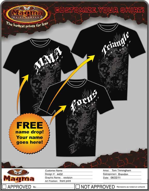
A simple sales piece that shows some of the possible variations for the artwork when it is personalized can make a big difference in properly educating the client and addressing many of the potential issues (Figure 1). There will still be impossible requests, but having a visual reference makes for an easy discussion about the limitations while still giving some options for compromise.
Design and separation for variable-data screen prints
The goal of having a name drop shirt that doesn’t look like it was a name drop is a challenge that needs forethought to make it production-friendly when it is first being created. It is ok to have a design that is simple and clear, but for a shared design to define a higher value, it will often need to spark some interest and look more like a custom piece of artwork than a quick identification piece.
The simplest version of a name-drop design typically will have the name arched over or under a curved element in the design, then the graphic will have this screen line up with the other colors that have been previously placed into the press. One option that can save time and money is to have the separations replicate just the name drop several times on a screen rather than create one whole new screen for each name. Depending on the wiggle room in your press, you can often create four to six name drops on a screen and then slide the screen out a little for each one. If you’re printing manually, this process can even be quicker, depending upon the design. The drawback to doing it this way is that you will end up having two trap colors and there may be a little ink pick-up on the back of the name drop screen that you will have to watch for as you slide it out and change names—unless you flash in between the final color and the name drop.
In the example design, the banner that is used for the main design has a flag in the middle with type that has a custom envelope forcing it into the shape that arches over the top (Figure 2). By using a vector-based software program like CorelDRAW, it is possible to create an envelope shape with live text that can be edited easily for multiple names and then the whole design can be changed quickly without making a time-consuming revision. The way to then separate this artwork into a variable-data print is to stack name drops above each other on the screen and then rotate others so they fit several up on each name drop screen (Figure 3). This works as a name drop that overlaps some of the design elements because the trap color is black ink and won’t show when printing over the top of other colors, as long as ink deposits underneath are not very thick.
An important consideration on all variable-data printing is to thin out the accent colors when overlaying trap colors. Whenever possible, it is ideal to use a chino base or other thin-ink base that will allow the ink to soak into the garment to give the best final result to the overprinted areas. The drawback is that opacity can be compromised. Make certain colors are opaque enough to block shirt colors when working with dark garments.
Working with stencil designs
Stencil design relates to the type of personalized print that is overprinting on top of a texture, picture, or graphic and it has the type knocked out so that the picture shows through the type. A typical design may have a shape or some sort of area around the personalized name that will cover over some of the texture and create the illusion that the design is a custom piece created just for that client (Figure 4).
Designing these types of designs can be a little tricky because the background graphics have to work for a variety of typographic changes. It will sometimes seem inevitable that a client with 45 letters in its name will want to try to jam it all into the stencil area. The goal is to make the embellishment underneath work for the majority of simple names and not to get too caught up with exceptions. Most of the time, if the client is excited enough, they will be okay with the extra cost of doing a separate run (as long as they have enough quantity to justify it), and it will be a moot point if their name doesn’t fit or if they must have their logo with the giant panda in it.
It is especially important when creating stencil designs for mass production that the colors underneath have a good balance from the top to the bottom of the potential image area. Test the design with a couple of different name sizes and types (with ascenders and descenders in the fonts) to help isolate any potential problems that will crop up during production.
One other development issue that is more design specific is when the background image has asymmetry or specific points of high interest that need to be shown through the front type graphic for it to look good. In these cases, it is a sales and marketing job to define when the graphic will work and when the name drop just won’t look good.
In the example graphic, the type that will be stenciled out of the background needs to be very simple so that the front of the design shows the proper imagery in the right places (Figure 5). This stencil style is more of a hassle on the preproduction end because each name drop will have to be carefully manipulated to make certain that it will display the background in the proper places. The final effect can be very dramatic and worth it. This style of stencil will have to be tested and will probably have a type-character limit to keep it from being mashed together. The burden can be placed on sales to communicate this with interested clients.
Composite designs as variable-data prints
In many ways the composite design is the simplest type of a variable-data style to print. The way these designs are compiled and stacked on top of each other makes it a lot less important if the registration and the clarity of the drop screen vary a little. Graphics in these designs tend to be distressed—an advantage in case the final print has less-than-perfect edge quality. Many composite prints will even look cool and develop a unique style if the drop image is not completely opaque and allows the graphics underneath to show through the top overprint to a certain degree. What could be a better scenario for a name-drop shirt than this?
The hardest part of creating composite designs is to find artwork that has the proper urban feel without looking like clip art. Some of the best looking composite designs on T-shirts have a hand-crafted look to the artwork and a lot of detail, engraved textures, flourishes, or tribal elements that serve as a background for the images that will stack on top of them (Figure 6).
Though these designs may sometimes seem to be thrown together, they actually can take quite a long time in development and separation to get them to merge together well. Without delving too deeply into an art-for-art’s-sake discussion, the abstract designs need to have a visual direction and a good combination of texture, contrast, and a properly developed merging of layers to create something that looks like more than a jumbled mess. Think of it in terms of a kaleidoscope with different elements overlapping and combining to form a harmony of sorts that accentuates the shirt itself rather than a random stacking of imagery.
One method of creating personalized designs for composite imagery is to have a cutout of just the area that includes the name similar to the simple name drop. This adds a screen, but it also allows for the stacking of names onto screens so that more customers can be combined onto one screen should the layout allow it.
There is also a strong trend in composite designs for the artwork to be printed in alternative locations on the garment. This can add challenges to production, so it is a good idea to look at how the garments can be loaded and printed effectively on the press and whether the design flows off of the standard press location, it can be advantageous to print the garment for the background imagery and then come back later and personalize it with a separate print run. This can actually be the smartest way to handle some alternative location prints, particularly when the job involves a wide variation in garment sizes and the personalization has to shift position in relation to the background to look right on the shirt.
The limits as to how a creative, variable-data screen print is put together are only defined by the innovation that the art and production departments can create. These types of orders can be very attractive to new customers because they allow them to sample some of printer’s products and services without incurring the initial setup costs. The drawback to a printer is that it requires some education. One final thought is that all processes can be refined through trial and error, and the execution of variable-data printing can be practiced and made very profitable by the careful recording of each area in the marketing, art, separation, and production/fulfillment stages. Each process can be made better, more efficient, and can assist the next department in creating a whole new method of capturing new clients with a minimum amount of effort in art and separations.


Subscribe

Magazine
Get the most important news
and business ideas from Screenprinting Magazine.
Most Popular
-

 Case Studies2 months ago
High-Density Inks Help Specialty Printing Take Center Stage
-

 Art, Ad, or Alchemy2 months ago
F&I Printing Is Everywhere!
-

 Andy MacDougall2 months ago
Functional and Industrial Printing is EVERYWHERE!
-

 Columns3 weeks ago
8 Marketing Mistakes Not to Make When Promoting Your Screen Printing Services Online
-

 Editor's Note3 weeks ago
Livin’ the High Life
-

 Marshall Atkinson3 weeks ago
How to Create a Winning Culture in Your Screen-Printing Business
-

 Thomas Trimingham2 months ago
“Magic” Marketing for Screen Printing Shops
-
 Case Studies3 weeks ago
Screen Printing for Texture and Depth