Press Releases
Announcing the Pantone Color of the Year 2020 Pantone 19-4052 Classic Blue
Let’s Talk About It
Creating a More Diverse and Inclusive Screen Printing Industry
LET’S TALK About It: Part 3 discusses how four screen printers have employed people with disabilities, why you should consider doing the same, the resources that are available, and more. Watch the live webinar, held August 16, moderated by Adrienne Palmer, editor-in-chief, Screen Printing magazine, with panelists Ali Banholzer, Amber Massey, Ryan Moor, and Jed Seifert. The multi-part series is hosted exclusively by ROQ.US and U.N.I.T.E Together. Let’s Talk About It: Part 1 focused on Black, female screen printers and can be watched here; Part 2 focused on the LGBTQ+ community and can be watched here.


Looking Back at the Early Years of Screen Printing: A Color Separation Showdown
Gildan Donates Surgical Equipment to Mario Catarino Rivas Hospital
INX University Expands Online Curriculum Program


Bulletins
Get the most important news and business ideas from Screen Printing magazine's news bulletin.
-

 Columns1 month ago
8 Marketing Mistakes Not to Make When Promoting Your Screen Printing Services Online
-
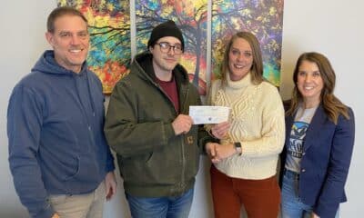
 Press Releases4 weeks ago
Hope Harbor to Receive Donation from BlueCotton’s 2024 Mary Ruth King Award Recipient
-

 Press Releases1 month ago
Sports Inspired Clothing Market: The Influence of Sports on Fashion Forward Looks
-

 Editor's Note1 month ago
Livin’ the High Life
-

 Marshall Atkinson1 month ago
How to Create a Winning Culture in Your Screen-Printing Business
-

 Case Studies1 month ago
Screen Printing for Texture and Depth
-
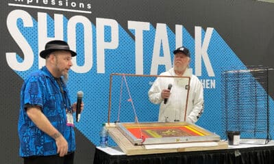
 Headlines1 month ago
Live Poster Printing Raises $30K for Charity
-

 Headlines1 month ago
613 Originals Takes a Unique Approach to Sales Presentation