Case Studies
Designing a Rock ’n’ Roll Shirt the Old Way
A look back at my experiences working with printing music merch designs on dark garments.
IN 1976, I WAS WORKING as a graphic designer for the ABC Corp. (TV and radio) and was asked to design the button that would be given away at the Wings concert when they played Madison Square Garden. The design was fairly simple, just the band’s logo and the words, “Wings 1976 Tour.”
While putting together the design for the button, a family friend came to visit me. As it turns out, he had quit his job and was involved with selling bootleg rock shirts on the streets during concerts. When he saw what I was doing, he asked if I could blow up the design, add some colors, and give him the separations so his printer could use them for his T-shirts.
I sent out to have some stats (paper positives) made and gave him the finished separations.
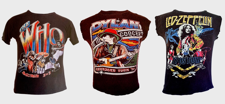
Never having designed a rock shirt, I didn’t understand anything about size. When I first blew up the design, it looked big to me since I was used to seeing designs on 8 ½” x11” paper. Once the design was on a shirt, it appeared very small. Lesson learned…think big.
A few days later, my friend came back and asked if I could do something more creative with more colors. I designed a new image that was much larger and more colorful. This design sold very well.
Eventually, he asked me to go into business with him designing shirts for concerts and taking care of my freelance clients. We drove to Bedford Stuyvesant, Brooklyn, and rented a 15,000-square-foot factory. I quit my job at ABC. And just like that, my rock ’n’ roll career was off and running. Now, all I had to do was learn something about “silk screening!”
Design Do’s
By the way, back then the designs we printed were for bootleg rock shirts when the licensing regulations weren’t as strict, although, eventually we did legal work as well. Once I was deeply involved with screen printing on black shirts for rock concerts, I came to several conclusions so the shirts would sell.
- Design big. However big you think is big, go bigger.
- Add the faces of the group or individual.
- Get a copy of the newest album available.
- Make sure the design can be seen from about 15 feet away.
- Make sure the design can be seen under dim light conditions. Most rock concerts are at night. The shirts we sold mostly were sold in parking lot kiosks or on the street where the lighting was poor.
Since this was an important part of our business, this is the way we designed for the rock concert designs:
- Since we would be printing on black shirts, we designed on black illustration boards.
- We used Craypas (oil-based pastels), which were similar in appearance to plastisol ink, for our illustration.
- We used the same number of Craypas colors that we would print.
- Added registration marks to the design so the separations could easily be registered.
- We used a Robertson 480 Low Bed camera to do our separations. The separations were done as a 4-color process but were cut apart to create additional colors. 4-color process doesn’t work well on black shirts since the inks are transparent and we needed opaque inks.
- Color order is critical. We designed so the earth tones (blues, greens, purple) printed early in the progression because they could hold up with screens coming down on them. Then, we worked our way toward to lighter colors (orange followed by yellow) with white always printing last. This is before the flash was invented and color order was very important, so the design looked strong.
- We made sure that there was a lot of color on color since that added additional colors to the design and made it easy to set up since the registration wouldn’t be as critical.
- We always made sure that the black of the garment was a critical part of the design, so the print and shirt were considered as one.
- Once the illustration was completed, we would hang it on the wall, dim the lights, and see if we could identify what was on the illustration. If we could identify everything, we knew the shirts would sell.
- If we couldn’t identify everything, we would rework the design. Once the design was approved, we would start the separations by combining the films from our graphics arts camera and adding hand separations.
The finished separations took about 30-40 hours per design since computers were not available at that time and everything had to be done by hand.
Advertisement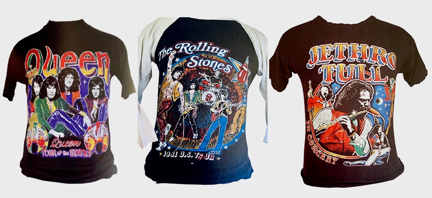
Old School Ways
Next, we would take the separated films and cut them apart and paste them together to form new colors. We would then add some hand stippling using Rapid-O-Graph pens with non-crawl added to the India ink so it would stick to the film. Once done, we would shoot the separated images into finished films.
We never knew how a design would really look until we had it on press. But we had a pretty good idea of what it would look like, and the prints usually were successful.
At that time, we didn’t understand much about screen mesh, but we knew we needed to get a lot of ink down on one stroke, since Precision presses were only able to do a single stroke. We used a 93 mesh, which unfortunately isn’t available today. If I were going to try to duplicate the designs today, I would use either an 86/100 mesh or, more likely, a 110/80 mesh.
The inks were a critical part of the process. Since there weren’t flash units invented yet, everything had to be printed using opaque inks without an underlay. We found that Union Ink made the most opaque ink available at that time.
We used several colors all the time that were custom made for us. In fact, we used them so often that Union eventually added them to its catalog because the staff got tired of making them as a custom color.
AdvertisementLet’s Talk About It
Creating a More Diverse and Inclusive Screen Printing Industry
LET’S TALK About It: Part 3 discusses how four screen printers have employed people with disabilities, why you should consider doing the same, the resources that are available, and more. Watch the live webinar, held August 16, moderated by Adrienne Palmer, editor-in-chief, Screen Printing magazine, with panelists Ali Banholzer, Amber Massey, Ryan Moor, and Jed Seifert. The multi-part series is hosted exclusively by ROQ.US and U.N.I.T.E Together. Let’s Talk About It: Part 1 focused on Black, female screen printers and can be watched here; Part 2 focused on the LGBTQ+ community and can be watched here.


Atlantis Headwear Goes Solar for Sustainable Future

Comfort Colors Announces New Proprietary Dyeing Process Called “Pigment Pure”

10 Production Scheduling Secrets That Will Have Your Team Ready to Rock


Bulletins
Get the most important news and business ideas from Screen Printing magazine's news bulletin.
-

 Case Studies2 months ago
High-Density Inks Help Specialty Printing Take Center Stage
-

 Art, Ad, or Alchemy2 months ago
F&I Printing Is Everywhere!
-

 Andy MacDougall2 months ago
Functional and Industrial Printing is EVERYWHERE!
-

 Columns3 weeks ago
8 Marketing Mistakes Not to Make When Promoting Your Screen Printing Services Online
-

 Editor's Note3 weeks ago
Livin’ the High Life
-

 Marshall Atkinson3 weeks ago
How to Create a Winning Culture in Your Screen-Printing Business
-

 Thomas Trimingham2 months ago
“Magic” Marketing for Screen Printing Shops
-
 Case Studies3 weeks ago
Screen Printing for Texture and Depth