Thomas Trimingham
Blending Colors for Better Prints
Mixing hues to save a screen sounds like a great idea, but it’s not as simple as kindergarten art class.
To most printers, the idea of blending colors means the process of using two colors to make an additional one. Let’s say a job includes a yellow screen and a blue one, and the design also has areas that are green. The printer can use the yellow and blue to create the green areas and save an additional screen. But this only works when the colors are the right hues to begin with. If you tried to attempt such a blend with a yellow gold and a deep royal blue, then you would likely end up with a brownish, olive green that wouldn’t be appealing.
To most printers, the idea of blending colors means the process of using two colors to make an additional one. Let’s say a job includes a yellow screen and a blue one, and the design also has areas that are green. The printer can use the yellow and blue to create the green areas and save an additional screen. But this only works when the colors are the right hues to begin with. If you tried to attempt such a blend with a yellow gold and a deep royal blue, then you would likely end up with a brownish, olive green that wouldn’t be appealing. To determine how to properly blend colors, the key is to print some overlapping hues that combine with each other so you can actually see what you will get in the final print.
The purest sense of blending colors and the widest possible results are achieved through four-color process, where cyan, magenta, yellow, and black are printed as small dots in close proximity. When viewed from a distance, the dots combine visually to create the illusion of a complete array of colors. Not every printer wants all of the challenges of process color printing, however, and that’s because every small issue in production will typically show up in the final print.
There is a way you can use your inks to blend colors that doesn’t cause as many headaches as process color. Through this technique, you’ll utilize the natural blending properties of the inks in tandem with some bump colors to create the more difficult-to-control hues. This means that you will create the easy-to-make blends by combining your base colors (yellows, reds, blues, and black) and then add screens to create any colors that may be out of gamut or close to impossible to get without a ton of testing of inks, screens, and production methods.
Before you dive in, a word of caution about blending inks to make extra colors: The better control you have of dot gain and ink flow, the better your chances of success. So before we go on, it would be useful to look more closely at these issues.
Dot Gain and Ink Flow
Think about a printed dot of ink being like a tiny Oreo cookie on a shirt. You know what would happen if you left 10 Oreos on a chair stacked on one another and happened to sit on them. The middles would all squish out and merge together. This is a bit like dot gain on a screen-printing press. Too much pressure from the screen and squeegee will smash the dots together and/or pull them back off of the shirt onto successive screens. This happens more easily on an underbase because the solid ink film after flashing is more like a table than the fabric of a chair – it’s a harder surface and the Oreos will just smear faster. To protect against dot gain, you must print with a tight screen and just enough squeegee pressure to release the ink.
Ink flow is another issue that will affect the print quality of your color blends. The major factor that determines ink flow is viscosity, a fancy term that denotes how thick the ink is (in regards to how well it will flow through an opening). For an extreme example, think about how water flows through a straw compared to a thick chocolate shake. Since the shake has a higher viscosity, it takes much more pressure to draw it through the straw. Most inks that a screen printer gets from a distributor are too high in viscosity for effective halftone printing. Unless they were specifically prepared as a low-viscosity product, the inks will have too much pigment and the base will be too thick to go through the small hole of a finer mesh used for halftone work.
So to compensate, guess what many printers do. That’s right – they ramp up the squeegee pressure in order to get the ink to flow, and then they see excessive dot gain on their halftones.
The best way to control ink flow is to discuss the proper use of additives with your suppliers and make some specific collections of inks that you’ll use just for detailed work. Call them your halftone ink blends or something similar. The important thing is to add the proper amount of a curable reducer, or a shape or flow additive that will allow the ink to flow through the stencil and mesh to blend colors in halftones without forcing you to use excessive pressure.
How much of an additive should you use? It depends on the ink, the additive, and the design that you are attempting to print. Remember, a decrease in viscosity can also mean a decrease in opacity (or the degree to which the ink is no longer transparent), so ease into ink additives and test a light adjustment in viscosity before you overdo it and waste your inks and test shirts.
Doing a Pre-Test
Once your ink flow and dot gain are under control, then you can commence with some color blending tests. These are fun if you do your homework because it’s very easy for artists to predict how to adjust colors to get the proper results on press.
A simple overlapping grid will show how some of your primary colors interact at different percentages (right). This grid can help artists reverse  engineer the separations by allowing them to check the color combinations before outputting a positive film or burning a screen. It is important to note that this test should be produced using the same dot shape, size, frequency, angle, and printing pressure as the design that will be printed. This is the best way to ensure that the final colors will be similar. In this example, I used square dots (stochastic or diffusion dither) at a 210 frequency printed from a 305 mesh. On short runs, it can be beneficial to avoid printing the halftones at multiple angles so there will be less chance of dot frequency (moiré) patterns. This causes moderately more dot gain, but the results are typically better with fewer headaches.
Choosing an Image to Color Blend
Not all images are suitable for this technique. Some will have secondary and tertiary colors that are difficult to create through blends. Many will have reference (or memory) colors, such as flesh, wood, steel, etc., which we have the ability to quickly spot when they are not correct. Others will have a lot of colors that are close to gray or light pastels, which are both very difficult to mix on press and maintain during a print run. Some images will consist entirely of secondary or tertiary colors, and in those cases it may not make sense to use a primary color because then the overall color tone won’t be consistent.
Other situation that makes color blending less appealing are designs featuring large areas of flat color, such as type or geometric shapes. Trying to blend colors in such areas often produces poor results that are inconsistent and hard to control during printing. An additional challenge to watch out for is images that are very dark or very light, with a lot of colors in deep shadows or washed out, as in watercolors. These high- and low-value images are typically very hard to blend and will end up looking muddy or shift quickly, becoming too bright or too dark.
Creating Color Blends During Separation
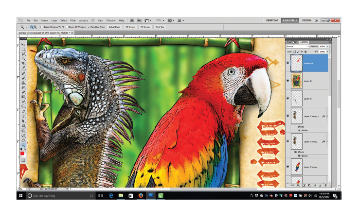
 For this article, rather than creating an image with all of the variables associated with four-color process printing, I went for an easier-to-control simulated process blend with a few bump colors. The image to the left is a decent candidate for color blending because it has all of the required primary colors (yellow, red, blue, and black) and some common secondary colors (green and orange). Many printers would see this image and think it is perfect for four-color process. The biggest problem, however, is that it contains hot reds, deep royal blues, and light tans on the outside that can be difficult to hit through process color without a lot of homework.
I started by reviewing the design for problem areas. I looked for memory colors, and although the bamboo was a bright green, the bird and the iguana were both fairly predictable and able to withstand some small color shifts, so no major edits were required. One of the most common problems with separations for color blending is that the original files show significant color pollution. This is where an image has, on close inspection, a rainbow of colored pixels in its grays and neutral colors, as well as areas where extra colors appear where they shouldn’t be (such as yellows in royal blue or magenta pixels in greens). If you see a design with color pollution, consider editing out the extra colors prior to doing the color separation. Even if you were able to separate the polluted design and it came out acceptable, you’d still have gotten better results with an edited file, and often it will save you costly revisions of positives and screens. So make sure you zoom in close on flat areas of color and pay special attention to royal, green, red, maroon, brown, and gray to look for unnecessary colors invading.
Since this design was being separated for a white shirt, no underbase was required. I only needed to prep the design for CMYK adaptation. The easiest way to recreate this design and blend the colors was to pull a set of four-color separations and then edit those channels to take out any colors that wouldn’t produce the hues that were shown in the test print on the garment.
Advertisement
Prepping the Design
The first step with any design that will include significant color blending is to color correct it prior to separation. This may seem a little backwards – you might think that the color correction should happen as the design is being separated – but typically the best results are achieved where the image is corrected before being split apart so that all of the hues in the design can balance against each other.
For this design, I color corrected the blues, outside border tans, reds, and yellows. I did this to remove extra colors that would pollute the final design. From experience, I knew that the royal blue would have a lot of magenta in it, and even though I was going to take out most of this and use a spot color, I didn’t want the existing blue to turn purple in the surrounding areas. To prevent this, I used the Color Range tool and selected the majority of the blue and other colors that might be an issue. One at a time, I selected them, copied them to an extra layer, and then color corrected just those pieces. Doing the corrections in this manner allowed me to quickly undo it if I didn’t like the result, and in the event a correction seemed to harsh, I could always lower the layer’s opacity and combine it with the original image to moderate the adjustment.

After the color corrections were complete, I made the final adjustments for the image to be converted to CMYK and then separated. These are the steps I took to create the four-color foundation:
1. I edited the color settings in Photoshop (below), making sure the black was set to maximum;
2. I created a duplicate of the original file with a white background;
3. I selected the Image/Mode/CMYK option from the image menu;
4. I copied and pasted each channel into an alpha channel in the original file with the channel options set as the proper CMYK color;
5. I used the Color Range tool to select the spot colors (red and royal blue) from the original file and then pasted them in as respective channels;
6. I extracted the spot colors and blended them out from the CMYK channels using the Curves menu;
7. I digitally proofed the final design by turning on all of the “eyes” and checking for color pollution;
8. Finally, I adjusted the design for dot gain (particularly the black).

I decided to use a stochastic or square dot to minimize the chance of moiré and also to maintain the detail in the lizard and macaw feathers. Using a stochastic dot can make the image appear somewhat grainy because all of the dots are the same size, unlike a traditional halftone dot, which varies in size depending on density. But since stochastic dots are randomly generated and not at an angle, they tend to cause interference with the pattern of the screen mesh, so I felt this would be an acceptable trade.

Color blending can be complicated, but with proper image preparation, ink adjustment, and press modification for dot gain, the final results can appear dramatic while saving money and still getting a “wow” from the client.
Let’s Talk About It
Creating a More Diverse and Inclusive Screen Printing Industry
LET’S TALK About It: Part 3 discusses how four screen printers have employed people with disabilities, why you should consider doing the same, the resources that are available, and more. Watch the live webinar, held August 16, moderated by Adrienne Palmer, editor-in-chief, Screen Printing magazine, with panelists Ali Banholzer, Amber Massey, Ryan Moor, and Jed Seifert. The multi-part series is hosted exclusively by ROQ.US and U.N.I.T.E Together. Let’s Talk About It: Part 1 focused on Black, female screen printers and can be watched here; Part 2 focused on the LGBTQ+ community and can be watched here.


The Profit Impact of a Market Dominating Position

Inkcups Announces New CEO and Leadership Restructure

Hope Harbor to Receive Donation from BlueCotton’s 2024 Mary Ruth King Award Recipient


Bulletins
Get the most important news and business ideas from Screen Printing magazine's news bulletin.

-

 Case Studies2 months ago
High-Density Inks Help Specialty Printing Take Center Stage
-

 Art, Ad, or Alchemy2 months ago
F&I Printing Is Everywhere!
-

 Andy MacDougall2 months ago
Functional and Industrial Printing is EVERYWHERE!
-

 Columns3 weeks ago
8 Marketing Mistakes Not to Make When Promoting Your Screen Printing Services Online
-

 Editor's Note3 weeks ago
Livin’ the High Life
-

 Marshall Atkinson3 weeks ago
How to Create a Winning Culture in Your Screen-Printing Business
-

 Thomas Trimingham2 months ago
“Magic” Marketing for Screen Printing Shops
-

 News & Trends2 months ago
What Are ZALPHAS and How Can You Serve Them in Your Print Business?