Andy MacDougall
Real-World Color: How to Mix It, Match It and Reproduce It Repeatedly
Andy MacDougall talks with a master printer about the challenges of producing perfect colors.
IT SEEMS LIKE THE entire printed graphics world has turned to digital processing and imaging. The need — and skills — required for custom mixing and printing of spot colors faded into a blur of stochastic dots spit out by 4-, 6-, and 8-color print heads. The actual printing of a specific color is controlled by the algorithms of the computer and a button. Don’t get me wrong; that’s some fancy printing hardware and software. But nobody is mixing inks in the digital world.
Screen printers, being a different species of printer, continue to work in a world where designers still call for spot colors, because it’s what we do. And Pantone, the color-matching system that has been a worldwide common language between designers and printers since 1963, still remains in use.
Lawrence Herbert is the former chairman and chief executive officer of Pantone®, Inc., a firm best known for the universal standards and multinational color language provided by its publications, software, hardware, and related products and services. After earning a Bachelor of Arts in biology and chemistry from Hofstra University in 1951, Herbert joined Pantone in 1956 as a color matcher. He bought the company in 1962, and in 1963 invented the world-renowned Pantone® Matching System®. This, of course, became the gold standard for global communication of color in the printing, publishing, packaging, graphic arts, paint, plastics, coatings, computer, film, video, textile, and fashion industries, according to information from Hofstra University.
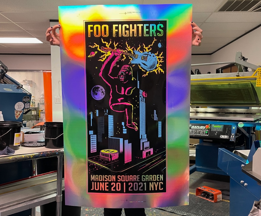
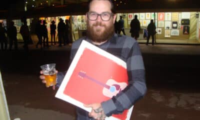
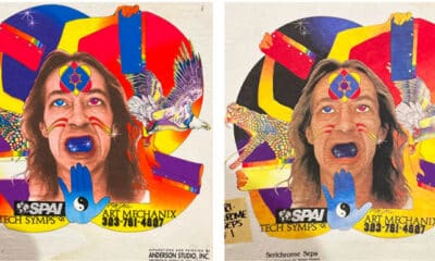
The Foo Fighters Foils flew across a parking lot before they made their way to Madison Square Gardens for the re-opening of the venue after Covid.
The concept was simple enough, and most readers know it and use it. Starting with a basic color palette of standardized base inks, a three-digit number gave precise mixing formulas that allowed a printer to match a color specified by an artist or designer. The colors were printed in a book or color fan and would be the same one used by the designer and the printer. Color by the numbers.
As the system was adapted worldwide, the benefits outweighed problems and challenges. Over the course of decades, it became universal. And then it became colossal. A few years ago, it became somewhat stupid, as it chased its technological tail. Color of the Year? Please….
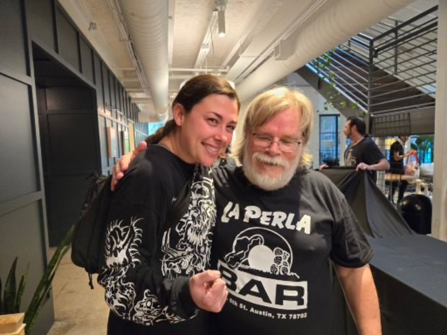
However, it’s still in use, and in Episode 21’s podcast of Art, Ad, or Alchemy, we’re going to meet a master printer from the flatstock department at Industry Print Shop in Austin, TX, and talk about color. Mixing it. Matching it. Reproducing it on repeat jobs. Madeline Hagy — Maddy to her friends — showed me around the ink room, where we were joined by designer Bart Kibbe.
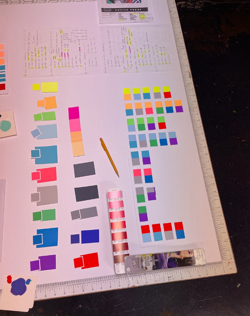
Once colors are decided, it’s time to scale up the mix quantities. Maddy keeps detailed notes on the mixes in case they are needed in future jobs. It’s like she’s got her color swatch book laid out in the ink room with the secret formula written down.
The discussion that followed was a dissection of the Pantone Matching System from the design and production side, and a dive into why its use is increasingly problematic for textile and flatstock screen printers. We also chatted about some of the bonehead moves that leave everybody wondering what is going on at Pantone corporate.
The biggest question mark for graphic designers is, “Where did Pantone go?” It’s no longer bundled with Adobe, so the days of easily integrated color specifying is gone, unless you did some online downloading and fakery to create a workaround. Now it’s a subscription, the digital death by a thousand cuts that now is all the rage.
Many years ago, after some bright lights decided to do away with sequential numbering of colors in the Pantone swatch books, there is very little rhyme or reason to the way the books are laid out. Even with so many color shades and choices, the books now are reduced to mixes obtained only using CMYK to more closely match digital output devices.
Printers have the additional burden of dealing with designers wielding a swatch book with colors and metallics and who knows what else that does not match the swatch book in the print shop. Henry Ford had the right idea. Any color you want, as long as it’s black.
While we’re piling on, a few other areas — some specific to screen printing and spot-color reproduction — came up:
- Specifying a color from a design on an uncalibrated screen, expecting it to match the swatch book color. Most designers and nearly all people don’t understand that their cell phone or tablet image color is not the same as a print shop’s computer. Their version of a Pantone color is not the same as the real one they are specifying.
- Those base mixing colors used to achieve the color swatches? They are not the same as the base colors screen printers have available in their ink lines. This means the formulas and measurements are not accurate. It doesn’t help that the folks at Pantone actually shifted their base color formulas, so even their own books don’t match with older versions.
- The range of substrates and their colors completely affect the printed color on top. This adds another layer to the challenge of hitting a specified color, which originally was printed offset on white paper with transparent inks. Many clients are unaware of this and that color perception changes, depending on lighting and the background color.
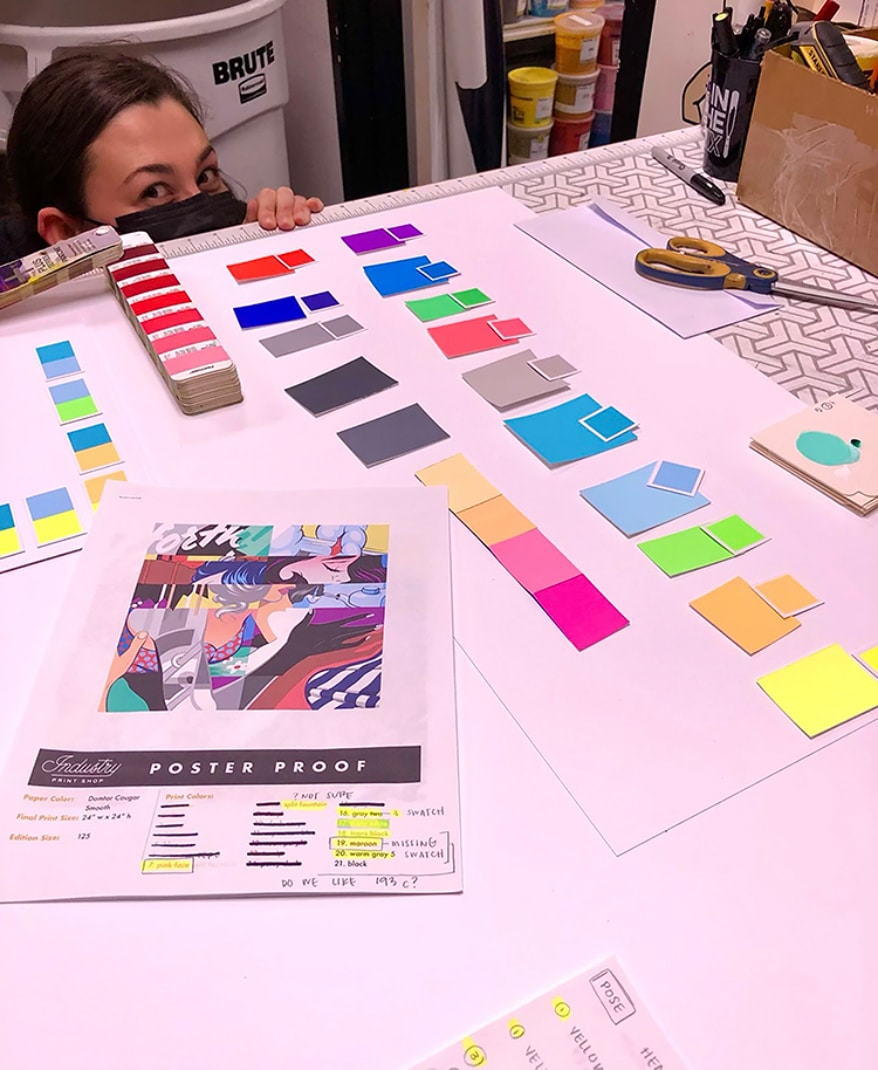
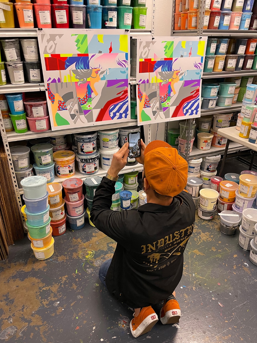
Measure, mix, test. This is for the Pose print we talk about in the podcast. Madeline is hiding because she has even more colors to go.
Unless the artist sends swatches of their own paint mixes, we’re stuck with Pantone as a guide despite all the challenges, plus a lot of color mixing skill. In Maddy’s case, it was a systematic approach with meticulous measuring and recording that produces consistency, great work, and happy clients.
Madeline’s background, which she goes into in the podcast is interesting. Although she ended up attending Savannah College of Art and Design, she remembers seeing live printing at music events around Austin in her teens. The company doing the printing was Industry. They still do. I met Maddy at Flatstock, where she was live printing at the Industry Stage. At college, she was exposed to many print methods, but fell in love with screen printing. She ended up being a print shop monitor (similar to Dan Gilsdorf in Podcast 20 on Functional Printing) so she could print all the time. She even took a job working in the school cafeteria after graduation, which gave her, as an employee of the college, continuing access to the print studio.
She ended up back in Austin, and got a job catching prints on the textile side of the shop. Eventually, she ended up where she wanted to be; in the flatstock department. She has worked her way up to master printer, where she oversees all aspects of production. The studio runs a couple of semi-auto Saturns, and they print mostly with TW inks, using both waterbase and UV, depending on the job and the materials. They not only print limited edition artwork but do a lot of rock posters and commercial flatstock jobs on different materials used for signs and labelling. At any given time, she and her assistant have six or seven jobs moving through production.
Maddy, and some of her co-workers, describe her as obsessed (in a nice way!) with color, accuracy, quality, and repeatability. There’s nothing wrong with that! The last time I saw color matching and testing like Maddy carries out, I was in the print shop at Boeing, where two guys in white lab coats used spectrometers and scales to match color samples. They checked them under a variable lighting rig with every bulb type imaginable. She makes do with a bit less, but still follows a protocol she outlines in the interview.
- Small batch, mixed and measured by weight.
- Test. Adjust.
- Larger batch following measurements. Test by printing through a sample screen on material, both the same as in production.
- Test under daylight after drying.
- Modify and test again when on press.
Tony Diaz, the head honcho at Industry Print Shop, checks proofs of the Pose print. Tony has built Industry into a top creative shop, with both flatstock and textile production sides. They are also known for their live printing and organizing events bringing designers and printers together.
All measurements are recorded on the samples and leftover ink containers, as these are used on reprints. She tries to keep the entire ink room looking like the Pantone book should be, with colors sorted by shade in a nice logical order. Find out about her favorite print jobs — the Foo Fighters concert as it opened Madison Square Garden after Covid is one example. And what does she enjoy outside of printing? Hint, it’s not hockey! She shares that and lots more about color and screen printing in Podcast 21 of Art, Ad, or Alchemy?
Listen to the Podcast here.
For more info:
Industry Print Shop: industryprintshop.com
Madeline Hagy: @alientender
Contact: flatstock@industryprintshop.com
Let’s Talk About It
Creating a More Diverse and Inclusive Screen Printing Industry
LET’S TALK About It: Part 3 discusses how four screen printers have employed people with disabilities, why you should consider doing the same, the resources that are available, and more. Watch the live webinar, held August 16, moderated by Adrienne Palmer, editor-in-chief, Screen Printing magazine, with panelists Ali Banholzer, Amber Massey, Ryan Moor, and Jed Seifert. The multi-part series is hosted exclusively by ROQ.US and U.N.I.T.E Together. Let’s Talk About It: Part 1 focused on Black, female screen printers and can be watched here; Part 2 focused on the LGBTQ+ community and can be watched here.


WB Week 2024: Water-Based Ink Workshop Coming to MADE Laboratory in July

‘Imagine Them in Their Underwear’: Charlie Taublieb Recalls His First Industry Speech

Lawson Opens Its Doors for Technology


Bulletins
Get the most important news and business ideas from Screen Printing magazine's news bulletin.
-
 Press Releases1 month ago
Infinity Her Teams Up with Nonprofit to Celebrate Volunteers During National Volunteer Week
-

 Marshall Atkinson2 months ago
10 Production Scheduling Secrets That Will Have Your Team Ready to Rock
-

 Columns2 months ago
The Profit Impact of a Market Dominating Position
-
 Columns1 month ago
Looking Back at the Early Years of Screen Printing: A Color Separation Showdown
-
 Case Studies1 month ago
Gen Z Gymnast-Turned-Printer Finds Success Through Increased Efficiency
-

 Press Releases2 months ago
Comfort Colors Announces New Proprietary Dyeing Process Called “Pigment Pure”
-
 Prepress & Screen Making2 months ago
Arcus Printers Barracuda Conveyor Flatbed Cutter
-
 Shop Management4 weeks ago
Become a Master Negotiator