Thomas Trimingham
Three Fast Ways to Separate Designs in Photoshop
GARMENT SCREEN PRINTERS continue to feel increasing pressure from clients to turn jobs around in record time. While these demands aren’t too tough to meet when the print runs involve one color, the heat is definitely on for shops that handle multicolor and process-color work. Time is of the essence, which means you need to be able to crank out good separations without delay—separations that are production-friendly and compatible with your entire workflow. This discussion focuses on three effective ways to do just that.
The methods described below are fast because they essentially do a big chunk of the work for you. They can make the difference between making or missing a deadline.
A little prep work goes a long way
Can you make the image more separation-friendly by breaking it up into colors? Herding color hues together—also known as color crunching—can take a bit of time up front, but it will pay off significantly when it comes time to separate the design. You’ll see that the colors will flow much better into the proper channels that you have selected.
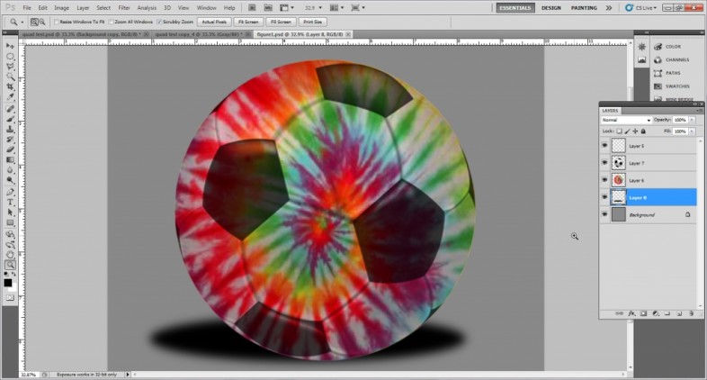
Color crunching can be as simple as corralling the hues that are similar in an image (Figure 1) and then using the Color Range tool in Adobe Photoshop to isolate those colors and save them in an extra alpha channel. Once you have this extra channel, you can add to it or adjust it to include or exclude areas of the image that you wish to color-combine. In the example shown in Figure 1, it was a matter of combining all of the warm and cool colors into red or blue hues so the graphic could be separated onto two screens instead of six.
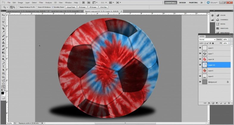
Here, color-combining involved selecting from the alpha channel, creating an extra layer, and filling the new layer with the color from the selection. This layer was then color-merged using layer-blending modes to adjust it, all the while considering the original image underneath. The resulting layer was then bumped down in opacity so that it would blend well with the original image (Figure 2).
Method one: Index separations
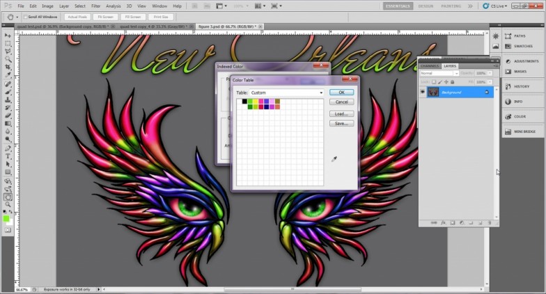
If you’re provided an image that has an artistic look to it—particularly one that has a texture or rough style—then you can separate it quickly with an index color table in Photoshop. The index style of separation is fast and relatively simple, but it does have limitations.
To split up a design into an index separation, take your prepped source image (Figure 3) and then size it appropriately in Photoshop. For index printing, it is useful to know what size of dots you can print. The size of an index dot is the same as one pixel at the resolution of the original file. That means, for example, that a 180-dpi index dot is 1/180th of an inch (0.005 in.). If your stencil can hold the size of dot you specify, then the index separation will work perfectly for your final output on the screens.
Once you’ve sized the design and dialed in the appropriate resolution, you can change it to index color by using the Color Mode command in Photoshop. The index color table will appear on screen, and you will need to turn the preview off so that you can select colors from the design. The next step is to clear out the existing color table by selecting the lower-right square in the table, then clicking and dragging the mouse up to the upper-left square (it will show that all the colors in the table are selected), and then releasing the mouse click. The program will then ask you to select the first and last colors of the blend you have selected. You will just put in white for both to clear out the table.
You will then create your custom ink table by selecting one color at a time from the image until you have all of the colors you feel you will need. Don’t forget to select a white and a black as well. When you approve the color table, the design will then convert to the new indexed design using the colors that you selected. The initial result will likely be less than satisfactory. If that’s the case, you can just undo the changes to the color table and then adjust the table with the colors that need to be changed or added.
You can keep undoing results you don’t like—and making changes to the table—until you have a good shift to index color without a lot of changes to the graphic. Even with several rounds of tweaking the index color table, this separation process tends to be very fast compared to traditional simulated separations that require curves modification or color selection from an image.
Your experience as a separator and the limitations of your press will dictate the degree to which you can refine the resulting color table and combine colors into final separations. If you want to divide the image into separation positives for output, just select the color that is to be separated, change it in the color table to black, and then change all of the other colors to white (Figure 4). Copy this file, save it as a separation channel in another file, undo this change in the source file, and pull out the rest of the separations using the same process. Don’t forget to copy the colors from the color table to use in the separation channels and to decide on ink colors.
Creating an underbase for the index file involves selecting all of the colors that need to be underbased, changing them in the color table to black, changing everything else to white, and then copying and saving the file. In some cases, you may wish to select the resulting channel (click on the image of the channel in Photoshop) and modify the selection by shrinking it a pixel or two if you wish to thin the underbase a bit in the final print. Doing so is OK, as long as it doesn’t affect the details in the image.
AdvertisementThis whole process can take less than 15 minutes to do. It’s a really fast separation technique that you can use when you are in a rush.
Method two: Quad-tone splits
Garment screen printers use the quad-tone split less frequently than other separation methods because setting it up can take a while. Its big advantage, though, is that once you create a recipe, you can save it and apply it instantaneously to another image with similar color characteristics.
Setting up a quad-color image requires that you have some experience with the Curves menu in Photoshop and you know how to separate a design with it. Here’s a really easy way to learn how to separate using the Curves menu in Photoshop: Start with a grayscale image, extract different levels of gray, and then save each level as a channel until you have rebuilt the image in the Channels menu. You just extract a black, a dark gray, a lighter gray, and a white. Once you’re able to complete these steps, the next logical process is to create some quad-tone channel splits. You can then apply the splits to parts of your image for quick separation.
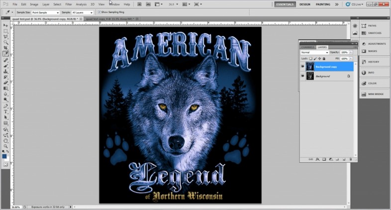
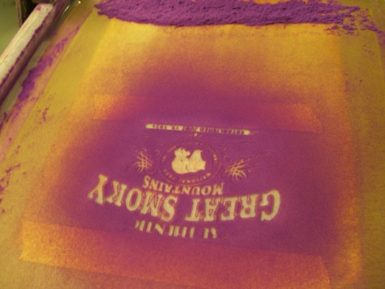
A supplied graphic that’s a good candidate for quad-tone separations is one in which the gamut is in the same color family and just changes in value (Figure 5). For this design, the easiest way to create fast separations was to convert the image to grayscale (>Image>Mode>Grayscale) and then bump the grayscale image with the Curves menu so that the blacks were 100% and the whites were 0%.
The next step was to apply a quad-tone preset. In this example, I had a quad tone saved as Quad Blue, which I applied to the image. This converted the entire image to a blue-toned design and allowed me to then create a multi-channel from it (>Image>Mode>Multi-channel) for separations. This image had essentially two different quad tones in it, so I repeated the whole process for the quad-yellow separations in the design (the eyes and bottom lettering).
When both of these separation sets were finished, I then created a mask as a channel of just the eyes and the bottom lettering. I erased this information from the blue-quad set and left only these areas on the yellow set. I could then combine these separations quickly, knowing that the standard underbase would work for both separations without using the mask.
This process is one of the fastest possible separation methods, assuming the image fits the right color models and you have a good recipe saved already. The time that it took to separate this design was two minutes, except for the masking and combining the artwork, because most of the work was already done.
Method three: Color-range channels
The last super-fast separation process is the channel method. This type of separation involves rebuilding the image, so to speak, in channels. It works really well when the graphic features defined areas of color and other types of separations don’t seem to be working. If you can visualize the proper colors from which a design should be created, then you have a good start already on using Photoshop’s Color Range tool to recreate a design.
The first step in using the Color Range tool to create separations is to assess the design and make sure that one of the other methods won’t work more quickly or effectively. If you can’t use a simpler or quicker process, then start by creating a shirt channel after the image channels in the design. You’ll then create the ink channels that will represent the screens on the press in a descending order—one channel per screen. Make sure to load the proper ink color into each channel via the Channel Options dialog so that a digital proof will show how the separations will ultimately combine to reform the image on press.
AdvertisementNext, go back to the original design and then select the color that you want from the design using the Color Range tool. Save the final selection into the appropriate channel that represents that ink color. You will have to practice with the Fuzziness slider on the Color Range tool, and you may have to add or subtract from your selections to get your color extractions right. Ideally, you should be able to rebuild your color separations using this method in a matter of minutes (Figure 6).
Here’s a great trick. If you’re getting a lot of extra colors that you don’t want selected through Color Range, just create a selection of a more intense color than what is shown in the design (change the color in the Color Selection panel’s foreground box on the lower left of Photoshop’s toolbar), save this selection, and use Curves on it to make it almost solid black and white. You can then click on it and make a pre-selection from your image and extract a color range from just those specific areas without drawing from other areas in the image. Doing this has saved me hours and hours of drawing painful selections using the Path tool.
When your channels are rebuilt and looking good, simply turn on all of the eyes on the channels in order and check to make sure your digital reconstruction of the image is as close to the original as possible. This also makes a great digital proofing process to test separations sent from outside artists, separation programs, or your own work before you send it to film, because it will clearly show whether the underbase is too big or whether the separations are muddy, fuzzy, or improperly blending.
Choosing the right technique
The type of image you wish to separate dictates the separation method you’ll use. Taking into consideration the style of the artwork and how it was put together tends to yield better results. Work with the design; don’t try to force it into a process for which it isn’t suited.
Know each separation process’s limitations ahead of time. For example, index-style dots have a grainy look at a bigger size; therefore, designs that have a texture or rough look to them are the best candidates for index separations. A quad-tone separation works best when the artwork has a certain color cast and it is all in the same color family. The color-range separation is the most versatile, but it sometimes has a hard time with details that are rendered in near-neutral colors and, as a result, tends to grab extra colors you don’t need.
The faster you can separate artwork—and do it well—the more profitable your art and pre-production department becomes. It is difficult to bill for separation time anymore, and a lot of companies chalk it up to the cost of doing screen printing. So, the faster you can do it, the faster the order can start making your shop some money.
PHOTO GALLERY (6 IMAGES)

Let’s Talk About It
Creating a More Diverse and Inclusive Screen Printing Industry
LET’S TALK About It: Part 3 discusses how four screen printers have employed people with disabilities, why you should consider doing the same, the resources that are available, and more. Watch the live webinar, held August 16, moderated by Adrienne Palmer, editor-in-chief, Screen Printing magazine, with panelists Ali Banholzer, Amber Massey, Ryan Moor, and Jed Seifert. The multi-part series is hosted exclusively by ROQ.US and U.N.I.T.E Together. Let’s Talk About It: Part 1 focused on Black, female screen printers and can be watched here; Part 2 focused on the LGBTQ+ community and can be watched here.


The Profit Impact of a Market Dominating Position

Inkcups Announces New CEO and Leadership Restructure

Hope Harbor to Receive Donation from BlueCotton’s 2024 Mary Ruth King Award Recipient


Bulletins
Get the most important news and business ideas from Screen Printing magazine's news bulletin.

-

 Case Studies2 months ago
High-Density Inks Help Specialty Printing Take Center Stage
-

 Art, Ad, or Alchemy2 months ago
F&I Printing Is Everywhere!
-

 Andy MacDougall2 months ago
Functional and Industrial Printing is EVERYWHERE!
-

 Columns3 weeks ago
8 Marketing Mistakes Not to Make When Promoting Your Screen Printing Services Online
-

 Editor's Note3 weeks ago
Livin’ the High Life
-

 Marshall Atkinson3 weeks ago
How to Create a Winning Culture in Your Screen-Printing Business
-

 Thomas Trimingham2 months ago
“Magic” Marketing for Screen Printing Shops
-

 News & Trends2 months ago
What Are ZALPHAS and How Can You Serve Them in Your Print Business?