Thomas Trimingham
How to Print the Ultimate Underbase
There are some situations when avoiding a white underbase will produce a better print.
THE BEST ARTWORK, and often the friendliest in production, breaks the rules. One of the commonly understood rules of getting the brightest hues possible on dark shirts is to start with a white underbase. On a black shirt in particular, if the underbase doesn’t properly block the color of the garment, there can be an unexpected muting of the entire image or a shift to the colors that are printed later. Prints that are dull or look different than the original art the clients approved (typically a digital file they viewed on their computer) can upset them and even make them doubt the quality of your company. This issue can cost you business, so it needs to be taken seriously.
This fear that orders will be rejected is one reason that the majority of screen printers standardize the practice of printing a solid-looking white underbase whenever they are working with dark garments. The majority of the time, using a white underbase isn’t a bad idea. It is predictable, repeatable, and will certainly give you the brightest, most saturated colors. It can be extremely difficult to achieve certain colors like fire engine reds and deep royal blues without a white underbase. But there are some situations when using a different color for the underbase will produce a much better print than using white. (And one of them isn’t when you run out of white ink.) The choice begins with the design concept and the final effect you want to achieve. It’s much better to consider the possibilities before you have printed several dozen shirts.
Underbase 101
Before we dive into when and how to use an underbase that isn’t white, it’s a good idea to review what underbases do and why white usually works so well. Knowing how an underbase works will help you come up with ideas for alternate colors and strategies.
Fundamentally, underbases do two things in creating a foundation for the overprint colors:
- They block the color of the garment as well as the individual fibers of the material.
- They create a reflective surface that will make the subsequent colors appear brighter and more saturated.
Blocking out the shirt color and matting down its fibers is an underbase’s most important job. When using plastisol inks, print the underbase with light squeegee pressure so that the ink isn’t pushed into the garment. The higher the underbase “sits” on the surface of the shirt, the brighter it will look and the more shirt fibers it will cover, benefits that are lost when squeegee pressure is excessive. Some printers try to counter this problem by double printing (and double flashing) the underbase in an attempt to better seal off the background. (I call this approach “revolvering” because it forces you to index the press in the wrong direction.) This just isn’t a profitable way to produce T-shirts, so avoid that technique whenever possible. With the right screen and minimal squeegee pressure, you shouldn’t have to resort to double printing the underbase.
Regarding reflectivity, the simplest way to envision this is to run a colorful photo through an inkjet printer on bright, white paper, and then print it again using a gray or black stock. You will quickly notice that the darker paper makes the top colors appear much duller. (On a black paper, they may not even be visible.) The reason images appear brighter on a white underbase is that almost all inks are somewhat transparent. In the case of deep, saturated colors like bright red, royal blue, and lemon yellow, the pigments in these inks are like stained glass windows. They create these bright colors by capturing every other color except the one they let through. So a royal blue pigment traps every color wavelength except bright blue, which is what our eyes see.
However, the degree of brightness will vary depending on how much light bounces off the surface underneath the ink. A darker paper (or underbase) will reflect less light, so the blue will seem much duller. The whiter the underbase, the more light that is reflected and the brighter the colors will be. (I should note that some inks have different levels of opacity and pigment saturations that can affect the recommended procedures for printing underbases. With the majority of semi-transparent inks, a white underbase will provide the brightest overprinted colors.)
When to Break the Rules
Knowing whether a design will look better, and/or print easier, with a color other than white as the underbase is challenging. Here are a few clues. This list is by no means all-inclusive, but it’s a good guideline for experimenting.
Consider an alternate color for your underbase when:
- The design has a consistent color cast over the majority of the image.
- The artwork has subtle, shadowy details that fade into the shirt and have a noticeable color.
- The design has very intricate details that scatter around the shirt like splatters, tiny lines, or dots.
- The artist or customer has requested a print that looks “vintage” or washed out and less bright.
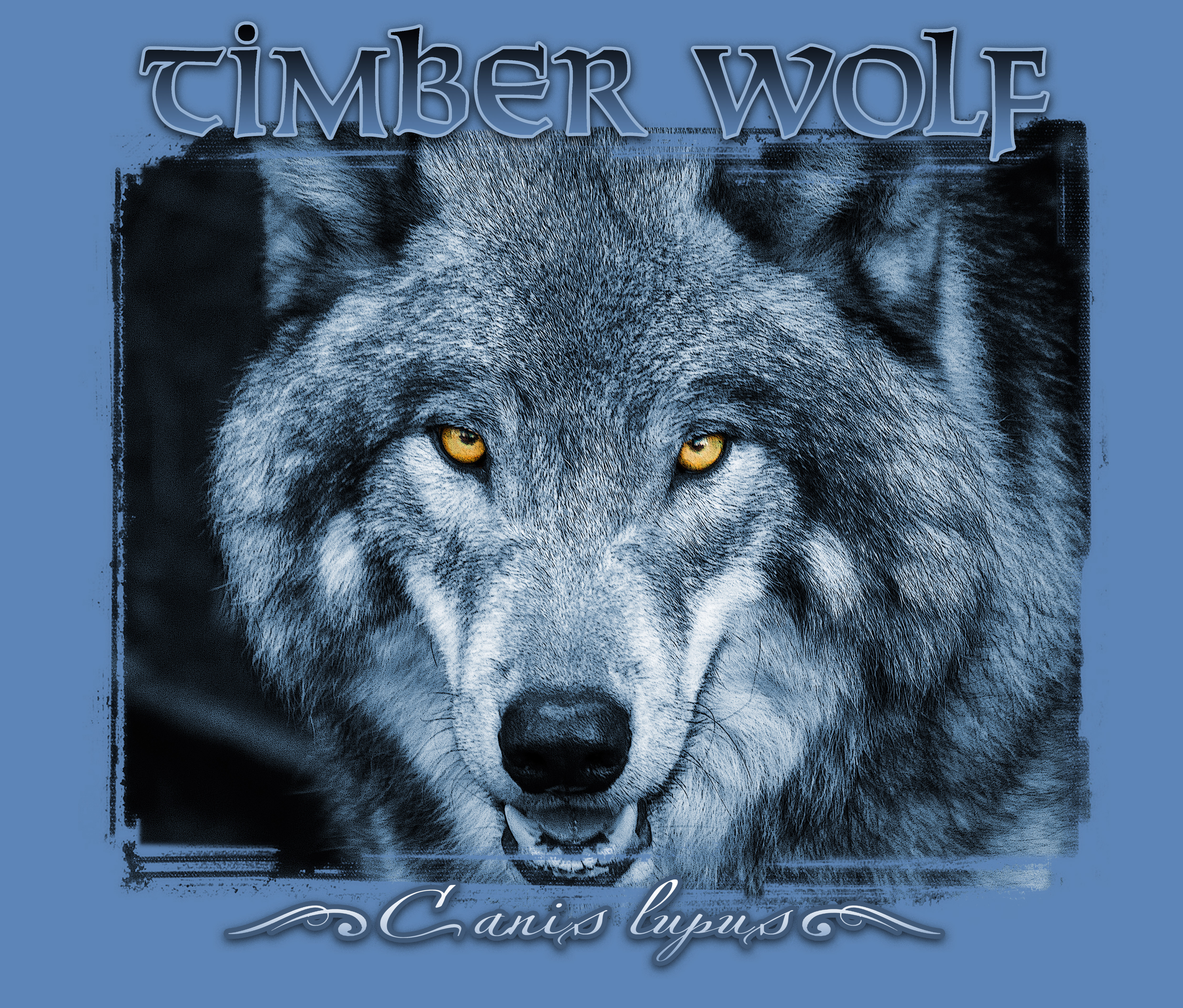
Designs with a consistent color cast, such as a duotone photo taken at twilight, often benefit from an alternate underbase color. (See Figure 1, above.) The substitution can reduce the number of colors needed for the job by creating a tint across the entire image. It also eliminates any concerns about a white underbase showing through in areas of the image that have lighter overprint ink coverage. Another advantage is that a colored underbase will make the overprinted colors look more worn, which is preferable on a vintage-style design.
Separating a duotone image in Photoshop is easy. Here are the steps, which are specific to the use of a nonwhite underbase:
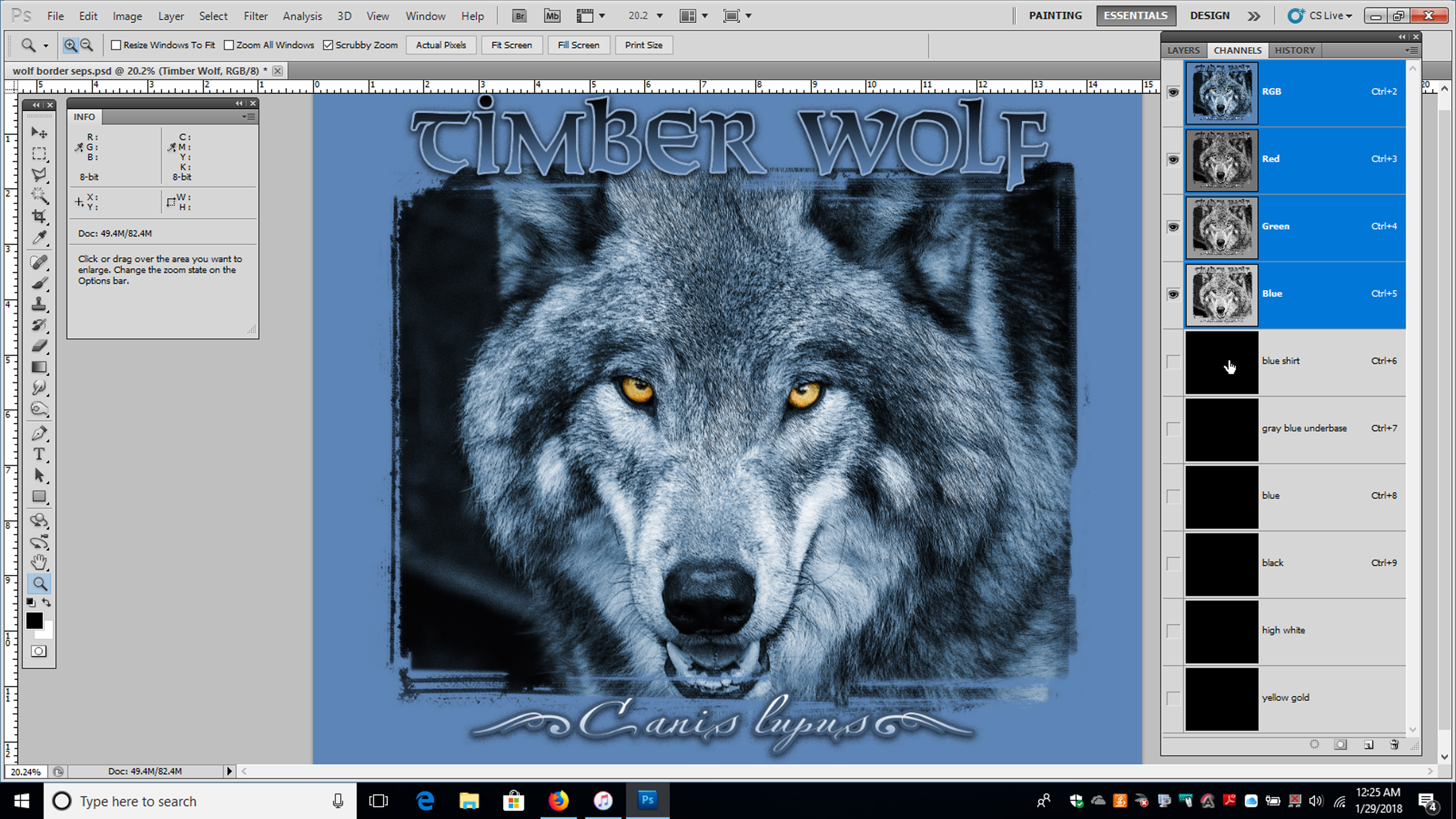 1. Create an Image Channel just below the RGB channels. Make it the same color as the shirt, name it “blue shirt,” and then make five Alpha Channels underneath it. These channels will be underbase blue-gray, blue, black, highlight white, and yellow gold. (See Figure 2, left.)
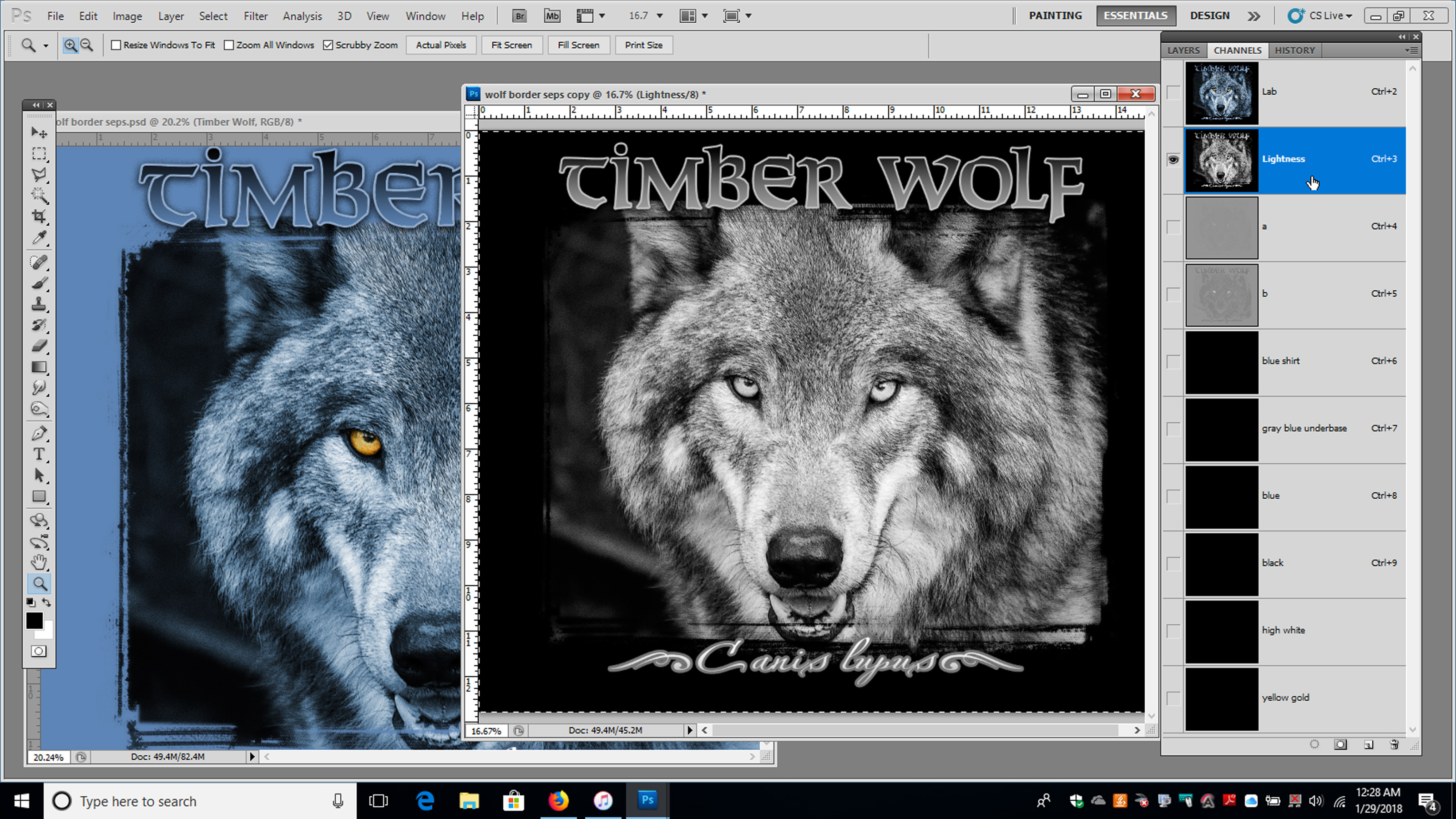 2. Next, duplicate the file, change the background to black, and convert it to L*a*b* color. Copy the Lightness Channel from the duplicate and then paste it into your original file as the “underbase channel.” (See Figure 3, right.)
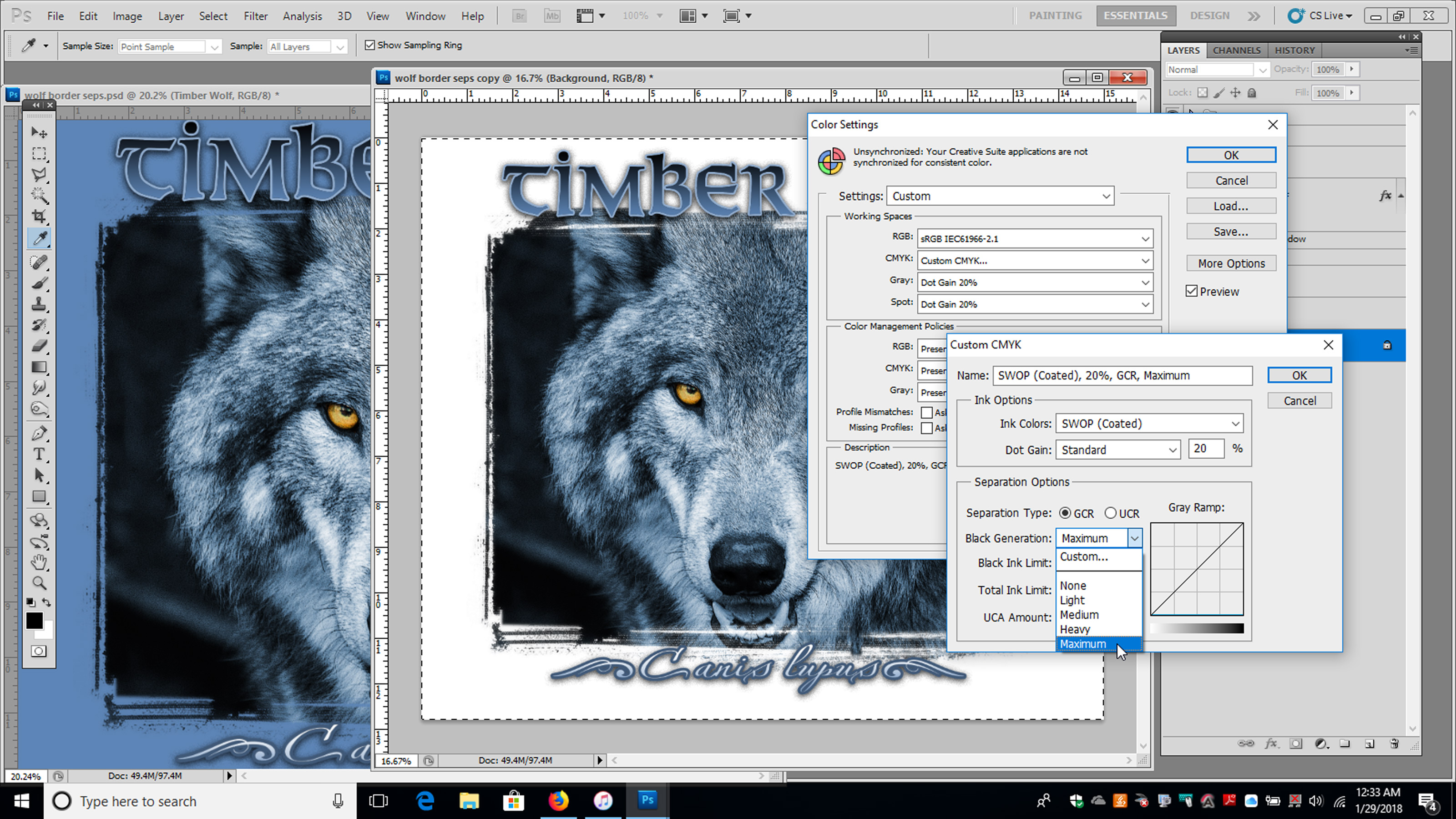 3. Next, create the information for the other channels. You do this by duplicating the original file again, converting the background to white, and then changing your image to CMYK mode with the Maximum Black setting turned on. I find that doing these types of underbases in CMYK rather than using Color Range gives the overprint colors a desirable gloss, more like an oil painting than a solid spot color. Edit your CMYK properties first: Edit/Color Settings/CMYK; select Custom CMYK, and change black to maximum, as shown in Figure 4 (left).
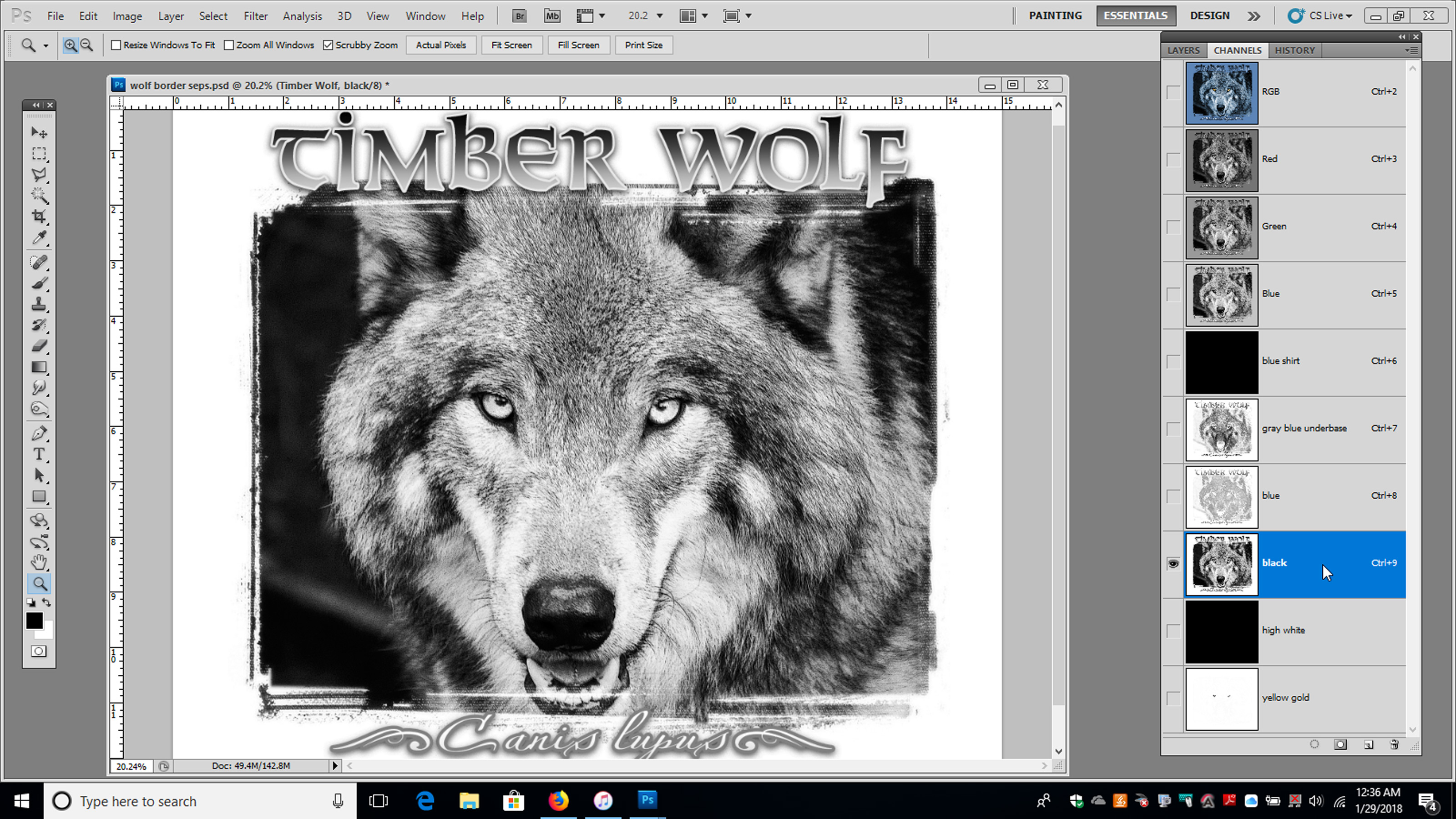 4. Once your duplicate file is converted to maximum black CMYK, copy and paste just the cyan, yellow, and black channels into the “blue,” “yellow,” and “black” separation channels in your original design. (See Figure 5, right.)
 5. Delete the copy of your original file to avoid confusion and then edit the copied channels to boost color and remove any ghosted areas using the Curves menu on each separation channel (Control/Command-M). Finalize the design using the Color Range tool with the background temporarily converted to black to select your highlight white channel. (See Figure 6, left.)
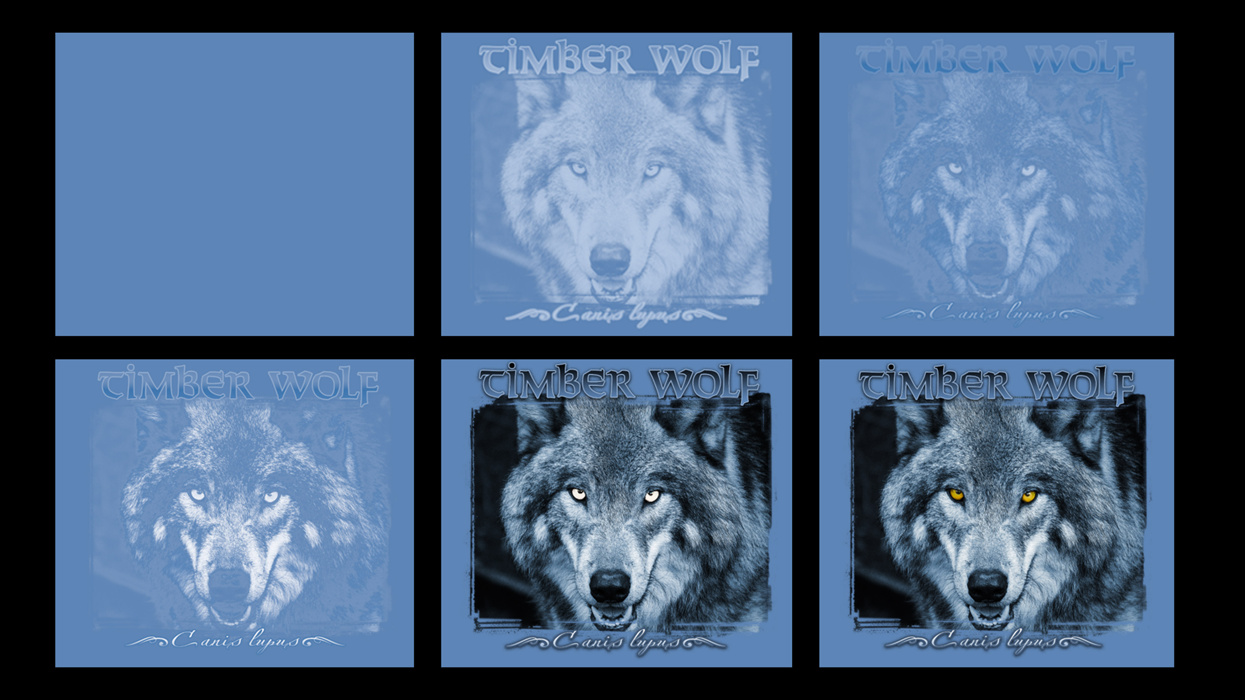
6. The final step is to convert all your Alpha Channels in Channel Options to match the ink color you will print. (You can use Color Picker for this or a PMS color match from the library.) Change the Alpha Channel to Spot Color and the opacity to 6 percent for the top color channels and around 80 percent for the underbase channel. You can then turn on the “eye” in front of each channel in the same order as the print sequence you are planning and view a digital approximation of how your separation will print. This won’t be a perfect match, but it will give you an idea if there are any bad areas or spots where the underbase is showing. You can view your design in stages with each color turned on in sequence to catch errors and see if the alternate underbase appears to be working. (See Figure 7, below.)
Remember that when you create separations using an alternative underbase, you will need to pull a slightly more saturated color for the accent or top-printed colors because the underbase will change them, making them slightly duller and/or changing their hue. As with most color mixing, avoid using a color for an underbase that might blend with an overprint color to create an unwanted end result (such as a light green underbase and a magenta overprint, which would combine to create a gross brown).
Be careful promising this process to a client in the art approval stage if you haven’t tested the color combinations first. You may have to make some on-press changes the first few times you attempt an alternate color underbase. You don’t want to have to revise your separations multiple times on a rush job for a picky customer.
Another time you may need to use an alternate underbase involves art with image elements that fade off into a dark shirt. Imagine a brick wall that slowly fades into the shadows on a black shirt. With such a design, it might be advantageous to use a mauve or slightly reddish-gray underbase because it will make for a more subtle, less heavy print. It also prevents the white underbase showing through as it fades out into the shirt background.
Some printers design this type of artwork so that one or more of the overprint colors print off the underbase and directly onto the shirt in parts of the image. This is an advanced technique and it’s vitally important to test, especially with shirt colors other than black. I’ve gone so far as to get samples of such shirts and then test print the underbase and overprint colors for the job, reducing the opacity of the underbase in stages so I could see what different combinations might yield rather than just guess. For a high-volume job, the extra effort can pay off. Even black shirts can vary from one manufacturer to another, with dyes that can skew toward another color like magenta or blue and that might produce a different hue than you expect.
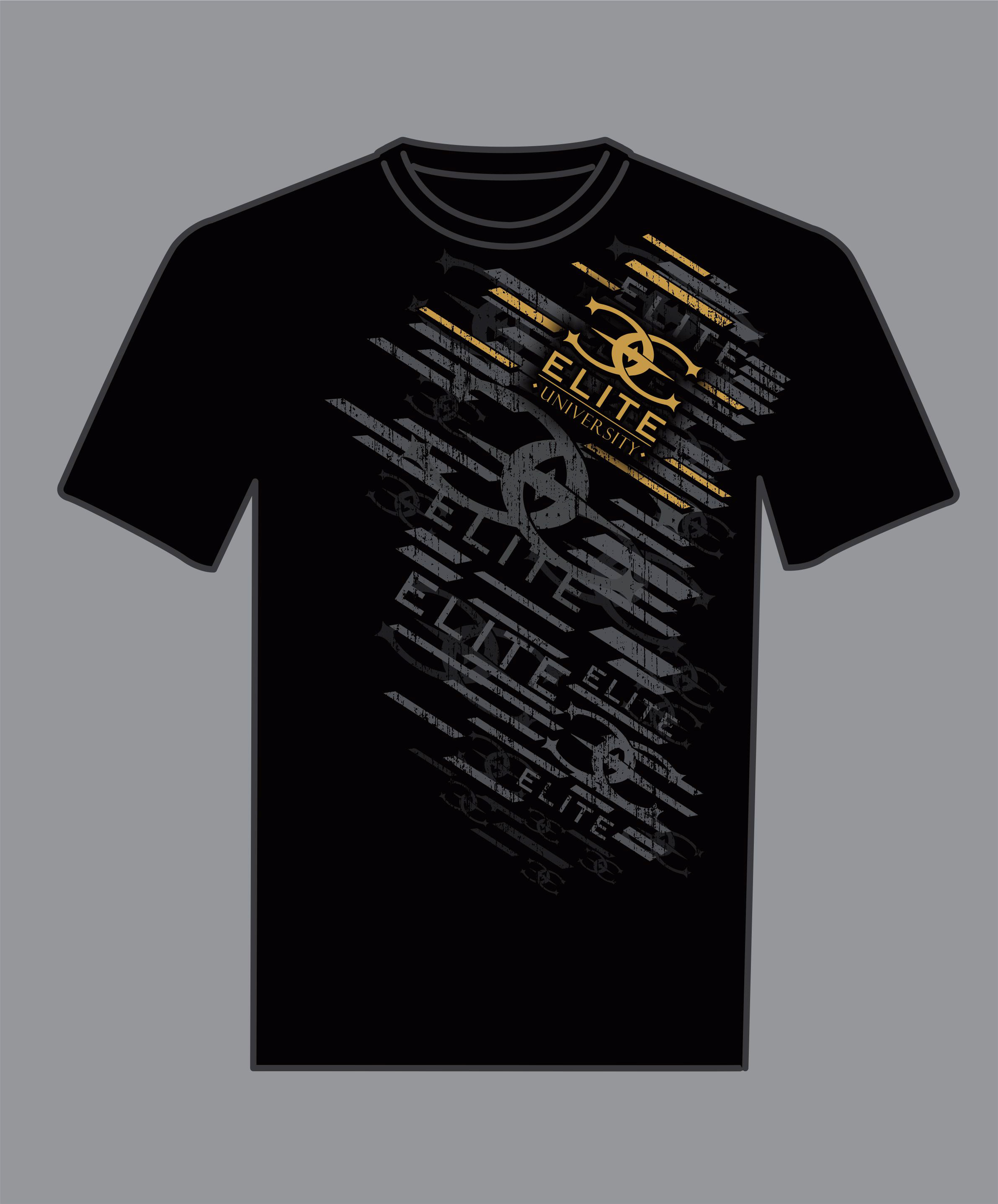
Another common challenge where this technique can help is grunge artwork that has a lot of tiny splatters or distressed pieces, like the shirt in Figure 8 (above). This type of design can cause some real headaches with registration and/or screen stretch on press between the underbase screen and the overprinted colors. Here, using an alternate underbase color can save a lot of profit. Those tiny image elements will be similar in color to the underbase, eliminating the registration concerns and allowing setup to go much faster. The main concern is if the colors from the original design that you’ll be overprinting are too bright for this to work.
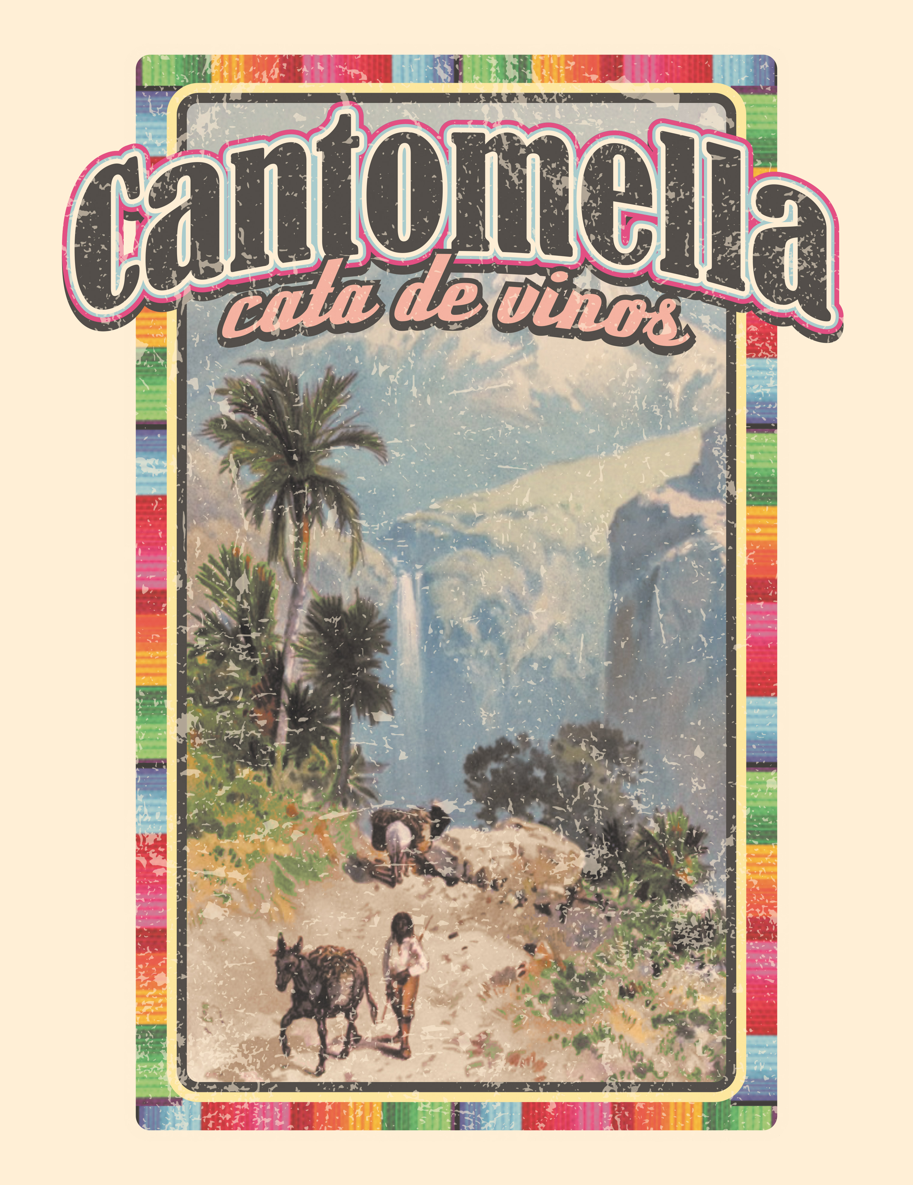
A final challenge that an alternate underbase can make easier involves full-color designs that are intended to have a washed-out look, such as the one in Figure 9 (below). Imagine a vintage wine label with a lot of colors. You want to print it on a tan shirt, but the artwork has a dull look to it as though it has been in storage for years. This would be a good situation to use an off-white underbase to help dull the top colors, making the print softer. It would also make the entire production process simpler because you could use regular, semitransparent colors and just let the underbase and shirt create the washed-out look. You may have to test it to get the right underbase color, but it would be a lot easier then custom mixing all of your top colors and printing them on a white underbase.
Printing an underbase with a color other than white can be an effective and useful way to cut the number of colors in a job, reduce setup time, and prevent press headaches. You just need the right design combined with some experience. Take the time to test variations of the press setup, inks, and separation methods so you can plan and anticipate the results you might get the next time you’re presented with a duotone or grunge design. With enough practice, this process can be a valuable solution that will provide great prints that are softer and more easily color matched to the original artwork.
Let’s Talk About It
Creating a More Diverse and Inclusive Screen Printing Industry
LET’S TALK About It: Part 3 discusses how four screen printers have employed people with disabilities, why you should consider doing the same, the resources that are available, and more. Watch the live webinar, held August 16, moderated by Adrienne Palmer, editor-in-chief, Screen Printing magazine, with panelists Ali Banholzer, Amber Massey, Ryan Moor, and Jed Seifert. The multi-part series is hosted exclusively by ROQ.US and U.N.I.T.E Together. Let’s Talk About It: Part 1 focused on Black, female screen printers and can be watched here; Part 2 focused on the LGBTQ+ community and can be watched here.


The Profit Impact of a Market Dominating Position

Inkcups Announces New CEO and Leadership Restructure

Hope Harbor to Receive Donation from BlueCotton’s 2024 Mary Ruth King Award Recipient


Bulletins
Get the most important news and business ideas from Screen Printing magazine's news bulletin.

-

 Case Studies2 months ago
High-Density Inks Help Specialty Printing Take Center Stage
-

 Art, Ad, or Alchemy2 months ago
F&I Printing Is Everywhere!
-

 Andy MacDougall2 months ago
Functional and Industrial Printing is EVERYWHERE!
-

 Columns3 weeks ago
8 Marketing Mistakes Not to Make When Promoting Your Screen Printing Services Online
-

 Editor's Note3 weeks ago
Livin’ the High Life
-

 Marshall Atkinson3 weeks ago
How to Create a Winning Culture in Your Screen-Printing Business
-

 Thomas Trimingham2 months ago
“Magic” Marketing for Screen Printing Shops
-

 News & Trends2 months ago
What Are ZALPHAS and How Can You Serve Them in Your Print Business?