Connect with us

News & Trends

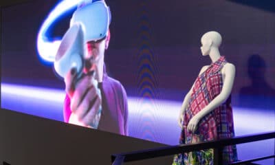
The Institute of Sound and Vision

mm

Published

on

2035-1.jpg

In the mid 1990s, the Dutch government decided to establish a national institute to preserve and present its audiovisual heritage, resulting in the Netherlands Institute for Sound and Vision in the city of Hilversum. The new institute was also meant to manage, preserve, and expand the too-limited reach of the available collections.

In the mid 1990s, the Dutch government decided to establish a national institute to preserve and present its audiovisual heritage, resulting in the Netherlands Institute for Sound and Vision in the city of Hilversum. The new institute was also meant to manage, preserve, and expand the too-limited reach of the available collections.

The designers wanted the facade of the new building to be colorful but translucent, as well as depict images from Dutch movies and television. They envisioned panes of glass in many vibrant shades that would continuously change colors with the amount of sunlight reaching the facade, generating a dynamic color palette. They decided that in order to maximize the color shifts from the changes in incidental light, the broadcasting images should be printed in relief on the panels. So the challenge of this huge project was creating the 3D images together with translucent colors on the glass.

A total of 2244 digitally printed glass panes with 768 different pictures were used to cover the massive facade, which measures nearly 54,000 square feet. Among the manyimages used on the panels, one shows the golden coach of the Dutch king. Another panel represents the burning Twin Towers in New York. As mentioned earlier, the colors were applied using a custom digital printer that had been built specifically for this project. The three-color machine deposited red, yellow, and blue glass powders that fused with the glass during the firing process to form the final colors in the design. One of the digital printer’s advantages over attempting to screen print the job was that individual panels could be modified (for example, to alter the screen angles of the individual colors) fairly quickly.

In order to produce the relief effects, the color images were converted into grayscale and the resulting file was used to digitally mill timber molds, one for each of the panels in the project. The relief depth of these molds was determined by the varying intensities of black. When each pane of glass was fired, the printed panels were positioned carefully over the corresponding mold. The glass softened when heated to 1300ºF and obtained the shape of the subsurface mold to form the relief with the decorations in place.

Advertisement

The final facade forms a kind of “second skin” around the building. Each glass pane was designed to be turned to facilitate cleaning. However, because our brains aren’t able to adequately process such complicated visual imagery, the project can create confusion among viewers. Our eyes tend to catch on one specific panel but can’t pick up such detail in larger areas of the design.

Read our full update on architectural glass decoration here.

Advertisement

SPONSORED VIDEO

Let’s Talk About It

Creating a More Diverse and Inclusive Screen Printing Industry

LET’S TALK About It: Part 3 discusses how four screen printers have employed people with disabilities, why you should consider doing the same, the resources that are available, and more. Watch the live webinar, held August 16, moderated by Adrienne Palmer, editor-in-chief, Screen Printing magazine, with panelists Ali Banholzer, Amber Massey, Ryan Moor, and Jed Seifert. The multi-part series is hosted exclusively by ROQ.US and U.N.I.T.E Together. Let’s Talk About It: Part 1 focused on Black, female screen printers and can be watched here; Part 2 focused on the LGBTQ+ community and can be watched here.

Promoted Headlines

Most Popular